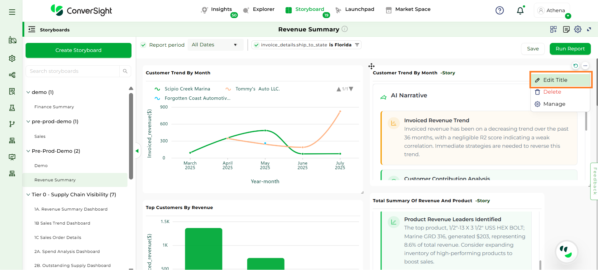
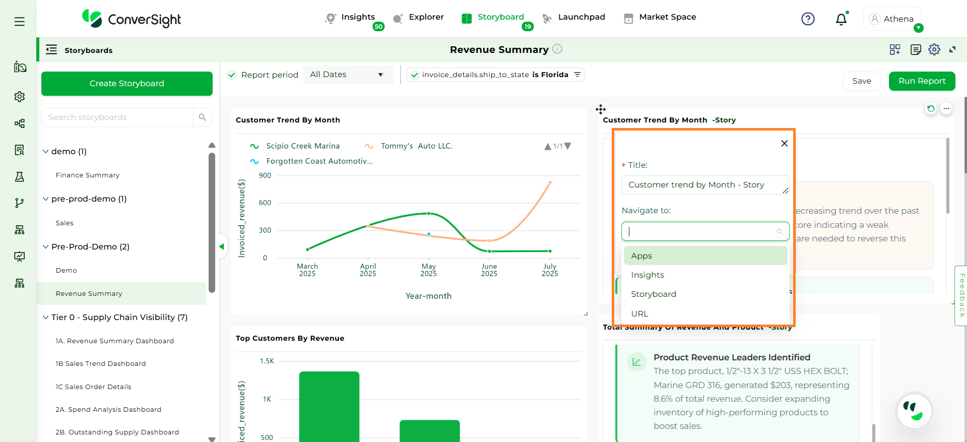
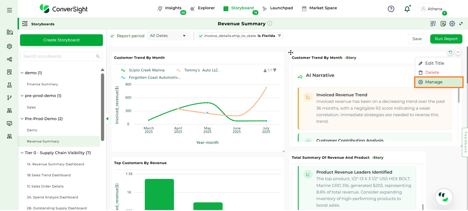
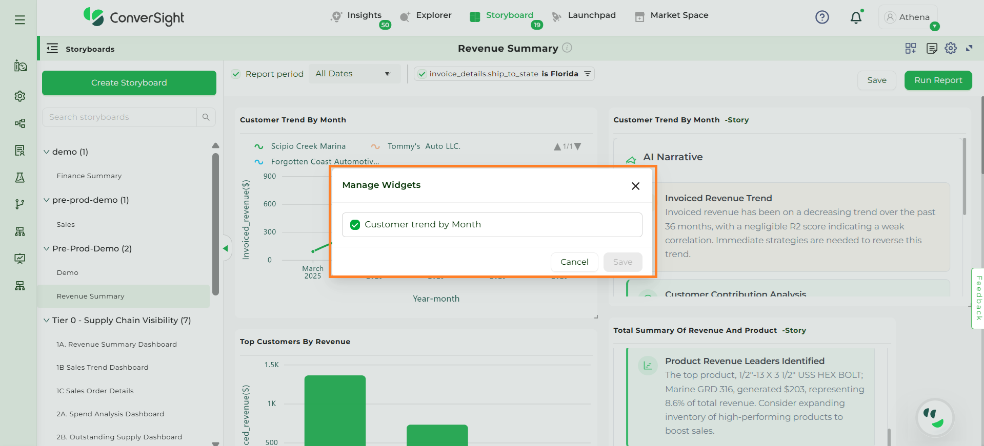
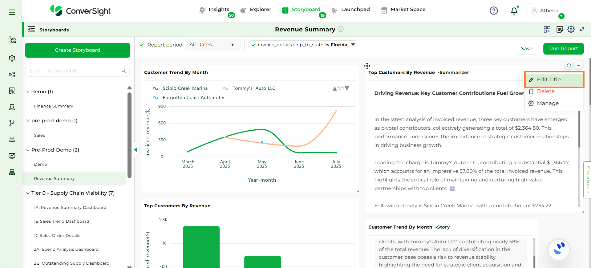
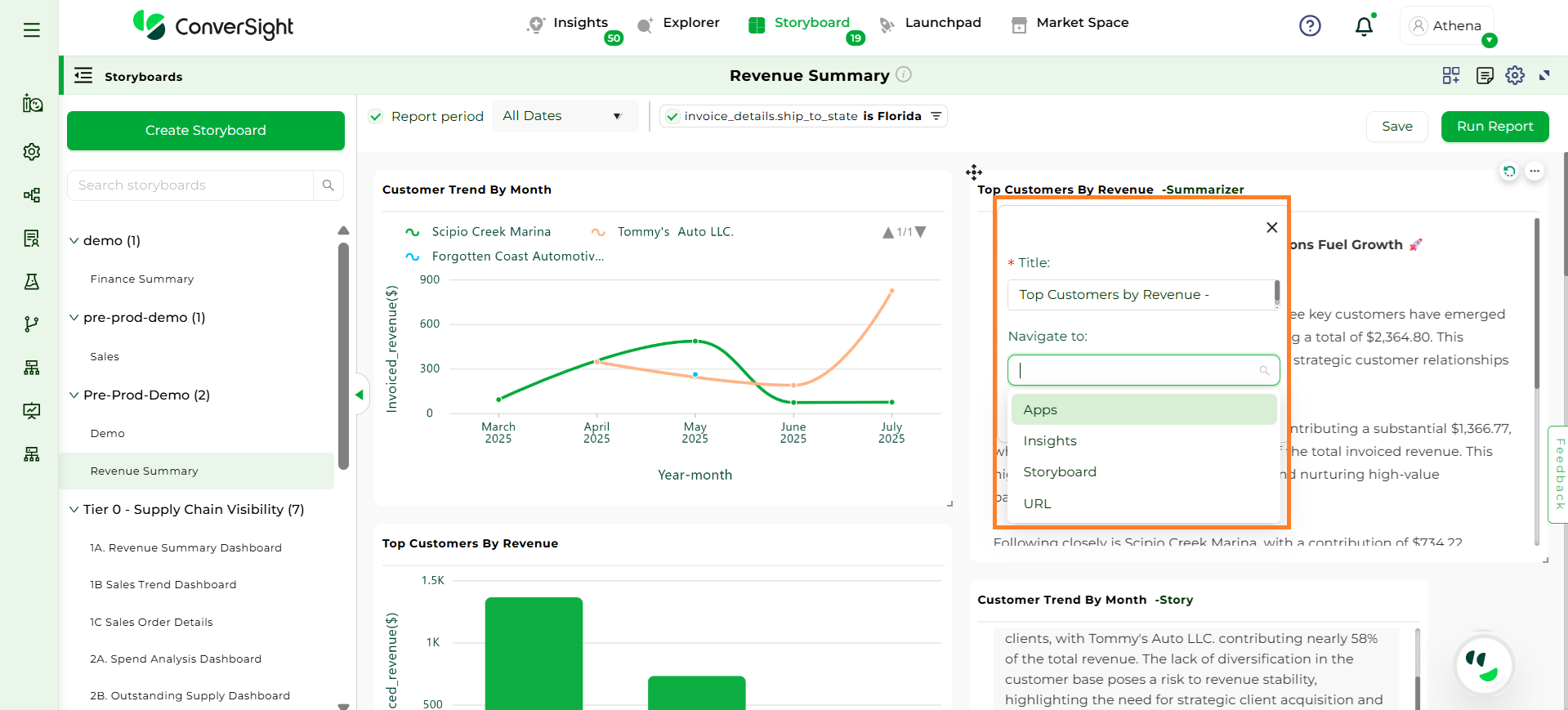
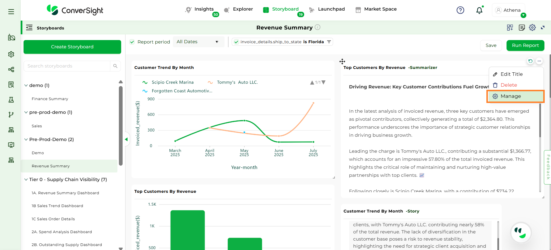
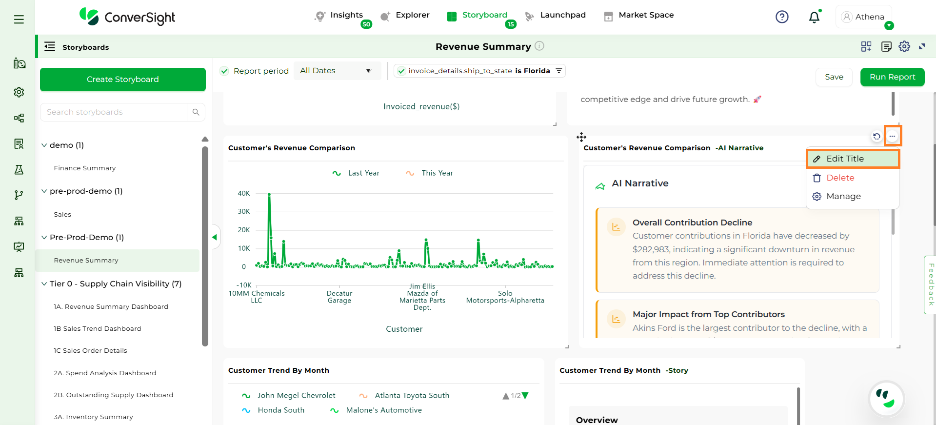
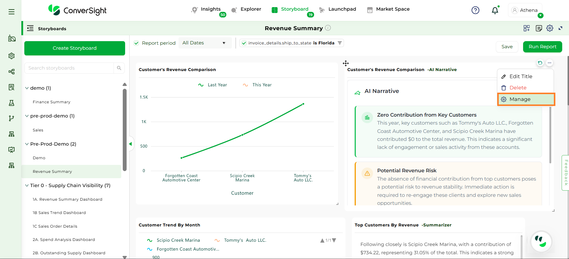
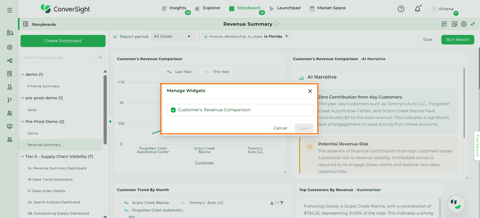
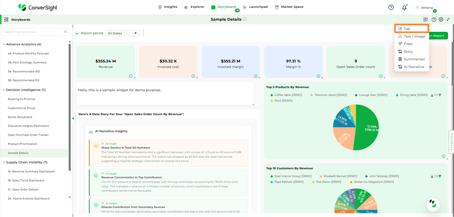
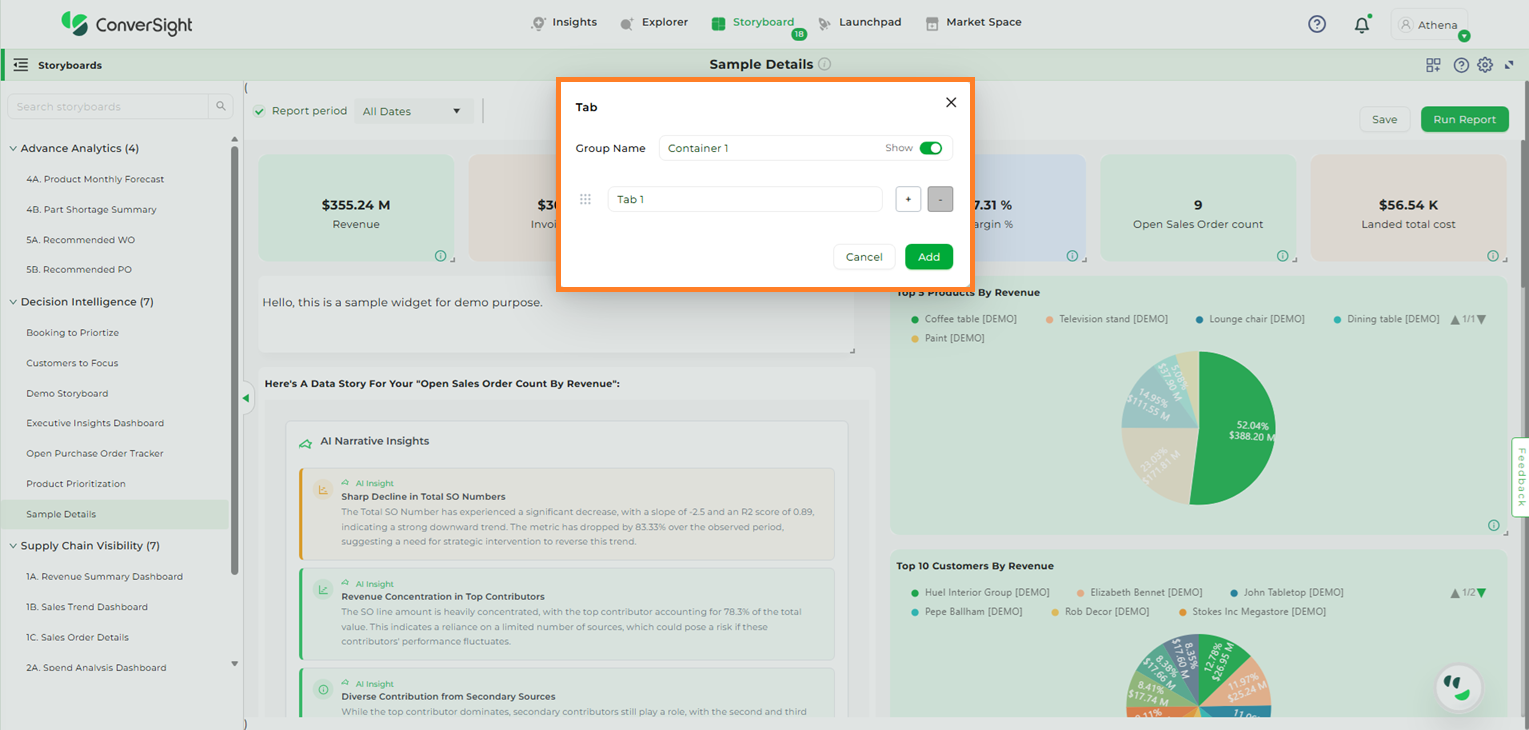
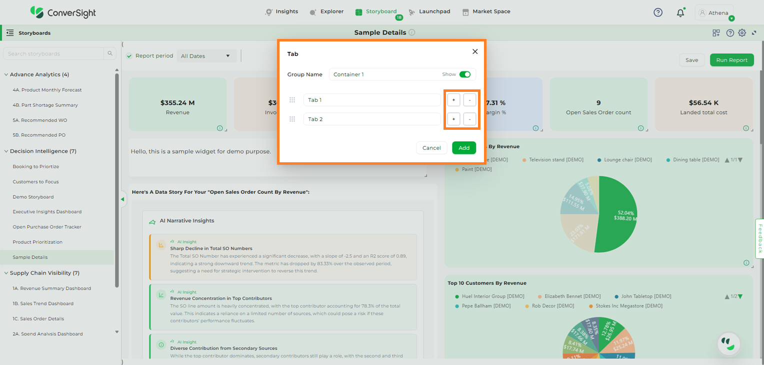
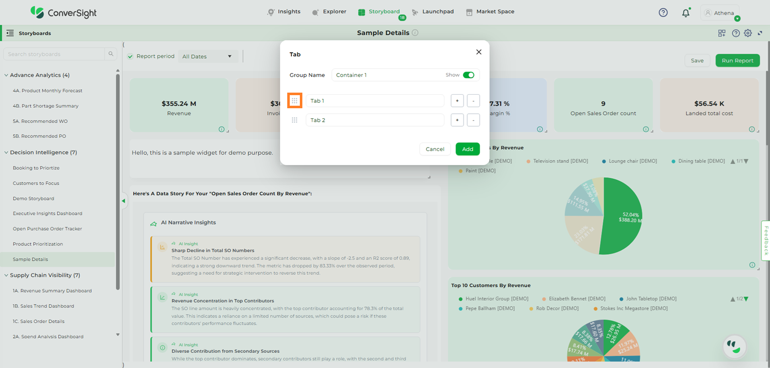
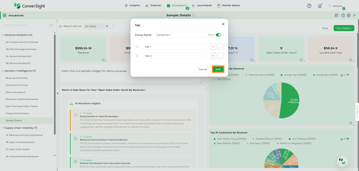
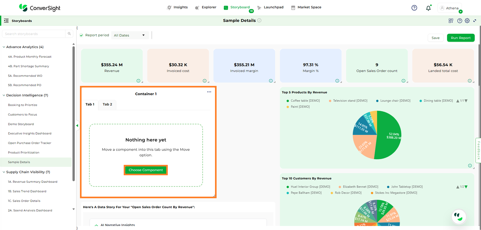
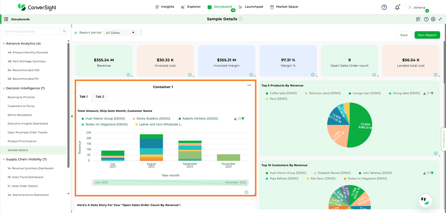
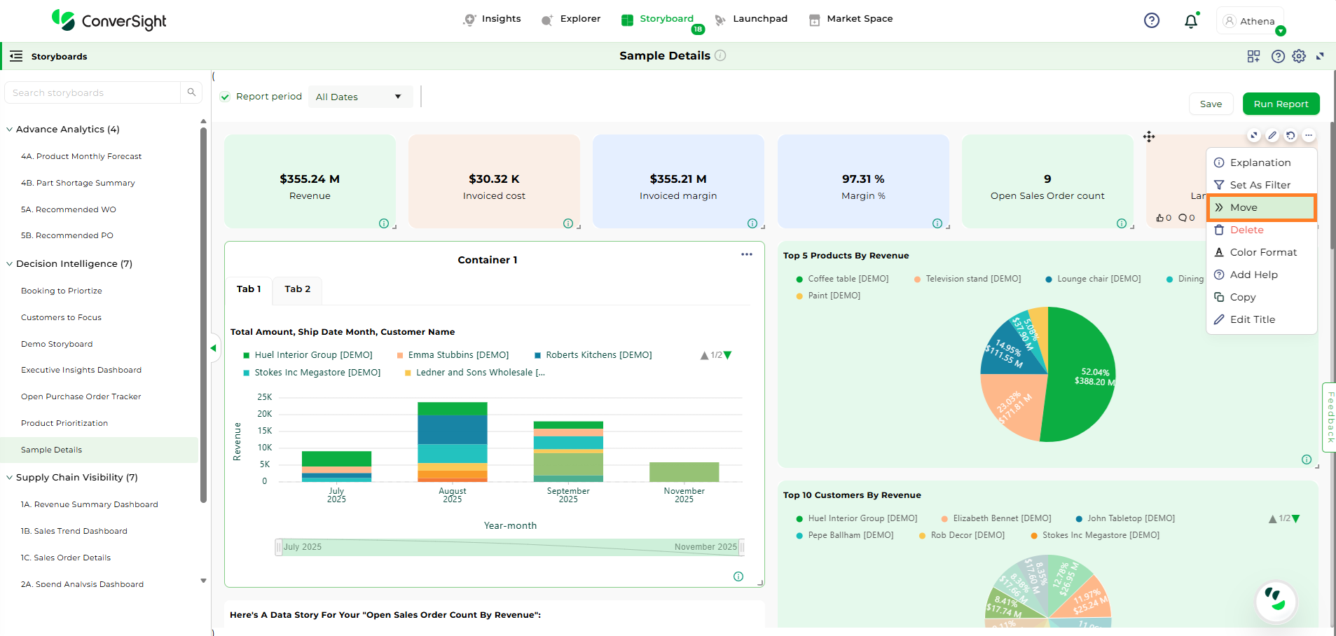
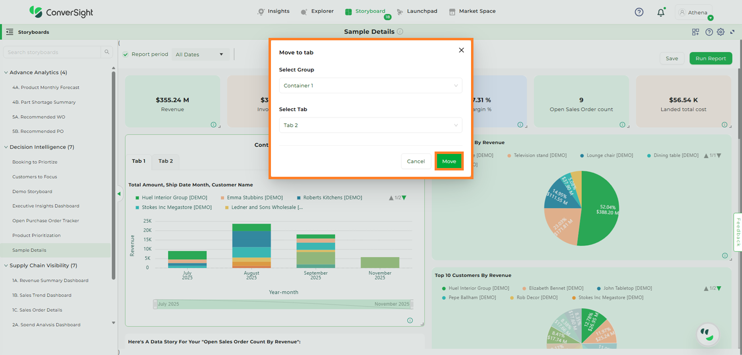
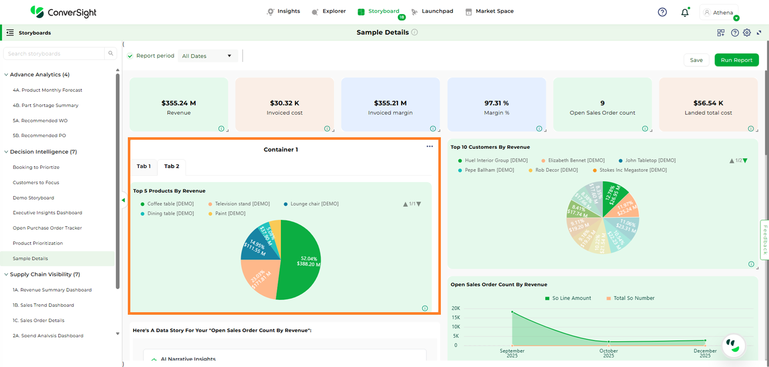
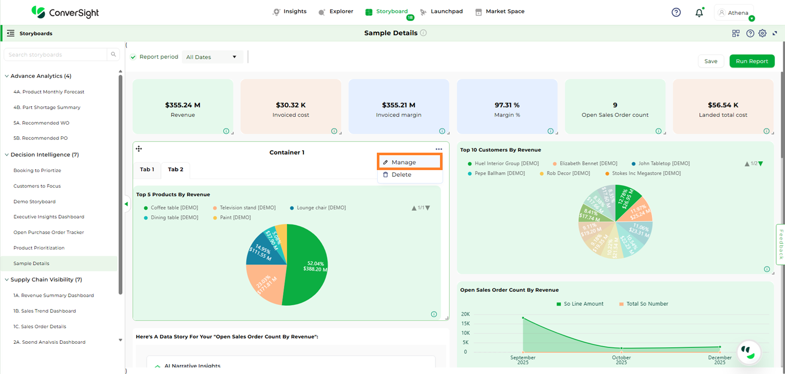
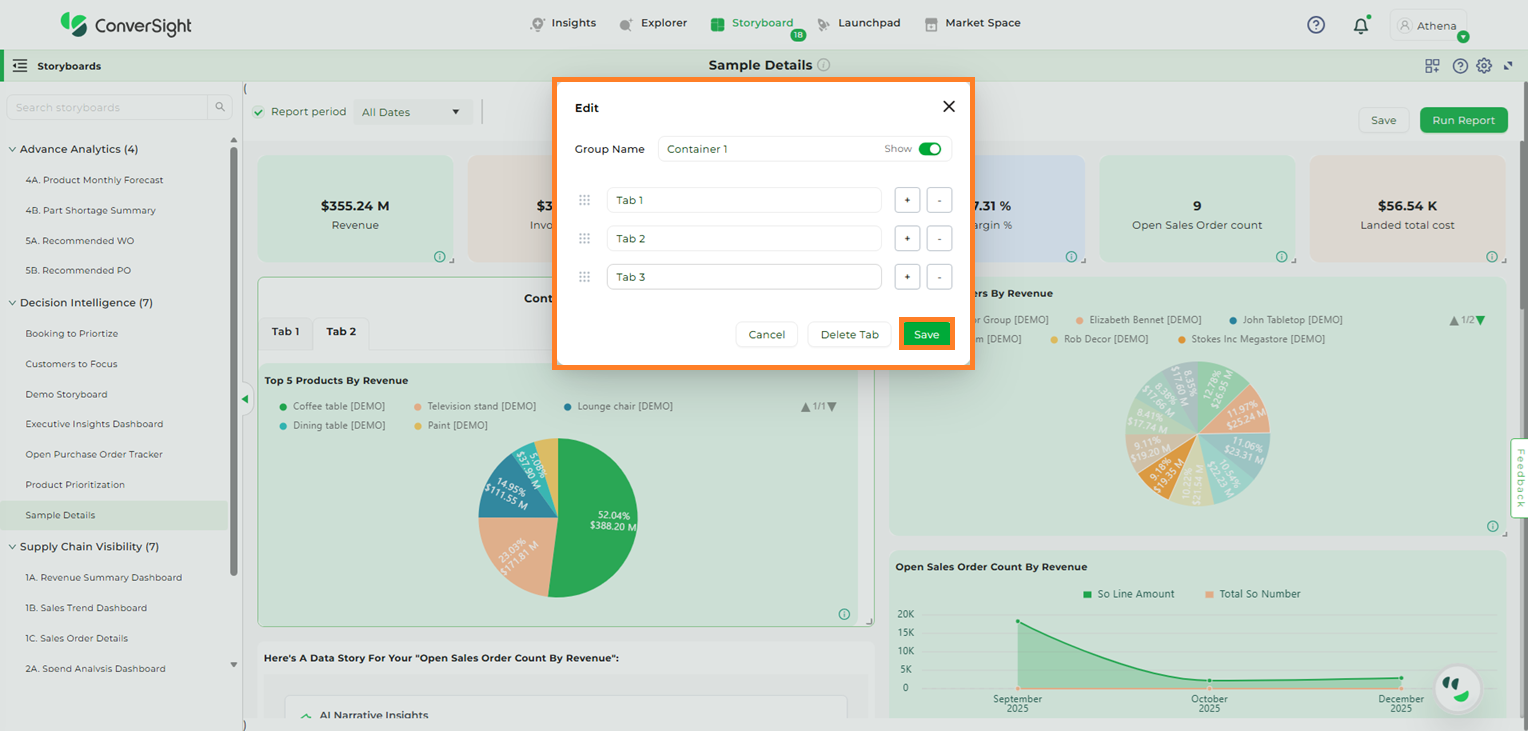
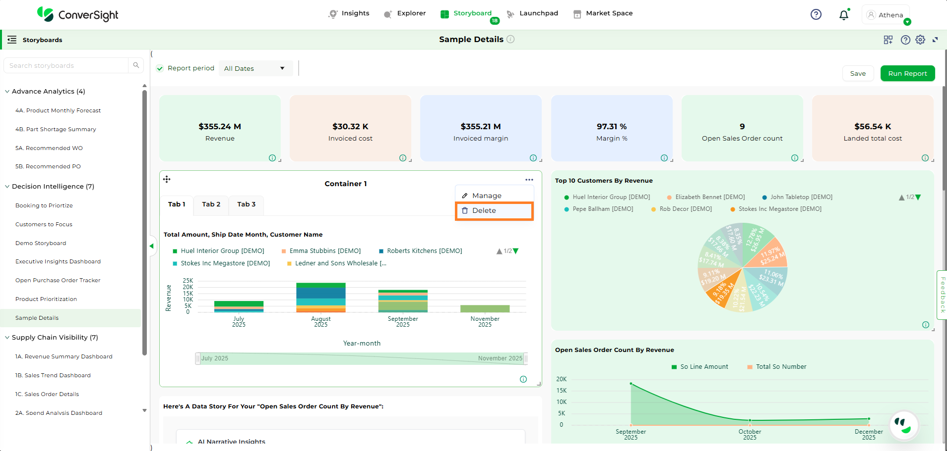
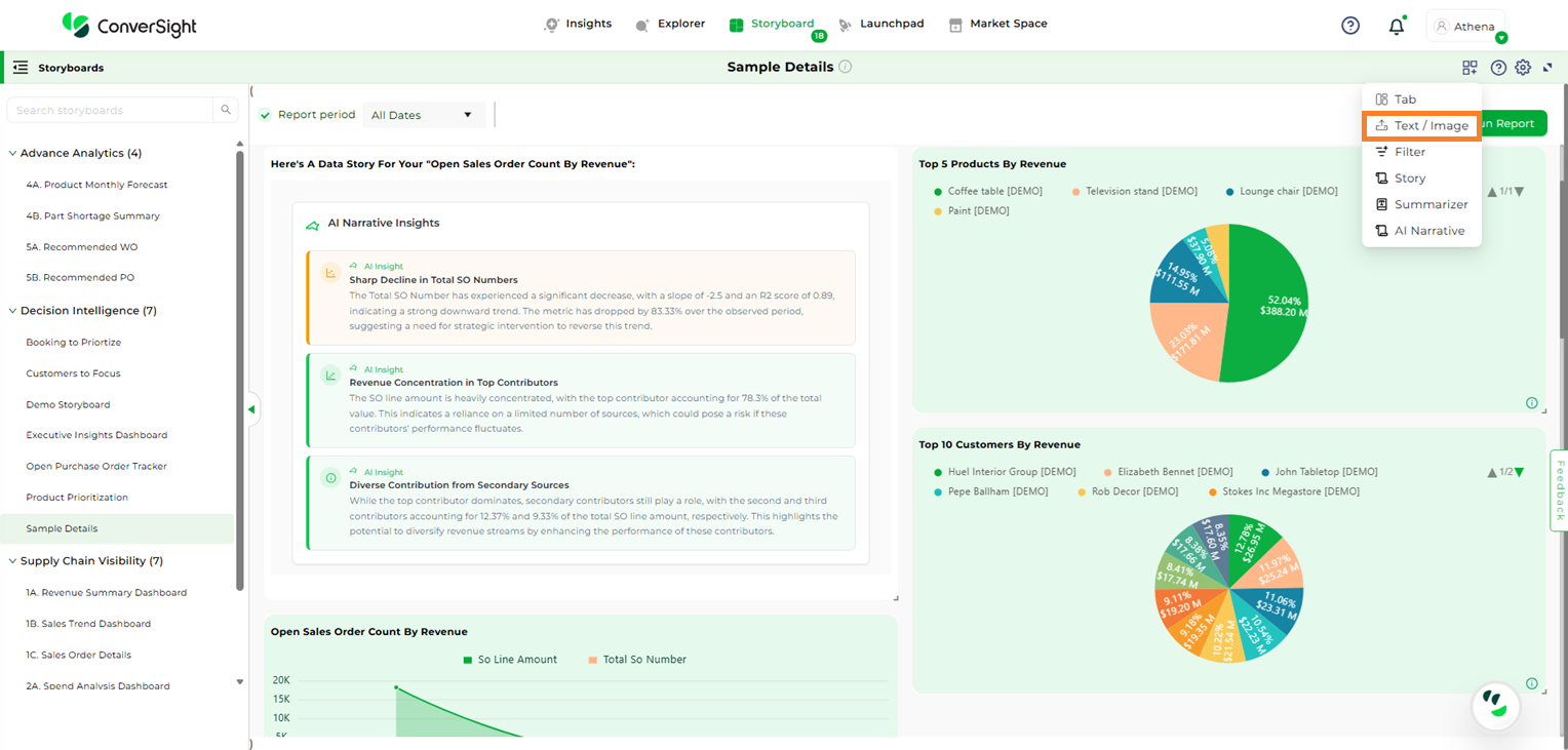
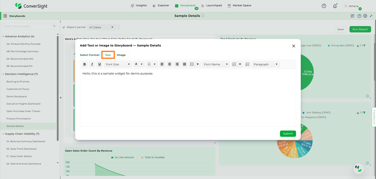
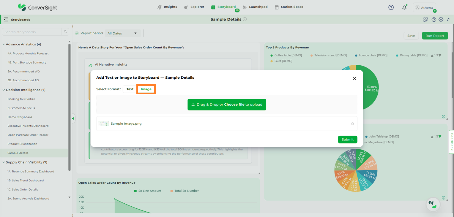
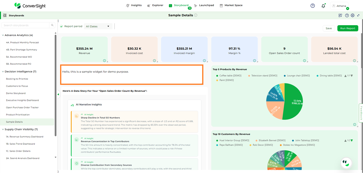
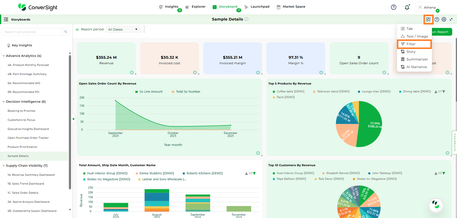
Widgets are the building blocks of a storyboard, allowing you to add meaningful content such as Tabs, Text, Images, Filter, Story, Summarizer, and AI Insights. They help convey the purpose, context, or key information within a storyboard, making it easier for users to grasp its meaning at a glance. Whether you want to illustrate a process, emphasize an important point, or visually support your content, widgets make the storyboard both informative and engaging.
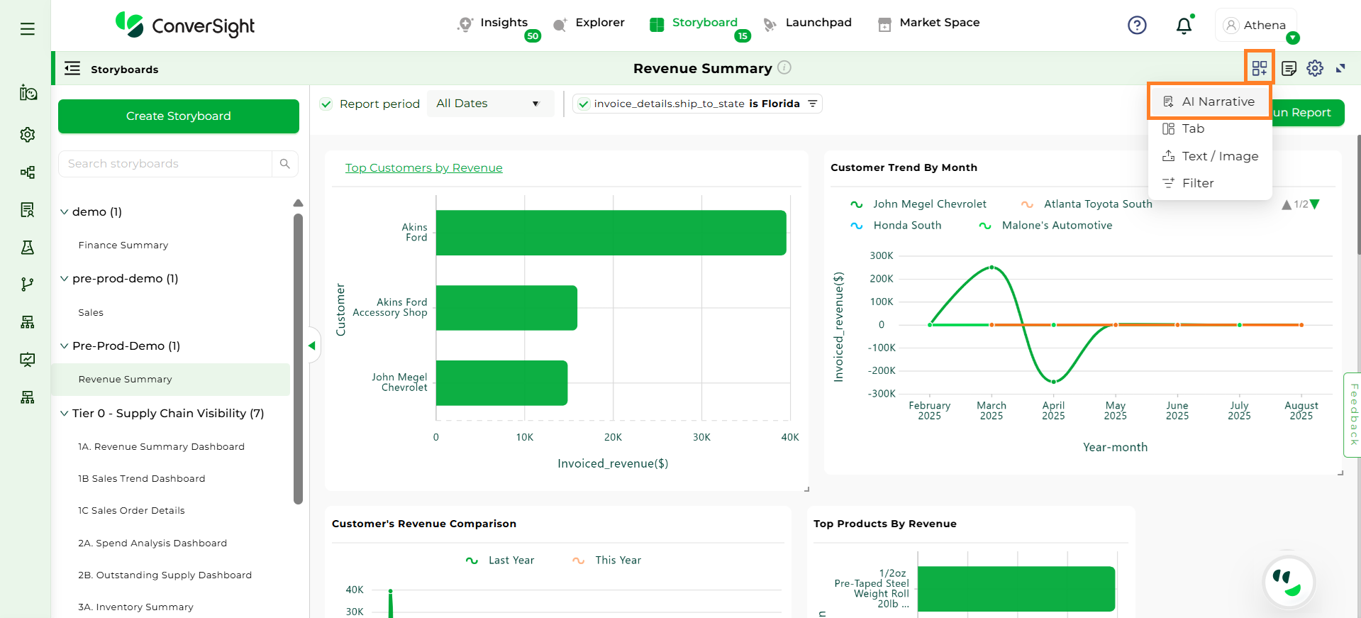
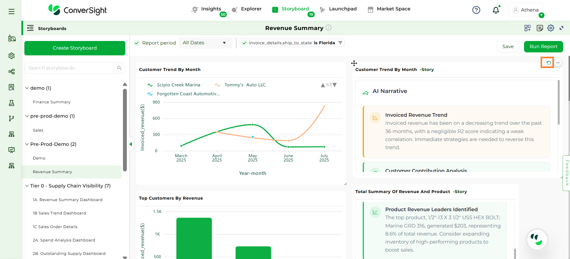
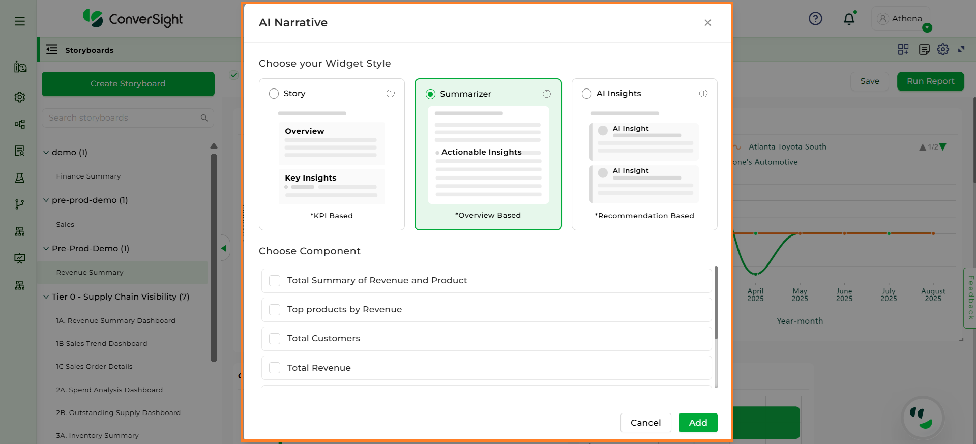
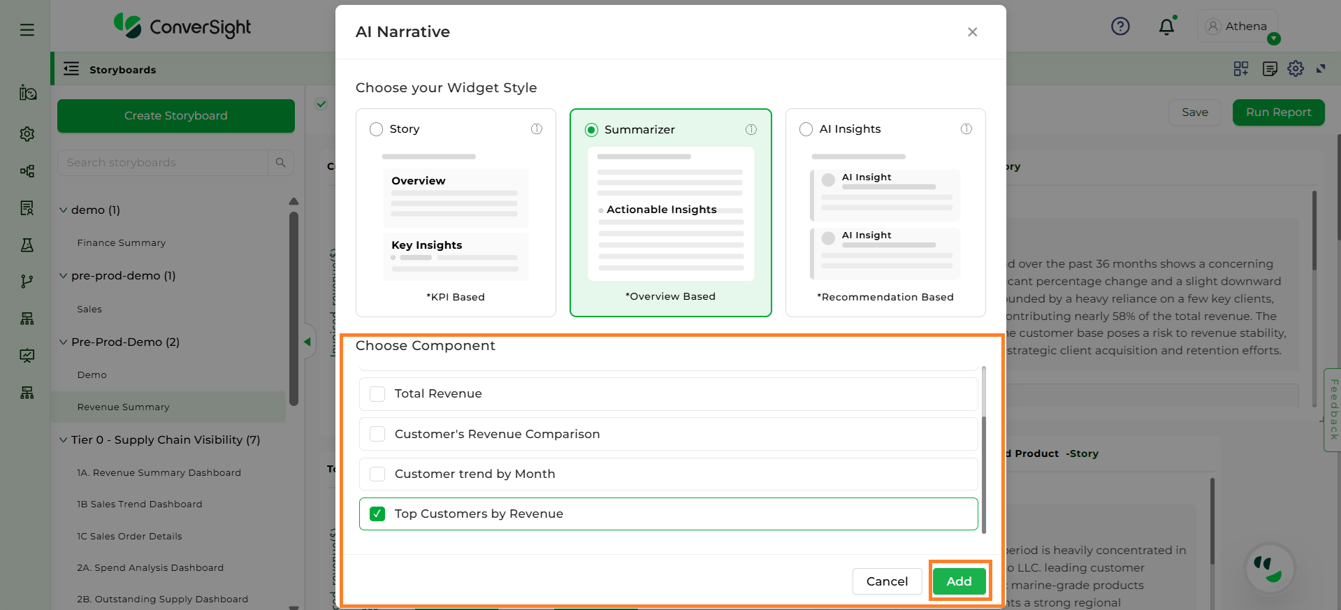
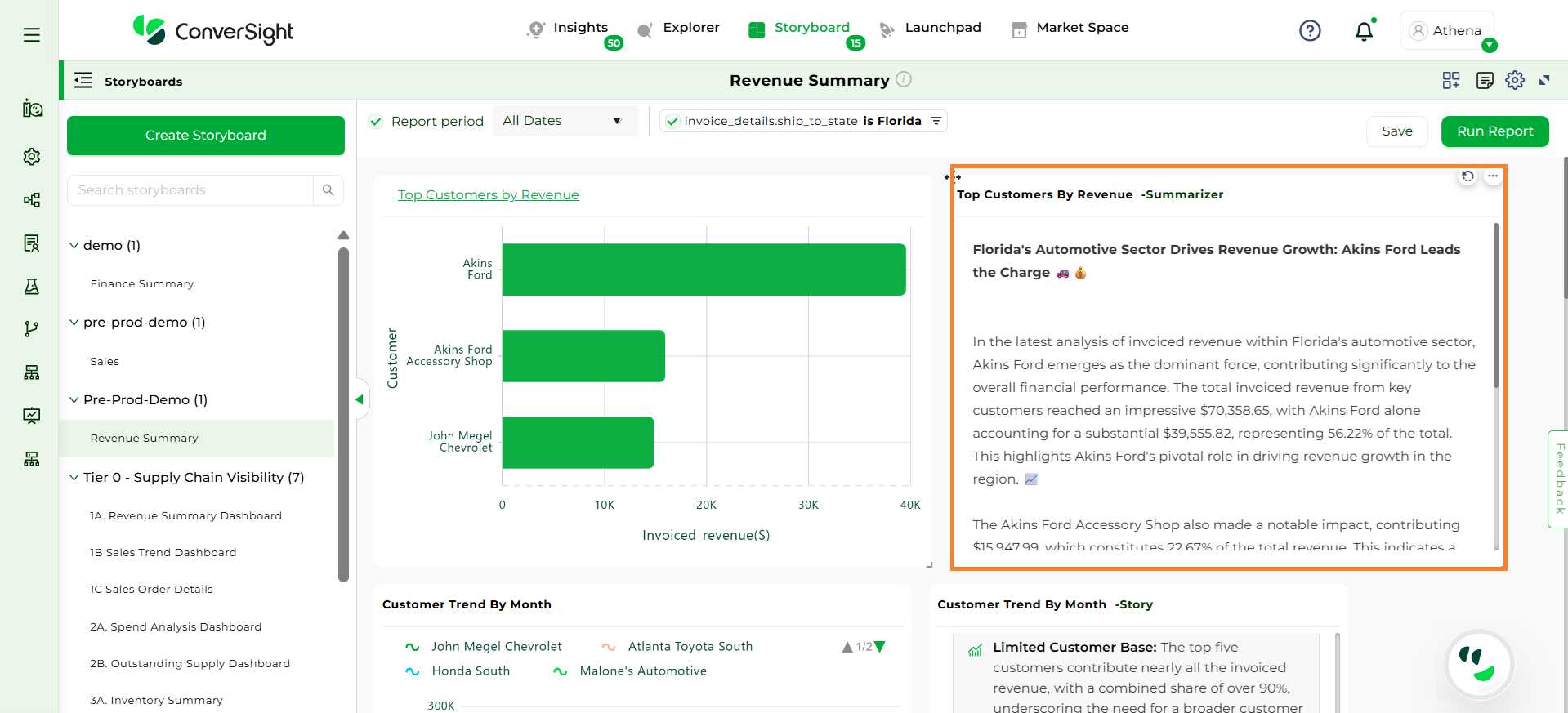
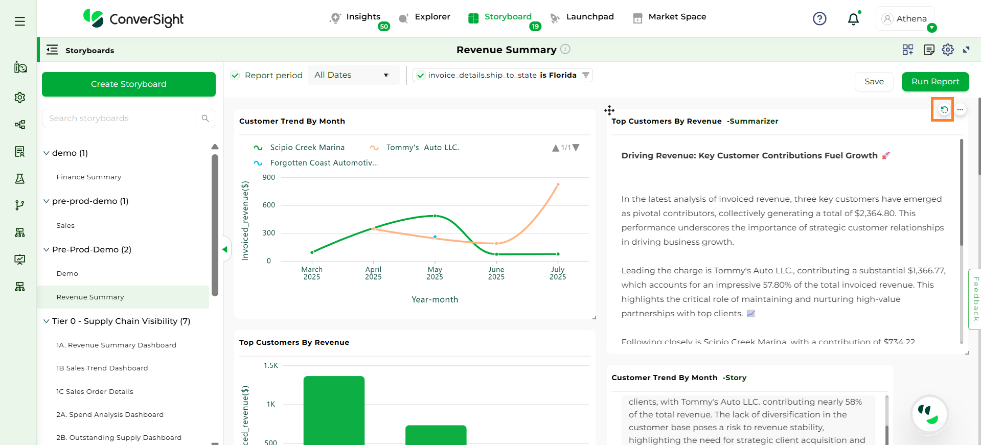
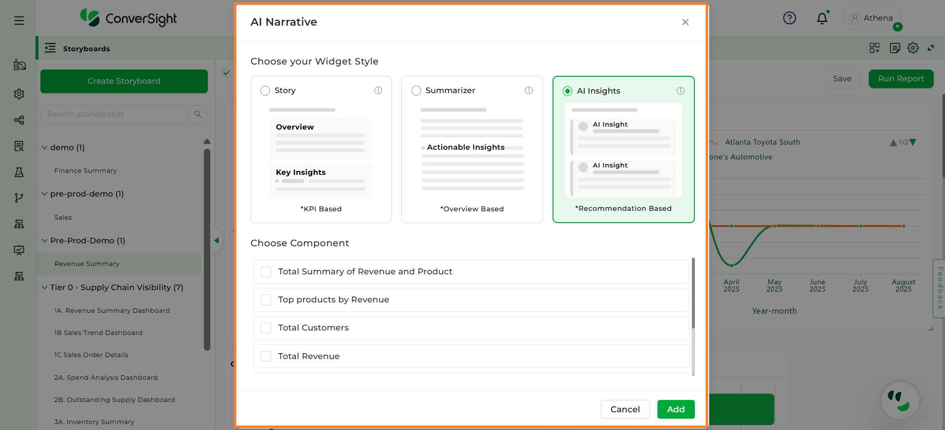
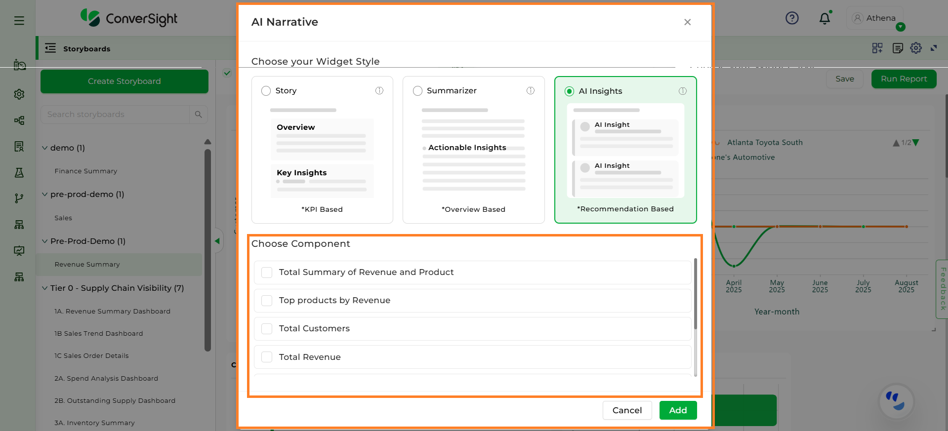
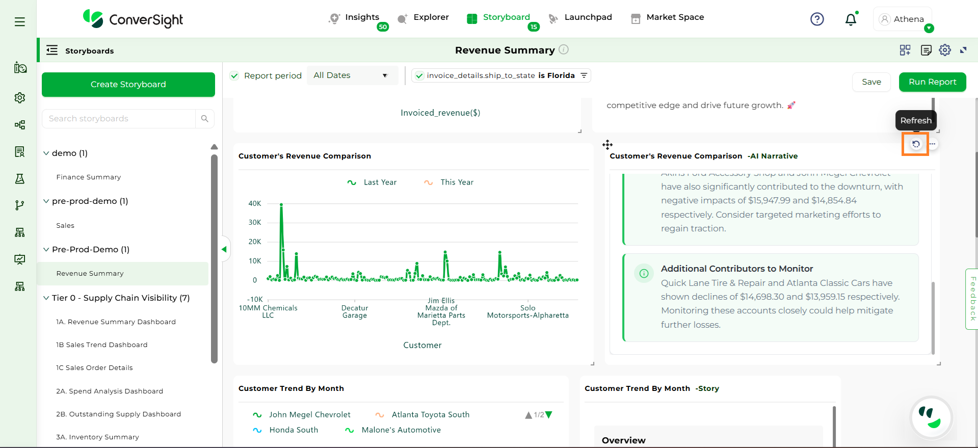
AI Narrative brings data to life by transforming charts, tables, and insights into clear, natural-language explanations. It includes Story, Summarizer, and AI Insights, each designed to help users quickly understand what the data means and why it matters. While Story provides a structured narrative with overviews, key insights and business recommendations, Summarizer delivers a concise textual summary of the analysis and AI Insights offer focused explanations and actionable recommendations directly tied to charts and metrics. Together, these AI narratives help users interpret data faster, communicate insights effectively, and make informed, data-driven decisions with ease.
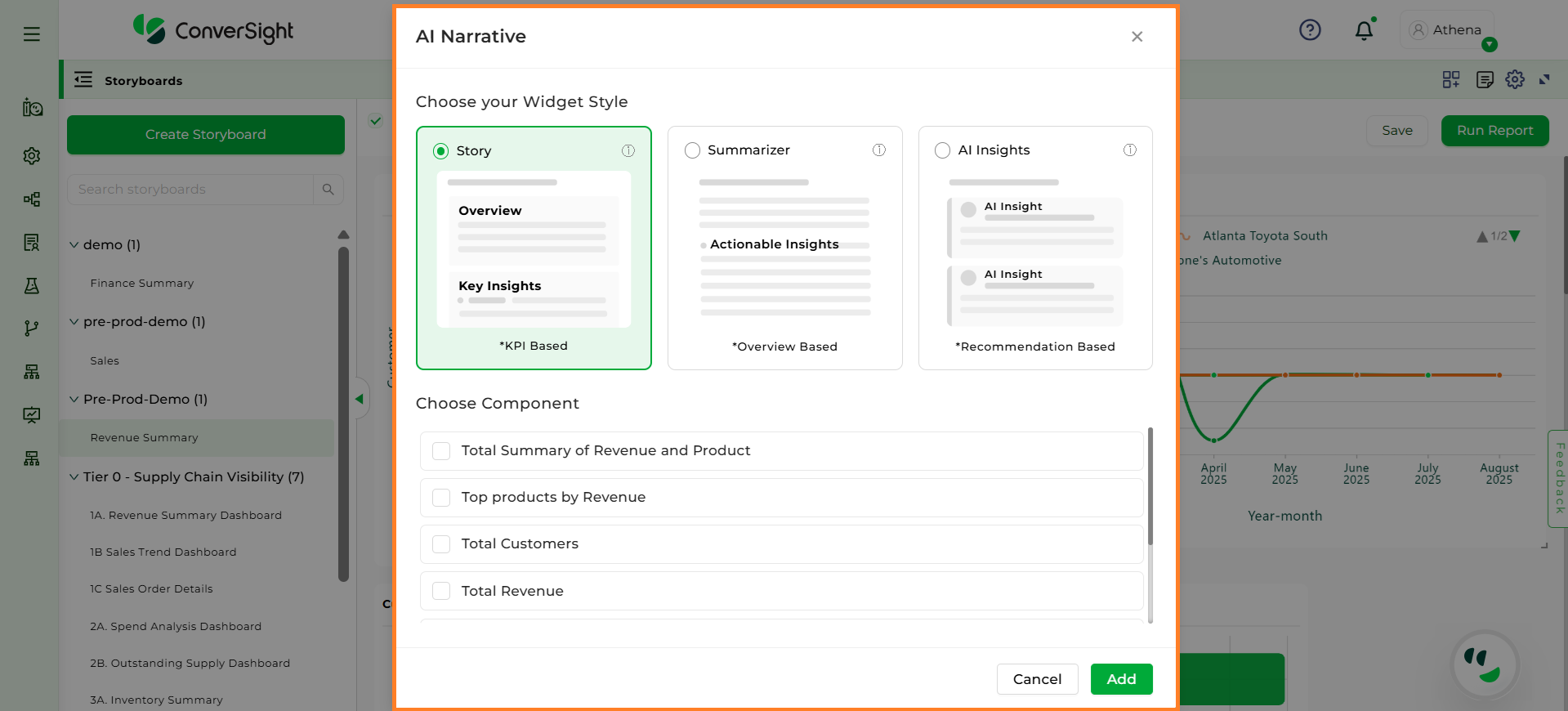
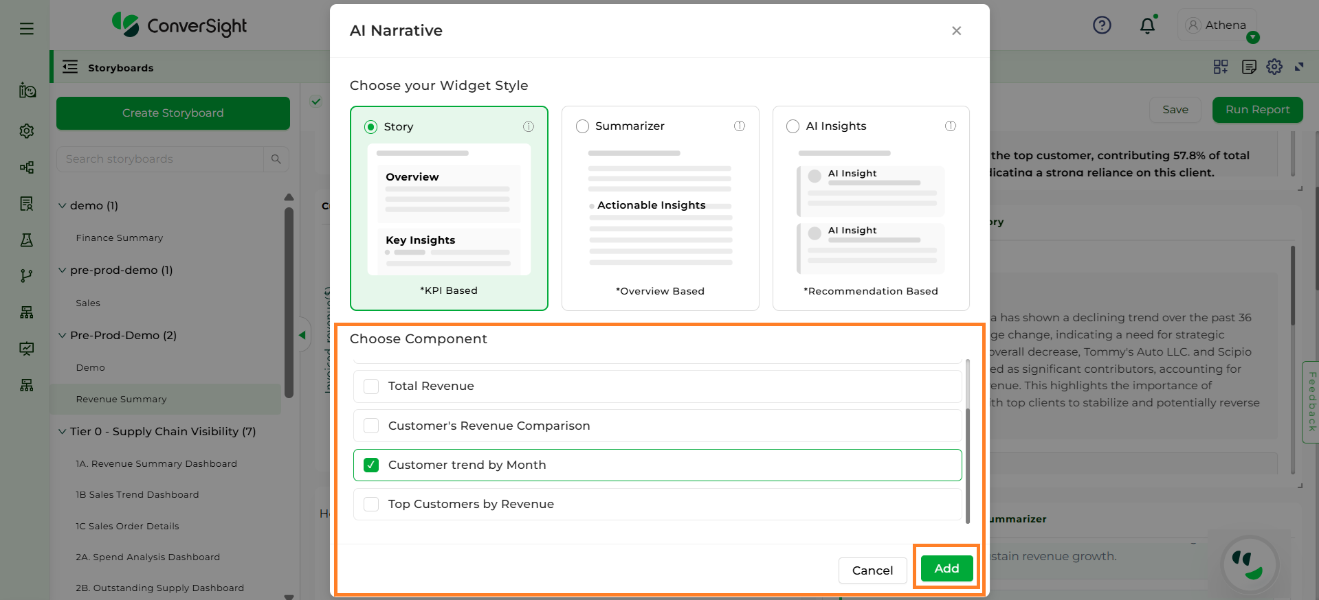
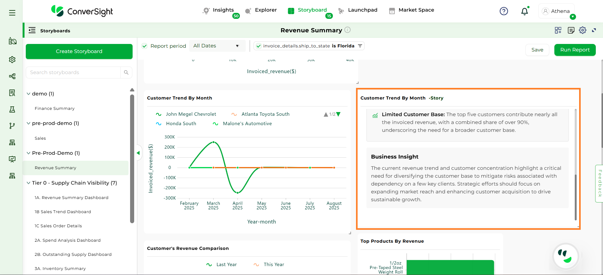
The Story widget presents selected insights in a natural language format. It includes an Overview section that provides a high-level summary of the insight, a Key Insights section that highlights clear trends, patterns, and key KPIs, and a Business Insights section that offers actionable recommendations based on the analyzed data.
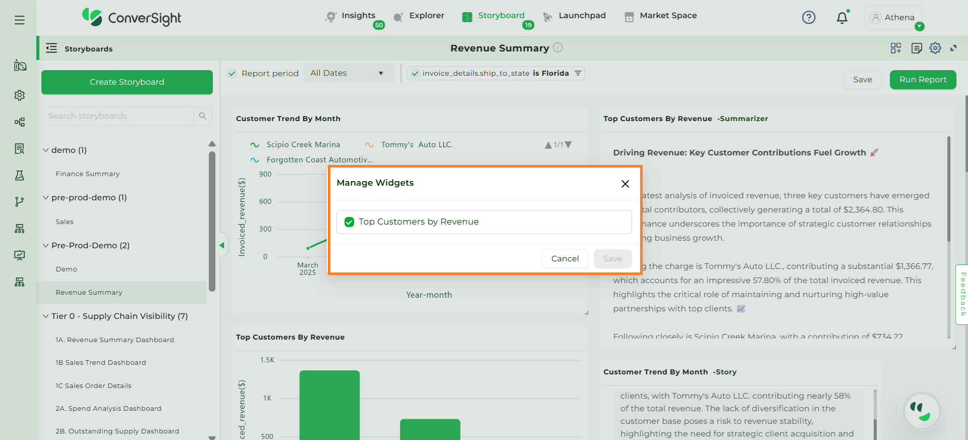
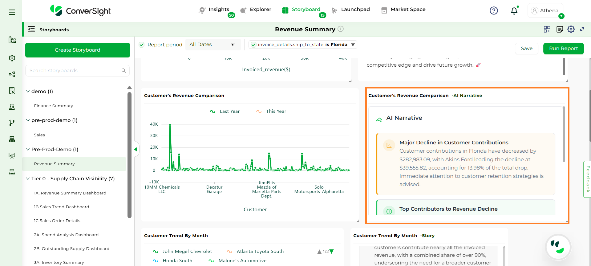
The AI Insights widget provides clear, AI-generated insights that explain charts and graphs in a concise and accurate manner, along with actionable recommendations to support better business decisions.
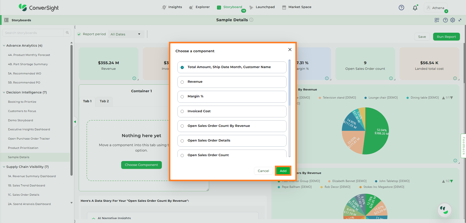
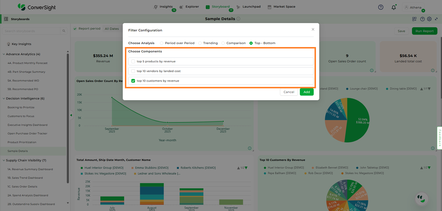
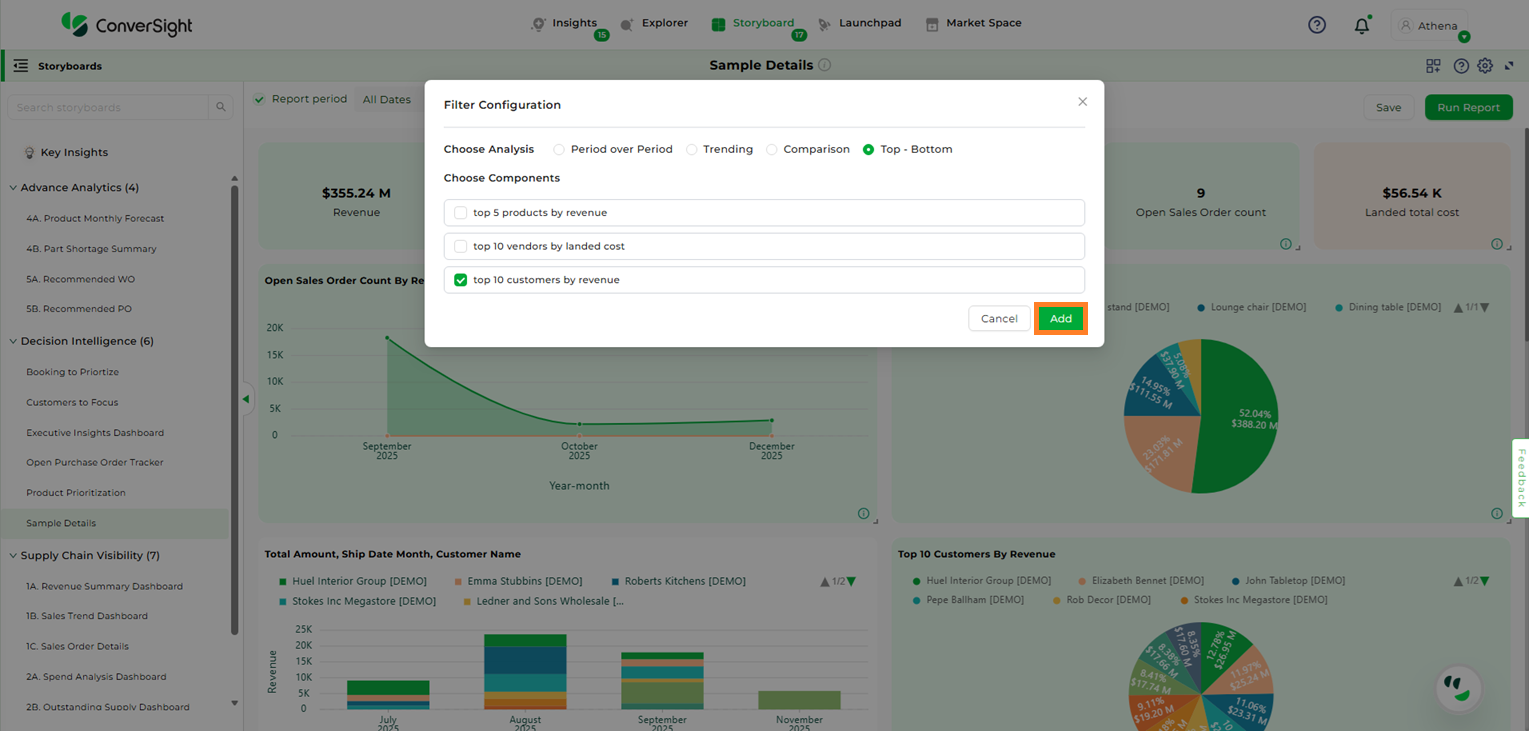
After clicking the “Choose Component” button, all available insights in that storyboard will be listed. Select the desired insight and click “Add” to include it in the tab.
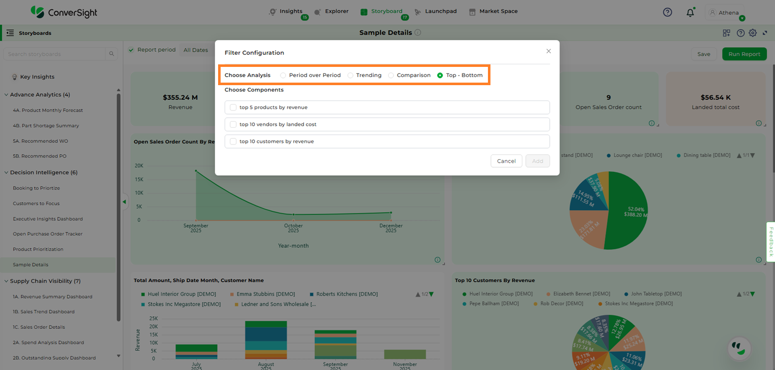
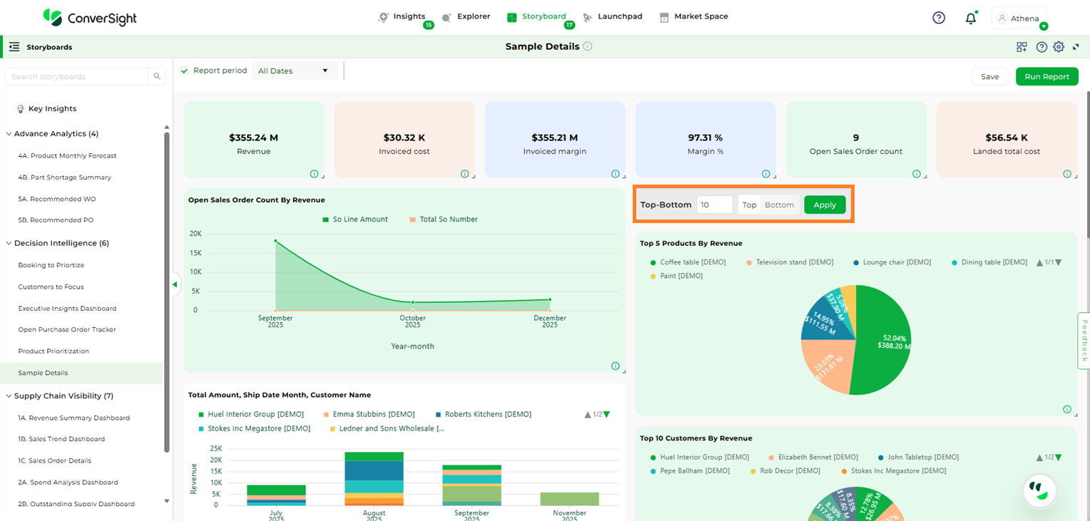
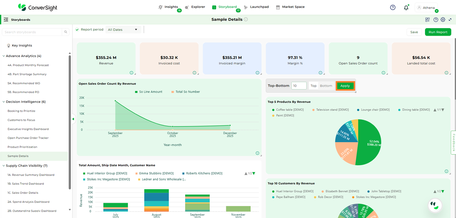
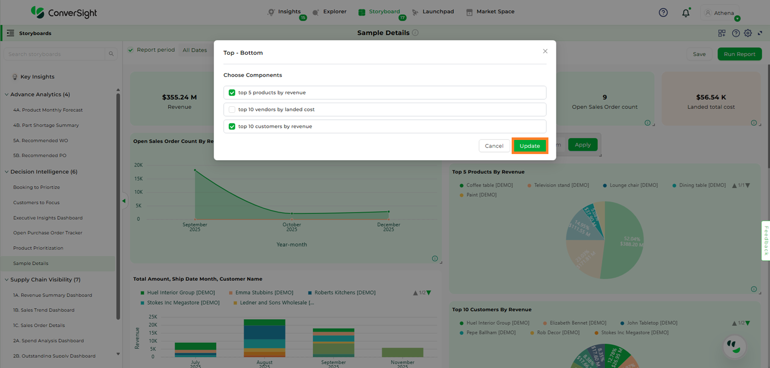
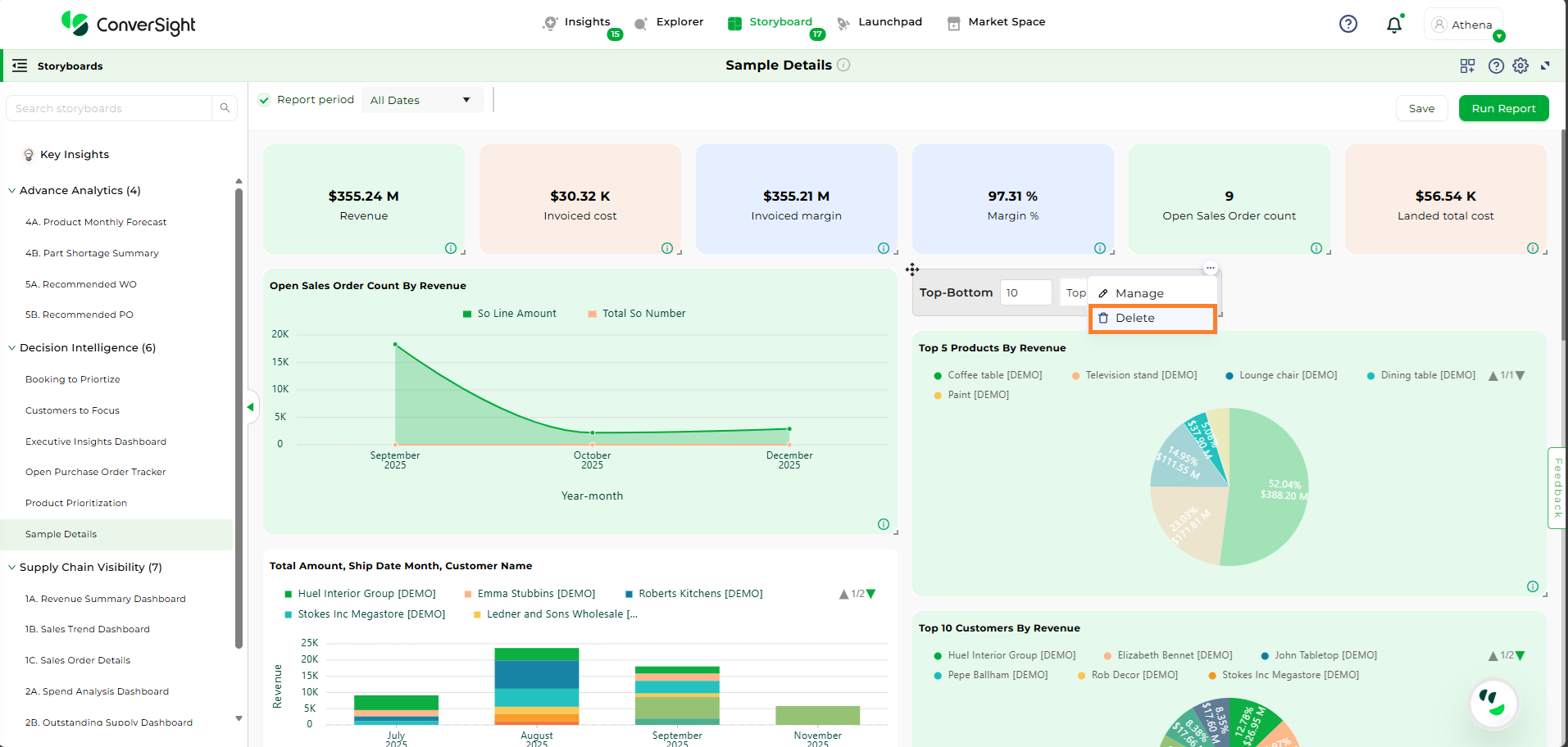
The Filter Widget enables users to apply a chosen analysis across multiple storyboard components, removing the need to create separate insights for the same dataset.
Click the Add Widget icon and choose the Filter option.
On the Filter Configuration page, choose the type of analysis you want to perform. The available options are:
Period over Period: Period Analysis helps you compare metrics across different time intervals to identify trends and changes in performance over time. You can configure comparisons by using period-over-period and by choosing a frequency that fits your analysis needs.
Trending: Trending Queries enable users to visualize trends over time, helping track upward or downward movements in data across selected metrics, dimensions, and dates.
Comparison: Comparison queries allow users to compare multiple columns according to business needs.
Top – Bottom: Top/Bottom Queries help users identify the highest or lowest performing values based on a selected metric and dimension. These filters are useful for questions like Top 10 Products by Sales or Bottom 5 Regions by Revenue.