Explorer#
The Explorer tab within ConverSight offers an advanced approach to dynamic report creation by categorizing data based on specific subject areas within the dataset. It is designed to simplify data exploration and analysis for users of all expertise levels. This feature provides a structured method for gaining data insights, allowing users to choose specific datasets and columns, and apply customized filters as needed. By offering direct access to their own data, the Explorer tab enhances users’ ability to understand and analyze their information more deeply.
The Explorer page supports General, Trending, Top/Bottom and Period Analysis Queries, allowing users to identify data patterns and performance insights over time. These capabilities help uncover top or bottom performers across different metrics and dimensions, enhancing data-driven decision-making.
Accessing Explorer#
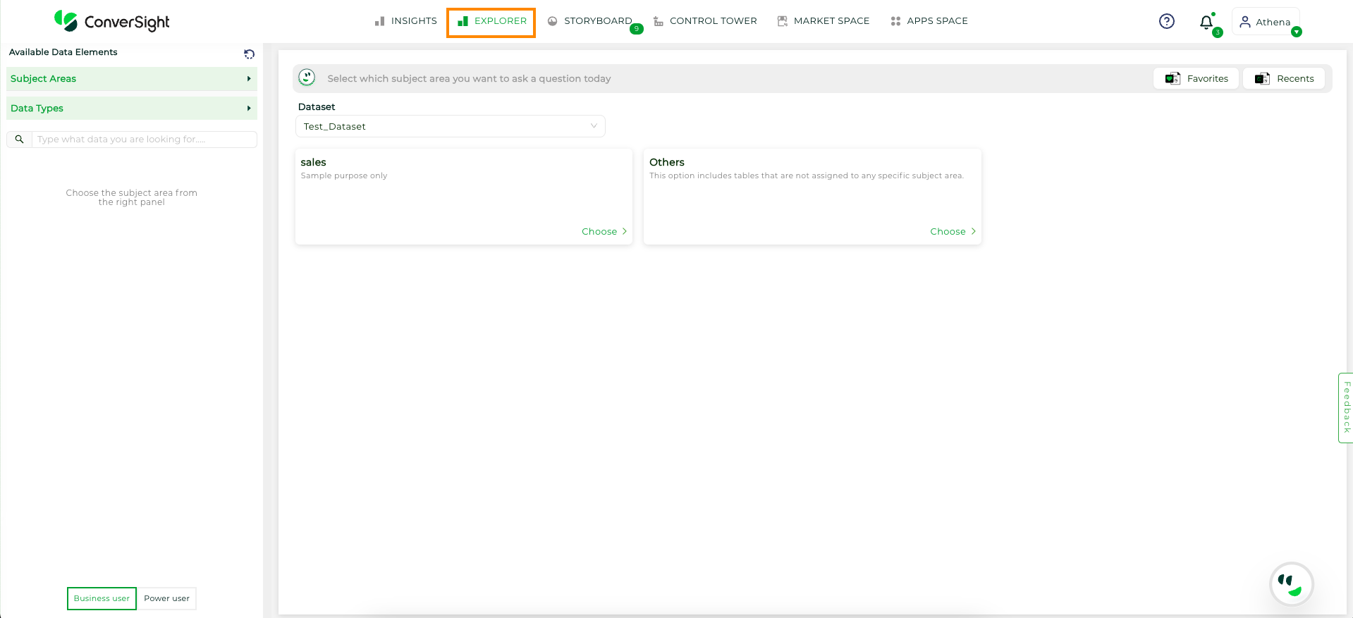
Click on the Explorer in the navigation tab at the top of the platform to access the Explorer feature page.
Explorer Tab#
In the Explorer tab, the Business User toggle is designed for users who need simplified access to data relevant to their role, such as sales or procurement and focuses on subject areas that make it easier for them to navigate without needing extensive knowledge of the data structure. On the other hand, Power Users, like data scientists or analysts, need to work with larger datasets across all tables and perform more complex analysis. The toggle allows Power Users to access all data in one view for full exploratory analysis, but they must be familiar with the underlying data architecture to perform cross-table reporting.
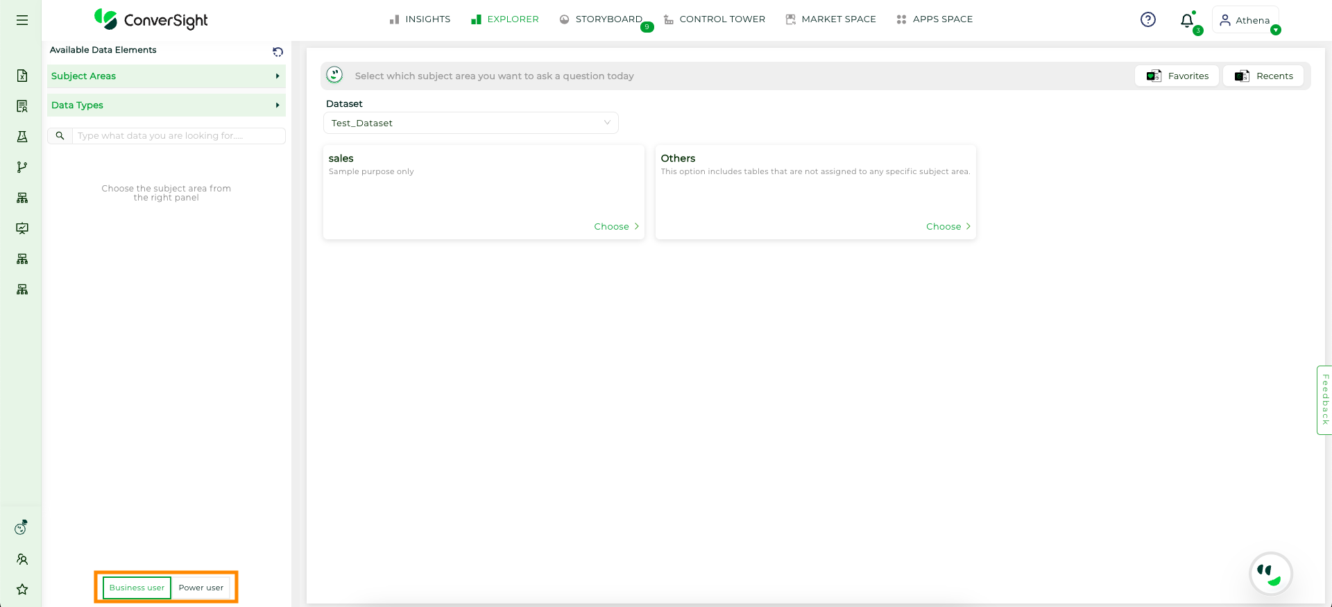
Business and Power Users#
In Power User mode, only columns from tables with an established relationship to the selected object are available for selection. Columns from unrelated tables are disabled.
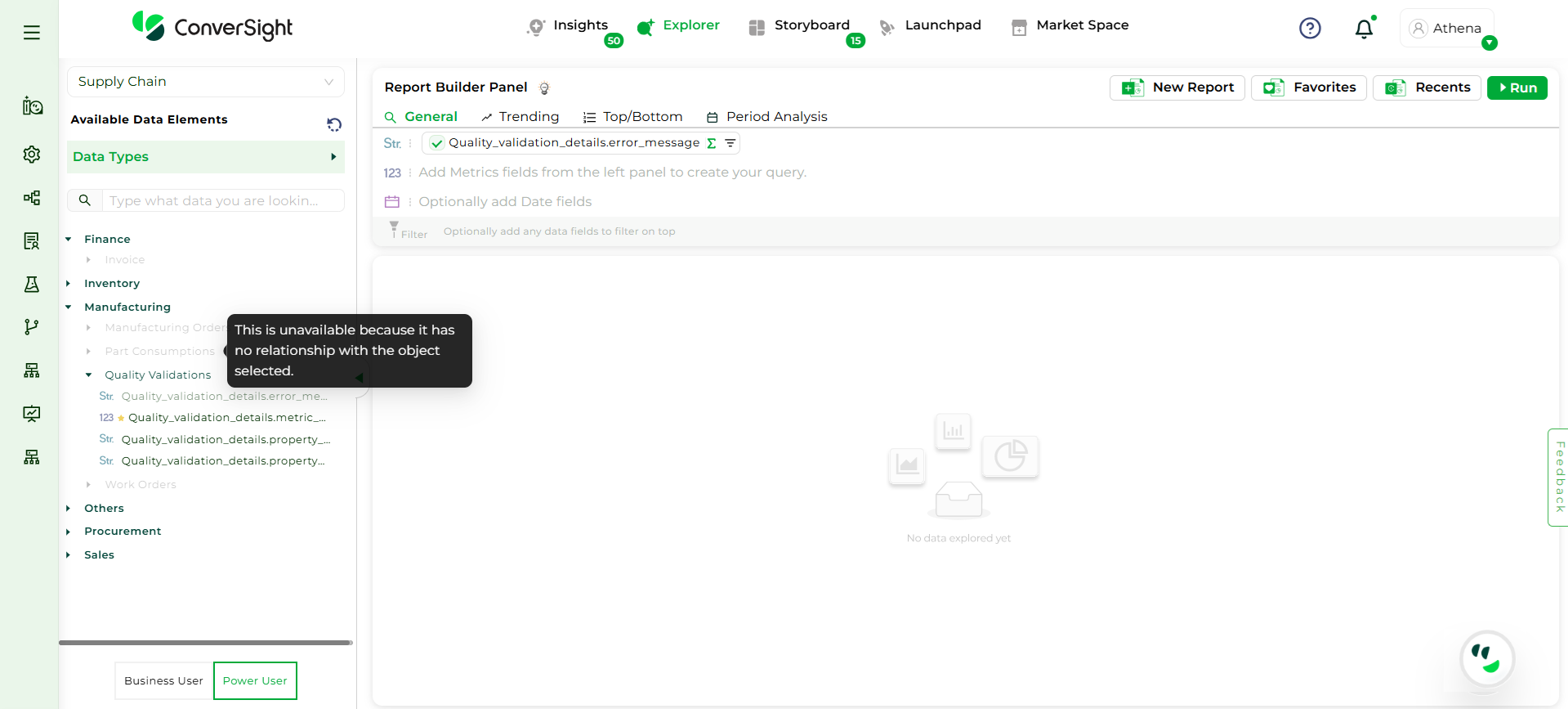
Power User#
Creating Reports#
Sequential steps to create reports in ConverSight are as follows.
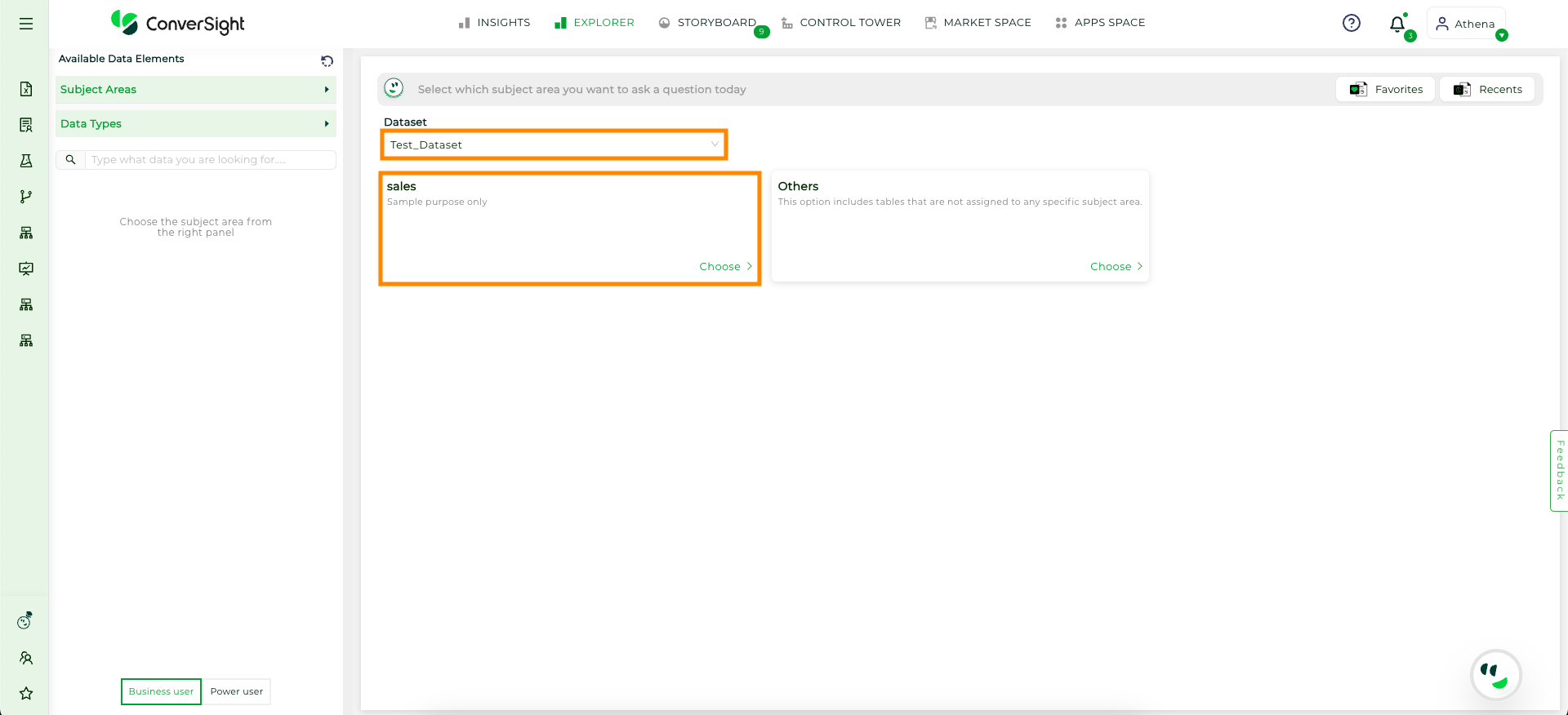
Step 1: Choose the dataset from the drop-down. After selecting the dataset, choose the subject area for which you intend to create the report.
Explorer Tab#
Step 2: After selecting the subject area, the tables relevant to that area will appear on the left. You will also be able to view the data types present in the dataset.
Subject Area#
You can also change to a different subject area using the Subject areas dropdown menu on the left side.
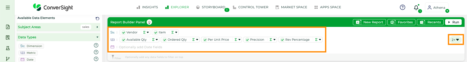
Step 3: You can simply click on the Columns you want to include in the report. The selected columns will be added in the query area and organized into specific categories such as metric, dimension, date, flag, smart query, smart columns and calculated Fields where columns within the same category will be grouped. Calculated metrics will be grouped under metrics, while smart query, smart columns, flag, and smart analytics will be grouped under dimension.
You can view the available field types on the left side, which lists all the field categories. Additionally, the help tooltip explains each field type.
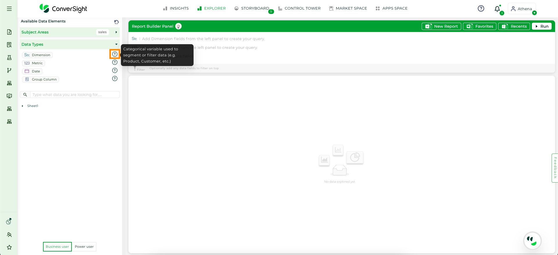
Categories info#
NOTE
Calculated metrics will be grouped under metrics, while smart query, smart columns, flag and smart analytics will be grouped under dimension.
The query field can be expanded by clicking on the  icon, or you can simply drag it down to increase its size. Additionally, when columns are added to the query field, they will appear at the top, allowing users to quickly review their actions.
Report#
Expand Panel#
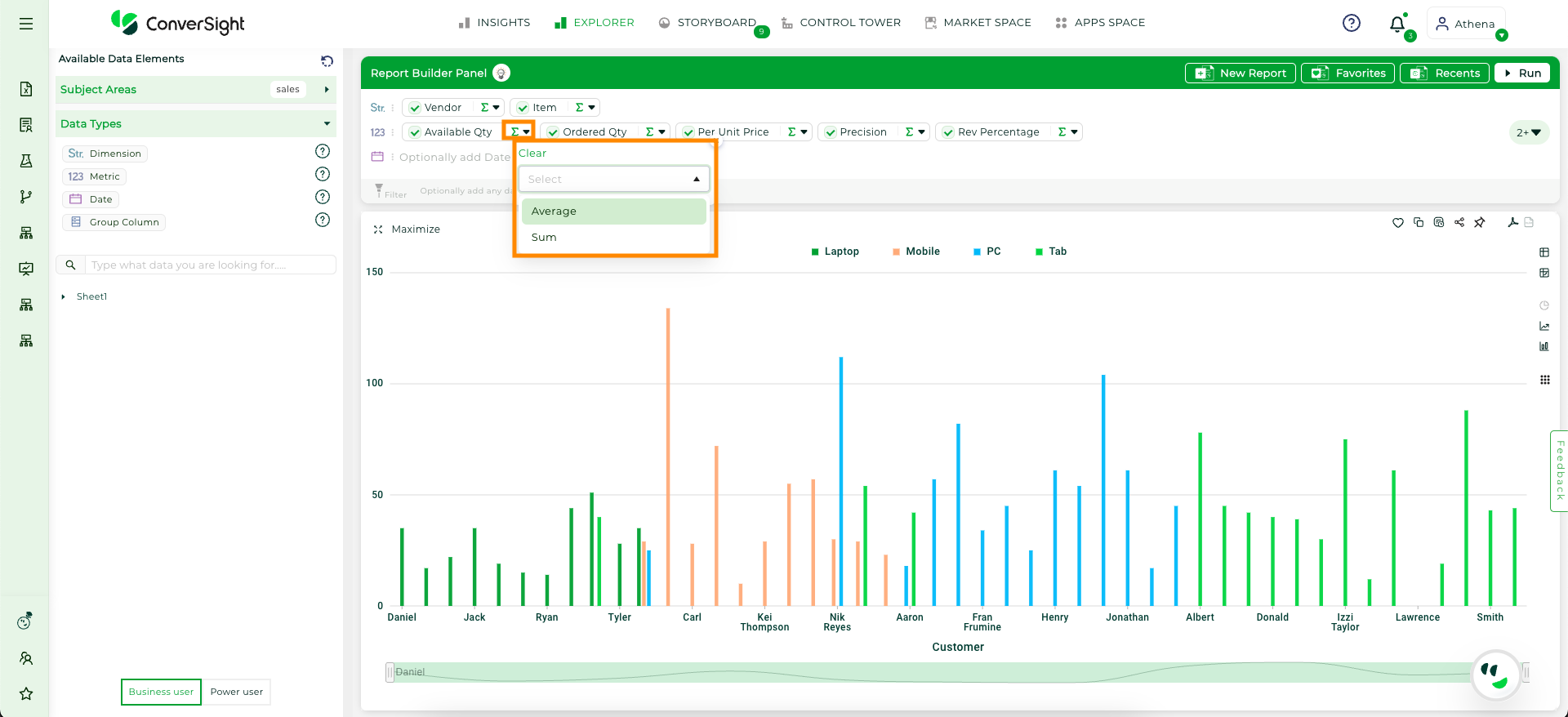
Step 4: To add aggregations to columns, click on the  icon. You can perform operations such as sum and average on metric columns. For date columns, you can aggregate data by day of the week (DOW), day, week, month, quarter and year. For dimensions and smart columns, you can use count aggregation.
Action Columns#
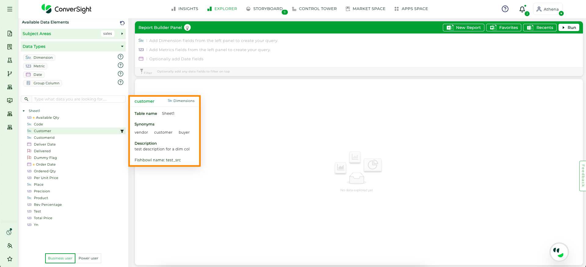
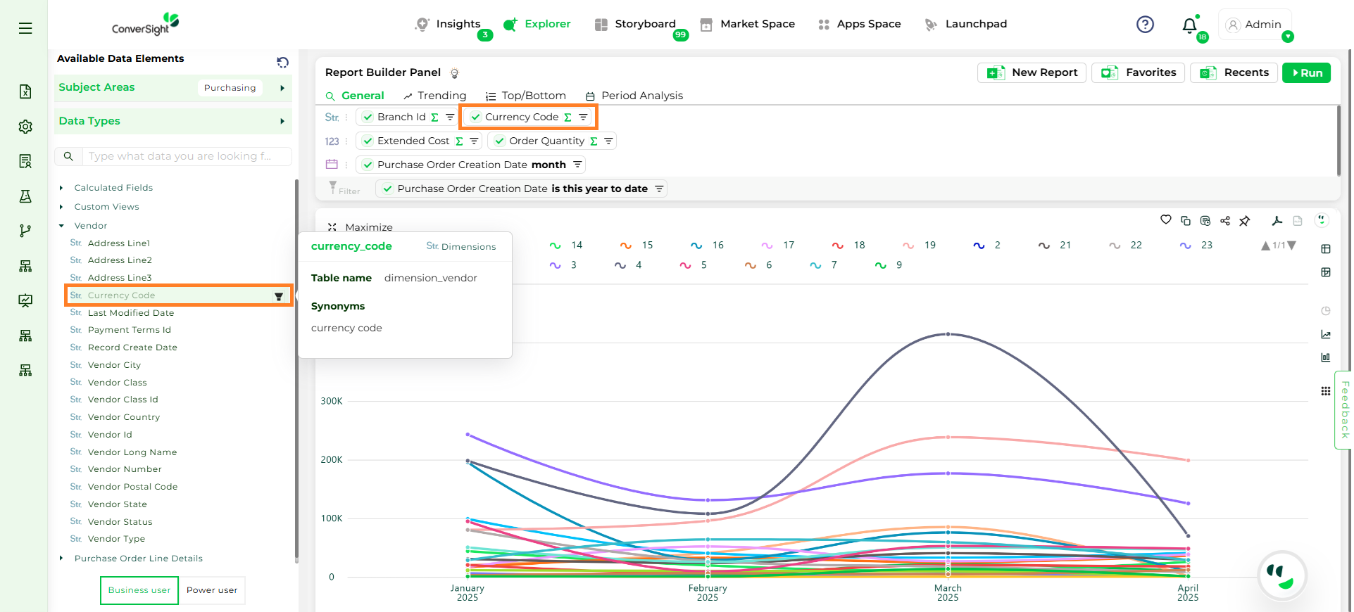
You can view details about each column, such as the table it belongs to, its category and any synonyms, by simply hovering over the column name in the list on the left.
Filter Columns#
Step 5: You can add filters to the reports by clicking on the Filter icon next to the columns. The selected filters will be added to the filter section under their respective categories, similar to how columns are organized.
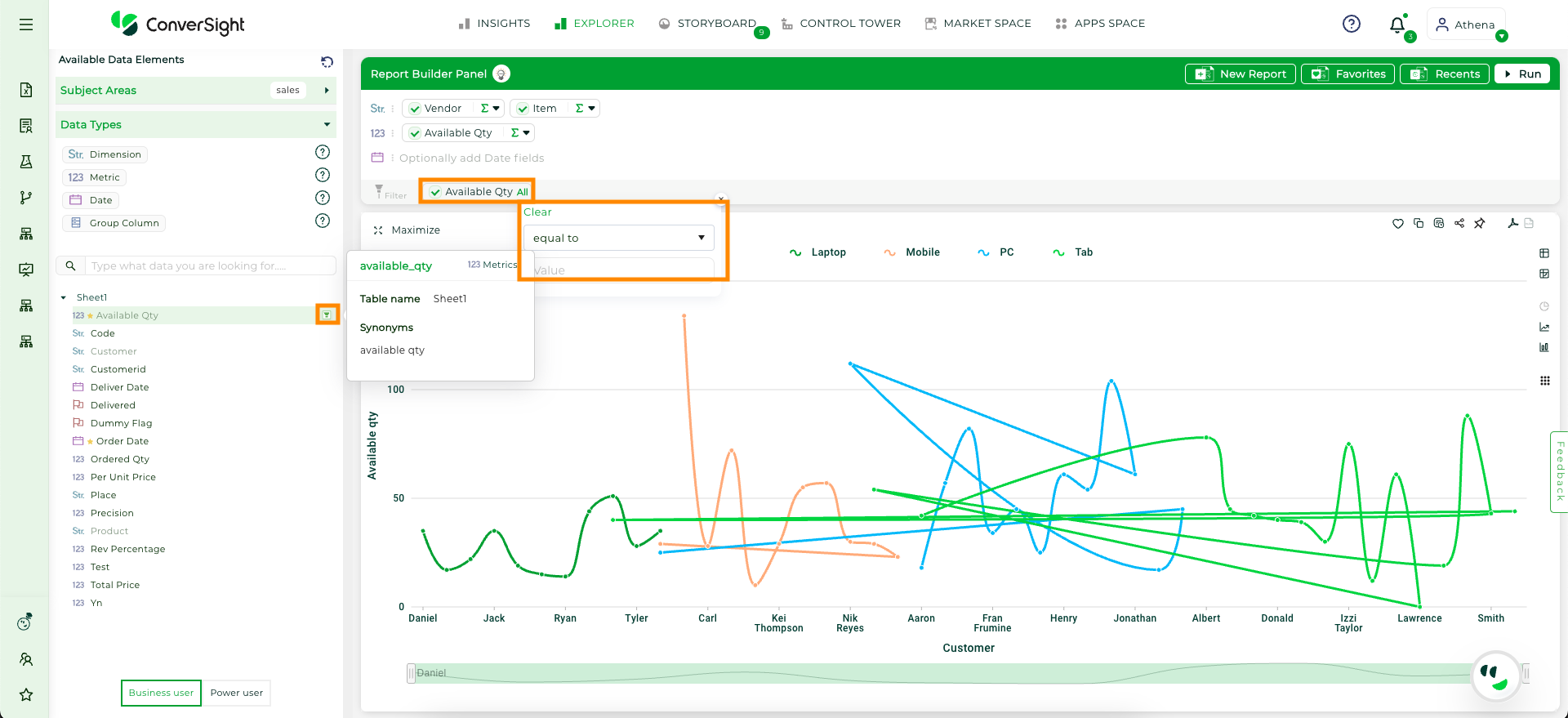
Action_Filter#
By default, filter values for the columns are set to All. You can then click on the icon to select one of the available options or create a custom condition, depending on the category type. Below are the filter values for each column category.
Category |
Conditions |
Value |
|---|---|---|
Date Column |
Custom, Yesterday, Today, this week, last week, next week, this week-to-date, this month, last month, next month, this month-to-date, last quarter, this quarter, next quarter, this quarter to date, this calendar year, this financial year, last calendar year, last financial year, this year to date, this year, last year, next year, last 30 days, last 60 days, last 90 days, last 180 days, last 360 days, next 30 days, next 60 days, next 90 days, next 180 days, next 360 days, last 3 months, last 6 months, and last 9 months |
A value is required for the condition. |
Dimension Column |
Is, like, != and not like |
A value is required for the condition. |
Metric Column and Calculated Fields |
Equal to, greater than, greater than or equal to, lesser than, lesser than or equal to, not equal to, and between. |
A value is required for the condition, and the ‘between’ condition requires two values to be inputted. |
Flag |
equal to and not equal to |
1 or 0 |
NOTE
Filters and columns can be removed by hovering over them, which will display an “x”. Clicking on the “x” will remove them.
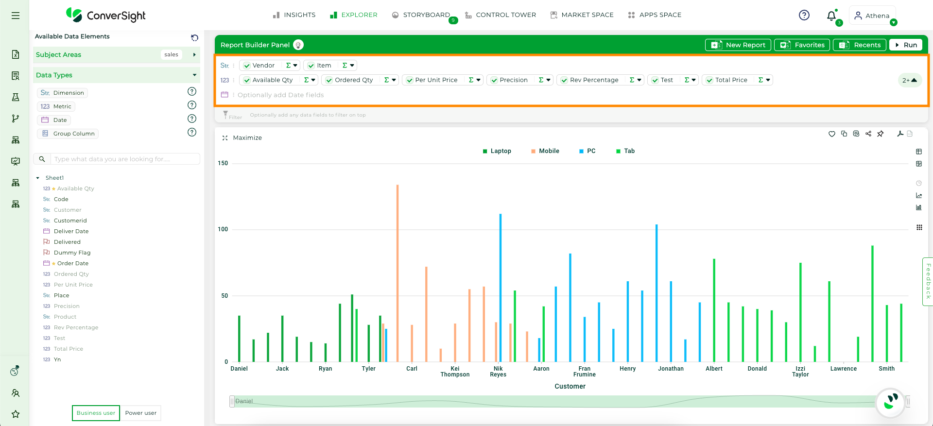
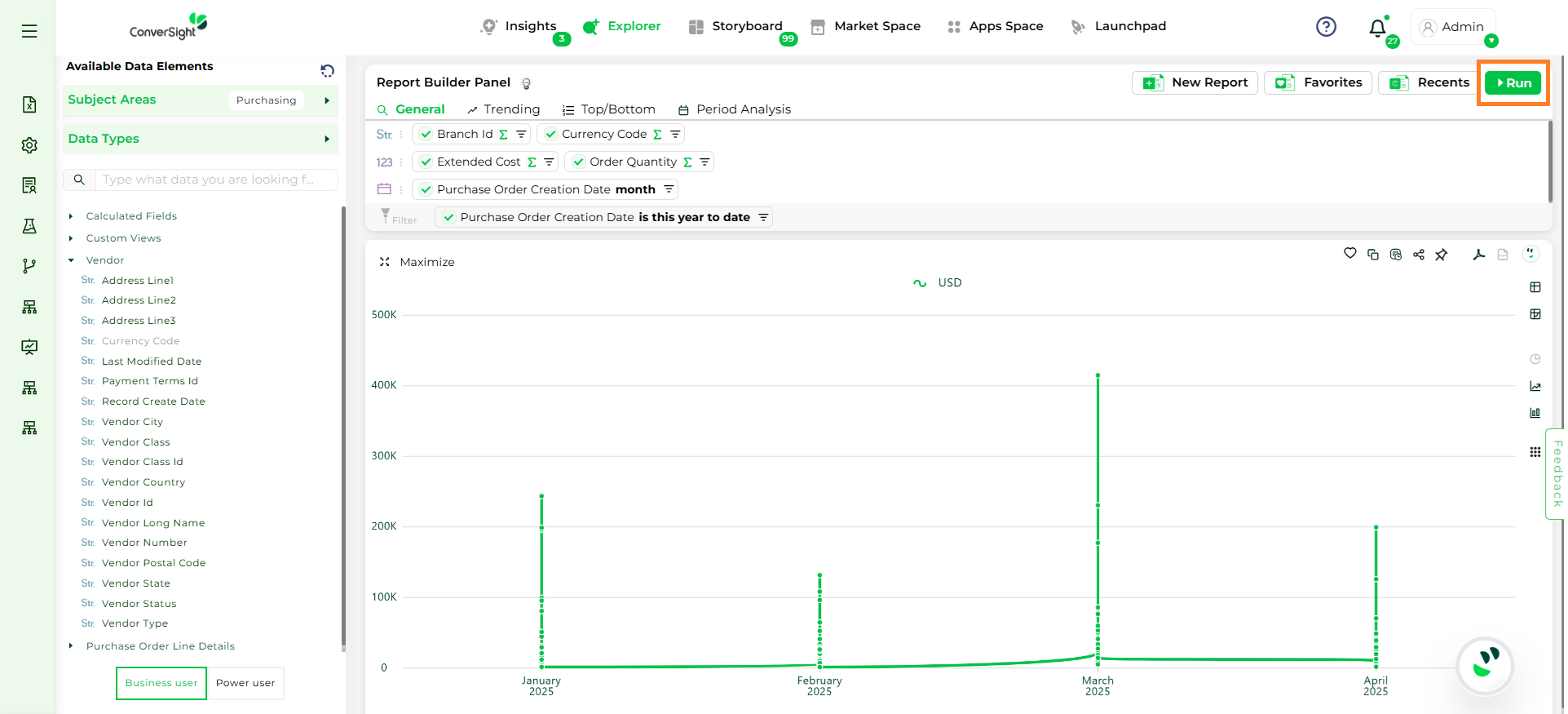
Step 6: Once the columns are selected and filters are applied, click on the Run button to generate the report
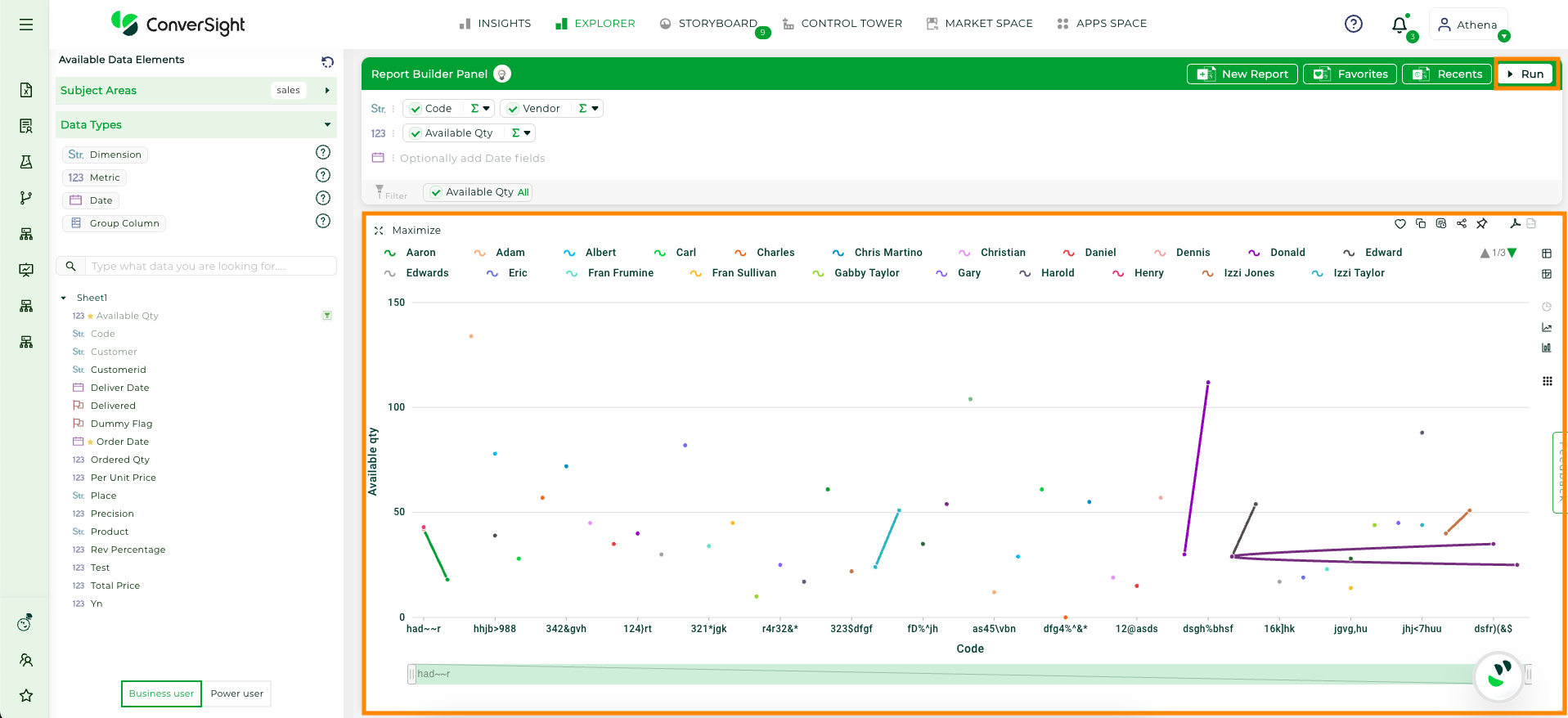
Run Report#
Users can cancel an ongoing query using the Stop button. This lets you halt response generation instantly instead of waiting for it to complete.
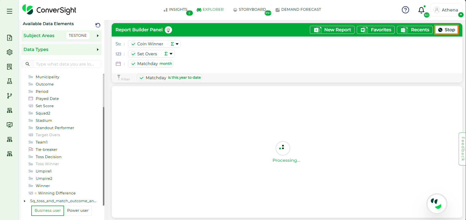
Stop Report#
Copy to Clipboard#
The Copy to Clipboard allows users to easily copy and transfer data with a simple click. When you click on the icon, a confirmation message will appear, asking if you want to proceed with copying the data. By clicking Ok, the data is copied, allowing you to paste it into other documents, emails or applications.
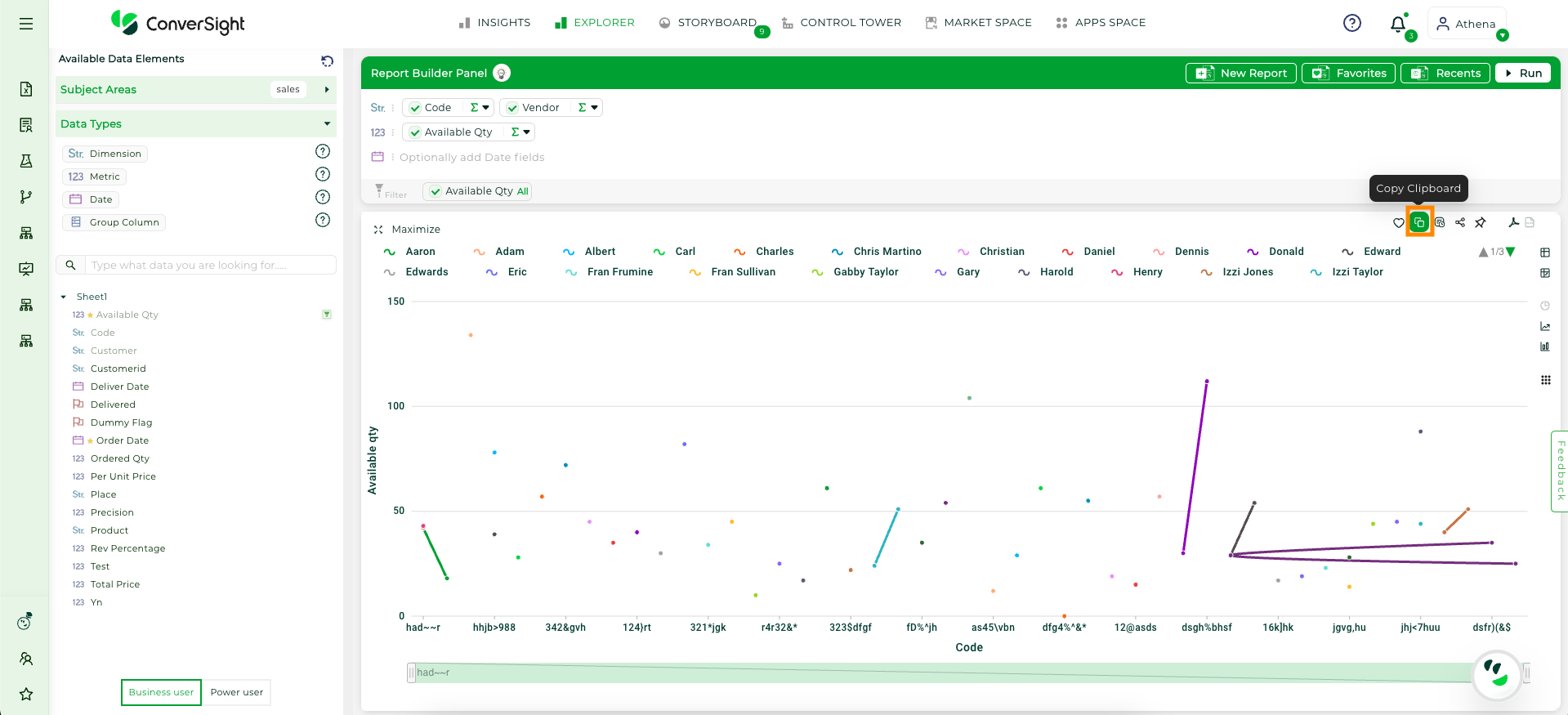
Copy to Clipboard#
Explanation#
The Explanation tab offers a detailed breakdown of your visualization, providing insight into its underlying structure and meaning. It is divided into three main areas:
Section |
Description |
|---|---|
Semantics |
Focuses on the meaning and context of the data, helping users interpret the relationships and significance of various data points. |
SQL Query |
Displays the SQL logic and criteria used to generate the visualization, providing transparency of operations performed on the data. |
SQL Form |
Presents the structured format of the SQL query, offering a clear view of the query’s organization for easier understanding, modification, or reuse. |
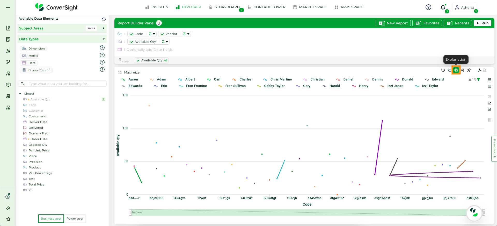
Explanation#
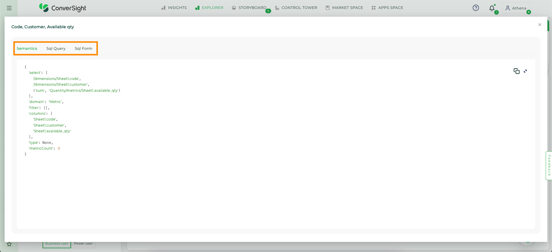
SQL#
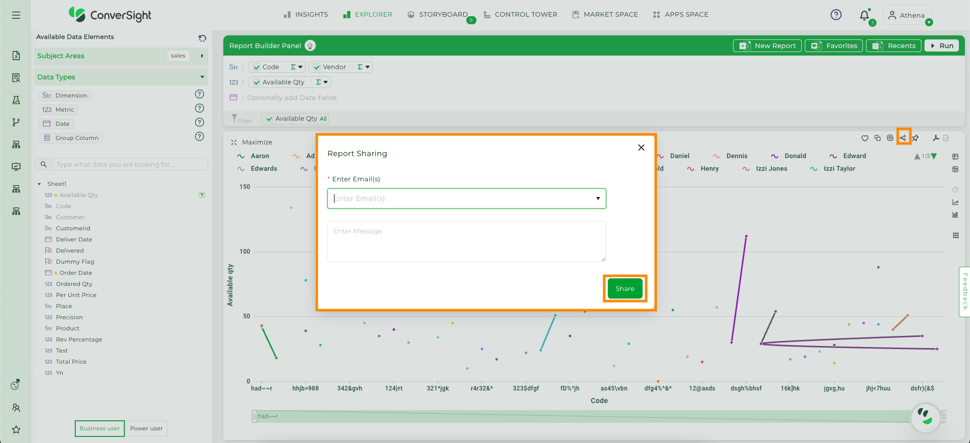
Report Sharing#
Use the Share icon to send reports via email to multiple recipients by separating their email addresses with commas. You can also add a custom message in the dialog box before clicking the Share button to complete the process.
Report Sharing#
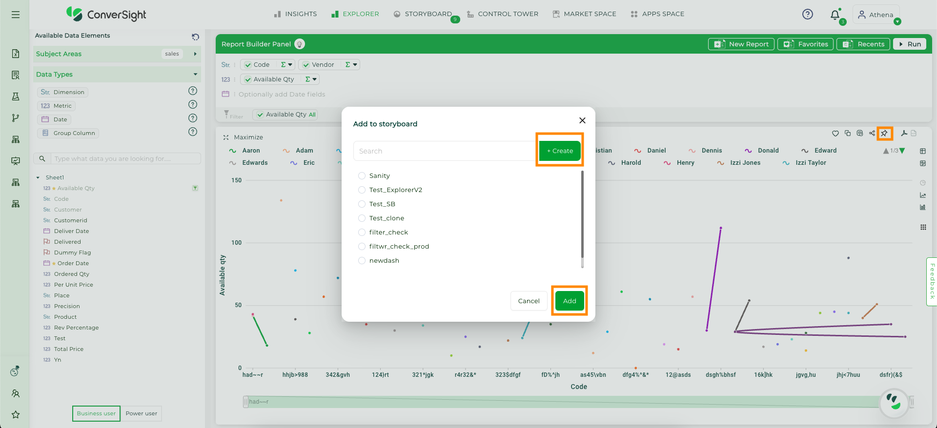
Add to Storyboard#
The Add to Storyboard feature lets users attach reports to a storyboard. You can create a new storyboard by clicking Create and Add button or add to an existing one by clicking Add, making it easy to organize and access relevant reports in one place for streamlined data viewing.
Add to Storyboard#
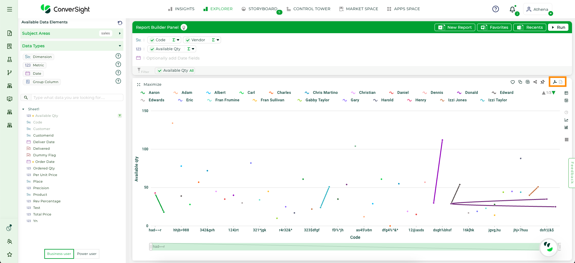
Export to PDF and Excel#
The Export feature allows you to convert reports into either PDF or Excel formats with a simple click. Exporting to PDF preserves the report’s formatting, while exporting to Excel enables advanced data analysis and manipulation.
Export to PDF and Excel#
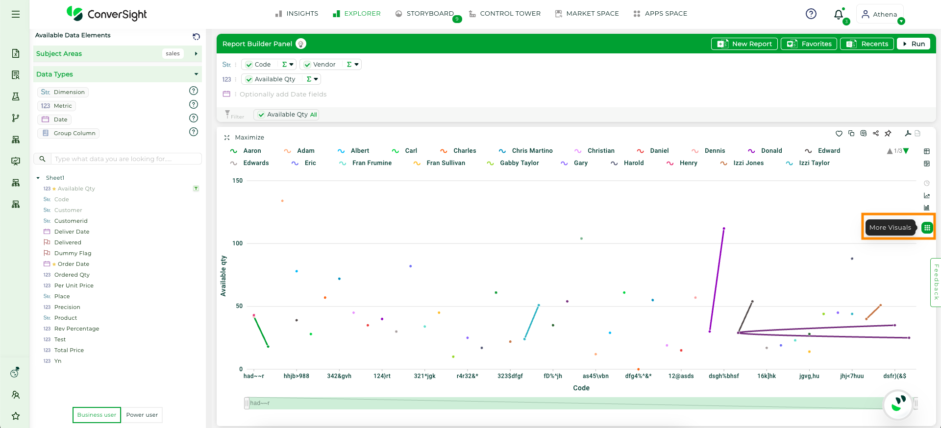
More Visuals#
The More Visuals feature in ConverSight offers a range of options to enhance data analysis through various visual formats, including CS Tables and Pivot Tables. It allows for customization of tables, conditional formatting, and field manipulation, providing flexible ways to display and analyze data. General settings enable users to tailor row and column displays, apply conditional styles, and adjust formatting for both CS and Pivot Tables, making data exploration more dynamic and efficient.
More Visuals#
Quick Search#
The search bar allows you to quickly find the data you need, especially when dealing with more number of columns. By entering keywords or terms of descriptions, you can swiftly retrieve specific columns, making it a more efficient and convenient method for locating data within extensive datasets.
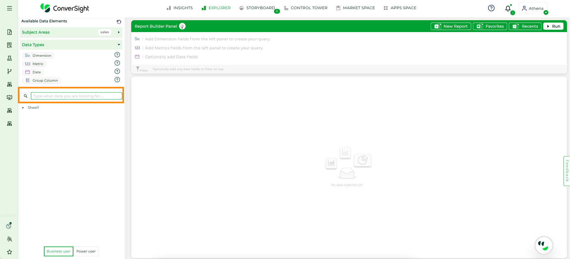
Search for columns#
New Report#
To create a new report, the quickest method is to click on the New icon on the top. This action will initiate the process, beginning with the selection of the subject area. From there, you can build your report from scratch, customizing it to fit your specific needs and preferences.
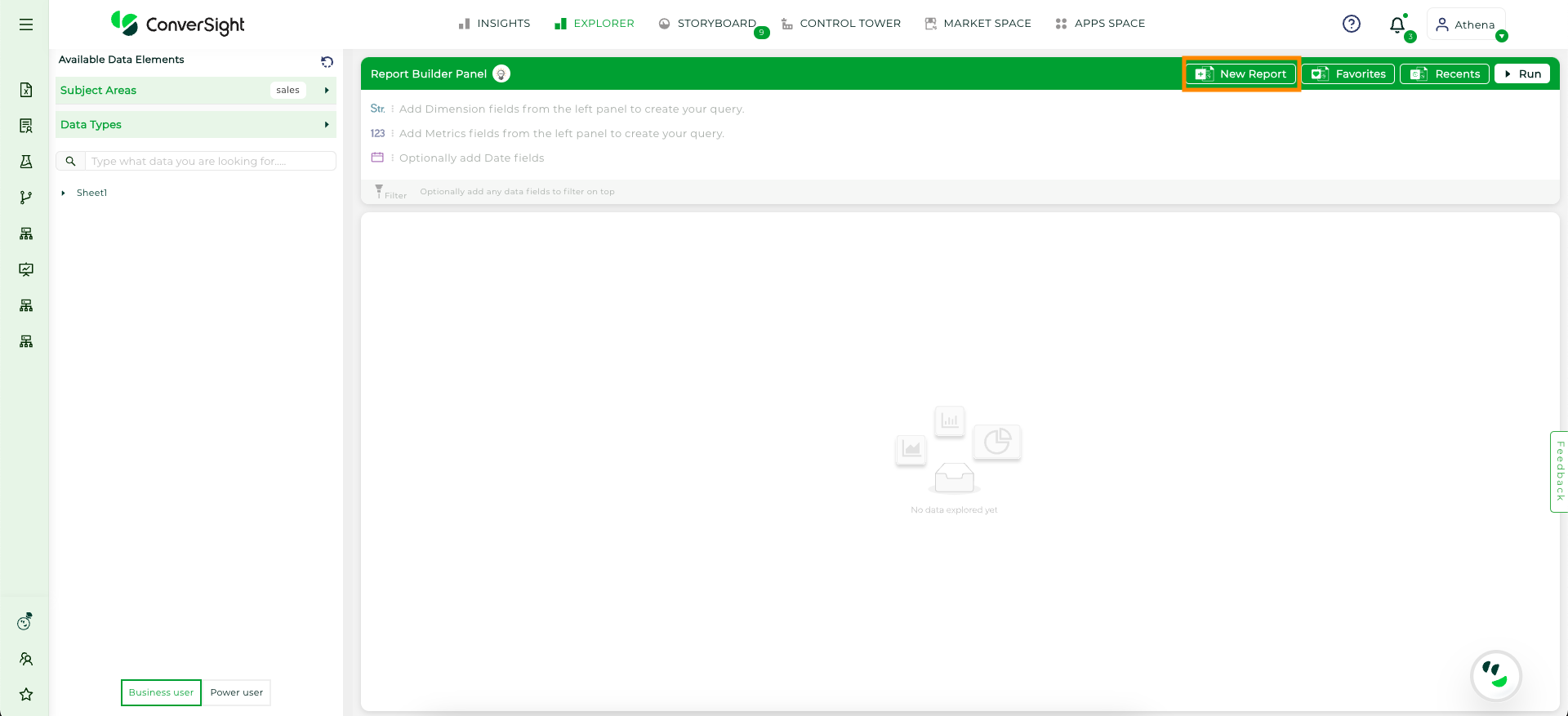
New#
Help#
The Help tooltip provides a visual example of how the data will appear once the columns and filters are added to the query area. This example helps you understand the layout and organization of the data, giving you a clearer idea of how your selections will affect the query results.
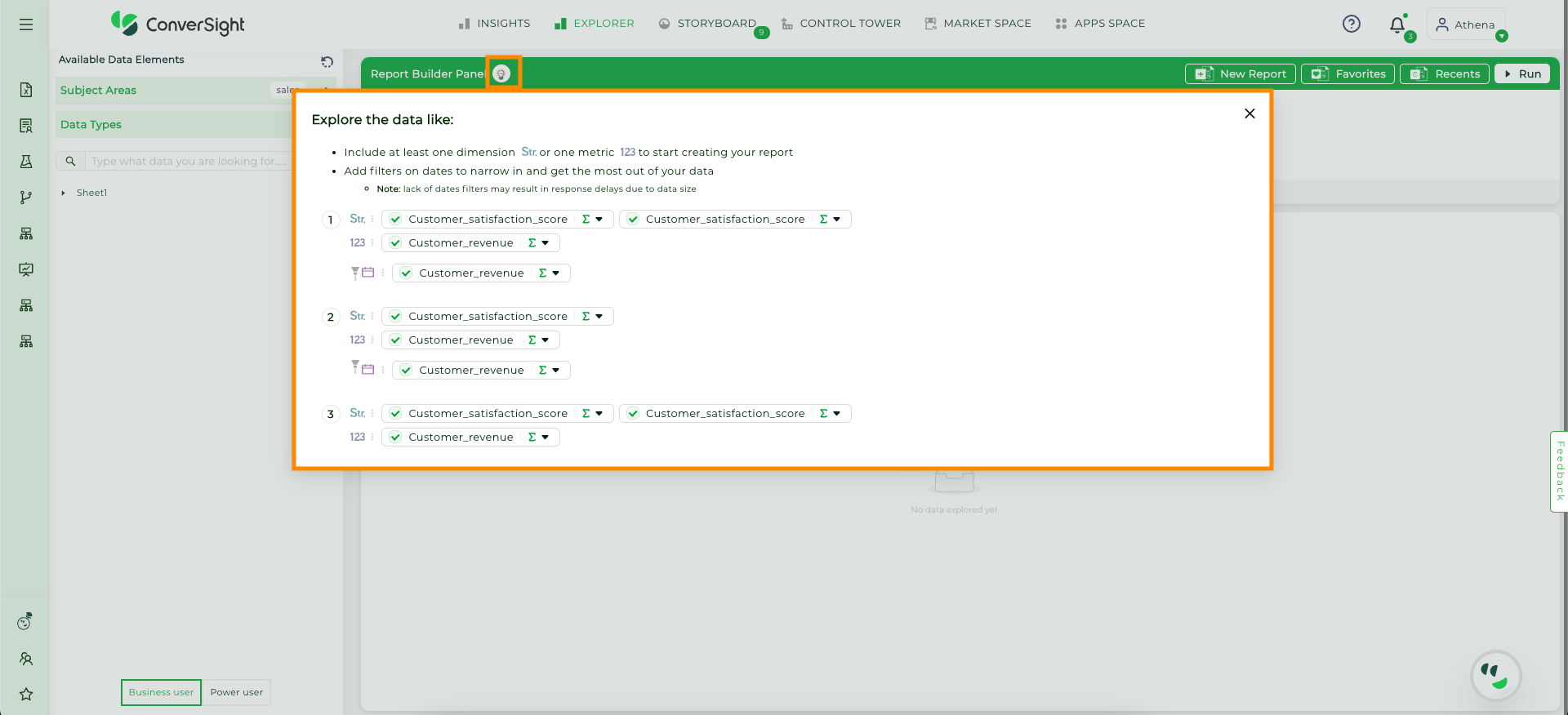
Help#
Recently Queried#
To view your recently queried data, click on the Recents button located in the top right corner of the page. This section will display a list of queries you have run recently, organized and categorized by field type. This feature helps you easily access and manage your previous queries, allowing you to quickly revisit and review your data.
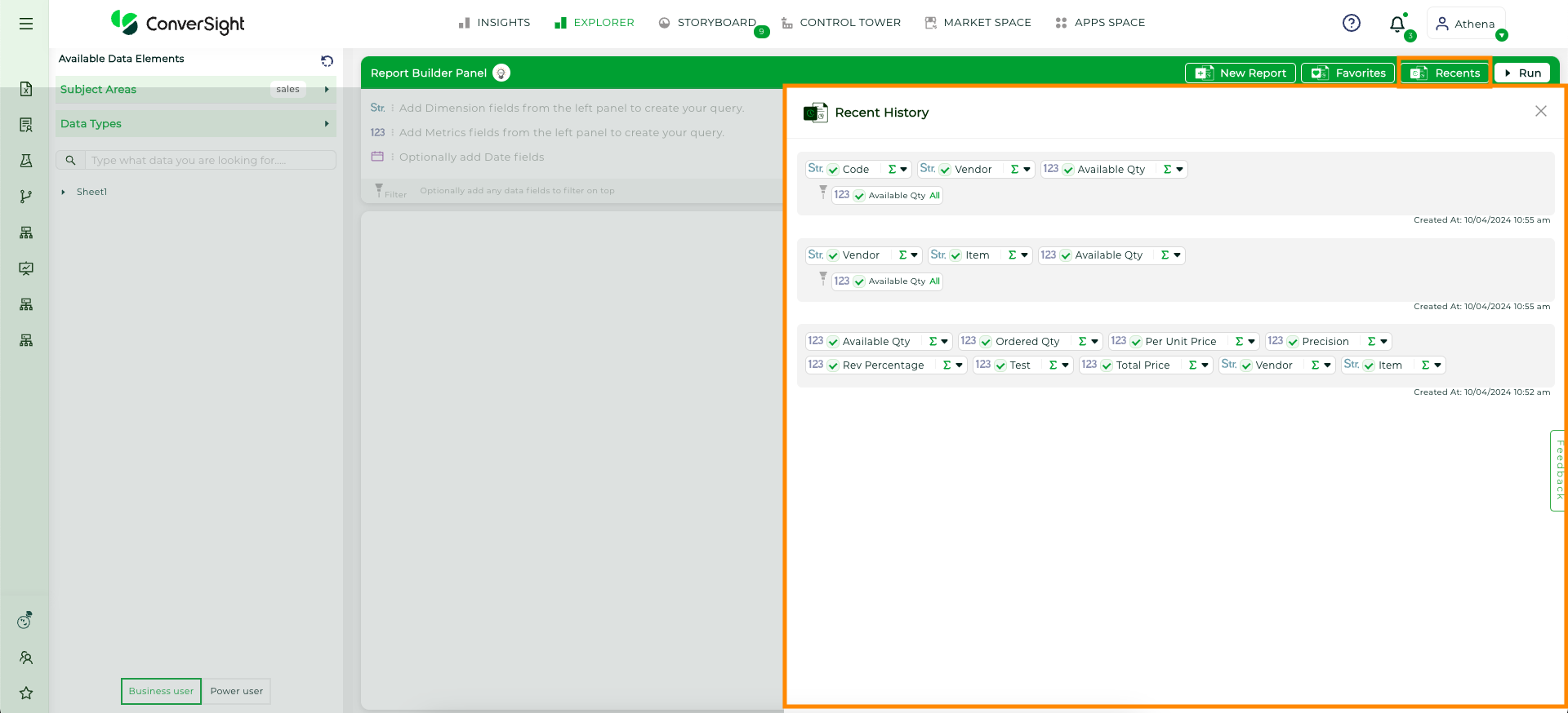
Recently Queried Button#
NOTE
The Recently Queried dropdown currently shows only the last 20 queries.
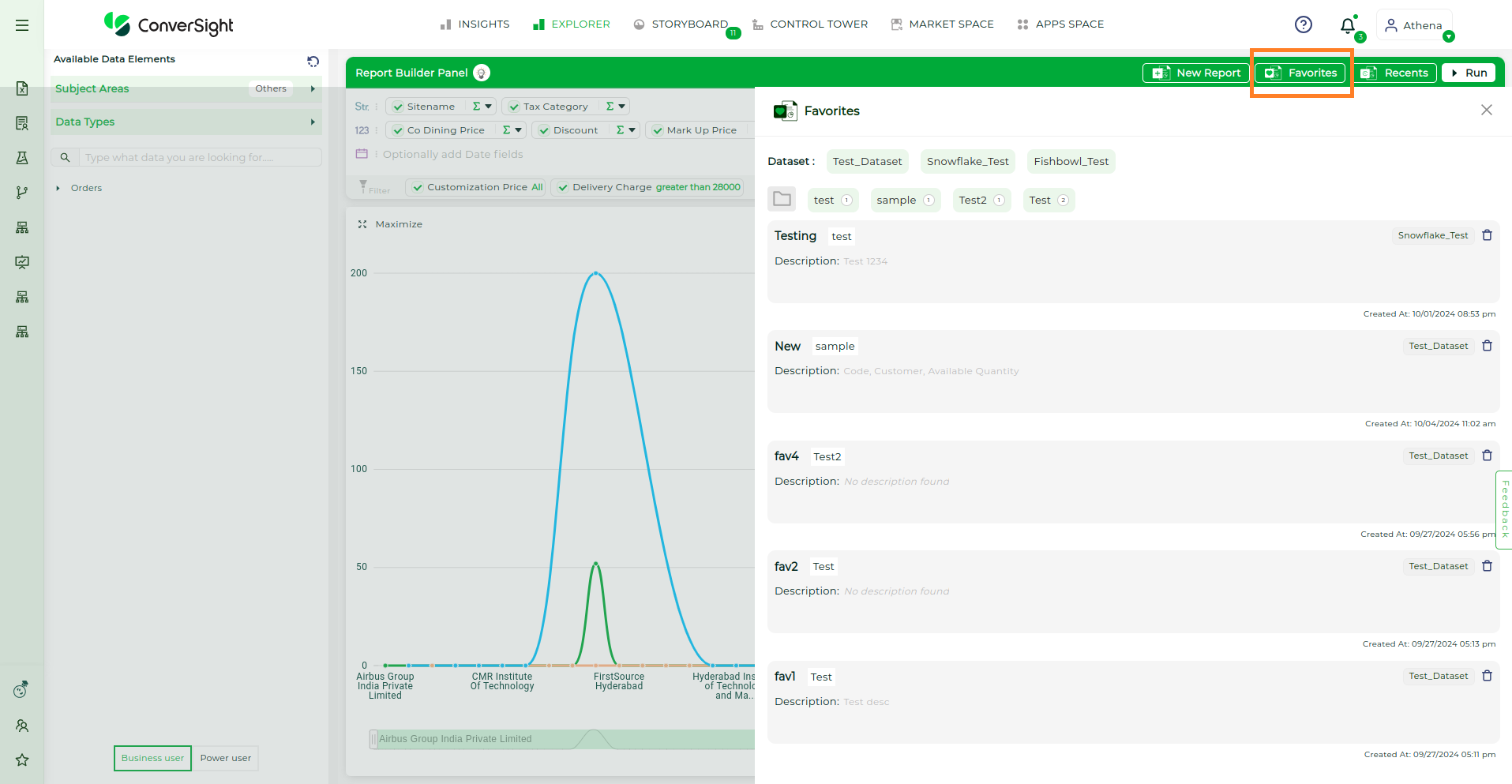
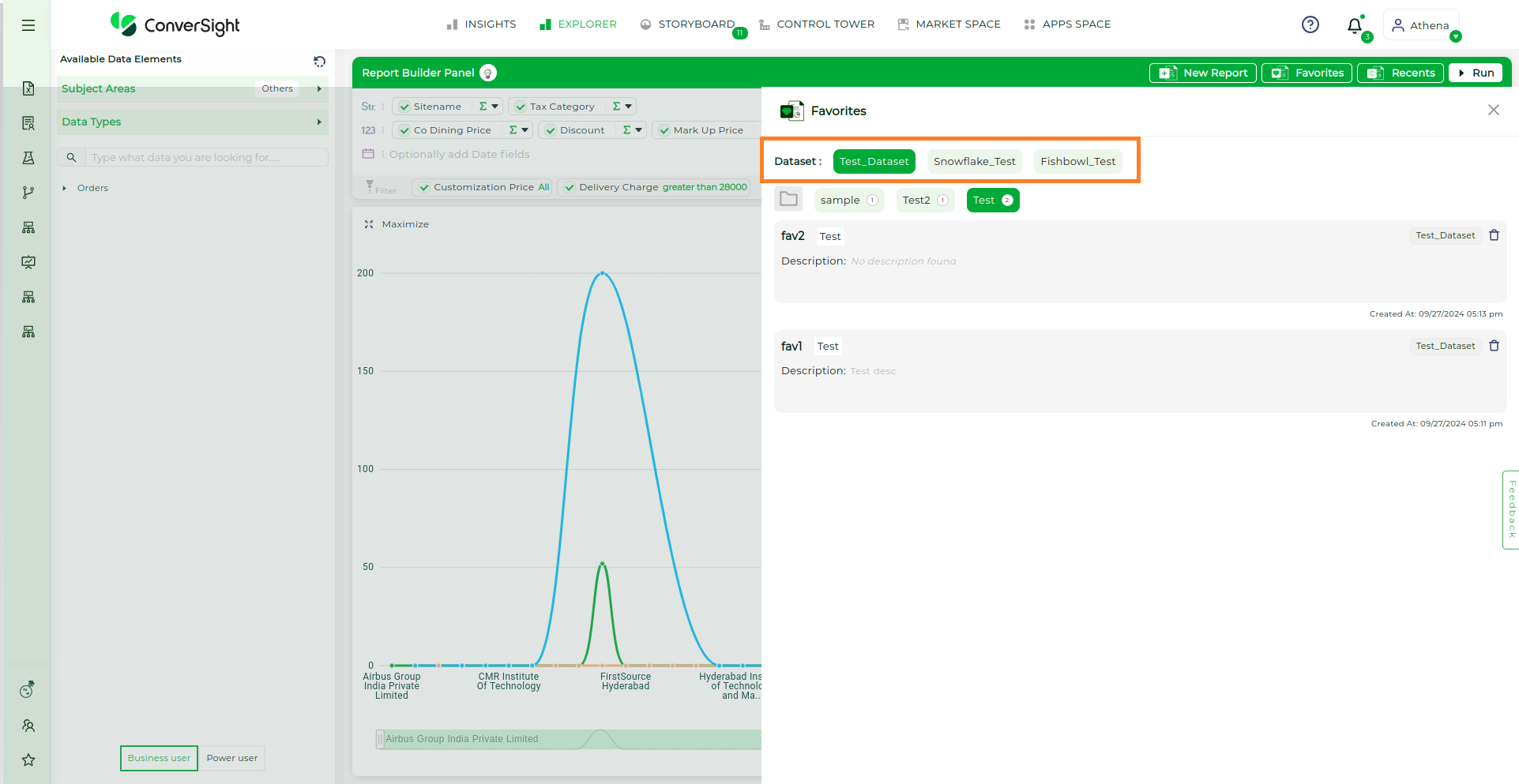
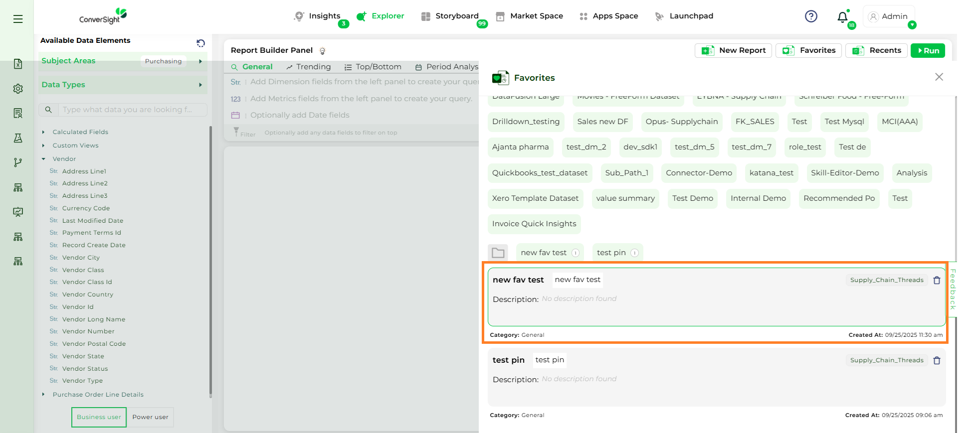
Favorites#
Favorites are reports you’ve created for quick and easy access, where you can select a specific dataset to view your saved reports. They function like personalized report folders, allowing you to organize and retrieve your reports efficiently. You can have multiple favorites for better organization.
Favourites Button#
Creating a Favorite#
To create a favorite, click the Heart icon on the generated report. A pop-up will appear where you can enter a name and description for the report. You can choose to save it in an existing folder or create a new one by clicking Create and providing a name for the new folder. Once you’ve made your selections, click Save to finalize.
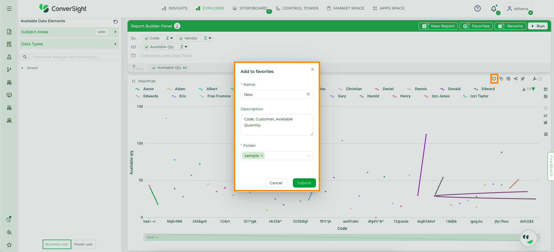
Add to favorites#
Accessing Saved Favorites#
To access your saved favorites, click the Favorites button at the top of the page. This will display all your saved favorites for quick retrieval. User can select a specific Dataset to view the favorites associated with that dataset. This allows them to filter and access their most frequently used or preferred data items within the selected dataset quickly and efficiently.
Saved Favorites#
Editing Favorites#
The Edit Favorites option in Explorer allows modifications to existing favorites, ensuring they remain up to date and aligned with reporting or analysis needs. Changes can be applied to columns, filters, or configurations and then saved back into the favorites list. The following are the steps:
Step 1: Select the Favorite that needs to be edited.
Favorite#
Step 2: Add or Modify the required columns or settings, then click the Run button to apply the changes.
Modifications#
Run Button#
Step 3: To save the modifications, click the Update Favorite button.
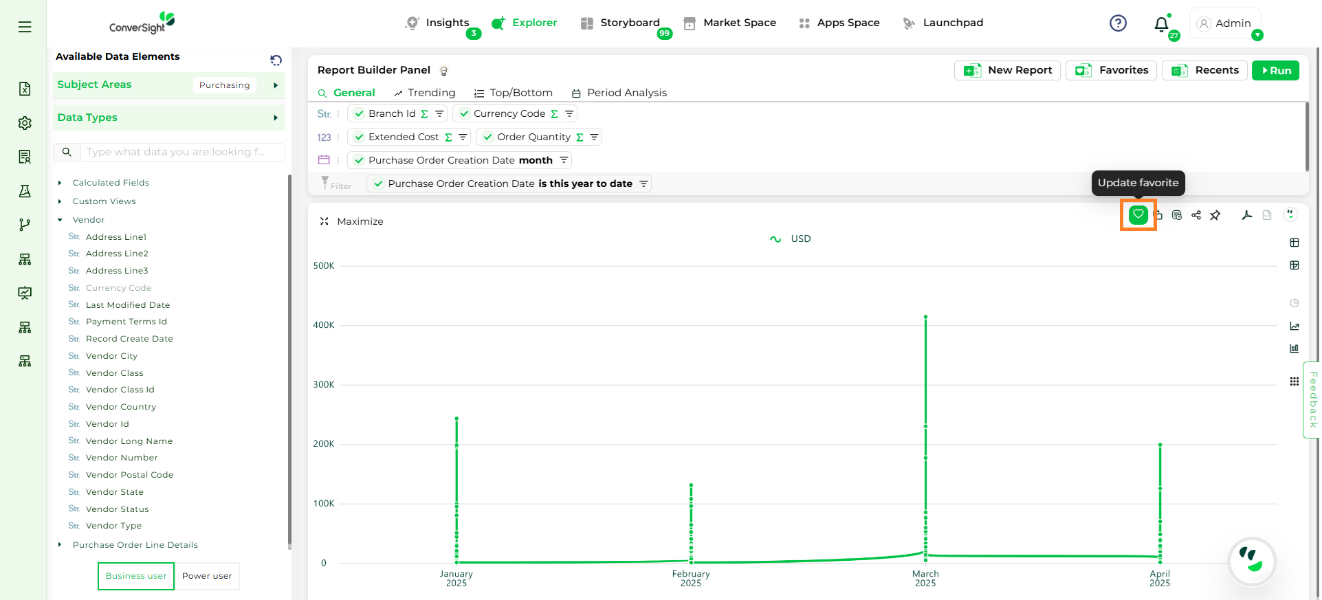
Update Favorite#
The Explorer feature in ConverSight enables users to create dynamic reports, suitable for various levels of expertise. Structured data exploration, customizable filters and diverse visual representations provide direct access to valuable insights, fostering better understanding and informed decision-making. The Pivot table offers an interactive way to explore data, with users able to customize them using different settings to improve functionality and appearance. Settings Option offer a range of choices for customization, allowing users to control how their data analysis is presented and functions.