Insights#
Insights alert you when the required data increases or decreases. This allows you to conduct an early analysis and take appropriate action.
Insights#
Now let’s see the various features available in Insights.
Timeline#
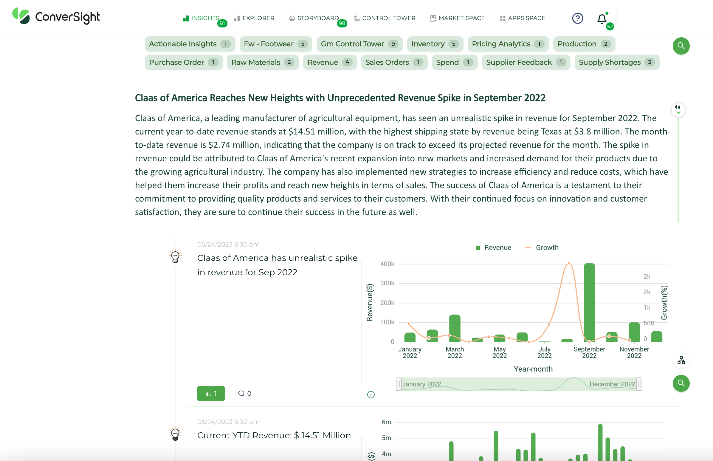
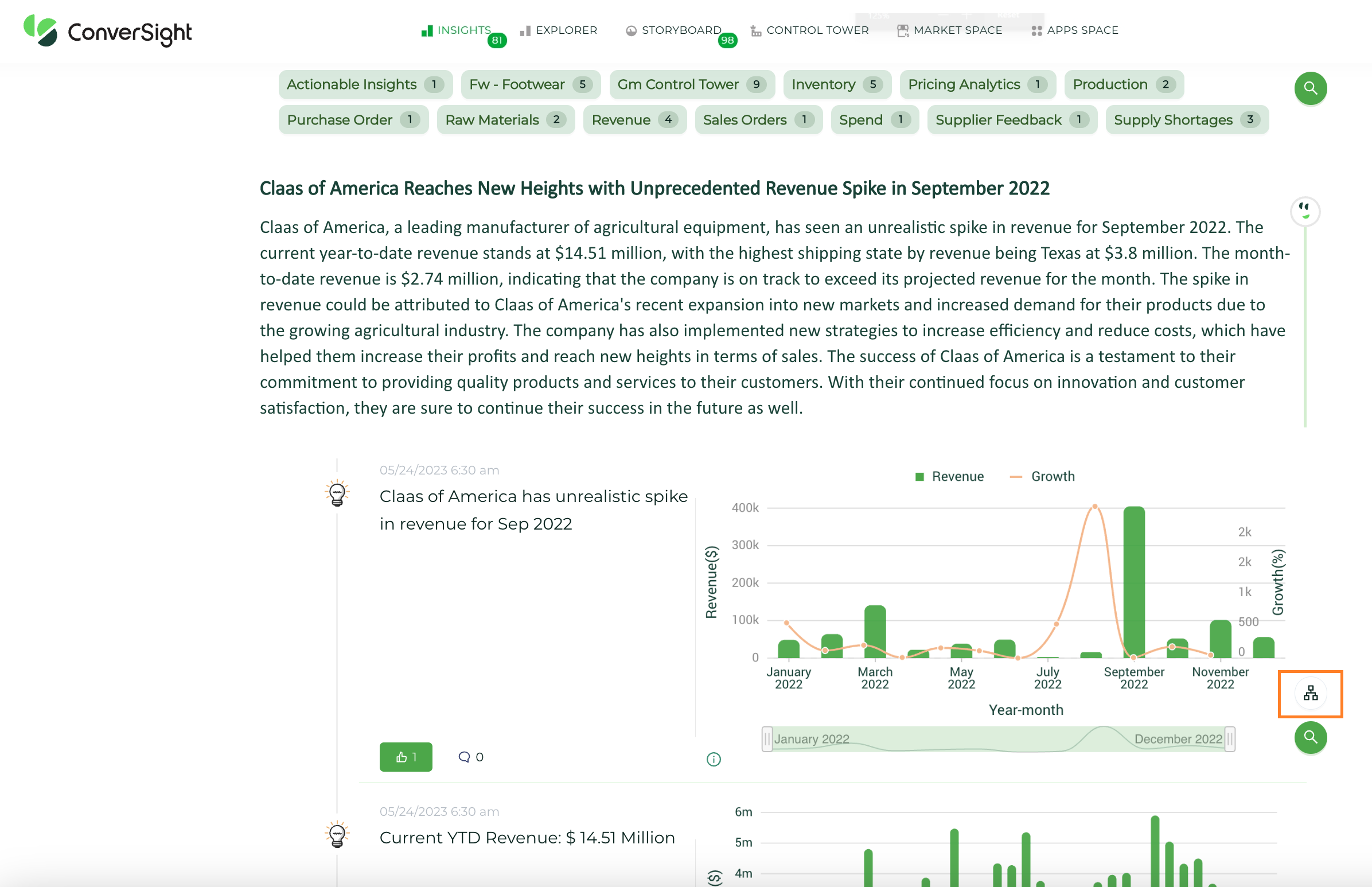
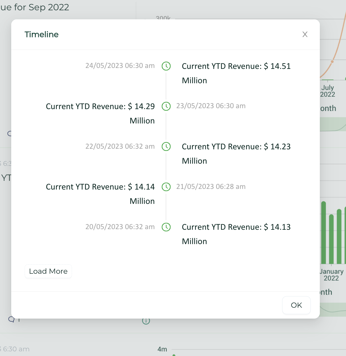
Timeline feature revolutionizes data analysis by providing users with a comprehensive view of data over time. With just a single click, users can effortlessly track the progression and analyze data trends. The Timeline feature enables comparisons and allows users to uncover valuable insights, patterns and correlations by visually representing data over specific periods. This powerful capability enhances decision-making by leveraging historical data and empowers users to make informed choices based on a deep understanding of data dynamics.
To access Timeline feature, click on ![]() on the Insights.
on the Insights.
Timeline#
The timeline view allows for a visual representation of data progression, enabling easy tracking and analysis of data over time.
Timeline Feature#
Explore#
Click on Explore icon  from the Insights page. Here, you can get detailed lists on Top 10 inventory items.
Explore Insights#
Explore Insights#
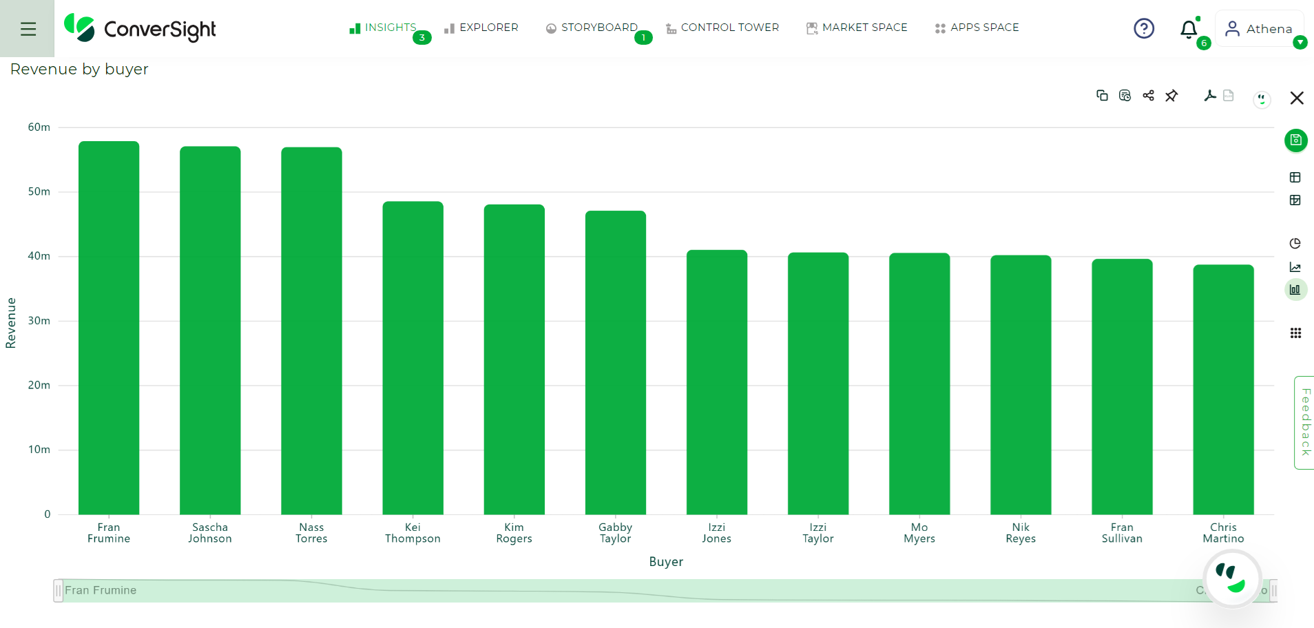
Copy#
Users have the ability to copy any insight to their clipboard by using the copy clipboard icon.
Copy Insights#
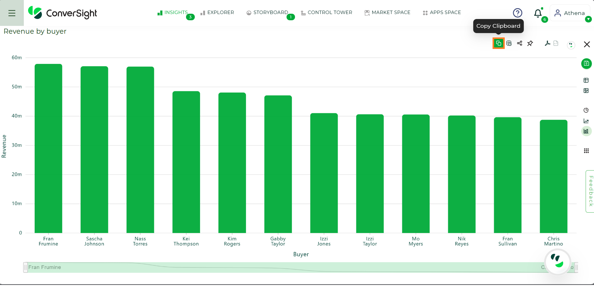
Share#
To share a report with more people, click on the Share icon  . If you are sending multiple emails, use a comma for email separation and enter your message in the custom message dialog box, which you can then share with your reports.
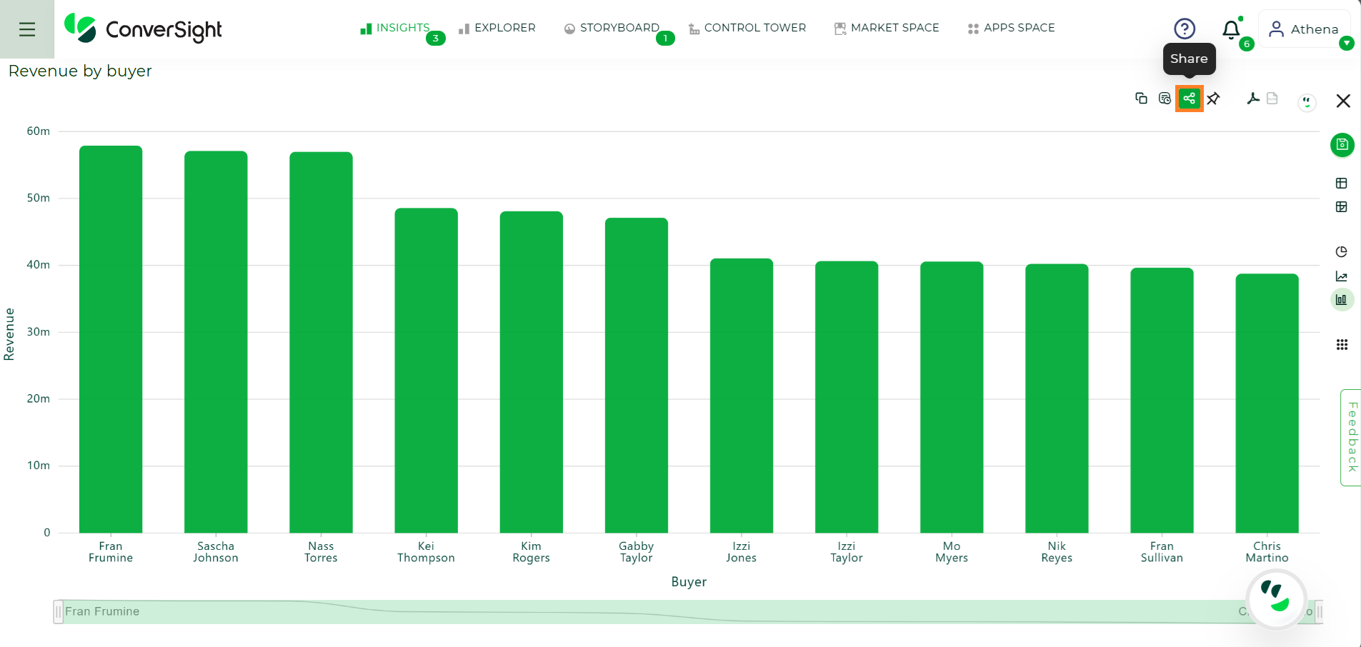
Adding Insights to Storyboard#
Add to Storyboard#
On insights page, there is an Add to Storyboard icon  available in the right corner. You can select the content required and save them to the Storyboard.
Adding Insights to Storyboard#
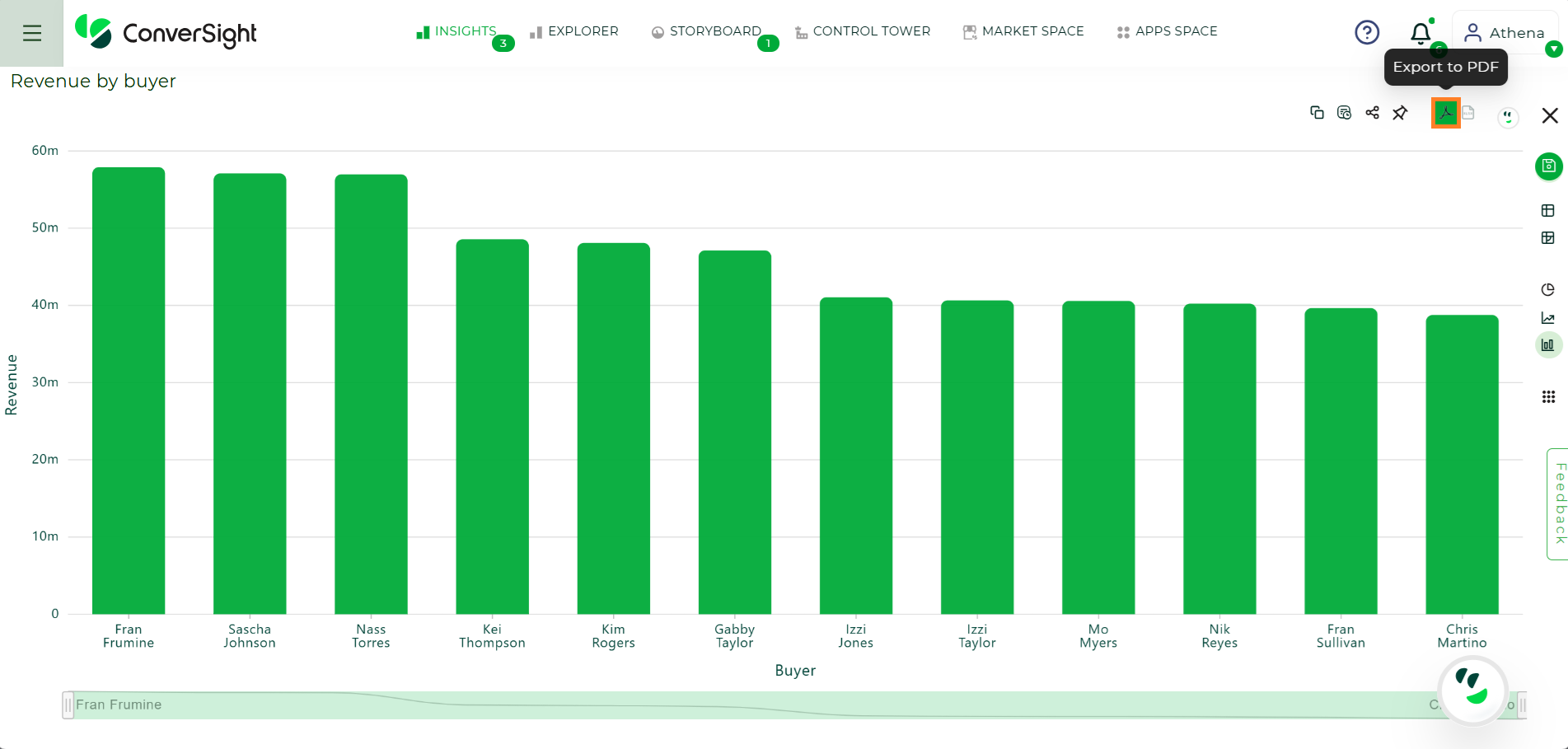
Export to PDF#
To create a PDF version of your report, click on the Export to PDF icon  .
.
Export to PDF#
Quick View Tab#
Quick view tab lists down the various chart types and tables such as CS Table, Pivot, Pie Chart, Line Chart and Column Chart.
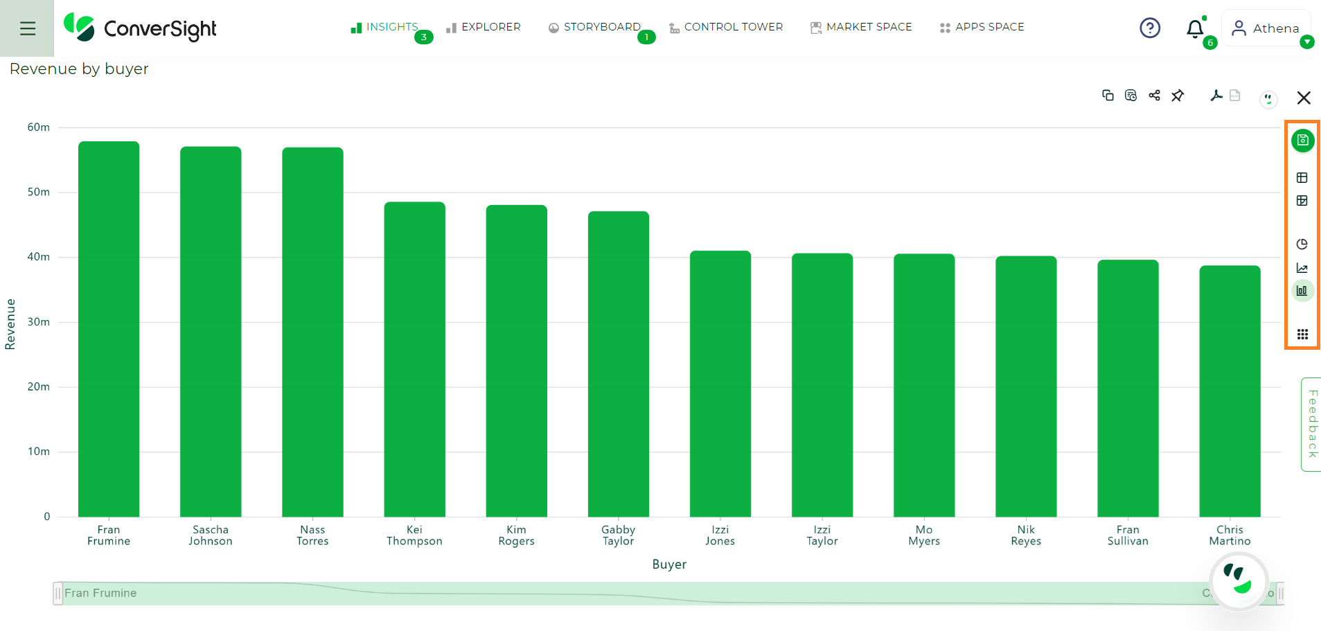
Quick View#
More Visuals#
More Visuals icon, shows up wide range of chart types in ConverSight. Each chart type displays you a different visualization of your answer.
Charts visually display your search answer. Your search needs at least one attribute and one measure to be presented as a chart. When you choose to display your answer as a chart, ConverSight will assign it to the best fit chart type.
To change the chart type of your answer, click and select the charts which you like to get a palette of chart types you can choose.
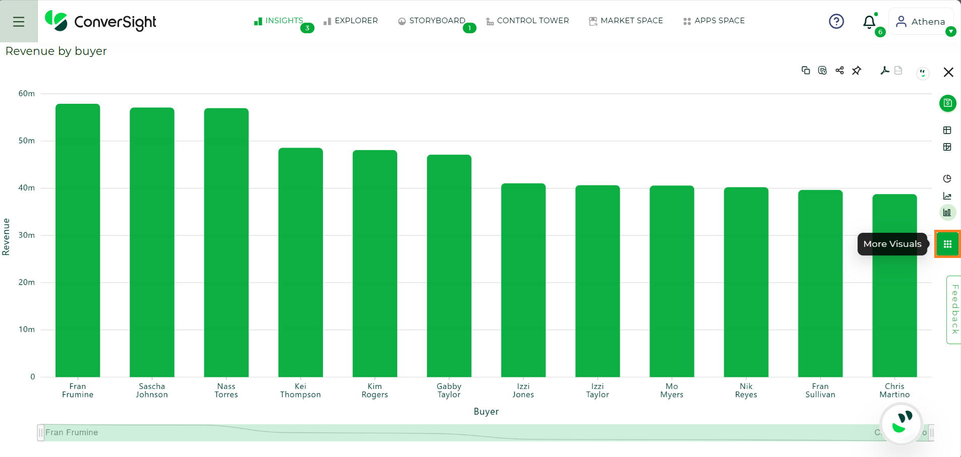
More Visuals#
Unavailable chart types are greyed out in ConverSight.
Text View#
Text View is appropriate when the query outcome is a single value, often an aggregable measure or a value grouped by an attribute for each column.
The text view can also be converted to a CS Table and Pivot table.
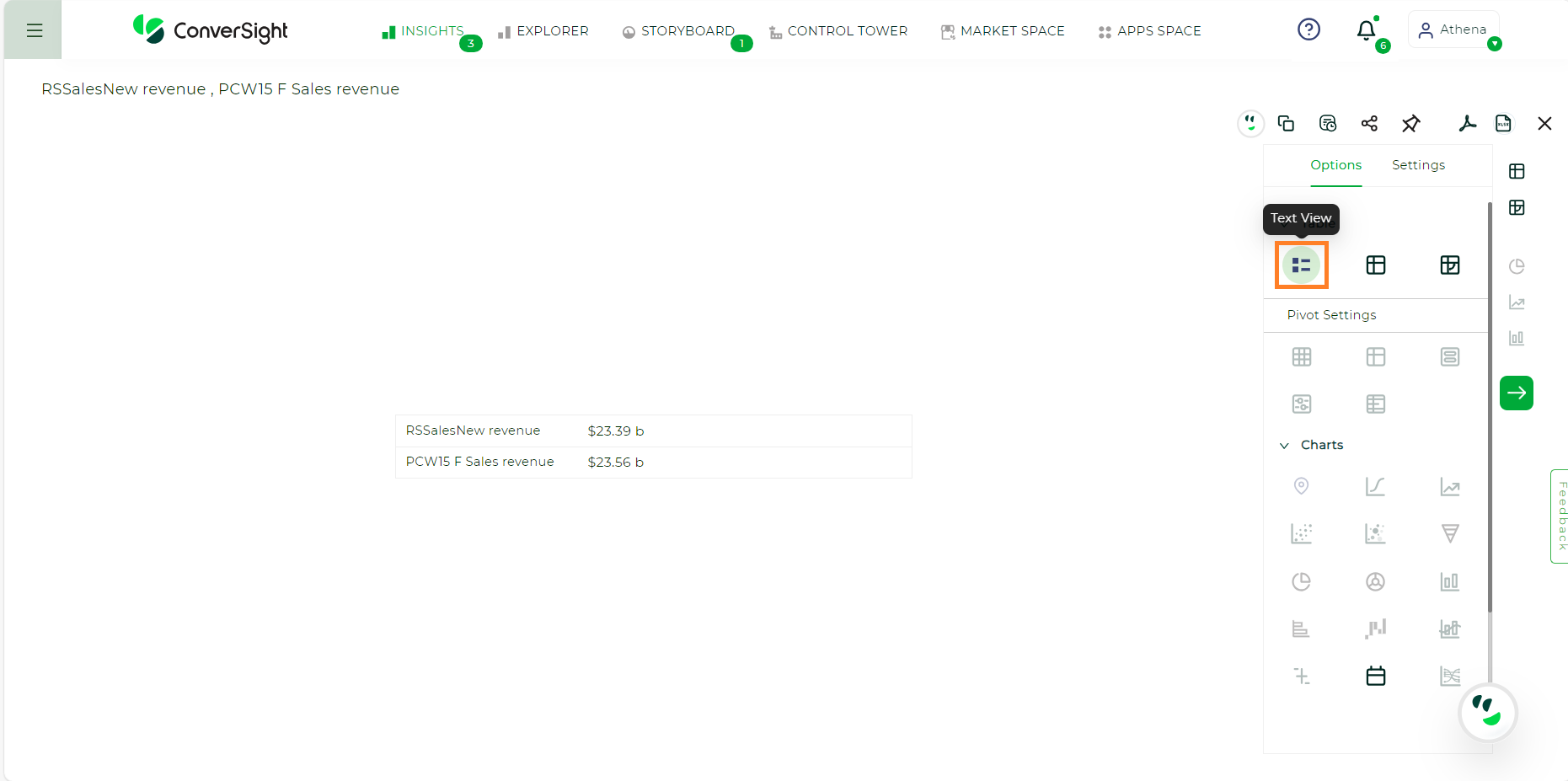
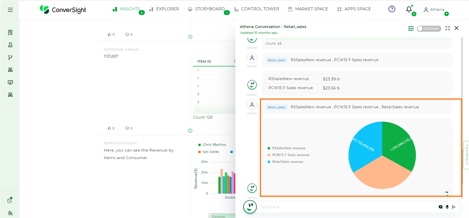
If all the values share the same unit and the query involves more than two measures, the text view will automatically transition to a pie chart.
In cases where the query involves different aggregable measures, the chart will be presented as a text view, displaying a singular representation of the sum for each column.
Text view is only applicable when column values can be grouped into single values, whether they are attributes or even dates.
When a response contains a single row, you can switch to Chart View for a clearer and more visual representation of your data.
Work With Charts#
Choosing a Chart
Note: Some chart types may not be available, depending on the columns in your search. For example, if your search does not contain at least one geographical column, then you will not be able to select any of the geo chart types. ConverSight shows unavailable chart types as grayed out.
To watch the video, click on Data Visualization Overview.
CS Table: The table is the main advantages of your report, you can set the table header name by row and column. You can filter the header name and drag a column and can view the filtered column.
Pivot Tables: Pivot tables in ConverSight use the well-known drag-and-drop interface. Creating a pivot table enables exploring alternate visualization of data in a wide table. The basic idea is that some data is easier to consume when laid out horizontally, while others, vertically.
Area Charts: The area chart is based on the line chart but has filled in regions.
Funnel Charts: The funnel chart shows a process with progressively decreasing proportions amounting to 100 percent in total.
Pie Charts: A Pie chart, also known as a circle chart, is a graphical representation of statistical data presented in a circular form.
Donut charts: Donut charts show a flow from one set of values to another, usually with visual emphasis (brighter colors or larger bandwidths) for comparison of the values (ex., top cities in terms of sales might be emphasized).
Column Charts: The column chart is one of ConverSight’s simplest, yet most versatile chart types. The column chart is often the chosen default chart type and displays data as vertical columns.
Bar Charts: The bar chart is nearly identical to the column chart. The primary difference is that it displays data as horizontal bars.
Line Charts: Like the column chart, the line chart is one of ConverSight’s simplest, yet most versatile chart types. More often than not the line chart will be chosen as your default chart type.
Waterfall Charts: Waterfall charts are good for visualizing positive and negative growth over time.
Geo Charts: A geo chart is a map of a country, a continent or a region with areas identified in one of three ways: The region mode colors whole regions, such as countries, provinces or states.
Combo Charts: A combo chart is a visualization that combines the features of two charts like a Line chart and Bar chart.
Gauge Charts: A Gauge chart, also known as dial or speedometer chart, is a data visualization type used to display a single value of data in a quantitative way.
Heat Map: A heat map chart is a graphical representation of data using colors to represent values. Heat maps use a matrix of colors to show the distribution of values across two variables.
XmR Charts: XmR (also known as X-mR or XmR) charts are a type of statistical process control chart used to monitor the stability and variability of a process over time.
Sankey Charts: A sankey chart is a type of data visualization that displays flows and relationships between different entities or variables.
Bullet Charts: A bullet chart is a compact visualization for comparing a key measure to a target or benchmark, making it ideal for KPI presentations with clear and efficient data representation.
Scatter Chart: A scatter Chart is a visual tool that illustrates how two continuous variables in a dataset are related.
Bubble Chart: A bubble chart is primarily employed to display relationships among numeric variables, but it gains the ability to compare three variables by including marker size as an additional dimension.
Liquid Chart: A liquid chart offers a clear and intuitive way to see if you are moving closer to your target, making it useful for performance monitoring and decision-making.
Calendar Chart: Calendar charts are used to visualize patterns, trends or variations in data over time.
Treemap Chart: A treemap is a data visualization technique that represents hierarchical data using nested rectangles, with each rectangle’s size proportional to a specific metric.
Venn Chart: A concise depiction of the interconnections between sets through overlapping circles, aiding in visualizing unique and shared elements for comparison and analysis.
Bidirectional Chart: A bidirectional chart presents data along both horizontal and vertical axes, each representing distinct categories. It efficiently illustrates comparisons or relationships between two datasets.
Types of Charts#
CS Table#
You can display the gridlines on tables. Viewing your data as a table, click on the Table icon on the top right of the insights.
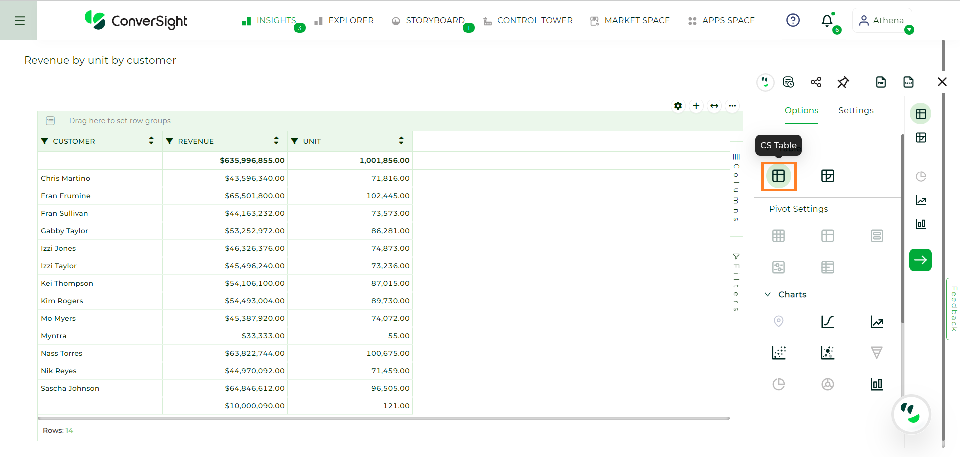
CS Table#
CS Table Settings#
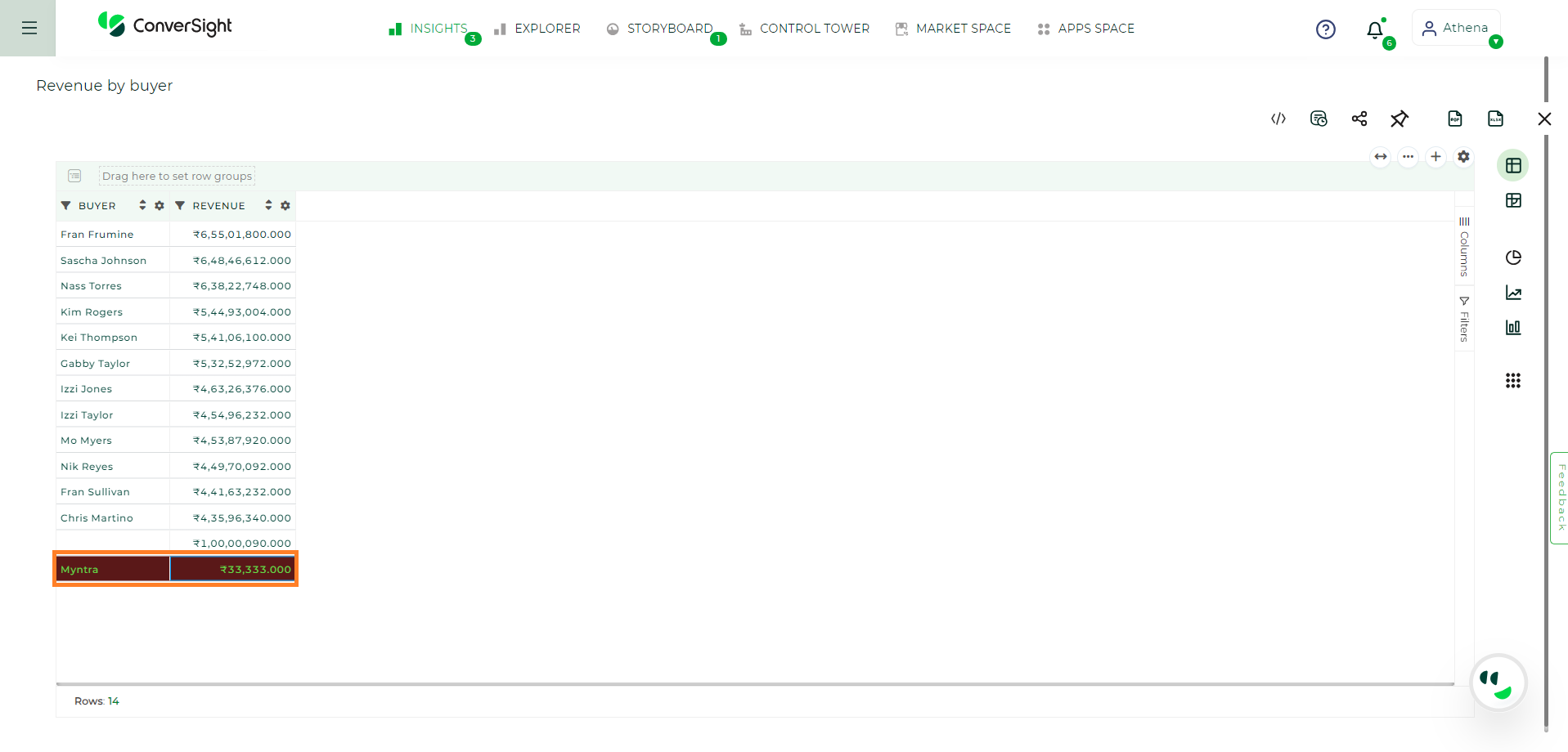
Within the CS Table, users can utilize the Setting option to modify overall CS Table settings with custom conditions on row styles and manage the visibility of column aggregates. Click on the Setting icon.
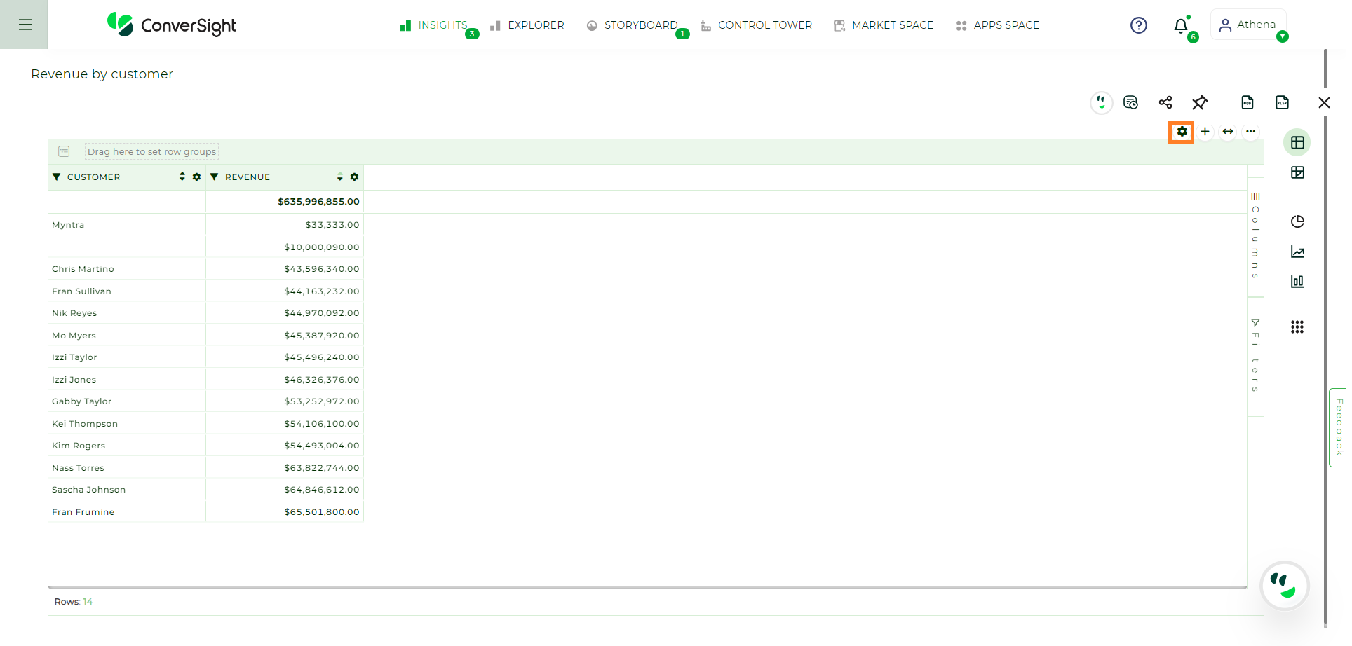
CS Table Settings#
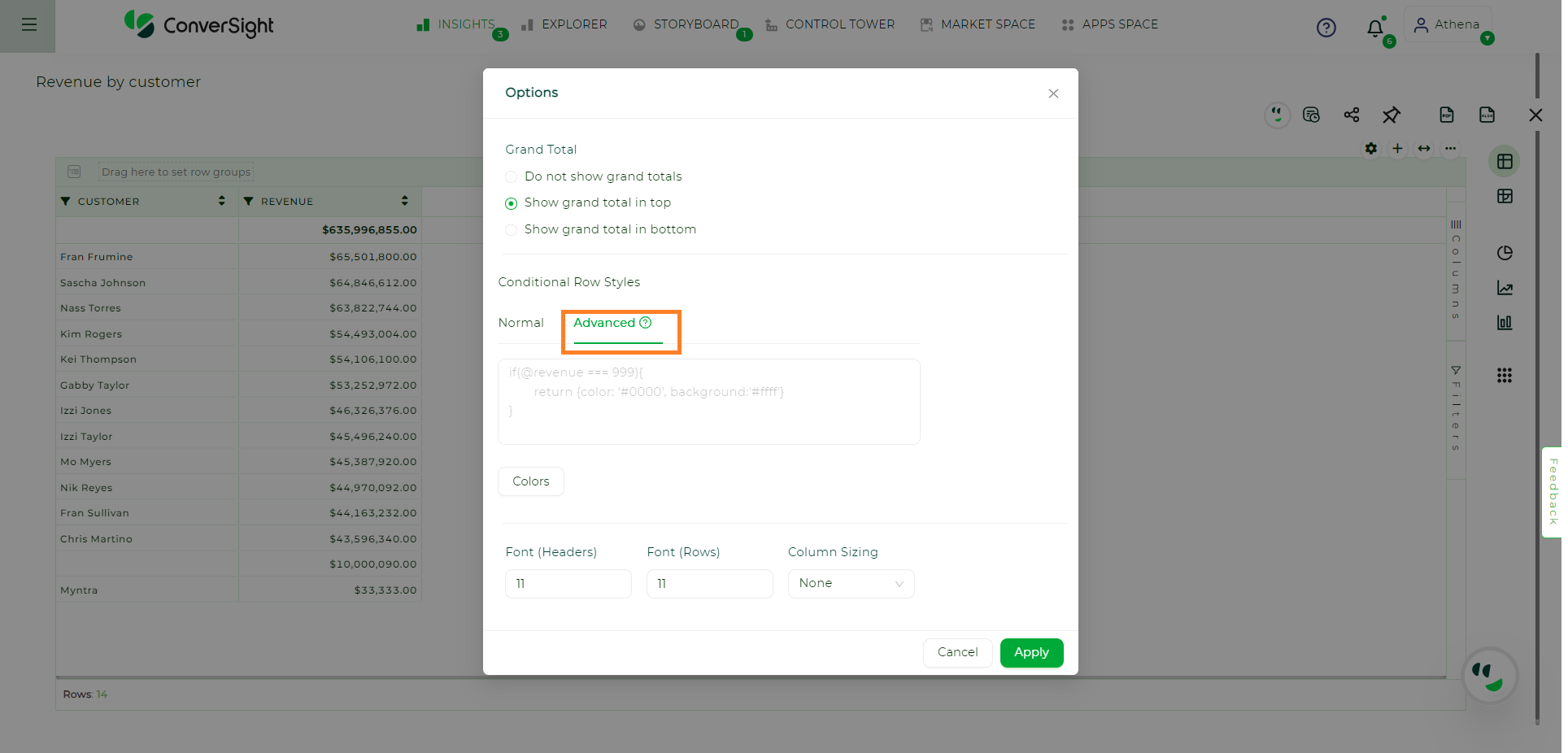
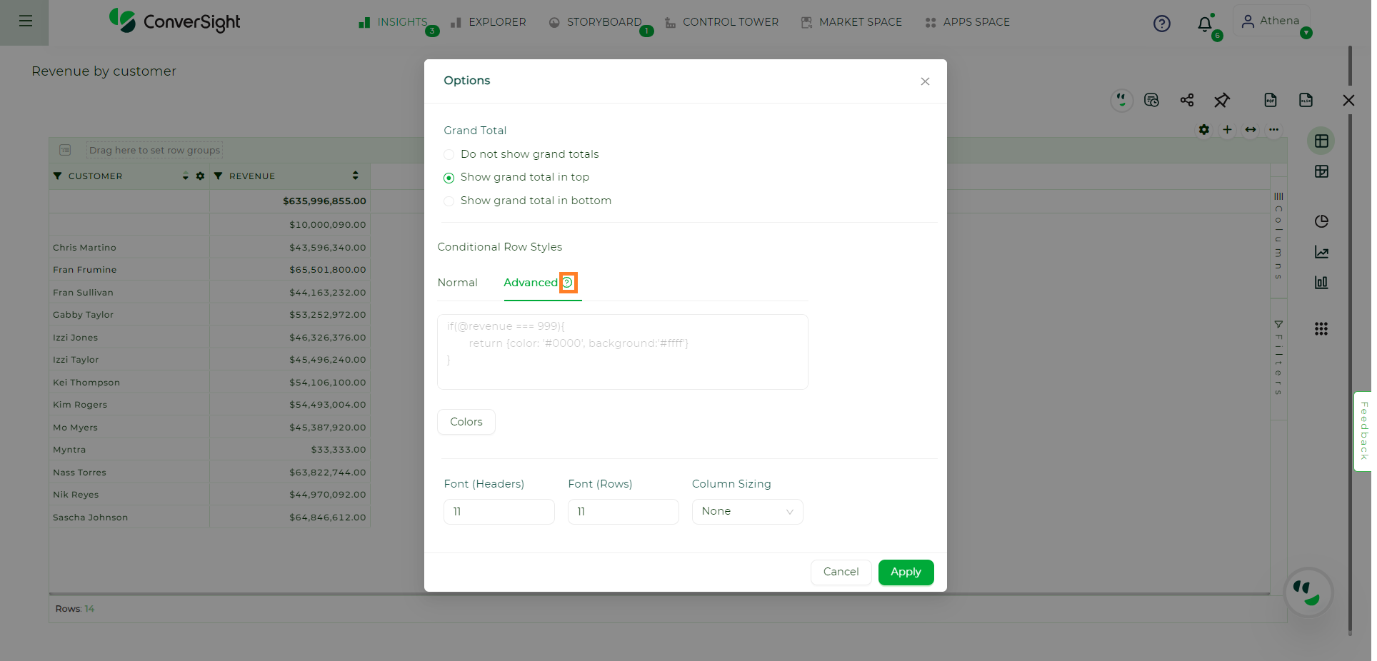
When clicking on the Setting icon, a pop-up will appear, offering display options for grand total, row condition styles and font settings.
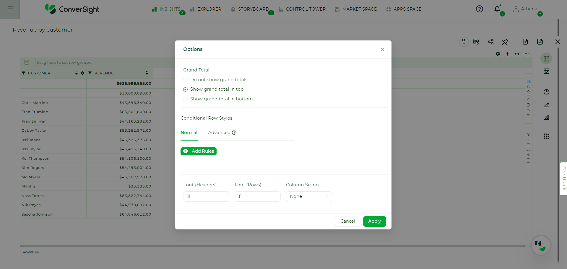
Setting Options#
Grand Total#
With the Grand Total option, users have the flexibility to manage the visibility of column aggregates as per their preferences.
Show grand total in bottom option displays the Grand Total at the bottom.
Show grand total in top option displays the Grand Total at the top.
Do not show grand total option does not show Grand Total anywhere.
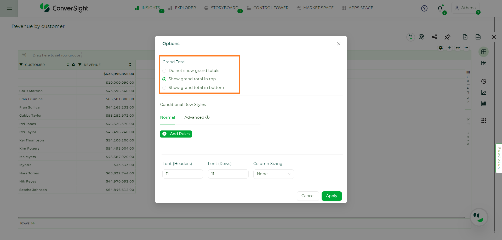
Grand Total Options#
Conditional Row Styles#
Conditional Row Styles enable users to customize the visual appearance of individual records within a table by modifying font color and background color based on user-defined conditions. This feature provides a flexible way to highlight or differentiate specific rows based on specific criteria, enhancing the visual representation of data and aiding in data analysis. Within Conditional Row Styles, there are two distinct approaches available, they are:
Normal
Advanced
Normal#
In Normal mode, users have the option to add rules for highlighting by simply clicking on the Add Rules button.
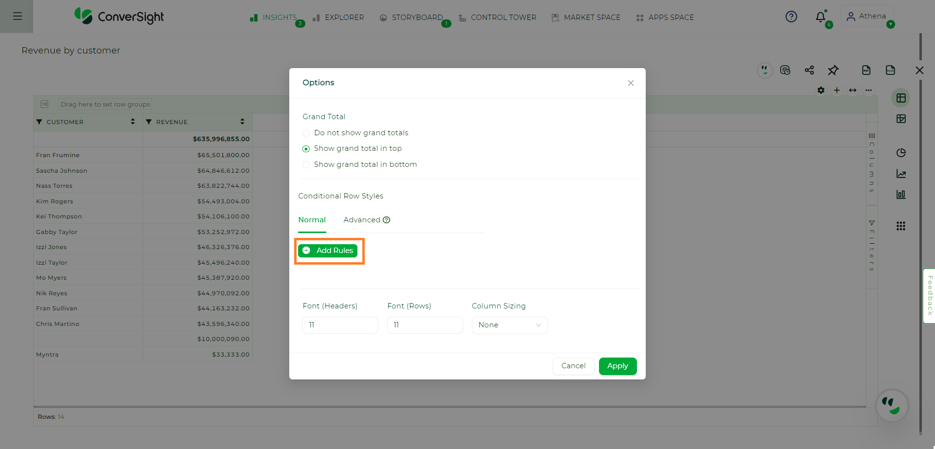
Add Rules#
Clicking on the Add Rules button will display the template for Normal Conditional Row Styles.
Template for Normal Conditional Row Styles#
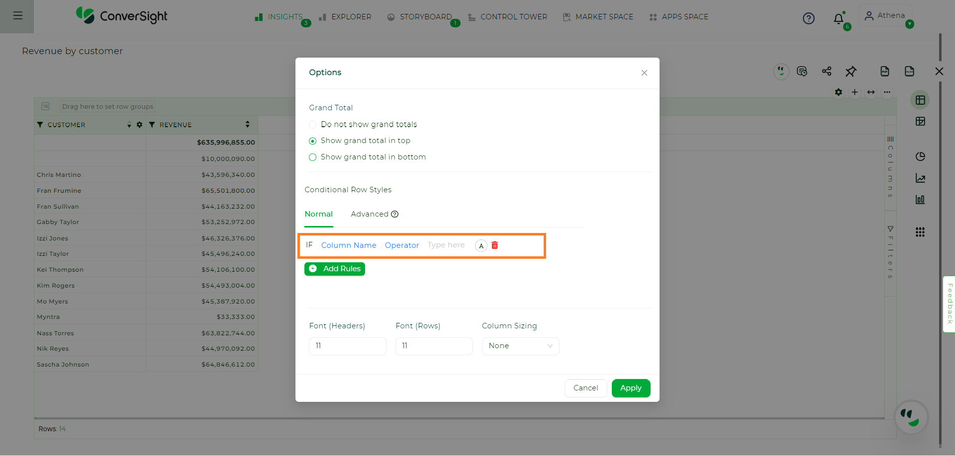
When you click on the Column Name, the list of column names in your CS Table will be displayed.
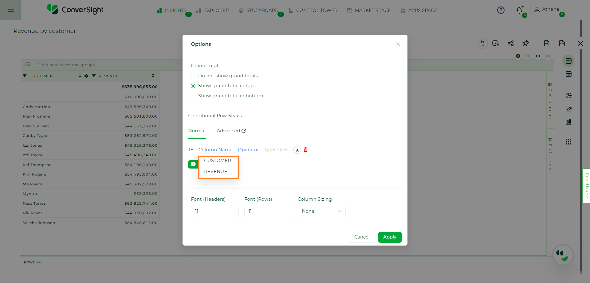
Column Name#
Once you have selected the column, click on Operator to view the available operations that can be performed based on the category of the column you have chosen.
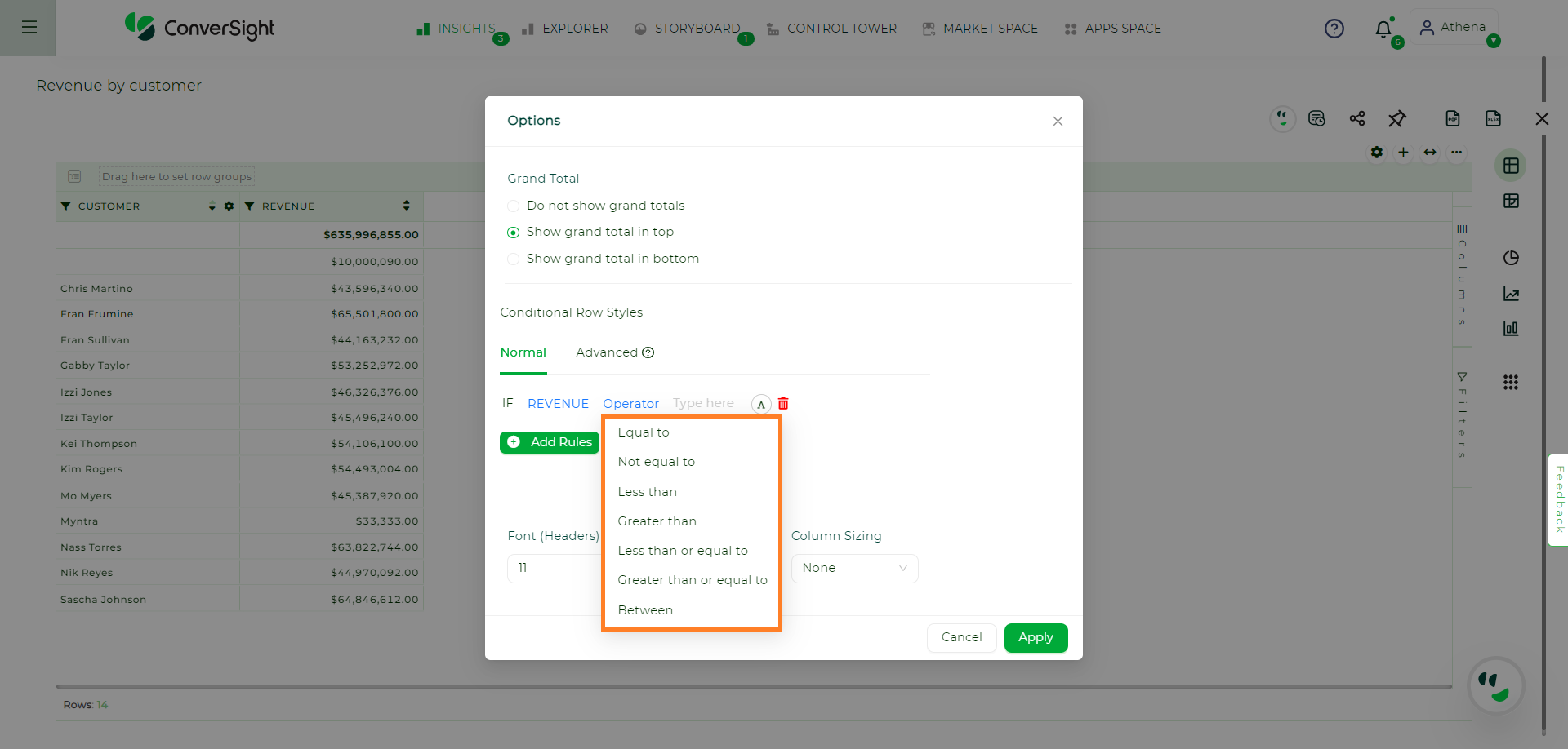
Operator#
After choosing the operator, enter the Value in the textbox provided.
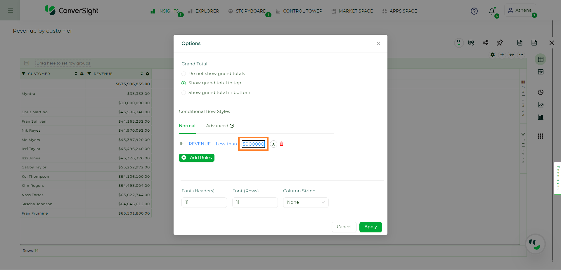
Value#
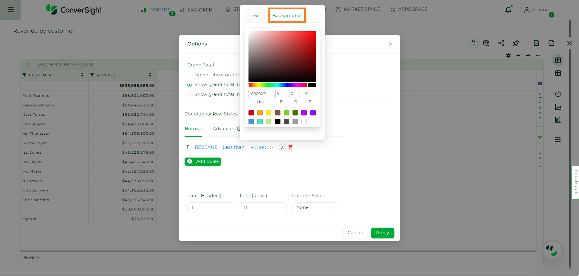
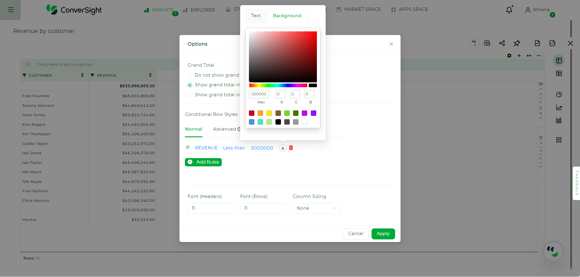
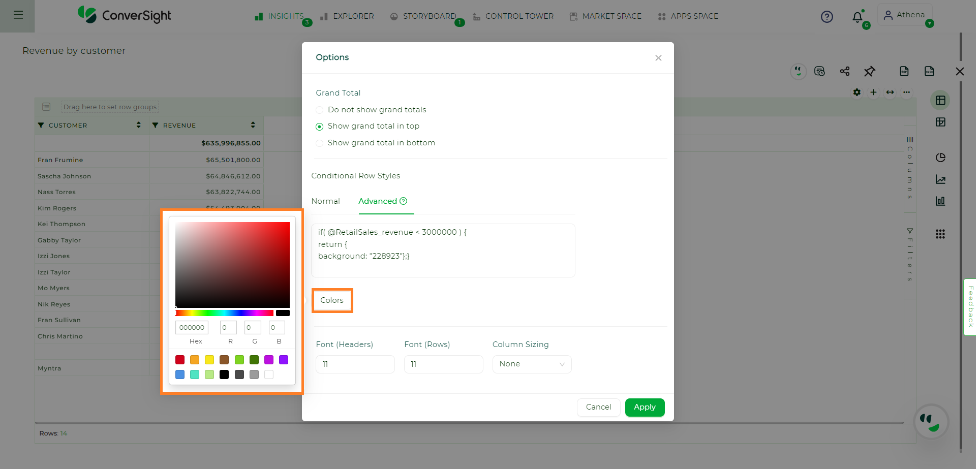
To modify the Text color and Background color, click on A icon. Users can select colors either from the color palette by clicking on them or by entering the hex values. Additionally, users can also choose from a selection of predefined colors.
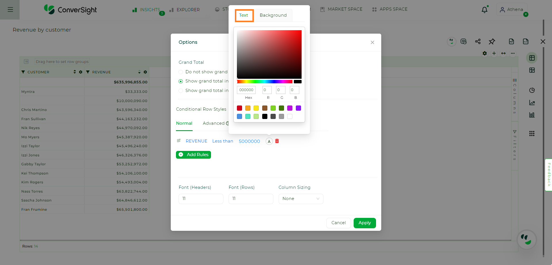
Text Color#
To change the background color, switch to the Background tab.
Background Color#
Click the Apply button to see the styles reflected in the CS Table.
Apply Changes#
Changes Applied#
Advanced#
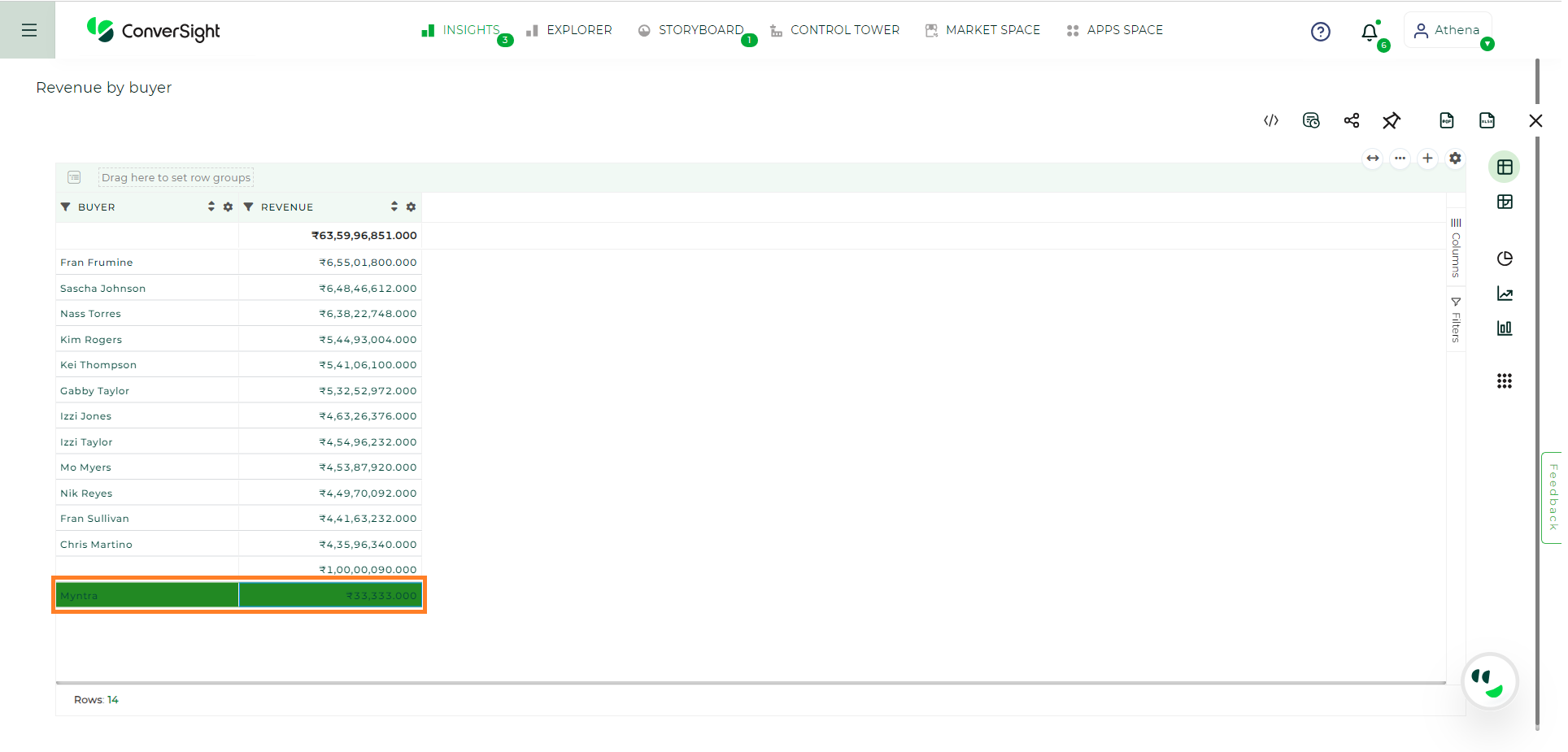
In Advanced mode, users can write custom code to highlight either the background, text or both in the CS Table. It is essential to ensure that the code returns at least one object for the text color or background color.
Advanced Option#
To understand the code syntax, hover over the Question mark icon to view the code’s syntax details.
Help Tip#
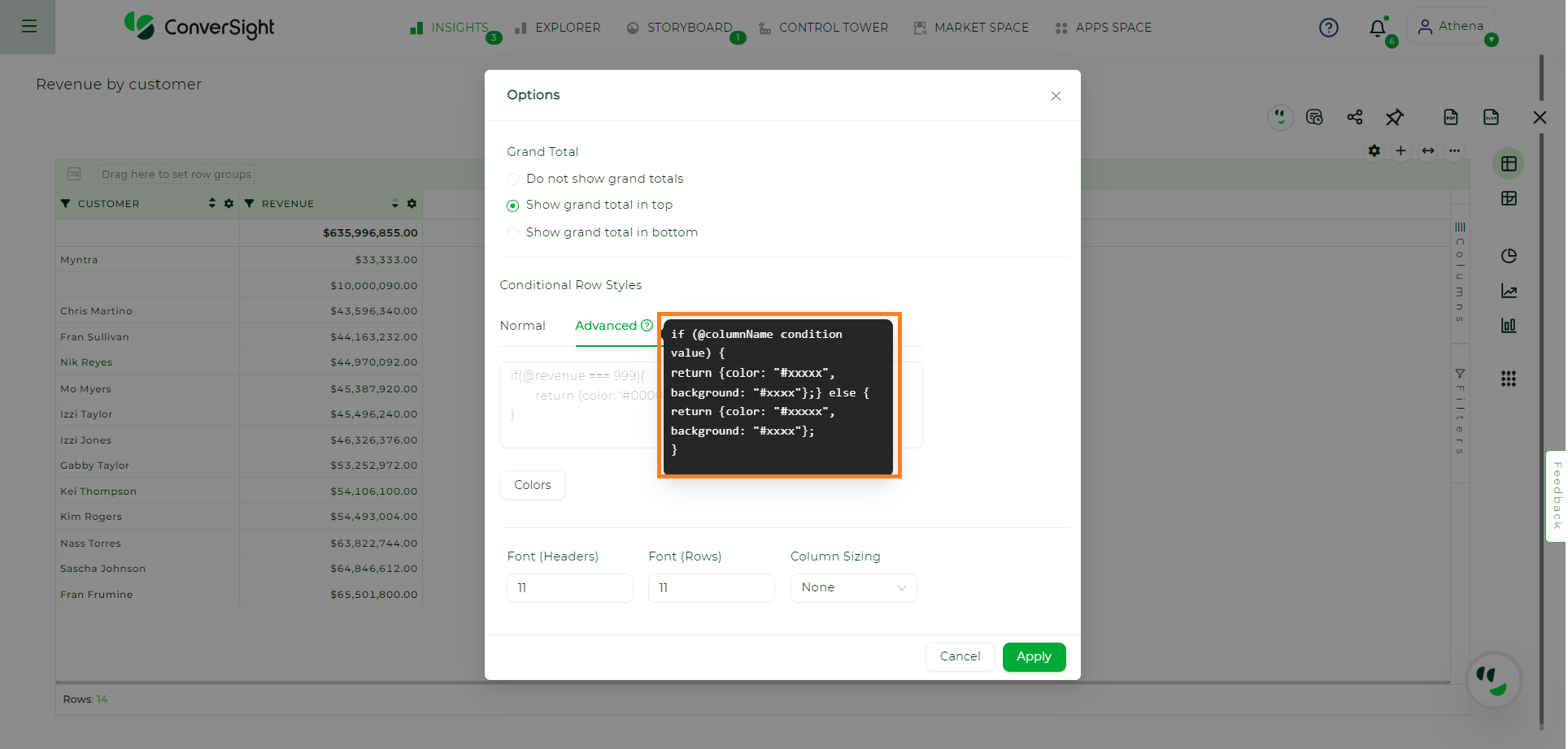
Syntax#
Enter the code into the Text Box. When typing the @ symbol, the column names will be shown and users can choose the desired column from the dropdown menu. For Example:
if ( @RetailSales_revenue < 300000 ) {
return {
background: "#228923"};}
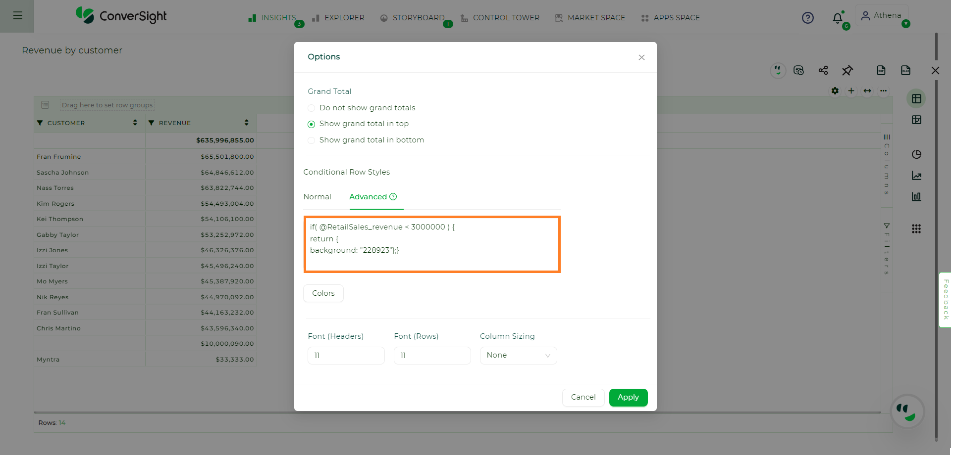
Code#
Click on the Colors button to find the hexadecimal values of the colors.
Colors#
Additionally, you have the option to adjust the size of the header font, row font and even modify the column sizing. Once you have made the desired changes, click on Apply to see the modifications take effect.
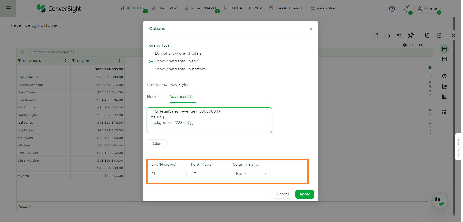
Apply Changes#
Changes Applied#
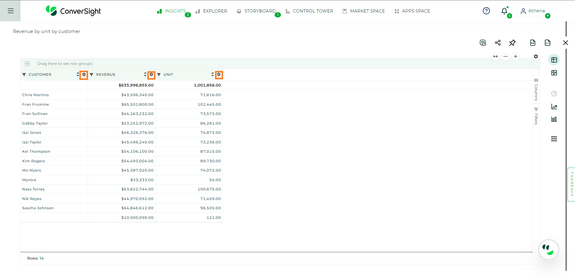
Column Wise Settings in CS Table#
Users are granted the flexibility to customize table settings on a column-wise basis, with each column having its own individual Settings icons. The settings displayed depend on the category of the columns, namely Metric, Dimension, Date and Flag.
Column Wise Settings#
Common settings present in all column-wise settings include:
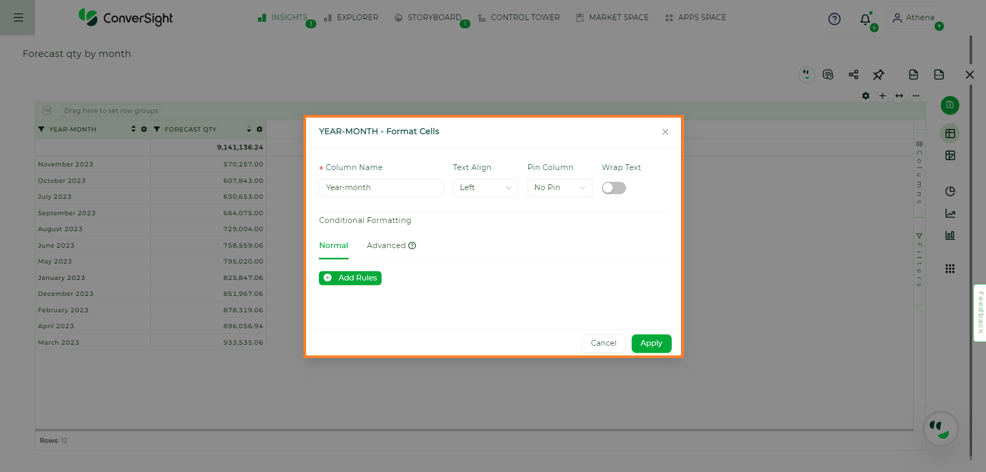
Column Name: This allows users to specify personalized names for each column, making data interpretation easier and more meaningful.
Text Align: Users can easily align the text within the column either to the left, right or center ensuring a polished and organized presentation of data.
Pin Column: This feature enables users to pin the column to either the left or right side of the table. By doing so, important columns remain visible even when scrolling through the table.
Wrap Text: Enabling this option automatically adjusts the width of cells to fit the content, ensuring that all data remains visible within the table cells.
Add Rules: Users can customize the appearance of the column based on specific conditions. This includes the ability to set different text and background colors, providing a dynamic representation of data based on predefined rules.
Common Column Wise Settings#
For Metric columns, there are additional options available:
Symbol: This feature allows users to add preferred symbols to represent data more precisely, providing additional context to the numbers.
Decimal: Users can define the number of decimal places for numeric values, ensuring accurate and concise data presentation.
Grand Total: Users have the choice to display or hide the grand total of the selected column, depending on their reporting needs.
Aggregation Options: Users have the flexibility to control the data displayed in the Metric column through various aggregation methods, such as sum, average or maximum value. This allows for deeper analysis and comparison of data within the column.
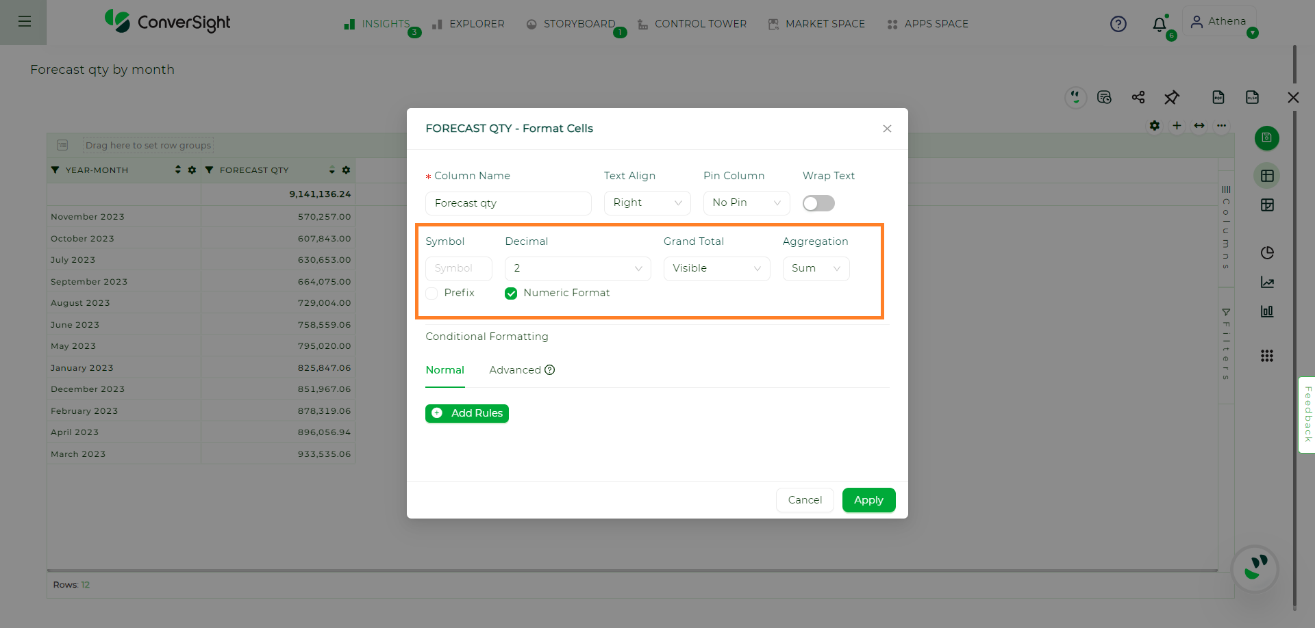
Metric Settings#
With these customizable settings, users can tailor the appearance and behavior of their data tables to best suit their analytical needs and presentation preferences.
NOTE
The settings at the Column Wise hold a higher priority than the global CS Table settings.
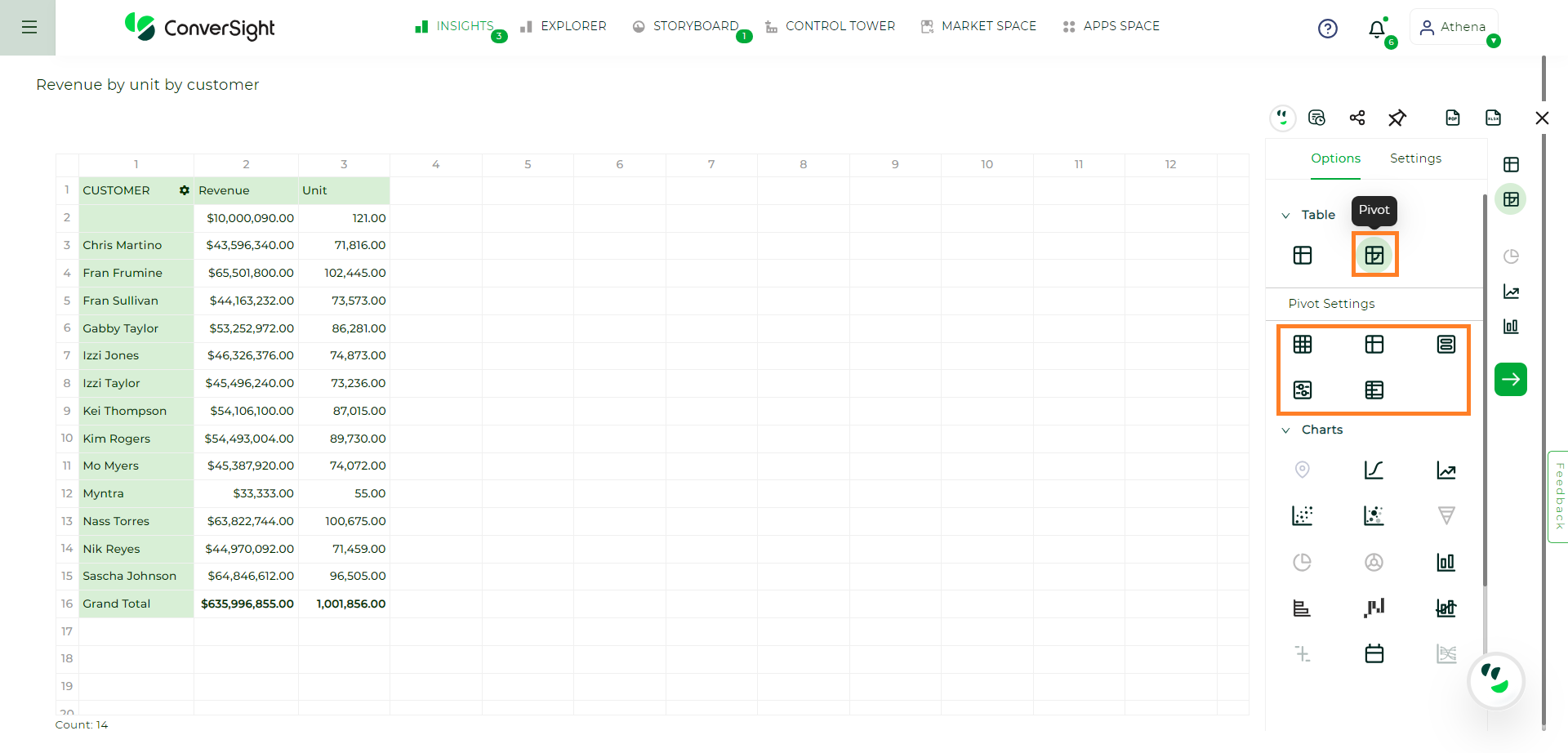
Pivot Table#
Pivot tables enable you to explore an alternate visualization of your data in a wide, customizable table. They allow you to visualize some of your data horizontally and some data vertically in the same table.
Pivot Table#
There is an option called pivot setting. This pivot setting provides you access to format cells, to do conditional formatting, arranging fields and more layout options.
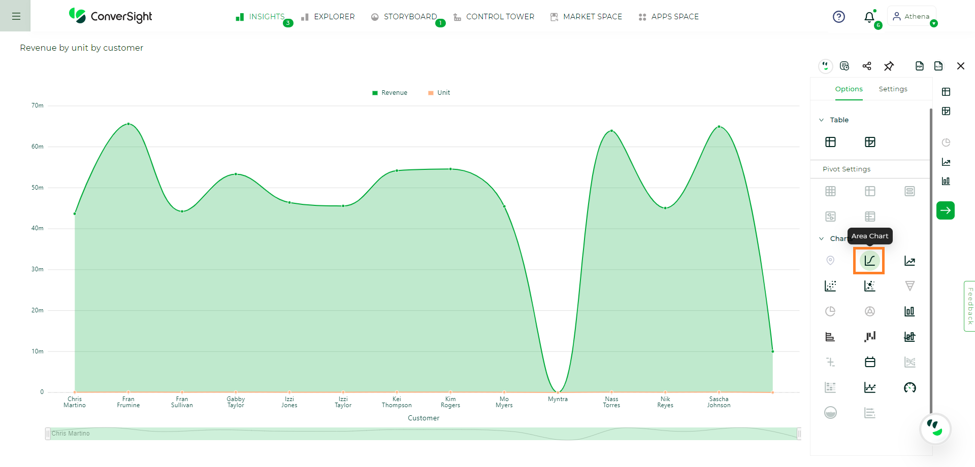
Area Charts#
The area chart is based on the line chart but has filled in regions.
Area charts display quantitative data graphically. The area between the x-axis and the line is colored in to help you compare different portions of the chart.
Area Chart#
Your search needs at least one attribute and one measure to be represented as an area chart.
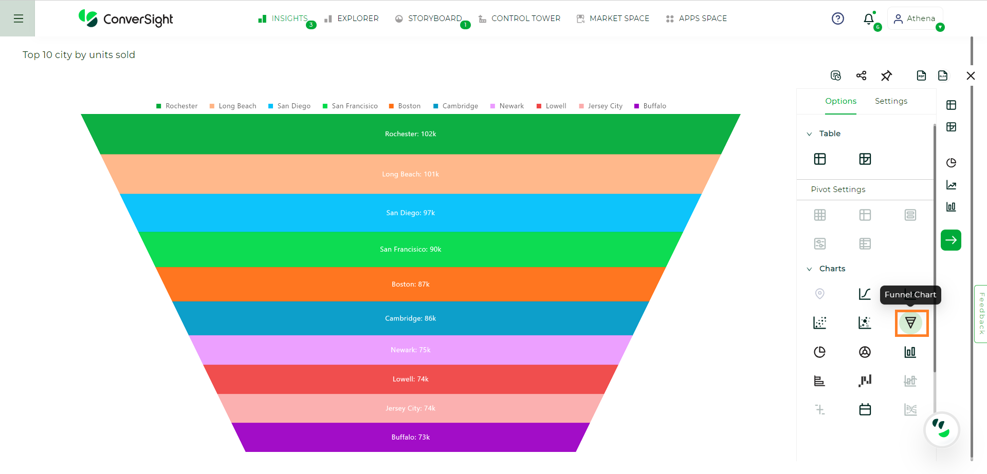
Funnel Charts#
The funnel chart shows a process with progressively decreasing proportions amounting to 100 percent in total.
A funnel chart is descending and is often used to represent stages in a sales process. You can visualize the progression of data as it passes from one phase to another. Data in each of these phases are represented as different proportions.
Funnel Chart#
Your search needs at least one attribute and one measure to be represented as a column chart. The attribute must contain 50 or fewer values.
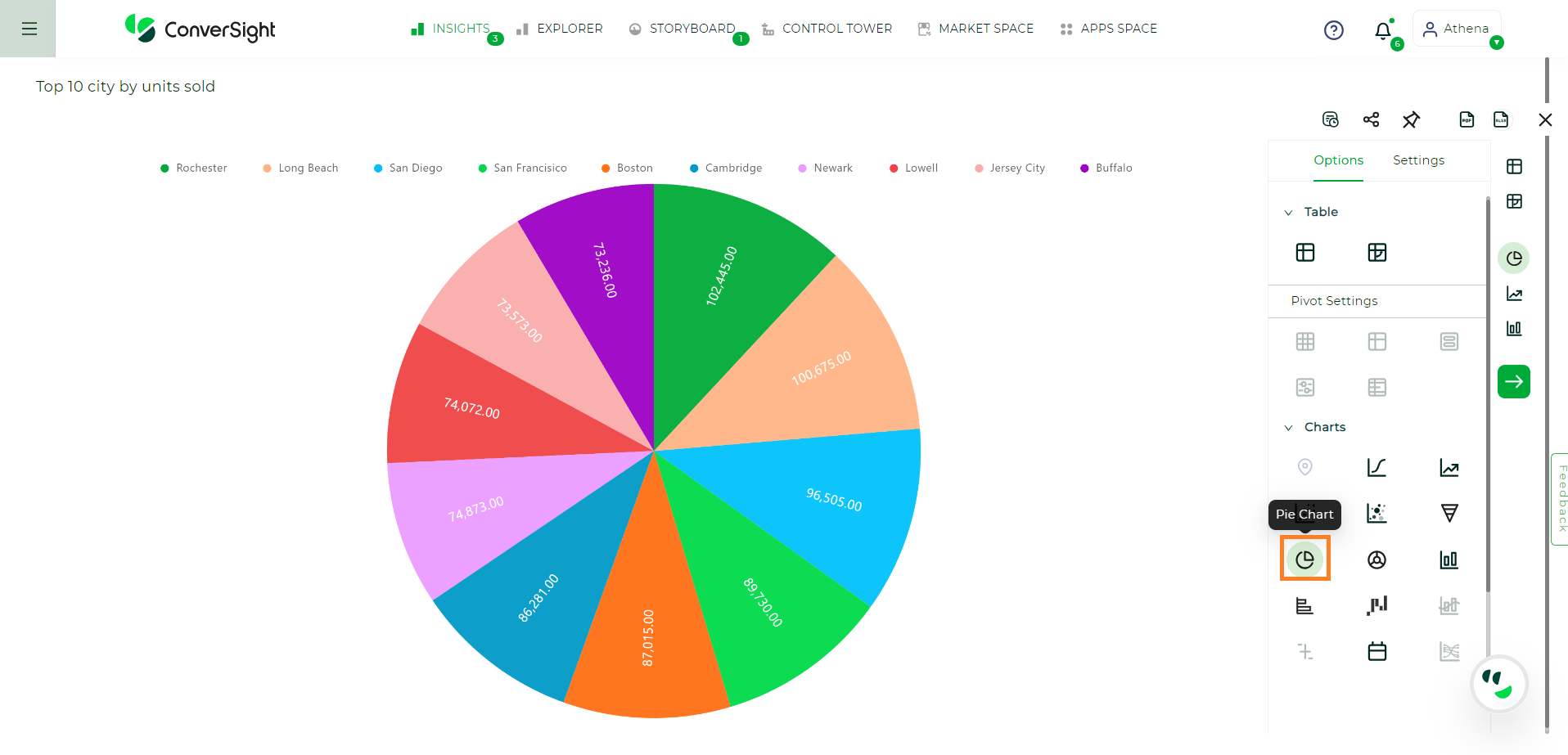
Pie Charts#
A Pie chart is a type of data visualization used to display data in a circular format, resembling a Pie that’s been divided into slices. Each slice represents a portion of the whole data set and the size of each slice corresponds to the proportion or percentage of that portion relative to the whole.
Pie charts are most commonly used to show the distribution of categorical data where the data points are divided into discrete categories. Each category is represented by a slice and the entire Pie chart represents 100% of the data.
Pie Chart#
The following are the specific settings available for the Pie Chart:
Label
Content Type: This option allows you to select the content type, which encompasses percentage and value representation.
Font Size: You have the flexibility to adjust the font size of content as per your preference.
Legend
Layout: You have the convenience of configuring the legend layout to be either horizontal or vertical, based on your preference. This allows you to arrange the legend in a way that best suits your needs and enhances the chart’s visual clarity.
Position: You can fix the position of the legend to ensure its optimal visibility and ease of use.
Flip Page: The flip page toggle option permits you to determine whether the paging should be applied to the legend when there is too many items.
Max Row: The max rows setting in the controls the number of rows displayed for legend items during paging, with the default value being 1.
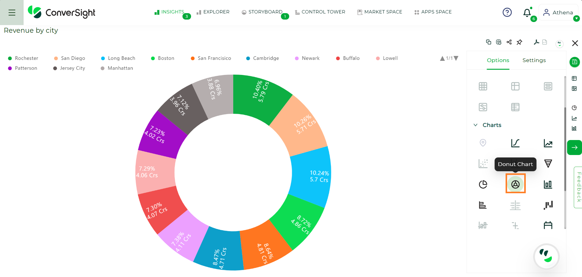
Donut Charts#
Donut chart is like a pie chart. The Donut chart is a new chart type that displays your search in a circle or ring-shaped. The default Donut chart in ConverSight displays data in the shape of a thick ring.
Donut Chart#
The following are the specific settings available for the Donut Chart:
Label
Content Type: This option allows you to select the content type, which encompasses percentage and value representation.
Font Size: You have the flexibility to adjust the font size of content as per your preference.
Legend
Layout: You have the convenience of configuring the legend layout to be either horizontal or vertical, based on your preference. This allows you to arrange the legend in a way that best suits your needs and enhances the chart’s visual clarity.
Position: You can fix the position of the legend to ensure its optimal visibility and ease of use.
Flip Page: The flip page toggle option permits you to determine whether the paging should be applied to the legend when there is too many items.
Max Row: The max rows setting in the controls the number of rows displayed for legend items during paging, with the default value being 1.
Column Charts#
A column chart is the most versatile chart type. The column chart is one of ConverSight simplest, most versatile chart types. More often than not, the column chart is your default chart type. Column charts are vertical bar charts that display your data using rectangular bars. The length of the bar is proportional to the data value.
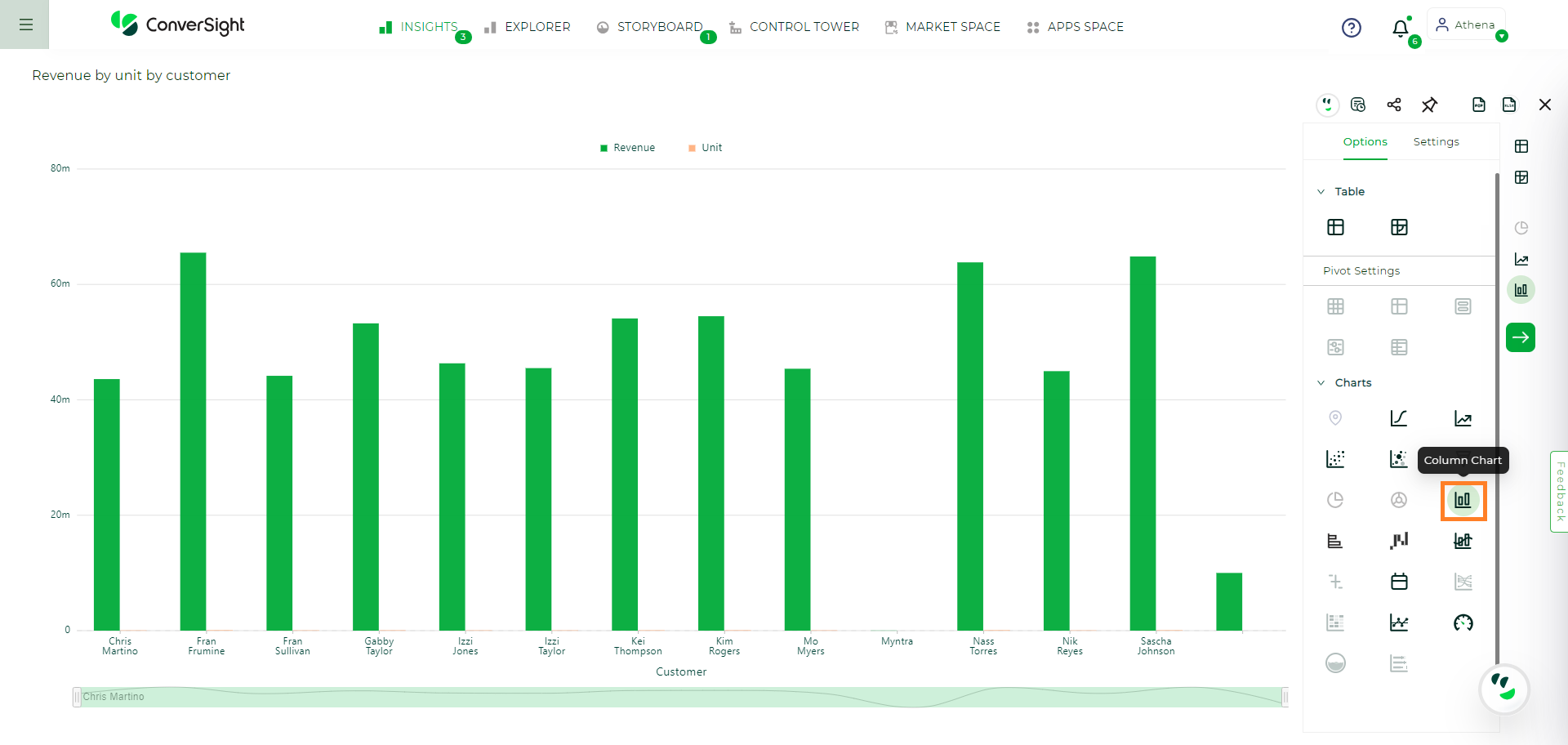
Column Chart#
Your search needs at least one attribute and one measure to be represented as a column chart.
Bar Charts#
The bar chart is very similar to the column chart. The only difference is that it is oriented horizontally, instead of vertically.
Bar charts display your data using horizontal rectangular bars and the length of the bar is proportional to the data value.
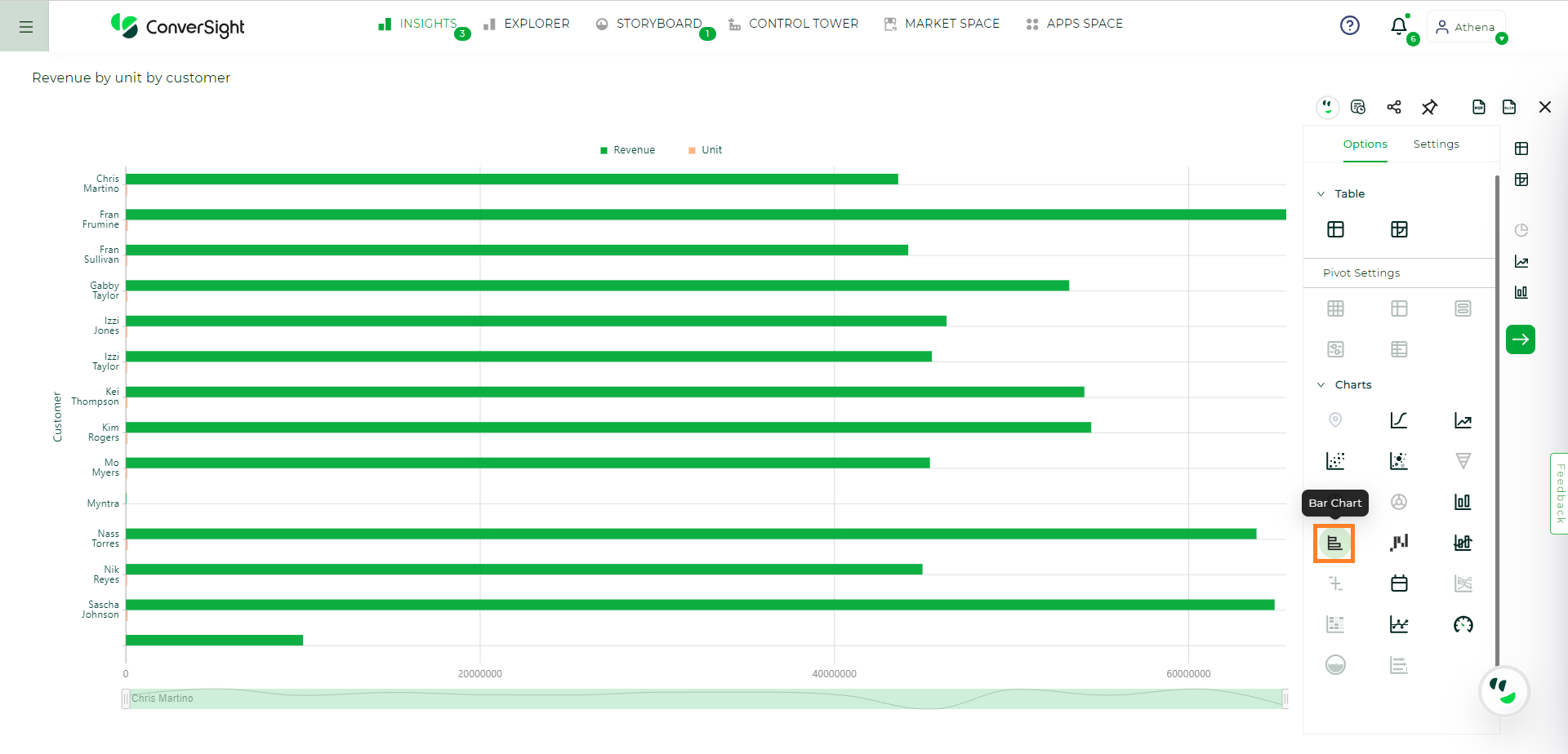
Bar Chart#
Your search needs at least one attribute and one measure to be represented as a bar chart.
Line Charts#
Line charts are good at showing trends over intervals of time.
Like the column chart, the line chart is one of ConverSight’s simplest, most versatile chart type. More often than not the line chart will be chosen as your default chart type.
Line charts display your data as a series of data points connected by straight line segments. The measurement points are ordered by the x-axis value.
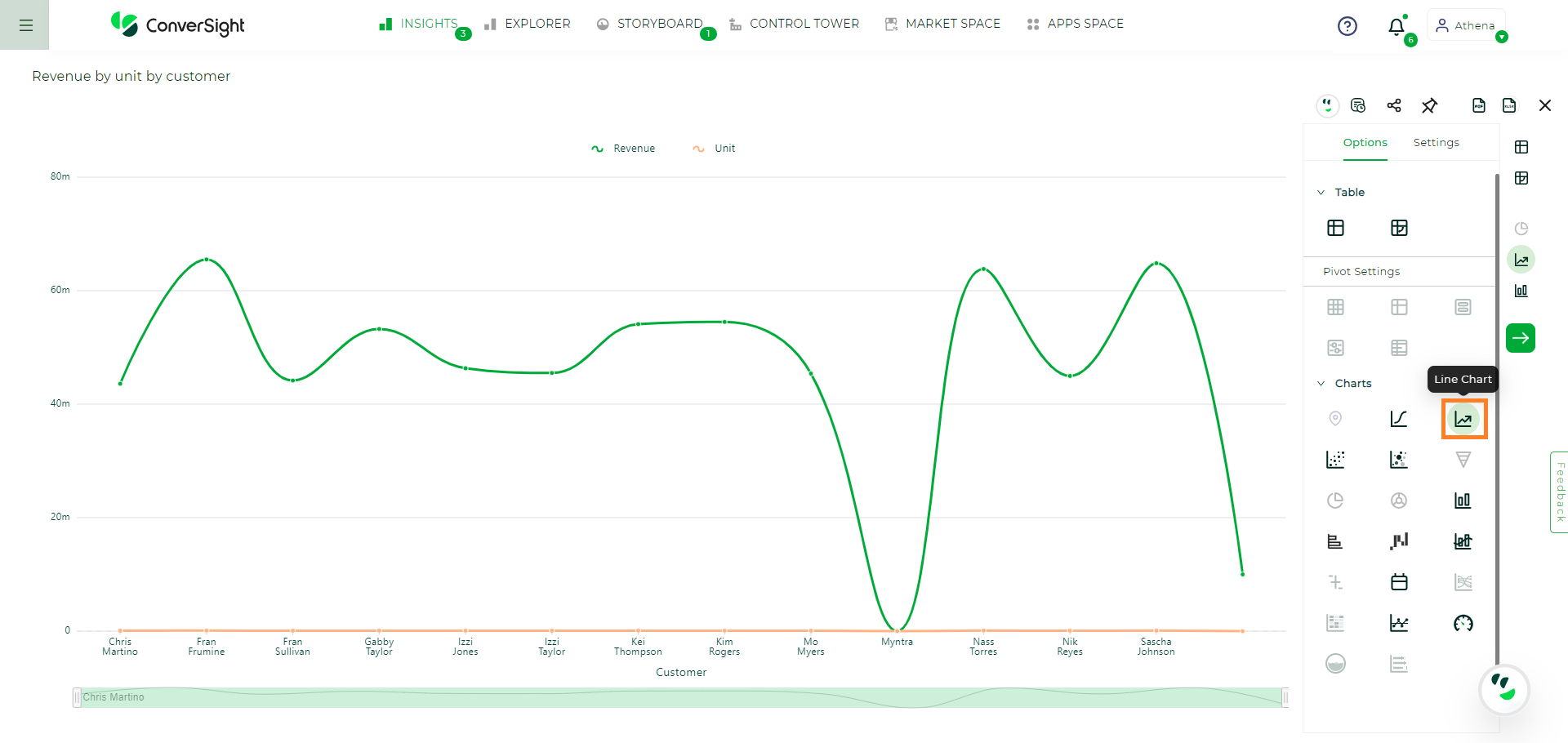
Line Chart#
Your search needs at least one attribute and one measure to be represented as a line chart.
Waterfall Charts#
The waterfall chart shows how an initial value is affected by a series of intermediate positive or negative values.
Waterfall charts are good for visualizing positive and negative growth and therefore work well with the growth over time keyword. The columns are color-coded to distinguish between positive and negative values.
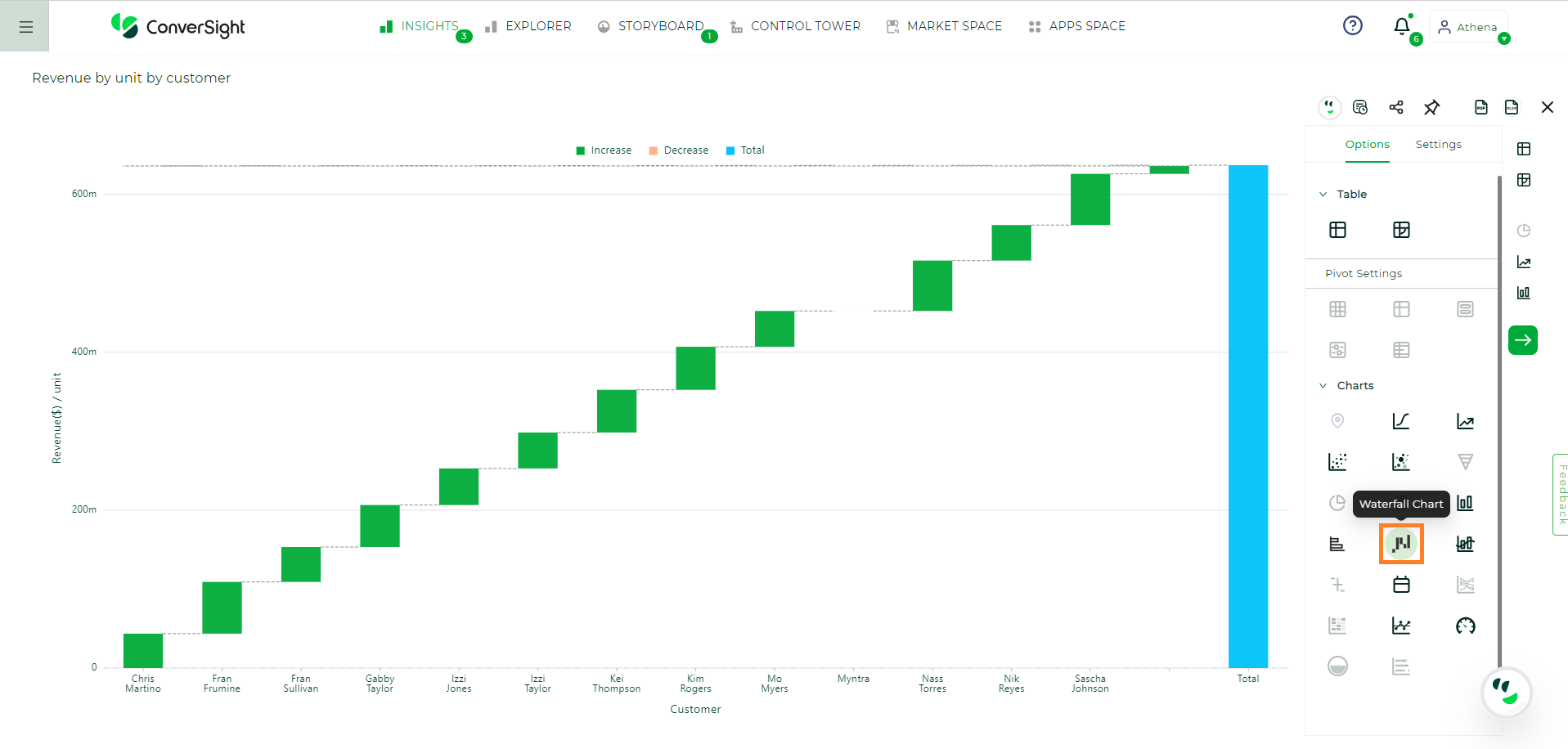
Waterfall Chart#
Your search needs at least one attribute and one measure to be represented as a waterfall chart.
Geo Charts#
A geo chart, short for geographic chart, is a type of visualization that displays data on a map or geographical representation. It provides a visual representation of data based on geographic regions such as countries, states, cities or any other location-based boundaries. The data is typically encoded using different colors, shading or markers to indicate variations or patterns across different geographical areas.
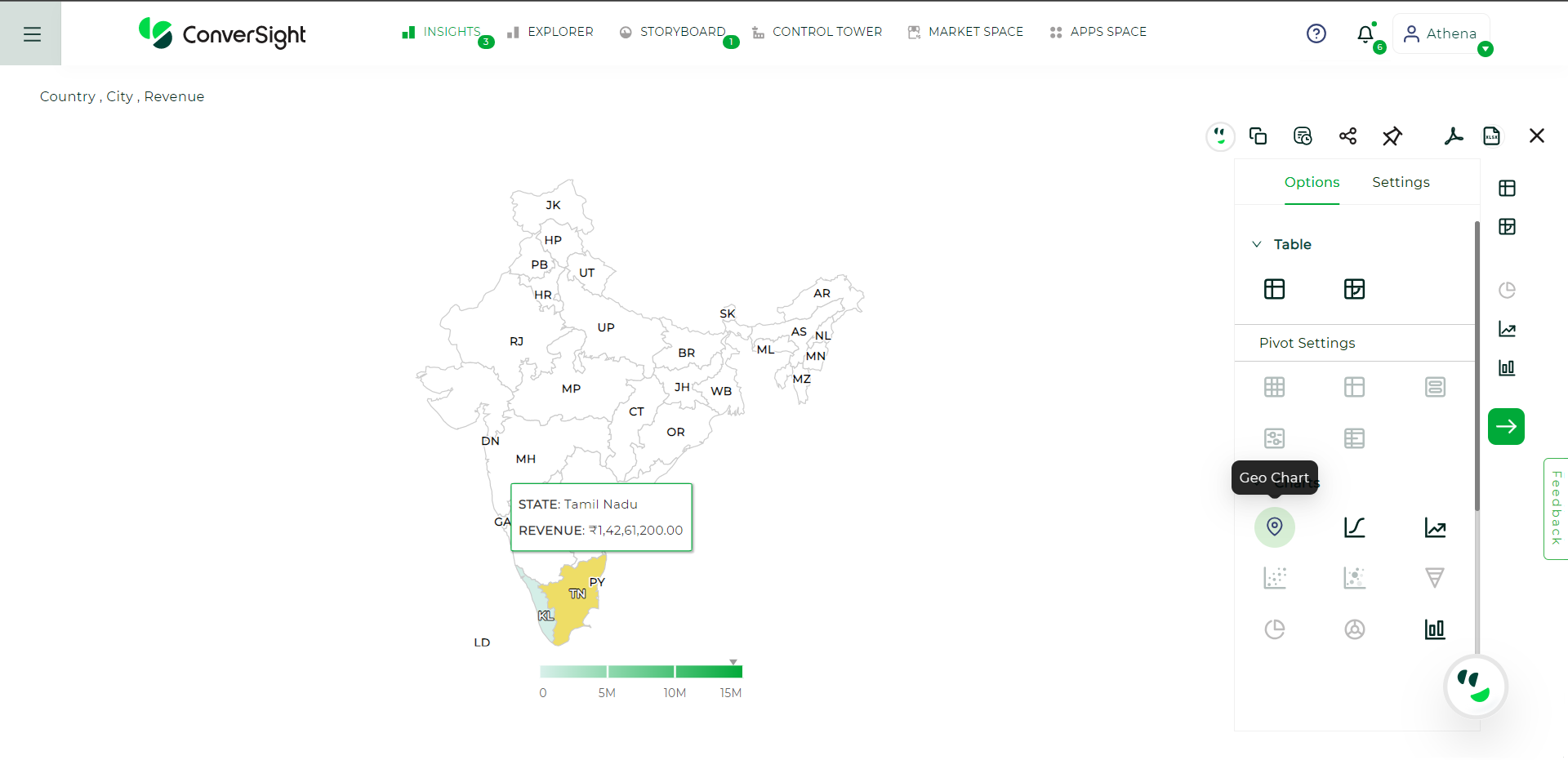
Geo Chart#
Users have the ability to choose the desired metric column for the geo chart. This can be accomplished by accessing the Settings menu, selecting the preferred metric column from the dropdown provided and then clicking Apply to save the changes.
It is mandatory to include a country attribute in your search. Additionally, the search may optionally include state, region or area attributes, along with a minimum of one measure value.
Combo Charts#
A combo chart is a type of chart that combines two or more different chart types into a single visual representation. It allows for the simultaneous display of multiple data series using different chart formats. We have combination of a line chart and a bar chart. This combination enables the visualization of diverse data sets and their relationships in a single chart, providing a comprehensive view of the data.
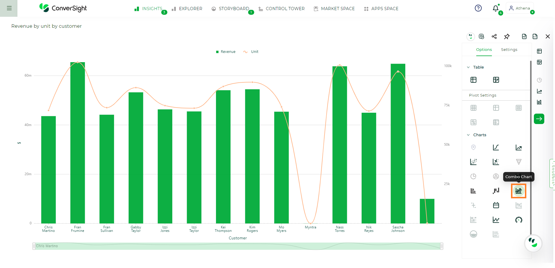
Combo Chart#
Your search must include two measures of different units/category and a attribute to be represented as combo chart.
Gauge Charts#
Gauge chart resembles a speedometer or dial, with a needle indicating a specific value relative to the pivot point. The dial typically incorporates various colors to segment the scale into multiple sections, facilitating a clear comprehension of the presented information.
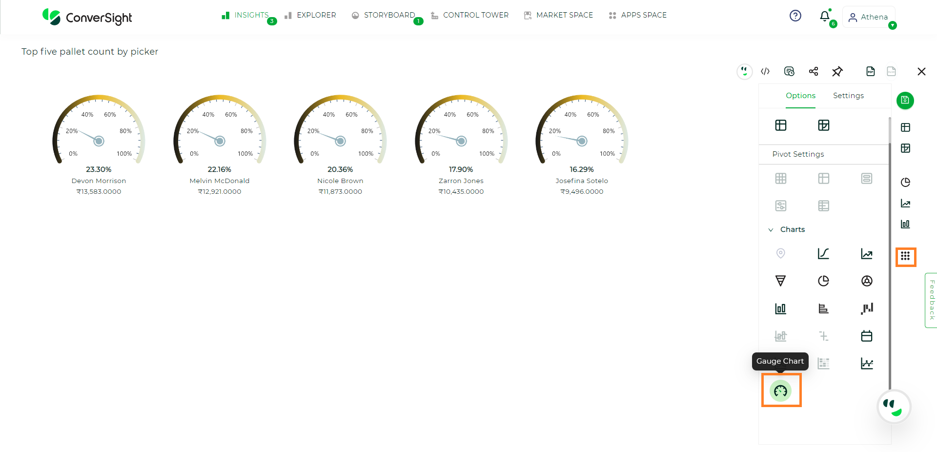
Gauge Chart#
Your search need one attribute and one measure or one attribute and two measure or one date and one measure or one date and two measure. The gauge chart will be available if any of the above conditions are met and the data count must be 30 or fewer.
Heat Map#
A heat map chart is a graphical representation of data using colors and the colors in the chart range from low to high values, with each color corresponding to a specific range of values. Heat maps are commonly used in data analysis to identify patterns and trends in large datasets and to visually highlight areas of interest or concern.
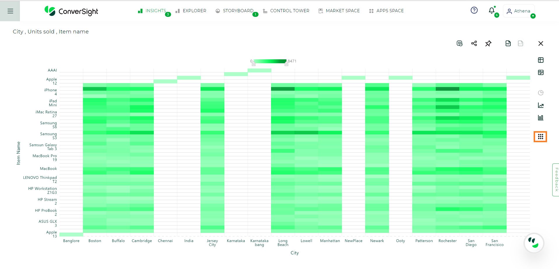
Heat Map Chart#
Your search needs two attribute and one measure or two date and one measure or one attribute, one date and one measure which may to be represented as Heat Map Chart.
XmR Charts#
The XmR chart consists of two charts: the X chart and the mR chart. The X chart is used to plot the average value of a variable being measured, while the mR chart is used to plot the range of the same variable. The X chart helps to detect shifts or changes in the mean value of the process, while the mR chart helps to detect changes in the variability of the process.
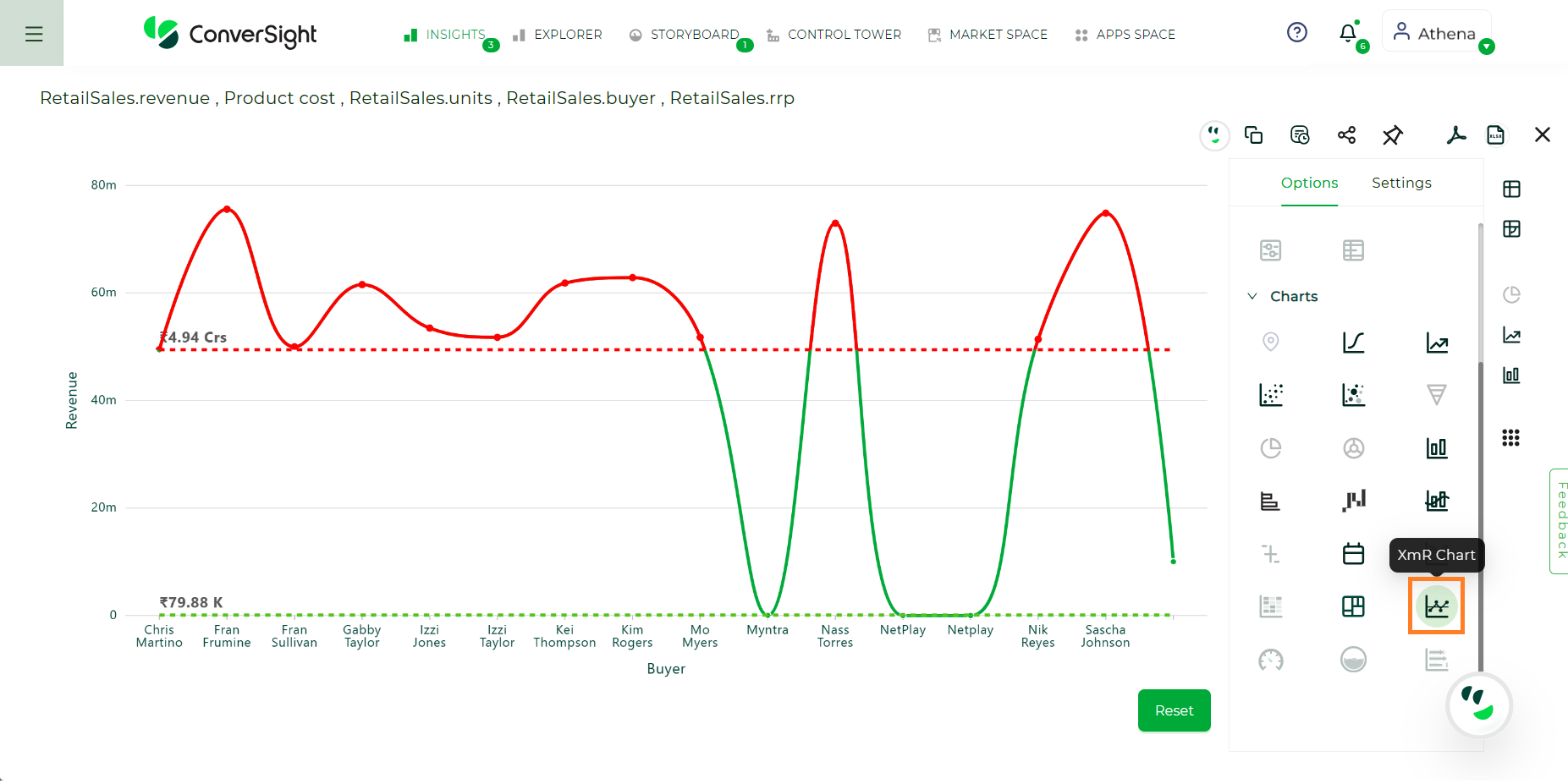
XmR Chart#
Your search needs one attribute and three measure which should be mostly of quantity and currency data type to be represented as XmR chart.
Sankey Charts#
A Sankey chart uses a series of flows or arrows of different widths to represent the relative magnitude of each variable. The width of each flow is proportional to the value or volume of the variable it represents.
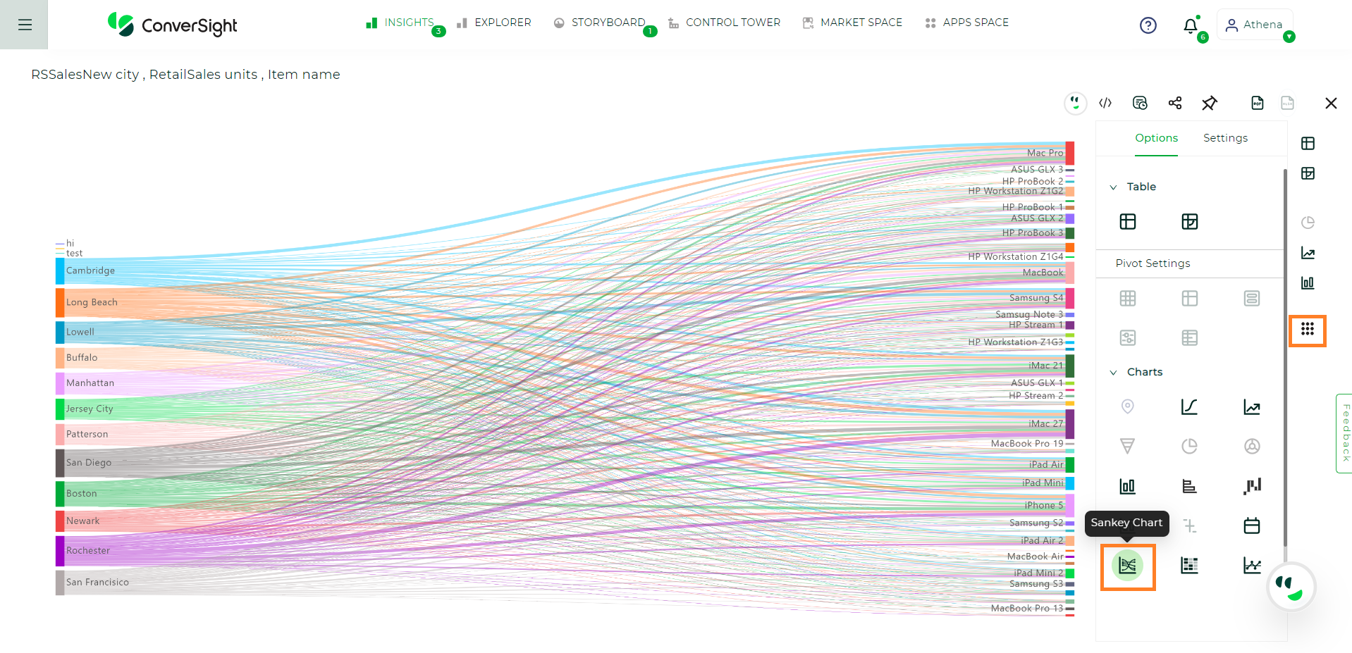
Sankey Chart#
Your search needs two attribute which may include date and one measure to be represented as Sankey Chart.
Bullet Charts#
A bullet chart is a data visualization tool that is designed to provide a clear and concise representation of a single data point or a set of data points, typically used to compare a primary measure against one or more target values or comparative measures.
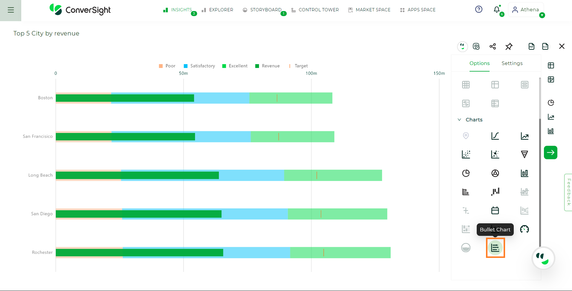
Bullet Chart#
Your search needs at least one attribute and one measure to be represented as a bullet chart.
Scatter Chart#
A scatter chart is used to visualize the relationship between two sets of data points, displaying them as individual dots on a two-dimensional plane. It’s helpful for identifying patterns, trends and correlations between variables, making it a valuable tool in data analysis and research.
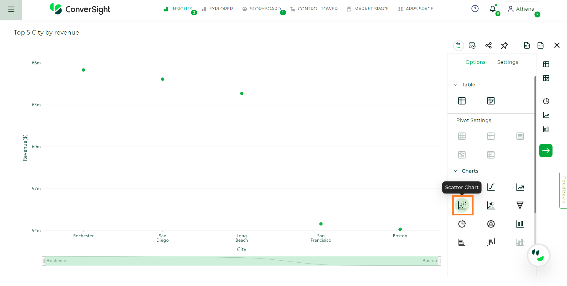
Scatter Chart#
Your search needs at least one attribute and one measure to be represented as a scatter chart.
Bubble Chart#
A bubble chart is a data visualization tool that extends the concept of a standard scatter chart by adding a third dimension, typically represented by the size of the data points (bubbles). It’s used to display and compare three variables within a single chart.
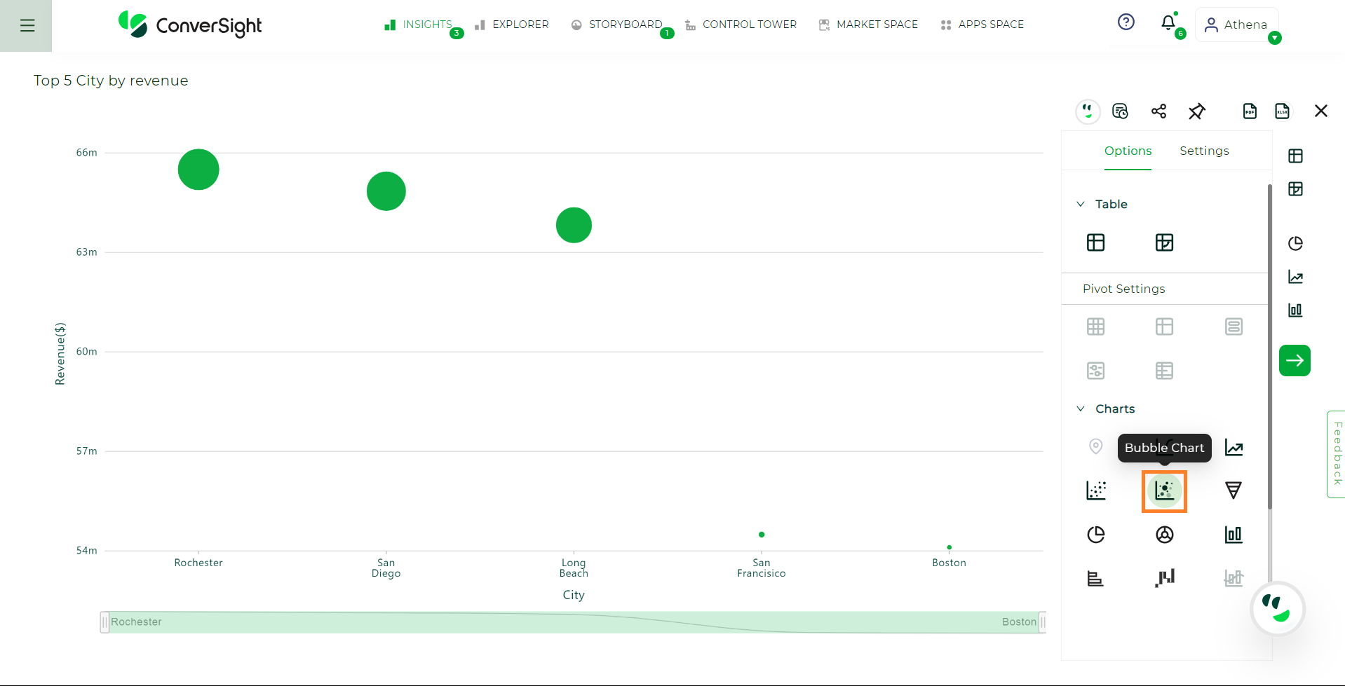
Bubble Chart#
Your search needs at least one attribute and one measure to be represented as a bubble chart.
Liquid Chart#
A liquid chart serves as a visual tool for tracking the advancement of a metric in relation to a set target or objective. It uses a dynamic, fluid-like representation to convey progress.
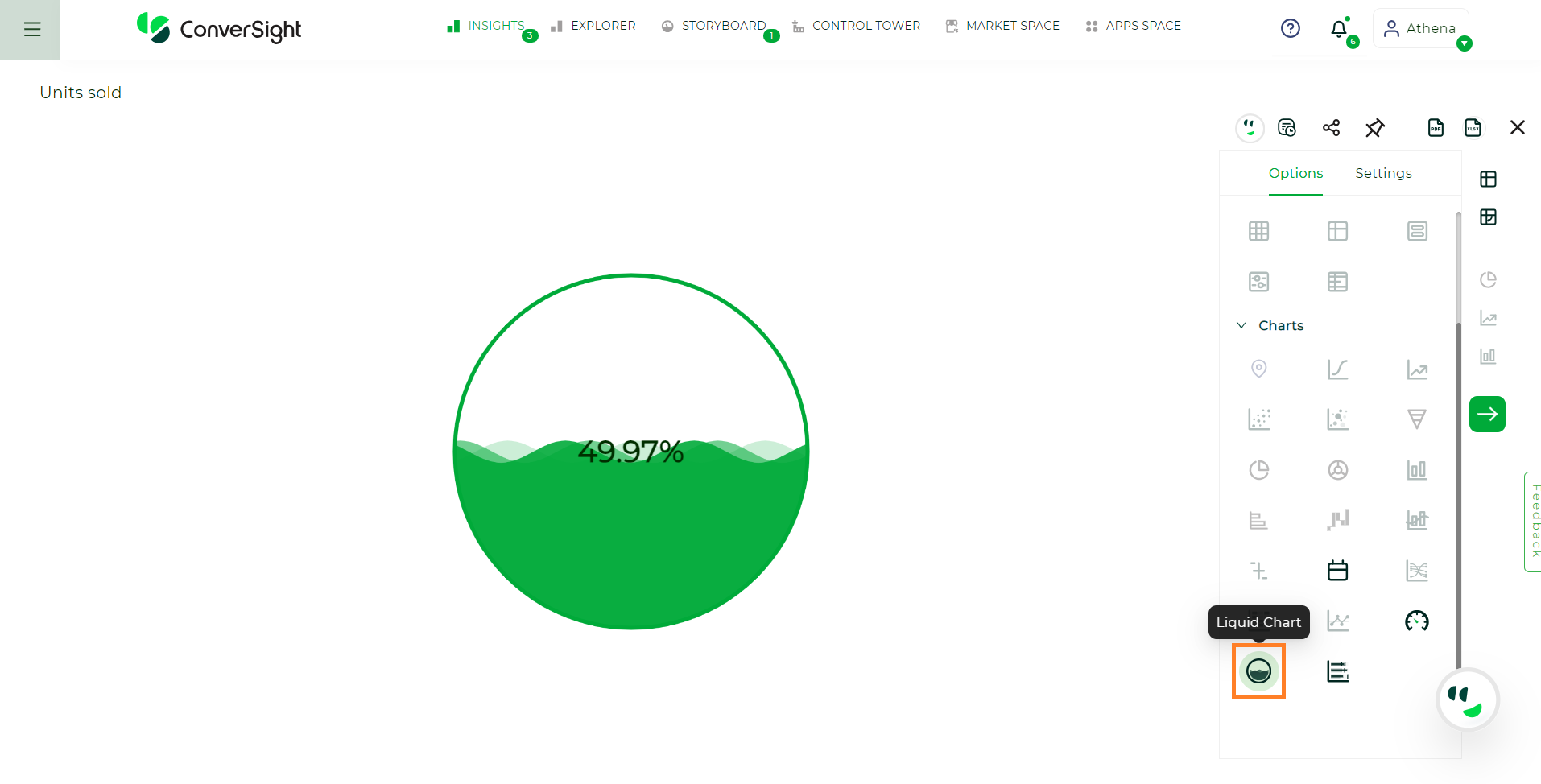
Liquid Chart#
To create a liquid chart, ensure your search includes both a measure and a target value. You can then set the target within the global configurations.
Calendar Chart#
A calendar chart is a specialized data visualization that represents data over a calendar-like grid. Each cell of the grid corresponds to a date, typically arranged in a monthly or yearly format.
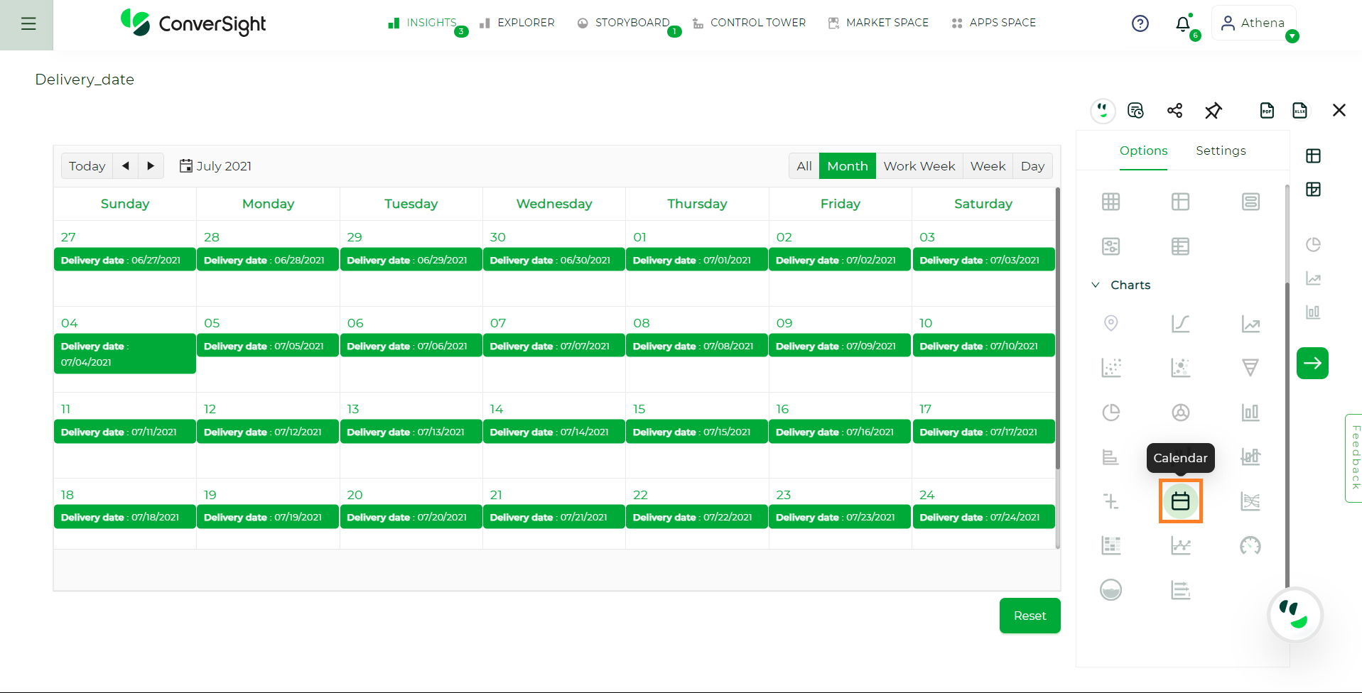
Calendar Chart#
Your search needs at least one date attribute to be represented as a calendar chart.
Treemap Chart#
A Treemap serves as a visual representation technique for hierarchical data, portraying hierarchical structures through nested rectangles. Colored rectangles represent each level or branch within the hierarchy and within these rectangles, smaller nested rectangles depict the sub-branches.
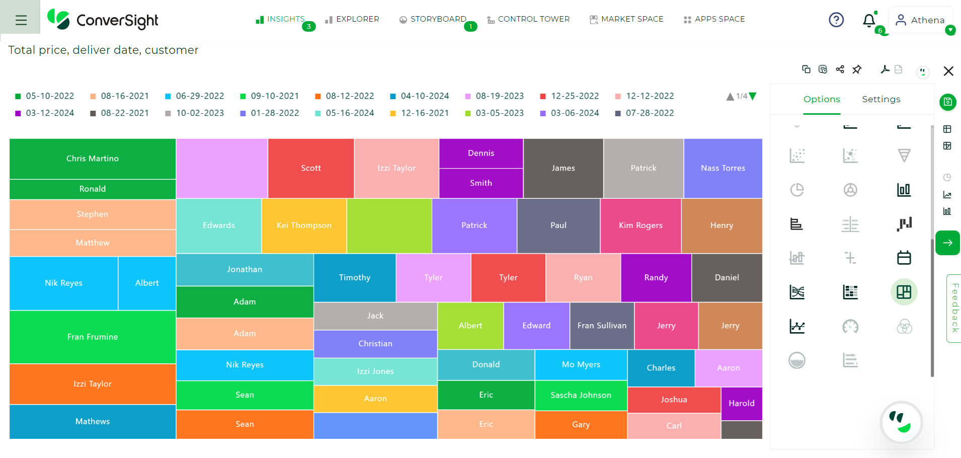
Treemap Chart#
Your search requires at least one measure and at least one attribute or date.
The following setting is a specific setting of Treemap chart:
Metrics Column: The metric column enables you to choose from multiple metrics rather than being limited to just one. It allows you to select and display the specific metric that is most relevant to your analysis or visualization, providing flexibility and customization.
Venn Chart#
A Venn chart is a graphical tool used to visually depict the relationships between different mathematical or logical sets. These sets are typically represented by circles or closed curves positioned within enclosing regions of different categories. The intersections of these circles highlights that the columns of different sets coincide. This method of representation allows for a clear visualization of how sets relate to each other, showing both their unique elements and their shared elements.
Venn Chart#
Terms |
Definition |
|---|---|
Total |
The complete value of a particular set’s metric column. |
Exclusive |
The value of a single set that does not have any shared elements with other sets. |
Total Percentage |
The percentage of the total metric value, calculated by dividing the set’s value by the total metric value. |
Exclusive Percentage |
The percentage of the exclusive value, calculated by dividing the exclusive value by the total metric value. |
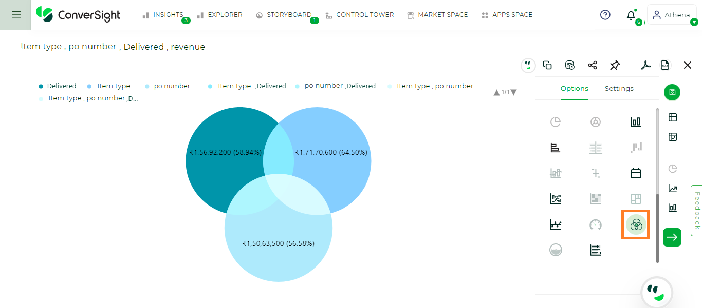
Your search requires at least one or more measures and two or three flag values.
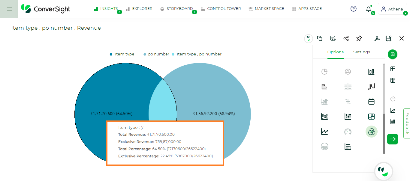
Scenario 1 – One or more measures with two flag values:
Let us consider, Item type as Set – A and po number as Set – B. When hovering over Set A, the total value represents the complete value of Set A, including all elements and the exclusive value includes only the elements that are unique to Set A and not shared with any other sets. The same principle applies for set B also.
Scenario 1 - Set A#
By hovering, the central intersection of the two sets displays values shared by both, where the total and exclusive values will be the same because the intersection only contains elements that are shared by both the sets, with no exclusive elements included.
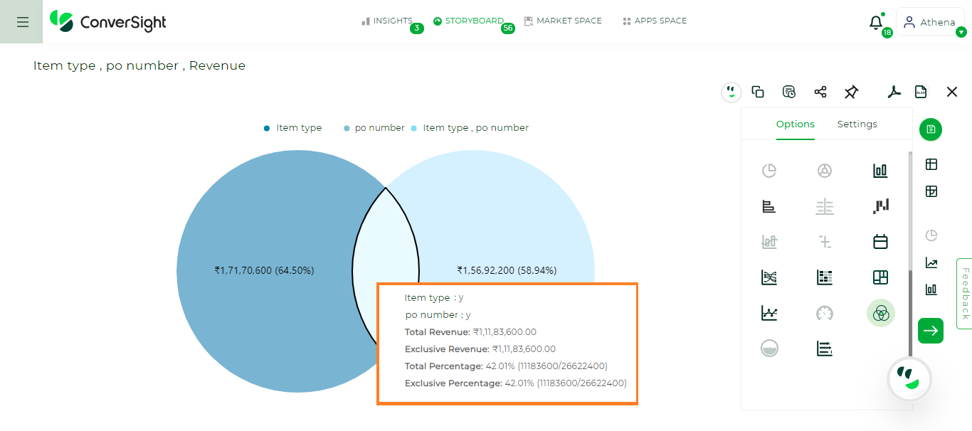
Scenario 1 - Intersection A and B#
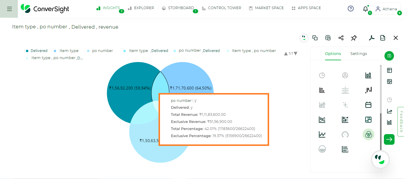
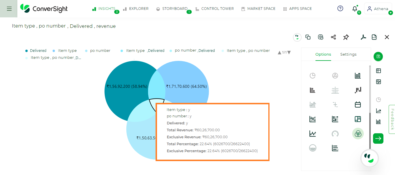
Scenario 2 – One or more measures and three flag values
Let us consider, Delivered as Set A, po number as Set B and Item type as Set C. When hovering over Set A, the total value represents the complete value of Set A, including all elements and the exclusive value includes only the elements that are unique to Set A and not shared with any other sets. The same principle applies for set B and Set C.
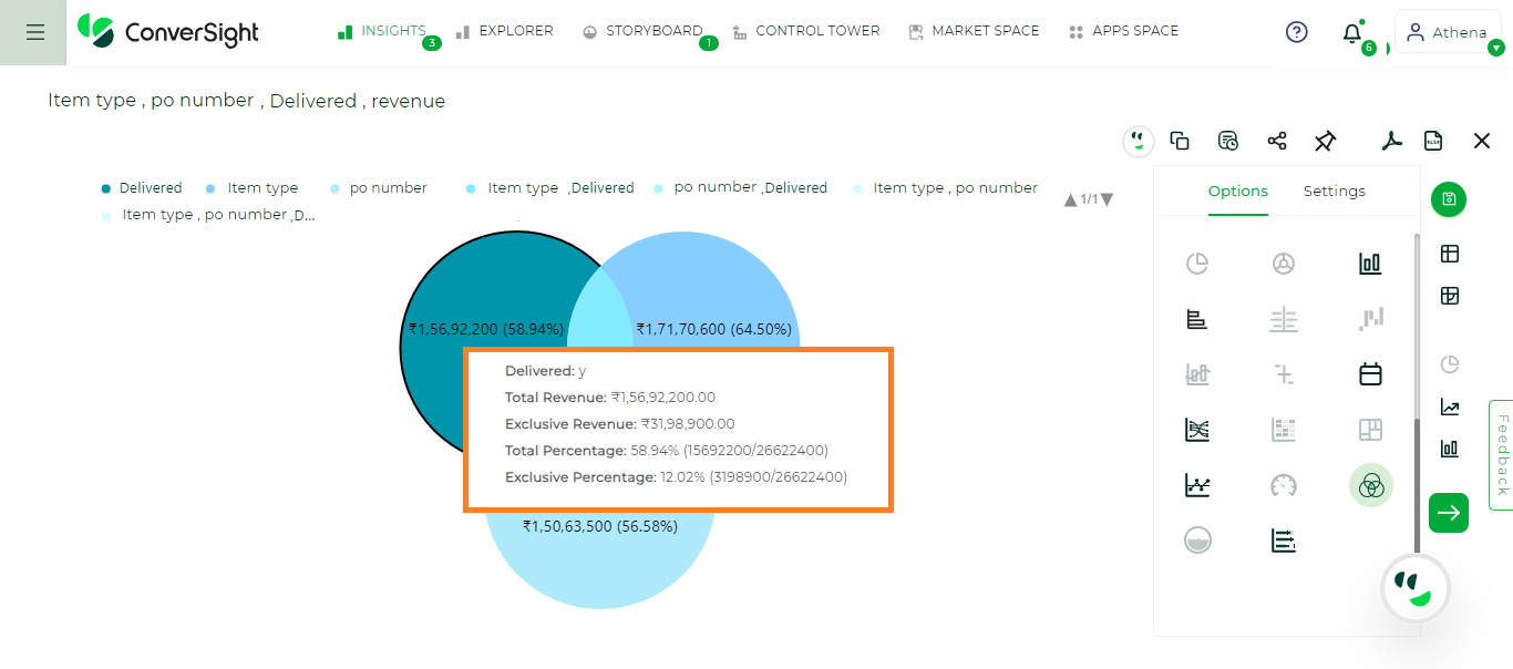
Scenario 2 - Set A#
When you hover over the intersection of Sets A and B, you’ll find both total and exclusive values. The total value represents the intersection solely between Sets A and B. The exclusive value indicates the unique elements within the intersection of Sets A and B, excluding those from Set C. The same principle applies to intersection of Sets B and C and Sets A and C.
Scenario 2 - Intersection A and B#
Hovering over the central intersection of Sets A, B and C displays values where the total and the exclusive values are same. This is because this intersection contains only elements shared by all three sets, without including any exclusive elements.
Scenario 2 - Intersection A, B and C#
NOTE
To generate a Venn Chart, in the Train Athena, make sure to adjust both the Category and Type columns to Flag. Additionally, ensure that the Unit values are aligned to those in your dataset.
The following setting is a specific setting of Venn chart:
Blend Mode: You can choose how intersecting parts are displayed, with options to determine the visual presentation of overlapping elements. This allows you to select the most appropriate method for visualizing intersections between elements.
Bidirectional Chart#
A bidirectional chart is a graphical representation that displays the data in both directions, typically horizontally and vertically. It often consists of two axes, each representing a different category. Data points are plotted along each axis to show how variables or categories relate to each other in both directions. This type of chart can be useful for visualizing comparisons, correlations or interactions between two sets of data.
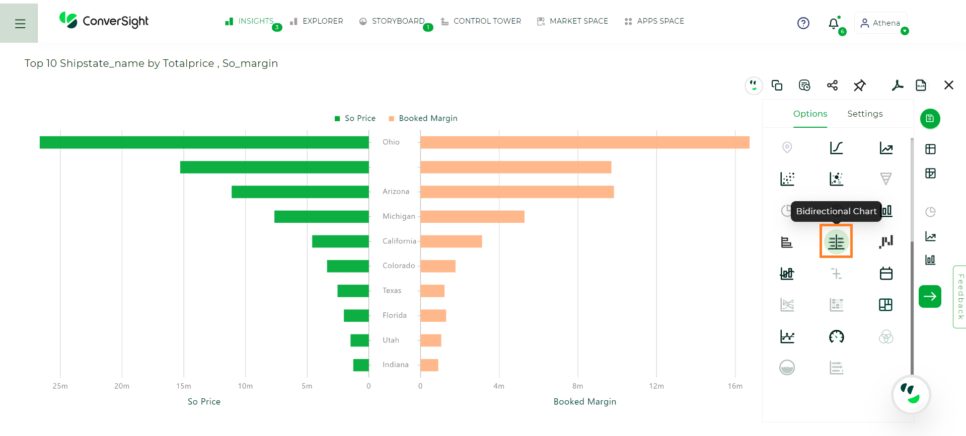
Bidirectional Chart#
Your search requires at least two measures and at least one attribute or a date.
The following setting is specific for Bidirectional chart:
Layout: You have the option to choose between two layout orientations - Horizontal and Vertical. Users can configure the chart to display data in either a horizontal arrangement, where data points are plotted along a horizontal axis or a vertical arrangement, where data points are plotted along a vertical axis. This flexibility allows users to tailor the chart’s appearance to best suit their data visualization needs and preferences.
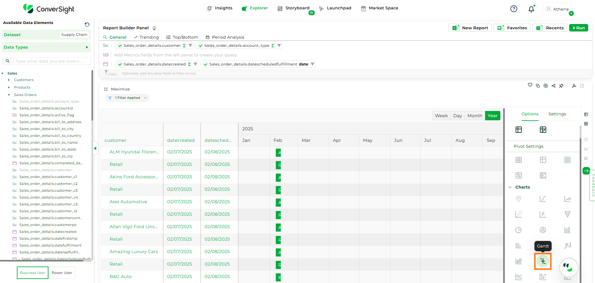
Gantt Chart#
A Gantt chart is a timeline-based visualization used to represent tasks, activities, or events across a time period. It displays start and end dates for each item, enabling users to track durations, overlaps, dependencies, and progress over time. This visualization is commonly used to understand schedules, timelines, and process flows, helping identify bottlenecks, delays, and concurrent activities. The chart plots date fields on the horizontal axis and categorical dimensions on the vertical axis, with each bar representing the time span of a specific item or activity.
There are two scenarios in which you can generate the Gantt chart based on the selected fields.
Scenario 1 – One or more measures with two date fields and one dimension:
In this scenario, Customer is selected as the dimension, Last Unit Price is selected as the measure, and Date Created and Date Scheduled Fulfillment are selected as the two date fields.
The Gantt chart displays a timeline for each customer, where each bar represents the duration between the created date and the scheduled fulfillment date. The selected measure is used to aggregate or represent the value associated with each customer across the timeline, providing additional context to the duration displayed.
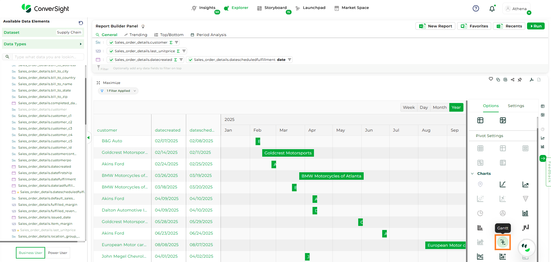
Bidirectional Chart Scenario 1#
Scenario 2 – Zero measures with two date fields and two dimensions:
In this scenario, Customer and Account Type are selected as the two dimensions, and Date Created and Date Scheduled Fulfillment are selected as the two date fields.
The Gantt chart displays timelines grouped by customer and account type, enabling analysis of order or process durations across multiple levels of classification. Each bar represents the duration between the created date and the scheduled fulfillment date without applying any measure-based aggregation.
Bidirectional Chart Scenario 2#
Global Configurations Settings#
Global configurations are a group of settings that have an impact on multiple charts simultaneously. Modifying these settings in one chart leads to corresponding changes in all other charts sharing those settings. This simplifies the process of managing and modifying settings across all your charts uniformly. Some of the common settings present in the global configurations are :
Label (X-Axis) and Label (Y-Axis): The X-axis and Y-axis labels will be displayed, allowing users to customize the label names according to their preferences.
X-Axis and Y-Axis: The columns in the X-axis and Y-axis can be adjusted using this field.
Sorting (X-axis): The X-axis sorting option enables you to arrange the values in the X-axis columns either ascending or descending order.
Min, Max and Range: These options enable you to define the minimum and maximum values of the chart, as well as the interval between each value. It is essential to provide the range value along with the minimum and maximum values.
Threshold Min and Threshold Max: This option enables you to define both the minimum and maximum threshold values for the chart.
Threshold Min Label and Threshold Max Label: With this option, you can label name for the minimum and maximum threshold.
Threshold Min Color and Threshold Max Color: You also have the flexibility to adjust the color of the minimum and maximum threshold.
Theme: By choosing a particular theme, you can change the overall visual style to match your preferences.
Show Label: The show label option refers to a setting that displays labels associated with data points on the chart.
Ignore Zero: The ignore zero option refers to a setting that excludes data points with a value of zero from being plotted or displayed on the chart.
Smooth: The smooth option refers to a visual enhancement that smooths out the jagged or sharp edges of the lines, creating a more visually appealing and continuous appearance.
Global Configurations streamline chart management by applying settings across multiple charts at once. Edit once, impact all – an efficient way to maintain uniformity and simplify adjustments.