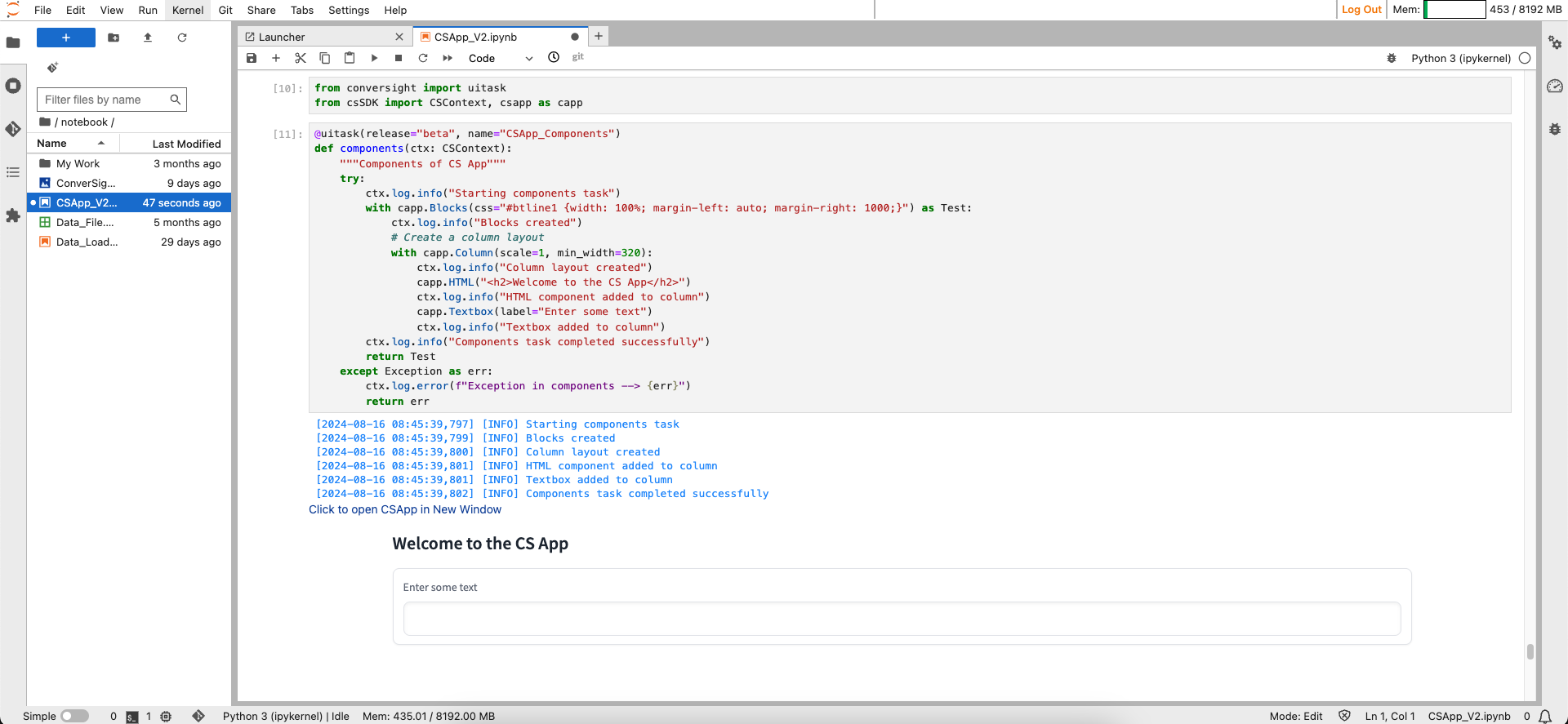
CS App Components#
The csapp features components like dropdowns, radio buttons, checkboxes, chatbots, toggle buttons and various other options that can be employed for crafting user interfaces. Tailoring and enhancing these components is accessible to the users, allowing them to create interfaces based on specific requirements.
Blocks#
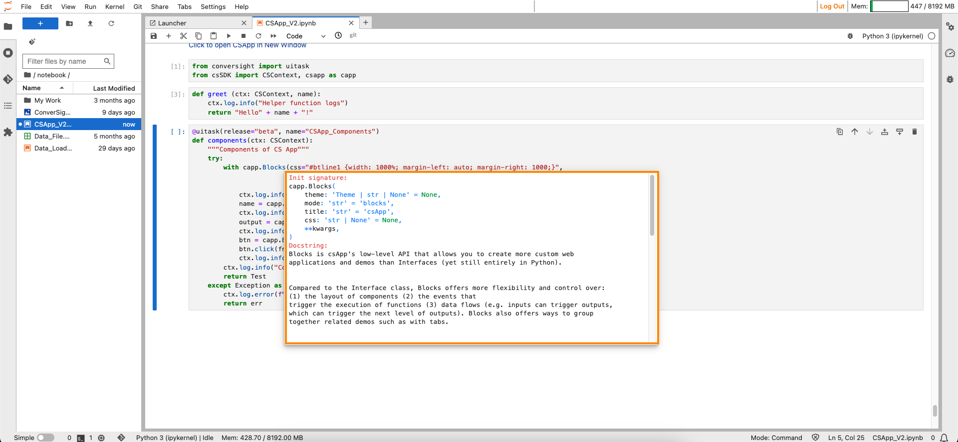
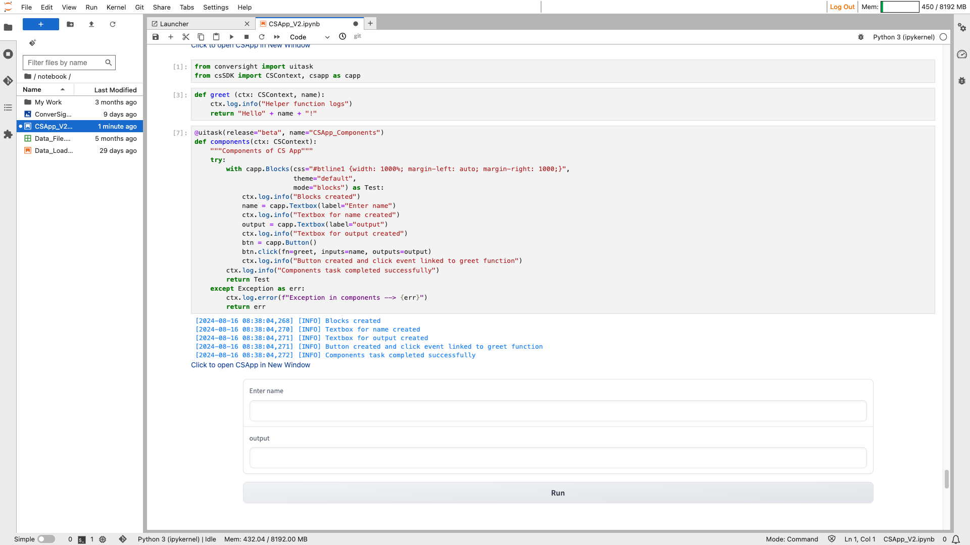
Blocks is a low-level API, that provides a great degree of customization for developing CS Apps. The enhanced flexibility is seen in how it controls component arrangement, triggers function execution based on events and manages data flow. This enables inputs to activate subsequent outputs, creating a cascading effect. To utilize Blocks, start by creating a Blocks object. Use the Block Objects as a context with the with statement. Define layouts, components or events within the Blocks context.
Syntax:
with csapp.Blocks():
Block#
Parameters of the Block component:
Parameter |
Type |
Default |
Description |
|---|---|---|---|
theme |
Theme | str | None |
None |
Theme object or string representing the theme. |
mode |
str |
“blocks” |
Human-friendly name for the type of Blocks or Interface being created. |
title |
str |
“Gradio” |
Title displayed in the browser tab. |
css |
str | None |
None |
Custom CSS string or path to a CSS file for the demo webpage. |
Sample :
Block#
NOTE
When you click on the Click to open CS App in new window link, the CS App will open in a new browser tab.
Layout Elements#
Layout elements in the CS App pertain to fundamental components responsible for organizing and presenting content systematically. They play a crucial role in structuring the arrangement of various elements within the application interface. Users have access to the row layout and the column layout. These layout configurations serve as foundational frameworks, enabling users to arrange and present information in a structured and visually appealing manner within the CS App interface.
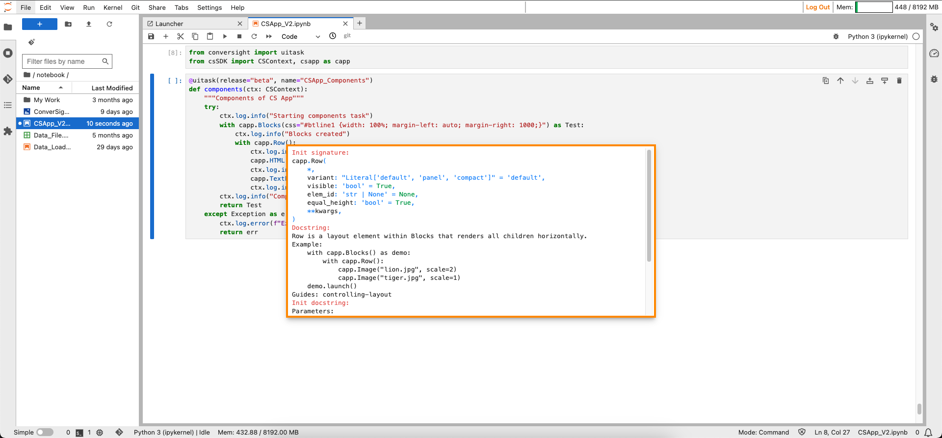
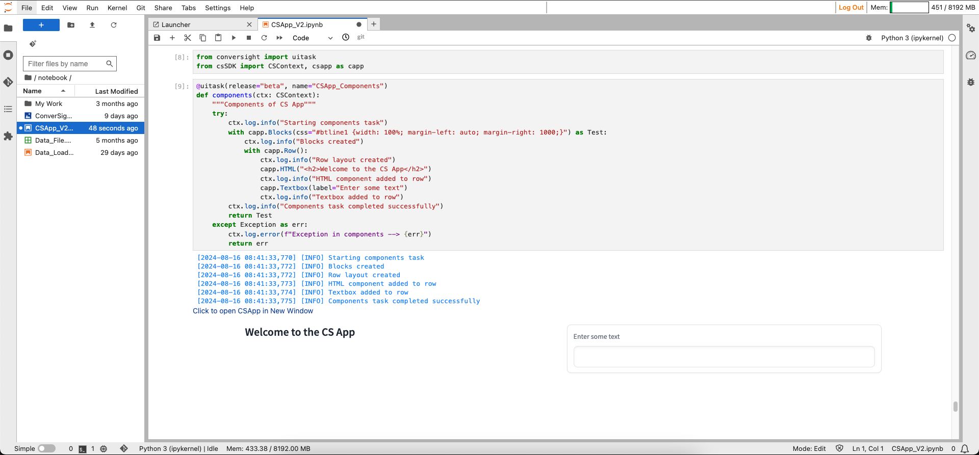
Row#
In Blocks, the Row layout element is instrumental in presenting components horizontally. It serves as a structural foundation, arranging and displaying various elements in a side-by-side manner along the horizontal axis. This functionality in Blocks enables the smooth alignment of components, facilitating their presentation from left to right or right to left, ensuring an optimized visual experience and improved accessibility for users navigating the interface
Syntax:
with csapp.Row():
Row#
Parameters of the Row component:
Parameter |
Type |
Default |
Description |
|---|---|---|---|
variant |
Literal[‘default’, ‘panel’, ‘compact’] |
“default” |
Row type: ‘default’ (no background), ‘panel’ (gray background, rounded corners), ‘compact’. |
visible |
bool |
True |
If False, row will be hidden. |
elem_id |
str | None |
None |
Optional ID for targeting CSS styles in the HTML DOM. |
equal_height |
bool |
True |
If True, makes every child element have equal height. |
Sample:
Row#
Column#
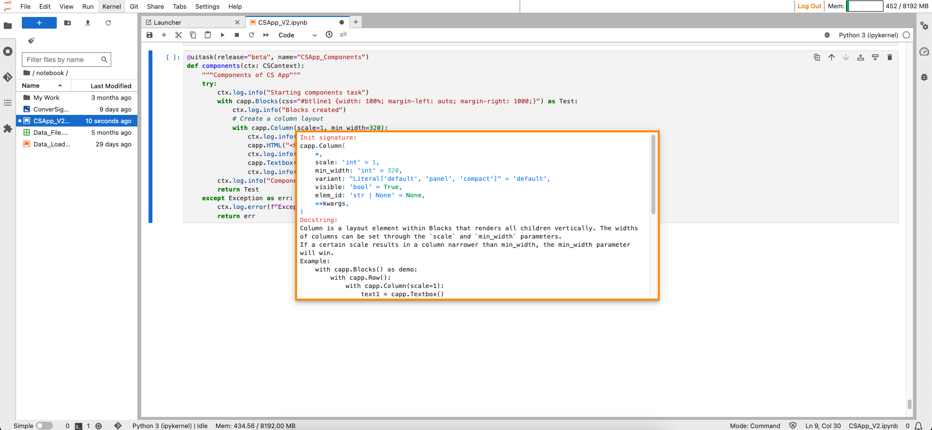
The Column layout element within Blocks is designed to present components in a vertical arrangement. It serves as a structural element, facilitating the stacking of various components in a top-to-bottom fashion. This layout feature ensures a clear and organized display, allowing users to showcase content or functional elements in a sequential and easily scannable manner within the Blocks framework. You can adjust the widths of columns using the scale and min_width parameters. If a specified scale leads to a column width narrower than the min_width, the min_width parameter takes precedence.
Syntax:
with csapp.Column():
Column#
Parameters of the Column component:
Parameter |
Type |
Default |
Description |
|---|---|---|---|
scale |
int |
1 |
Relative width compared to adjacent columns. |
min_width |
int |
320 |
Minimum pixel width of the column. If less, it will wrap. |
variant |
Literal[‘default’, ‘panel’, ‘compact’] |
“default” |
Column type: ‘default’ (no background), ‘panel’ (gray background, rounded corners), ‘compact’. |
visible |
bool |
True |
If False, the column will be hidden. |
elem_id |
str | None |
None |
Optional ID for targeting CSS styles in the HTML DOM. |
Sample:
Column#
Components#
Components include selectors, properties and values that dictate how elements like text, images and layout are displayed.
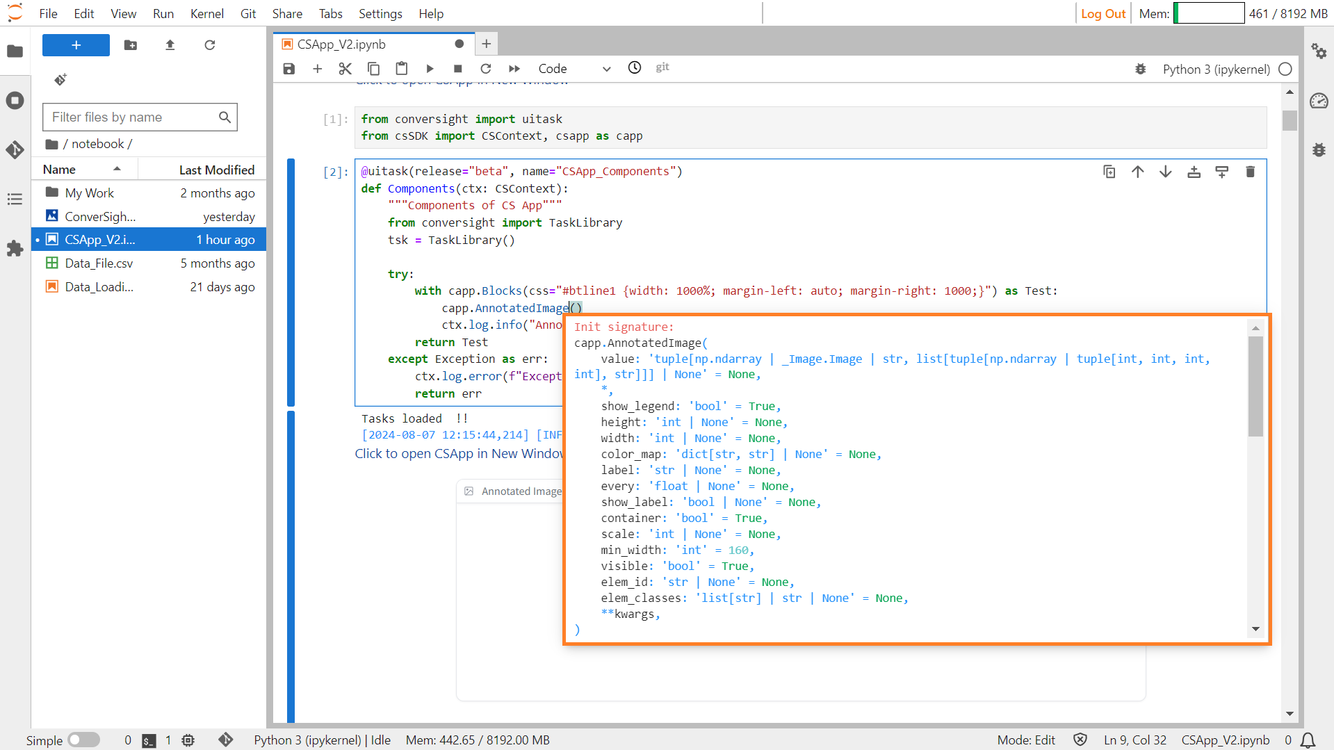
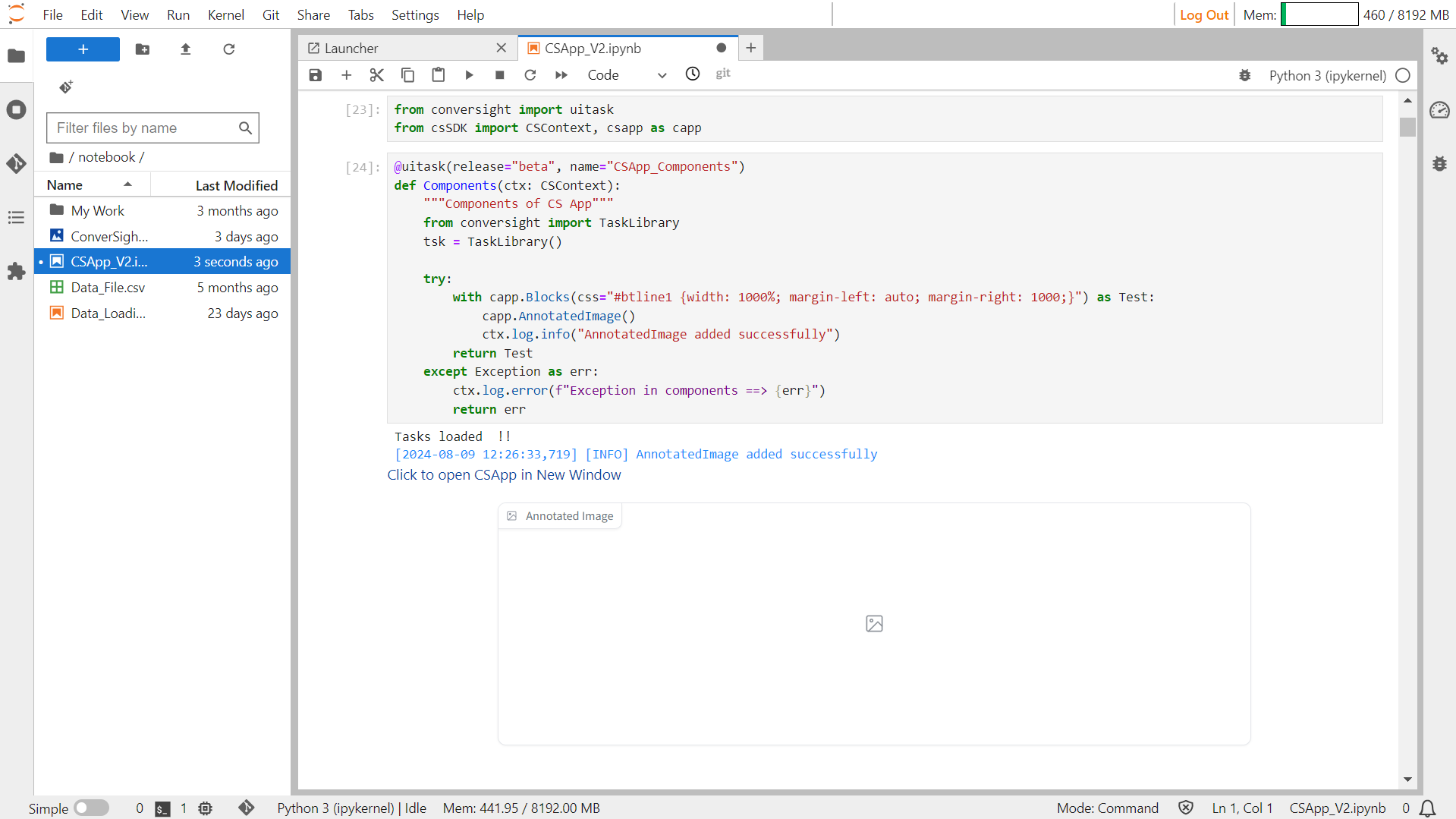
AnnotatedImage#
AnnotatedImage displays a base image along with colored subsections overlaid on top of that image. These subsections can represent various elements such as object boundaries or confidence masks for image segmentation. The component accepts a tuple consisting of the base image and a list of subsections, where each subsection is defined by its coordinates or confidence mask along with a label. AnnotatedImage also provides options to show a legend of the subsections, specify the height and width of the displayed image, define a color map for labeling, and customize its appearance using CSS styles.
Syntax:
csapp.AnnotatedImage(Parameters)
Annotated Image#
Parameters of the AnnotatedImage component:
Parameter |
Type |
Default |
Description |
|---|---|---|---|
value |
tuple[int, int, int, int] | str |
None |
Tuple of base image and list of (subsection, label) pairs. |
height |
int |
None |
Height of the displayed image. |
width |
int |
None |
Width of the displayed image. |
color_map |
dict[str, str] |
None |
A dictionary mapping labels to colors. The colors must be specified as hex codes. |
label |
str |
None |
Component name in interface. |
every |
float |
None |
If value is a callable, run the function ‘every’ number of seconds while the client connection is open |
show_label |
bool |
None |
If True, will display label. |
container |
bool |
True |
If True, will place the component in a container - providing some extra padding around the border. |
scale |
int |
None |
Relative width compared to adjacent Components in a Row. Should be an integer. |
min_width |
int |
160 |
Minimum pixel width, will wrap if not sufficient screen space to satisfy this value. If a certain scale value results in this Component being narrower than min_width, the min_width parameter will be respected first. |
visible |
bool |
True |
If False, component will be hidden. |
elem_id |
str |
None |
An optional string that is assigned as the id of this component in the HTML DOM. Can be used for targeting CSS styles. |
elem_classes |
list[ str] |
str |
None |
Sample :
Annotated Image#
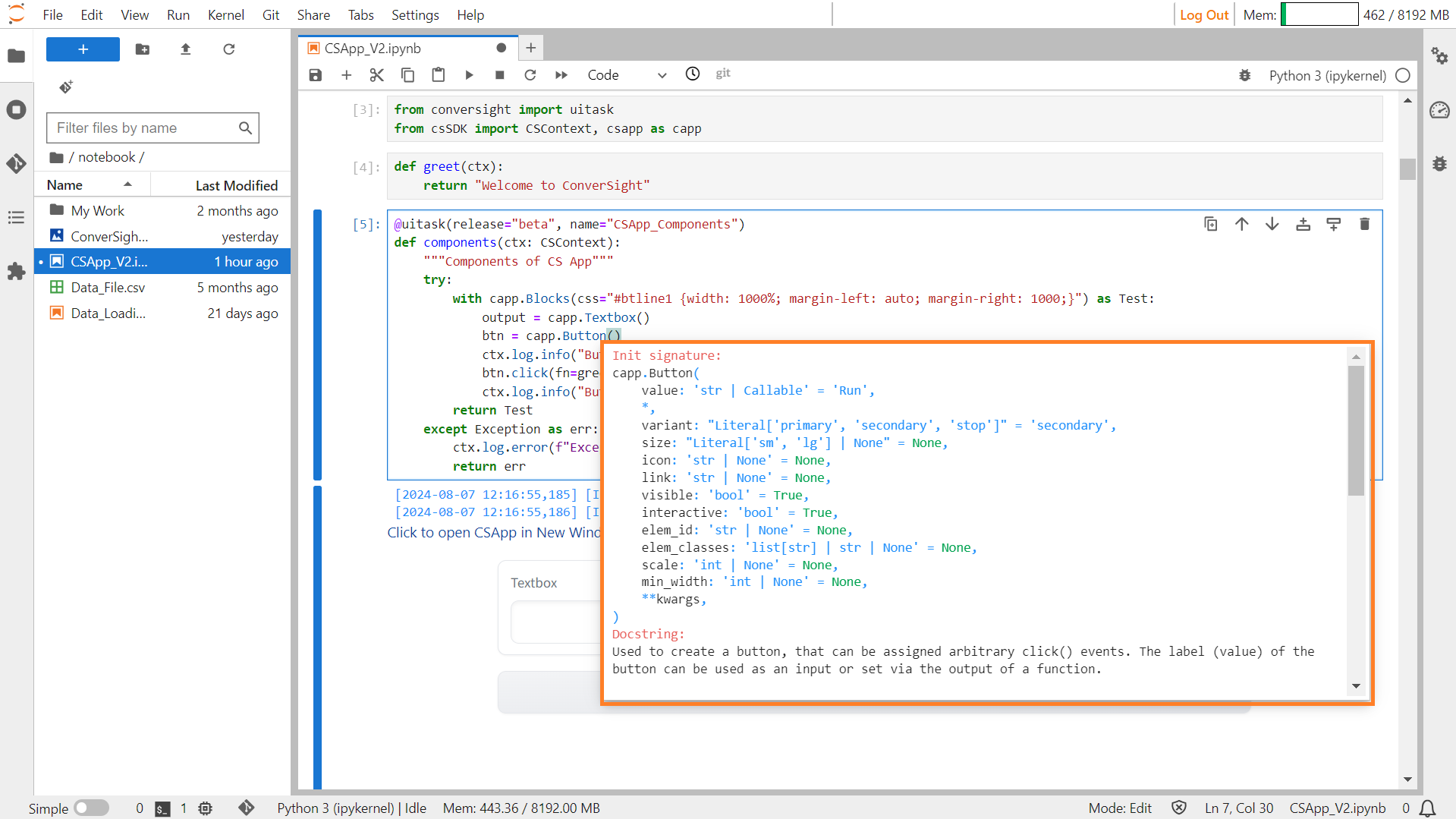
Button#
The Button function is employed to generate a button capable of having customized click events assigned to it. The Button’s label can serve as an input or be configured through the output of a function.
Syntax:
button_object = csapp.Button("Label of the botton")
button_object.click(fn=Associated_Function_Name, inputs = input_variable,outputs= output_variable)
Button#
Parameters of the Button component:
Parameter |
Type |
Default |
Description |
|---|---|---|---|
value |
str | Callable |
“Run” |
Default text for the button to display. If callable, the function will be called to set the initial value. |
variant |
Literal[‘primary’, ‘secondary’, ‘stop’] |
“secondary” |
Style variant of the button: ‘primary’, ‘secondary’, or ‘stop’. |
size |
Literal[‘sm’, ‘lg’] | None |
None |
Size of the button: “sm” (small) or “lg” (large). |
icon |
str | None |
None |
URL or path to the icon file to display within the button. If None, no icon will be displayed. |
link |
str | None |
None |
URL to open when the button is clicked. If None, no link will be used. |
visible |
bool |
True |
If False, the component will be hidden. |
interactive |
bool |
True |
If False, the button will be disabled. |
elem_id |
str | None |
None |
Optional ID for targeting CSS styles in the HTML DOM. |
elem_classes |
list[ str] | str | None |
None |
Optional classes for targeting CSS styles in the HTML DOM. |
scale |
int | None |
None |
Relative size compared to adjacent components. |
min_width |
int | None |
None |
Minimum pixel width of the button, will wrap if not sufficient screen space to satisfy this value. |
Sample :
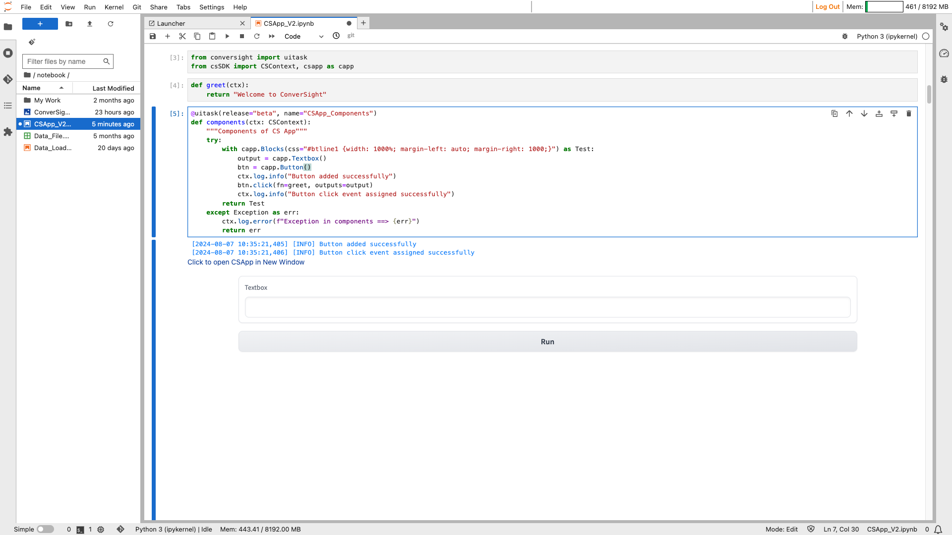
Button#
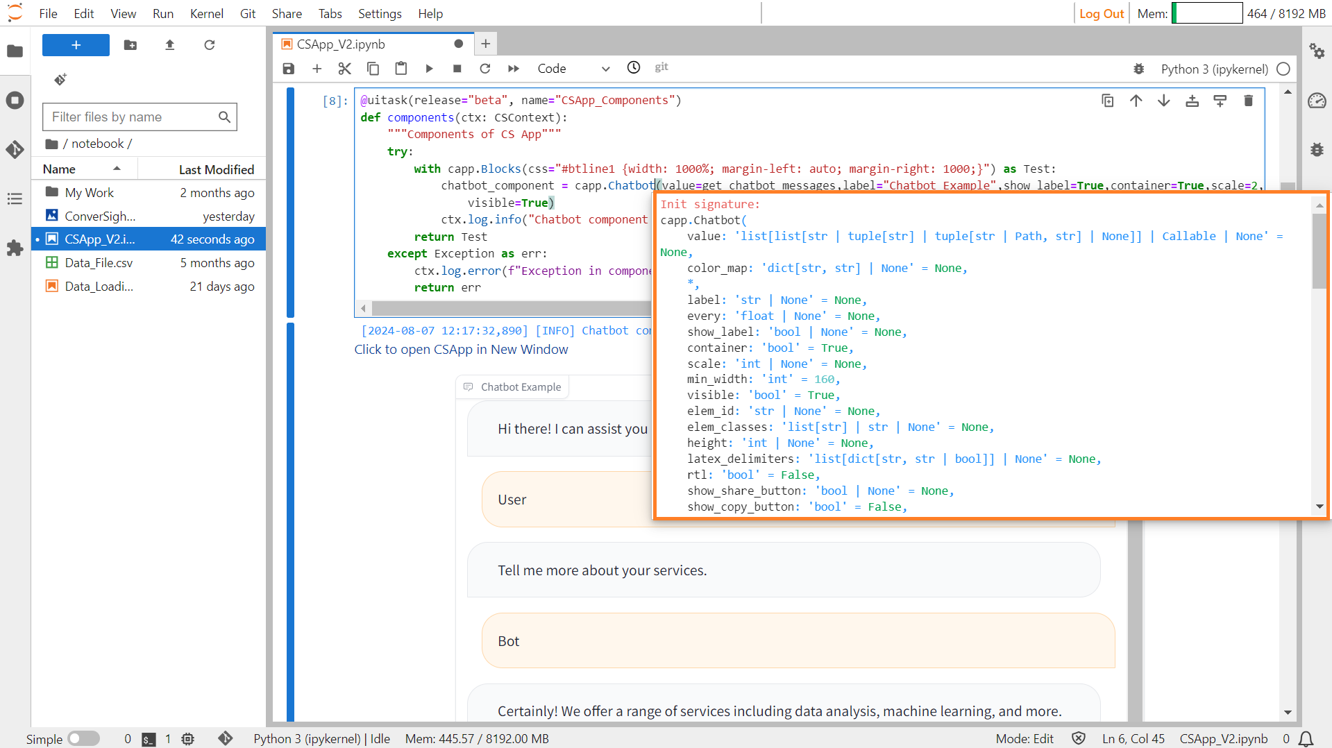
Chatbot#
The chatbot function creates an interactive chat platform supporting Markdown formatting (bold, italics, code blocks and tables) and displaying various media types like audio, video and images within the chat. Other file types are presented as clickable links.
Syntax:
chatbot_object=csapp.Chatbot()
Chatbot#
Parameters of the Chatbot component:
Parameter |
Type |
Default |
Description |
|---|---|---|---|
value |
list[list[str | tuple[ str] | tuple[str | Path, str] | None]] | Callable | None |
None |
Default value(s) representing chatbot responses. If callable, the function sets the initial value. |
color_map |
dict[str, str] | None |
None |
Dictionary mapping labels to colors for highlighting. |
label |
str | None |
None |
Component name in the interface. |
every |
float | None |
None |
If value is a callable, run the function every number of seconds while the client connection is open. |
show_label |
bool | None |
None |
If True, will display the label. |
container |
bool |
True |
If True, places the component in a container providing extra padding around the border. |
scale |
int | None |
None |
Relative width compared to adjacent components in a Row. |
min_width |
int |
160 |
Minimum pixel width, wraps if not enough screen space. |
visible |
bool |
True |
If False, the component will be hidden. |
elem_id |
str | None |
None |
Optional string assigned as the id of the component in the HTML DOM. |
elem_classes |
list[ str] | str | None |
None |
Optional list of strings assigned as the classes of the component in the HTML DOM. |
height |
int | None |
None |
Height of the component in pixels. |
latex_delimiters |
list[dict[str, str | bool]] | None |
None |
List of dictionaries specifying LaTeX delimiters for rendering math expressions. |
rtl |
bool |
False |
If True, renders text right-to-left. |
show_share_button |
bool | None |
None |
If True, displays a button for sharing the chatbot conversation. |
show_copy_button |
bool |
False |
If True, displays a button for copying the chatbot conversation. |
Sample :
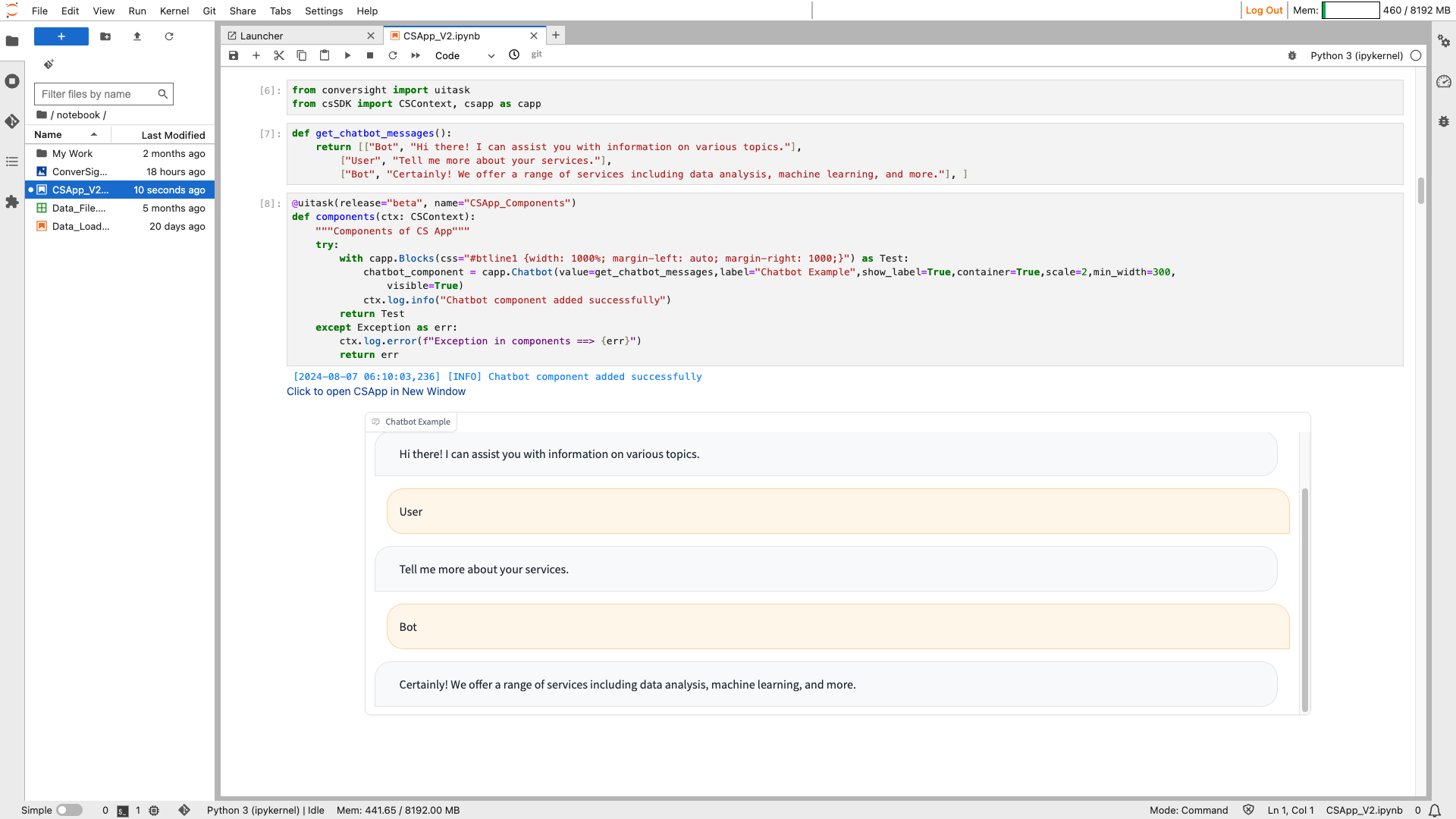
Chatbot#
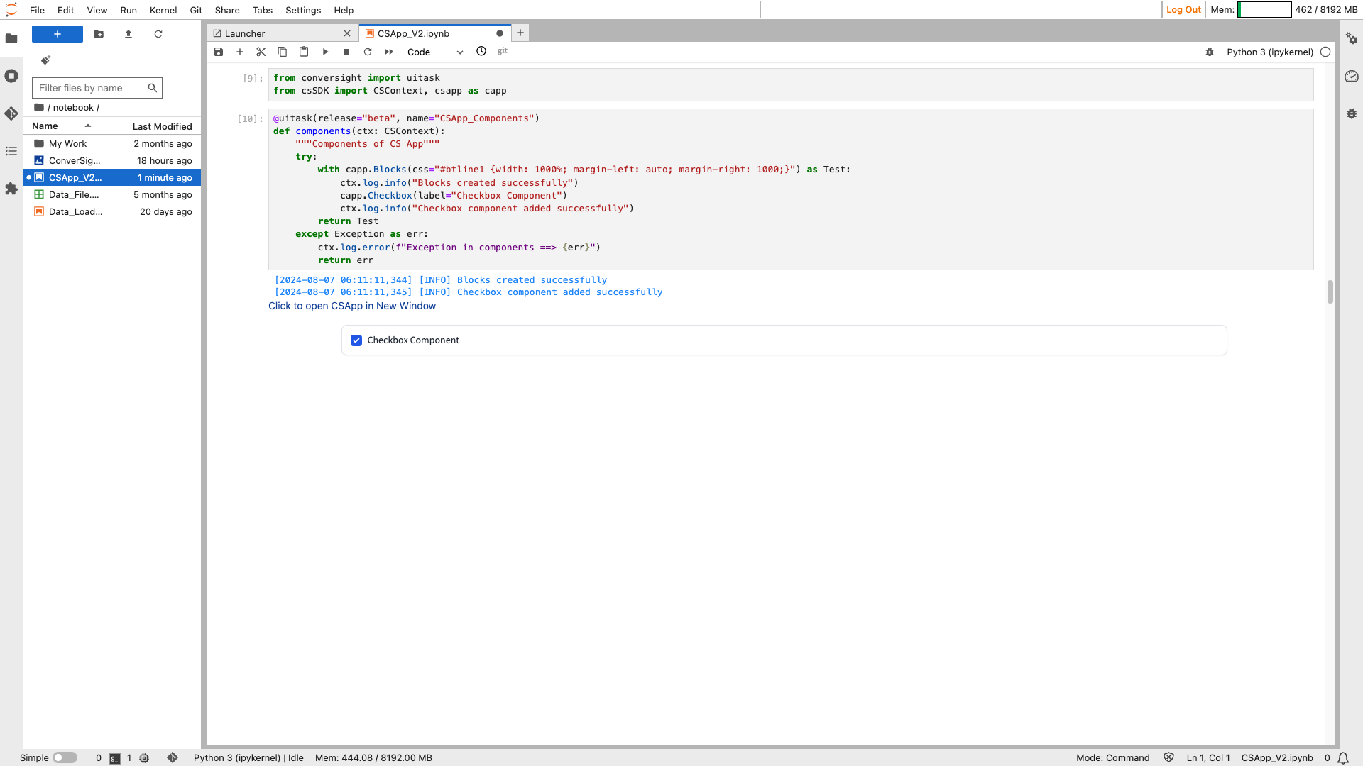
Checkbox#
The Checkbox function allows users to make binary choices, indicating a selection or deselection of a particular option.
Syntax:
csapp.Checkbox(label= "Label of the checkbox")

Checkbox#
Parameters of the Checkbox component:
Parameter |
Type |
Default |
Description |
|---|---|---|---|
value |
bool | Callable |
False |
If True, the checkbox is checked by default. If callable, the function sets the initial value of the component. |
label |
str | None |
None |
Component name in the interface. |
info |
str | None |
None |
Additional component description. |
every |
float | None |
None |
If value is a callable, run the function every number of seconds while the client connection is open. |
show_label |
bool | None |
None |
If True, display the label. |
container |
bool |
True |
If True, places the component in a container, providing extra padding around the border. |
scale |
int | None |
None |
Relative width compared to adjacent components. |
min_width |
int |
160 |
Minimum pixel width, wraps if screen space is insufficient. |
interactive |
bool | None |
None |
If True, the checkbox can be checked; if False, checking is disabled. |
visible |
bool |
True |
If False, the component will be hidden. |
elem_id |
str | None |
None |
An optional string assigned as the id of this component in the HTML DOM. |
elem_classes |
list[ str] | str | None |
None |
An optional list of strings assigned as the classes of this component in the HTML DOM. |
Sample :
Checkbox#
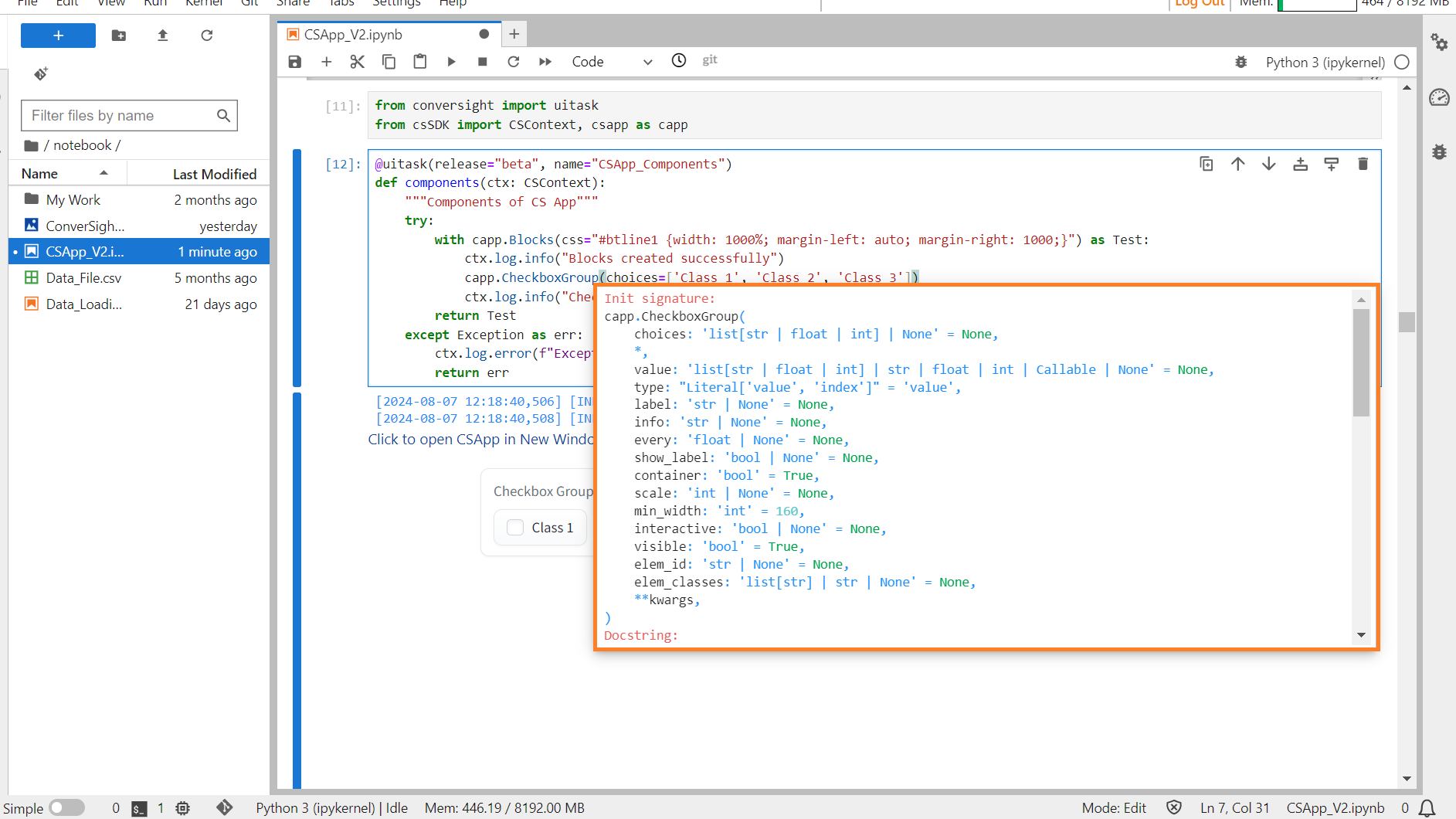
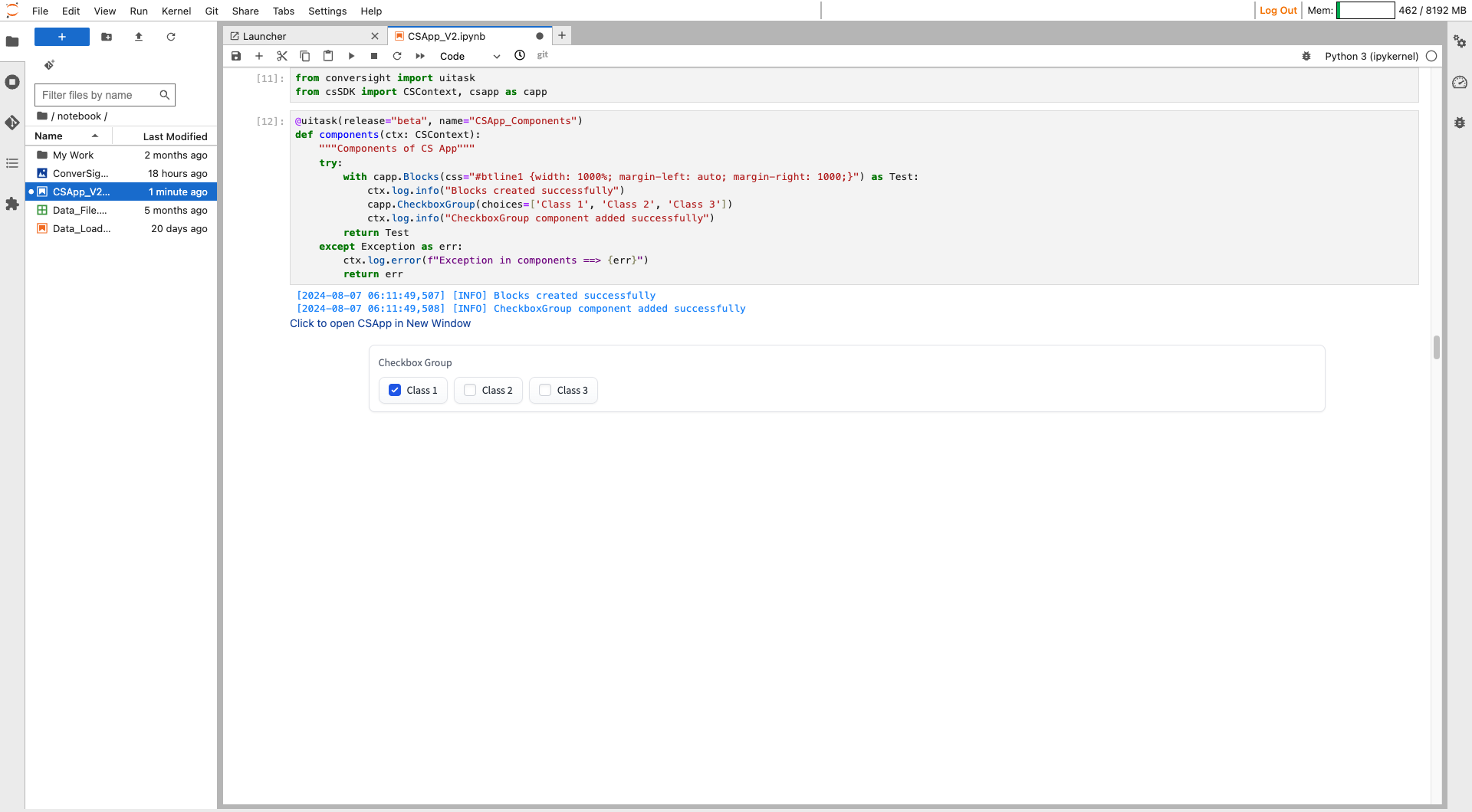
CheckboxGroup#
The CheckboxGroup component creates a series of checkboxes for selecting values, that function as either input, conveying selected values to a function, or output, displaying values, with pre-selected options.
Syntax:
csapp.CheckboxGroup(Choices=[ "Option1", "Option2"...])
Checkbox Group#
Parameters of the CheckboxGroup component:
Parameter |
Type |
Default |
Description |
|---|---|---|---|
choices |
list[str | float | int] | None |
None |
List of options to select from. |
value |
list[str | float | int] | str | float | int | Callable | None |
None |
Default value(s) selected. If callable, the function is called to set the initial value. |
type |
Literal[‘value’, ‘index’] |
‘value’ |
Type of value to be returned by the component. |
label |
str | None |
None |
Component name in the interface. |
info |
str | None |
None |
Additional component description. |
every |
float | None |
None |
If value is a callable, run the function every number of seconds while the client is open. |
show_label |
bool | None |
None |
If True, will display the label. |
container |
bool |
True |
If True, places the component in a container providing extra padding around the border. |
scale |
int | None |
None |
Relative width compared to adjacent components in a Row. |
min_width |
int |
160 |
Minimum pixel width, wraps if not enough screen space. |
interactive |
bool | None |
None |
If True, choices are selectable; if False, selection is disabled. |
visible |
bool |
True |
If False, the component will be hidden. |
elem_id |
str | None |
None |
Optional string assigned as the id of the component in the HTML DOM. |
elem_classes |
list [ str] | str | None |
None |
Optional list of strings assigned as the classes of the component in the HTML DOM. |
Sample:
Checkbox Group#
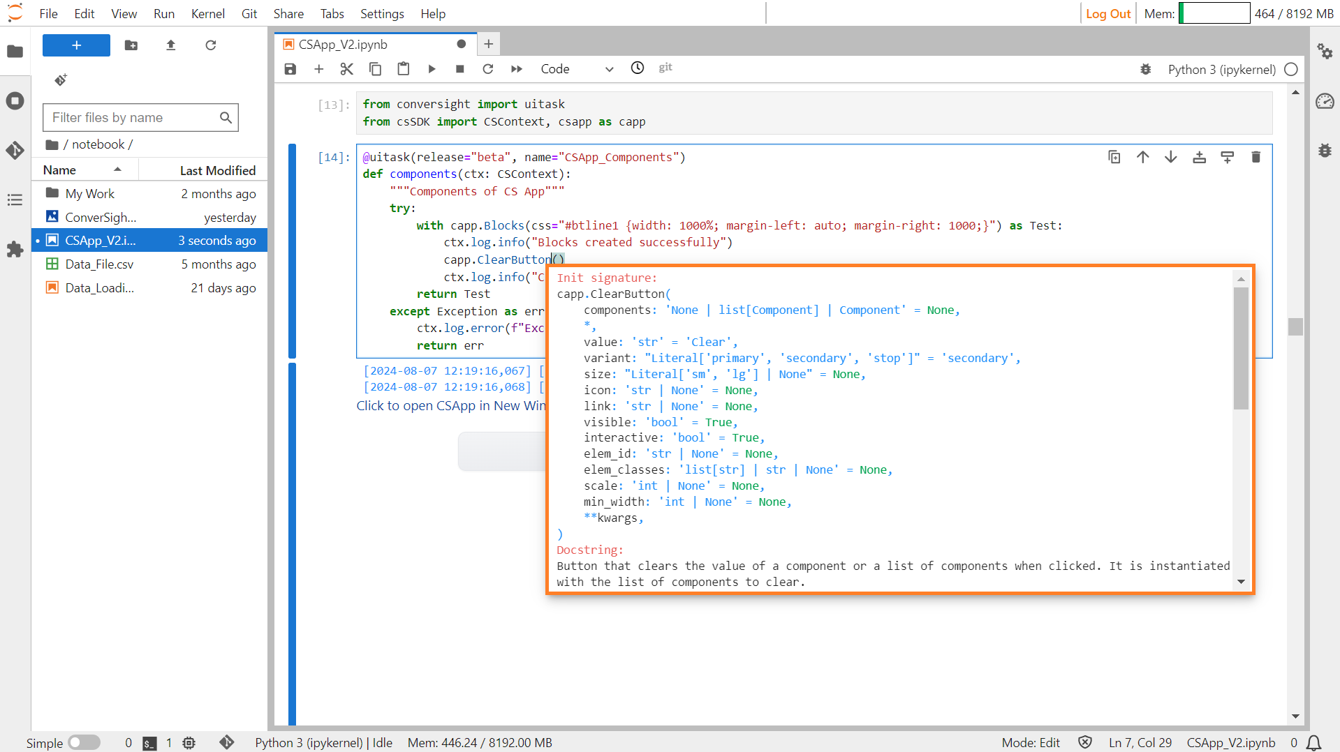
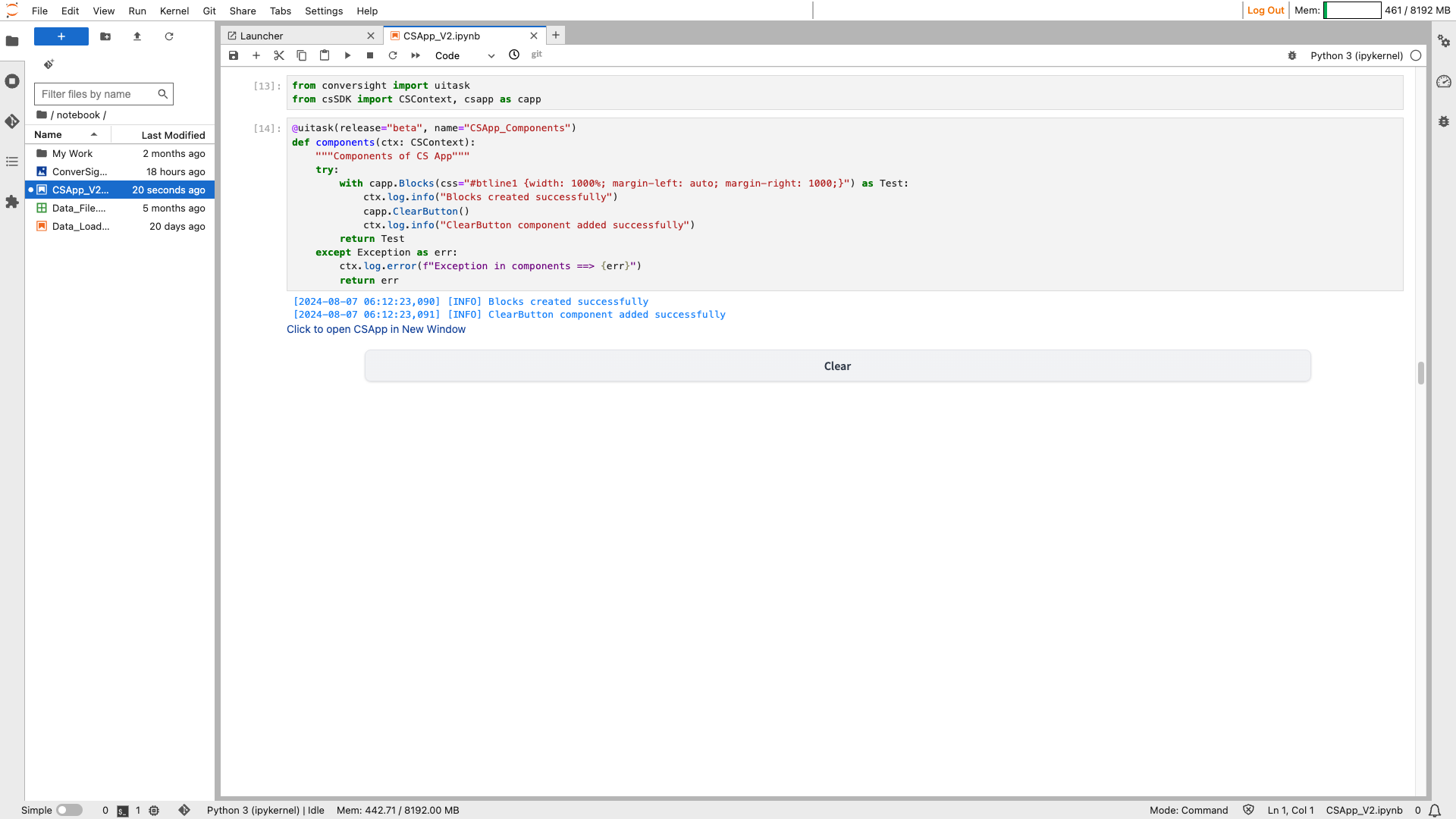
Clear Button#
The ClearButton component provides a convenient feature for users to reset or clear the contents of input fields or components within their applications. When added to an interface, the ClearButton appears as a clickable button that, when pressed, triggers the clearing action, effectively removing any text, data, or selections entered by the user in associated input fields or components.
Syntax:
csapp.ClearButton(Parameters)
Clear Button#
Parameters of the ClearButton component:
Parameter |
Type |
Default |
Description |
|---|---|---|---|
components |
None,list[ Component] | Component |
None |
Components or list of components to clear when the button is clicked. |
value |
str |
‘Clear’ |
Default text for the button to display. |
variant |
Literal[‘primary’, ‘secondary’, ‘stop’] |
‘secondary’ |
Variant style of the button. ‘primary’ for main call-to-action, ‘secondary’ for a subdued style, ‘stop’ for a stop button. |
size |
Literal[‘sm’, ‘lg’] | None |
None |
Size of the button. ‘sm’ for small, ‘lg’ for large. |
icon |
str | None |
None |
URL or path to the icon file to display within the button. |
link |
str | None |
None |
URL to open when the button is clicked. |
visible |
bool |
True |
Boolean indicating whether the button is visible. |
interactive |
bool |
True |
Boolean indicating whether the button is interactive. |
elem_id |
str | None |
None |
Optional string assigned as the id of the component in the HTML DOM for targeting CSS styles. |
elem_classes |
list[ str] | str | None |
None |
Optional list of strings assigned as the classes of the component in the HTML DOM for targeting CSS styles. |
scale |
int | None |
None |
Relative width compared to adjacent components in a Row. |
min_width |
int | None |
None |
Minimum pixel width; the button will wrap if there’s insufficient screen space. |
Sample :
Clear Button#
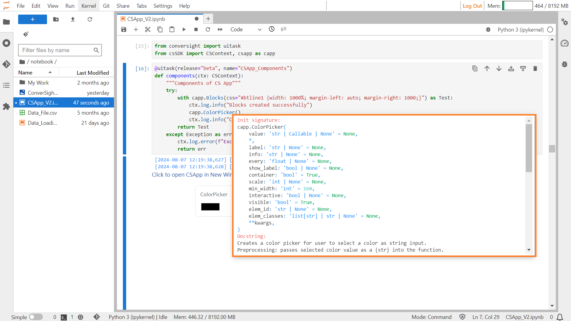
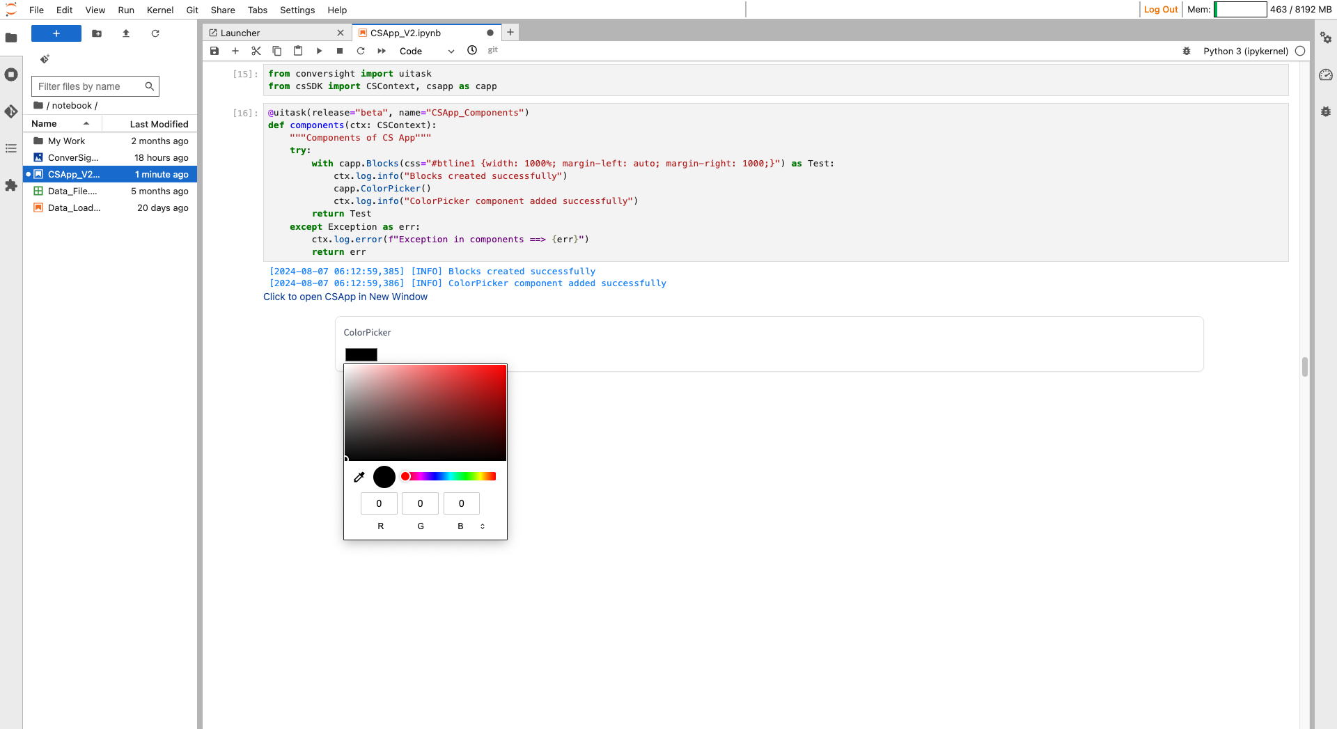
Color Picker#
The Color Picker component offers an interface for users to visually select a color, providing the selected color as a string input, typically in hexadecimal or RGB format.
Syntax:
csapp.ColorPicker(label = "Label of the ColorPicker")
ColorPicker#
Parameters of the Color Picker component:
Parameter |
Type |
Default |
Description |
|---|---|---|---|
value |
str | Callable | None |
None |
Default text to provide in the color picker. If callable, the function will be called whenever the app loads to set the initial value. |
label |
str | None |
None |
The label for this component, which appears above the component. |
info |
str | None |
None |
Additional component description. |
every |
float | None |
None |
If value is a callable, run the function ‘every’ number of seconds while the client connection is open. |
show_label |
bool | None |
None |
If True, will display the label. |
container |
bool |
True |
If True, will place the component in a container, providing some extra padding around the border. |
scale |
int | None |
None |
Specifies the relative size compared to adjacent components. |
min_width |
int |
160 |
Minimum pixel width; the component will wrap if not sufficient screen space. |
interactive |
bool | None |
None |
If True, will be rendered as an editable color picker; if False, editing will be disabled. |
visible |
bool |
True |
If False, the component will be hidden. |
elem_id |
str | None |
None |
An optional string that is assigned as the id of this component in the HTML DOM. |
elem_classes |
list[ str] | str | None |
None |
An optional list of strings that are assigned as the classes of this component in the HTML DOM. |
Sample :
Color Picker#
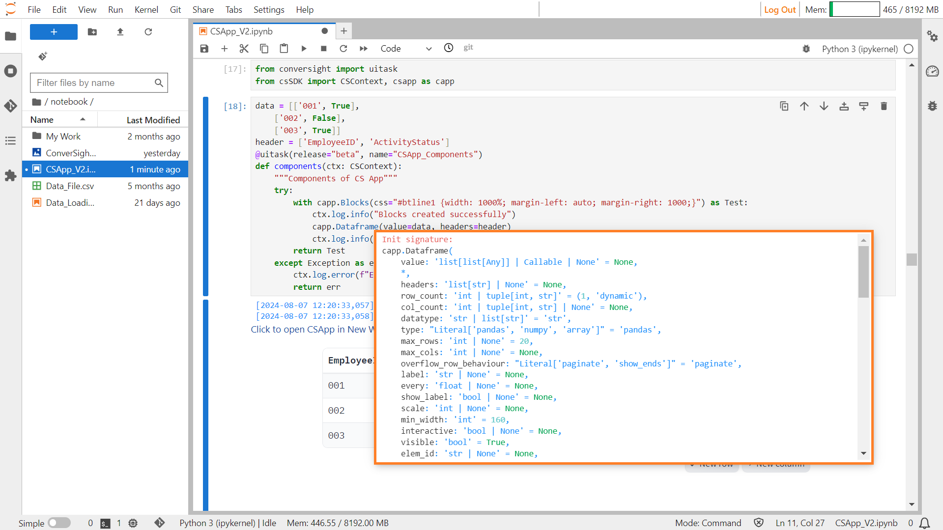
DataFrame#
The DataFrame component functions as a table or spreadsheet, capable of displaying data or collecting user input. It can be used to showcase data in a structured format or to gather information by presenting a table.
Syntax:
csapp.Dataframe(parameters)
Dataframe#
Parameters of the DataFrame component:
Parameter |
Type |
Default |
Description |
|---|---|---|---|
value |
list[list[ Any]] | Callable | None |
None |
Default value as a 2-dimensional list of values. |
headers |
list[ str] | None |
None |
List of header names. If None, no headers are shown. |
row_count |
int | tuple[int, str] |
(1, ‘dynamic’) |
Limit number of rows and new row behavior. |
col_count |
int | tuple[int, str] | None |
None |
Limit number of columns and new column behavior. |
datatype |
str | list[ str] |
‘str’ |
Datatype of values in the sheet. |
type |
Literal[‘pandas’, ‘numpy’, ‘array’] |
‘pandas’ |
Type of value to be returned by the component. |
max_rows |
int | None |
20 |
Maximum number of rows to display at once. |
max_cols |
int | None |
None |
Maximum number of columns to display at once. |
overflow_row_behaviour |
Literal[‘paginate’, ‘show_ends’] |
‘paginate’ |
Overflow behavior for rows. |
label |
str | None |
None |
Component name in the interface. |
every |
float | None |
None |
If value is a callable, run the function periodically while the client is open. |
show_label |
bool | None |
None |
If True, will display the label. |
scale |
int | None |
None |
Relative width compared to adjacent components in a Row. |
min_width |
int |
160 |
Minimum pixel width, wraps if not sufficient screen space. |
interactive |
bool | None |
None |
If True, users can interact with the dataframe. |
visible |
bool |
True |
If False, the component will be hidden. |
elem_id |
str | None |
None |
Optional string assigned as the id of the component in the HTML DOM. |
elem_classes |
list[ str] | str | None |
None |
Optional list of strings assigned as the classes of the component in the HTML DOM. |
wrap |
bool |
False |
If True, text in table cells will wrap when appropriate. |
Sample :
DataFrame#
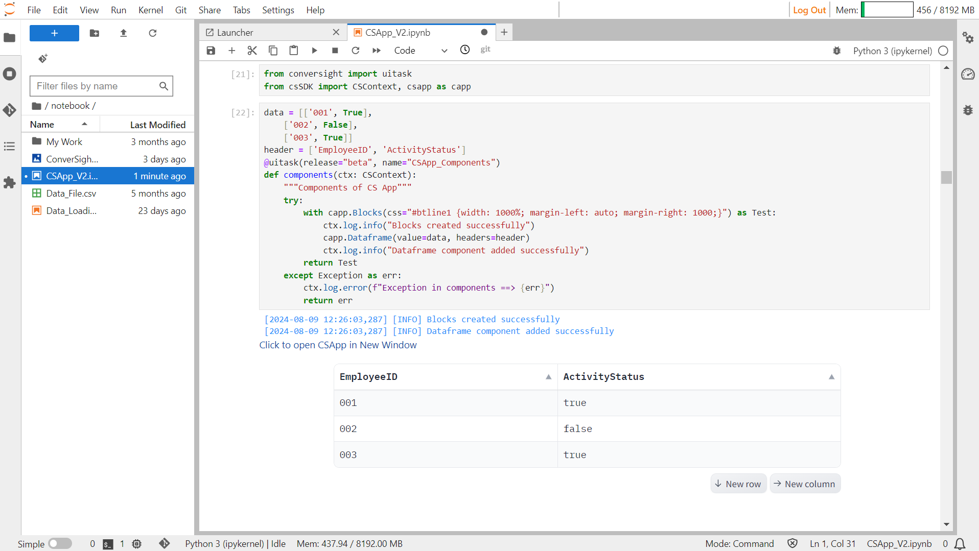
Dataset#
The Dataset component produces a gallery or table for presenting data samples. It offers a visual representation that aids users in reviewing and comprehending the provided samples.
Syntax:
csapp.Dataset(components= list_of_Components)
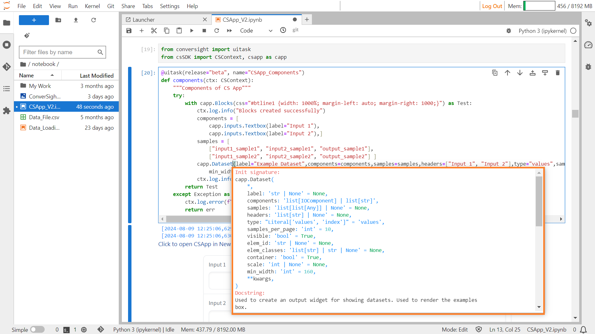
Dataset#
Parameters of the Dataset component:
Parameter |
Type |
Default |
Description |
|---|---|---|---|
label |
str | None |
None |
The label for this component, which appears above the component. |
components |
list[ Component] | list[ str] |
required |
Specifies which component types to show in this dataset widget. |
samples |
list[list[ Any]] | None |
None |
A nested list of samples. Each sublist represents a data sample, and each element within the sublist represents a value for each component. |
headers |
list[ str] | None |
None |
Column headers in the Dataset widget, should be the same length as components. If not provided, inferred from component labels. |
type |
Literal[‘values’, ‘index’] |
“values” |
Determines whether clicking on a sample should pass the value of the sample or the index of the sample. |
samples_per_page |
int |
10 |
Specifies how many examples to show per page. |
visible |
bool |
True |
If False, the component will be hidden. |
elem_id |
str | None |
None |
An optional string that is assigned as the id of this component in the HTML DOM. |
elem_classes |
list[ str] | str | None |
None |
An optional list of strings that are assigned as the classes of this component in the HTML DOM. |
container |
bool |
True |
If True, the component will be placed in a container, providing some extra padding around the border. |
scale |
int | None |
None |
Specifies the relative size compared to adjacent Components. |
min_width |
int |
160 |
Specifies the minimum pixel width. |
Sample :
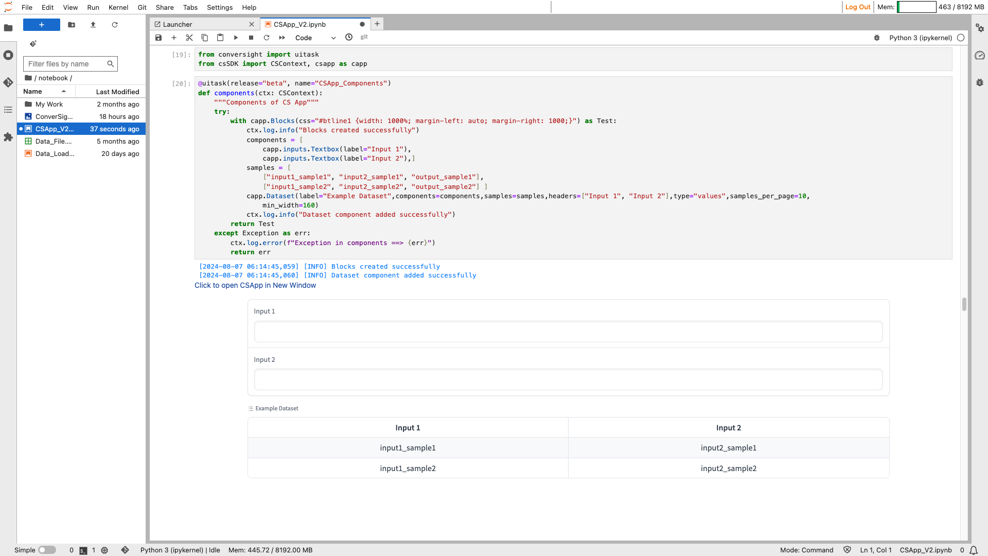
Dataset#
DataTable#
A Datatable serves as a structured container for presenting and viewing tabular data, providing a framework specifically designed for table visualization.
Syntax:
forecast_Table = csapp.Datatable(data=df, elem_id="test",config={"allowRowSelection":False,
            "showFormattings":False,"showTotal":False,"showRowGroup":False},
                                   manual_config=[{"field":"Field_Name",
                                                   "headerName":"Header_Name",
                                                   "dataType":"String",
                                                   "type":'rightAligned',
                                                   "wrapText":True,
                                                   "autoHeight":True,
                                                   "editable":False},
                                              # You can include many Fields
                                                  {"field":"Field_Name",
                                                   "headerName":"Header_Name",
                                                   "dataType":"String",
                                                   "type":'rightAligned',
                                                   "editable":False}],visible=True)
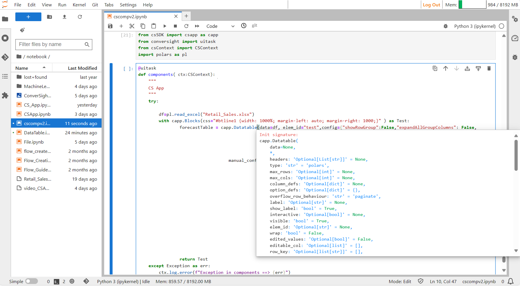
Datatable#
Parameters of the Datatable component:
Parameter |
Type |
Default |
Description |
|---|---|---|---|
data |
DataFrame | np.array | List[ List] | List | str |
None |
Input data for the table. |
headers |
Optional[List[ str]] |
None |
List of header names. If None, no headers shown. |
type |
str |
‘pandas’ |
Type of value to be returned by component. |
max_rows |
Optional[ int] |
None |
Maximum number of rows to display at once. |
max_cols |
Optional[ int] |
None |
Maximum number of columns to display at once. |
overflow_row_behaviour |
str |
‘paginate’ |
Behavior for overflowing rows. |
label |
Optional[ str] |
None |
Component name in the interface. |
show_label |
bool |
True |
If True, display the label. |
interactive |
Optional[ bool] |
None |
If True, users can edit the table; if False, only display data. |
visible |
bool |
True |
If False, the component will be hidden. |
elem_id |
Optional[ str] |
None |
Optional string assigned as the id of this component in the HTML DOM. |
wrap |
bool |
False |
If True, text in table cells will wrap when appropriate. |
edited_values |
Optional[ bool] |
False |
If True, the values in the table have been edited. |
editable_col |
Optional[ list] |
[] |
List of editable columns. |
row_key |
Optional[list[ str]] |
[] |
List of row keys. |
config |
Optional[ dict] |
{} |
Additional configuration options for the datatable. |
Config Attributes
Parameter |
Description |
|---|---|
showRowGroup |
The ShowRowGroup feature allows users to activate row grouping functionality, enabling them to drag and drop date, dimension, or both types of columns to create hierarchical row groups for better visualization. |
ExpandAllGroupColumn |
If set true will expand all the row groups. |
allowRowSelection |
If set to True, enables the display of checkboxes in the first column of each row. When a checkbox is selected, it allows users to conveniently select the entire row. |
columnSizing |
ColumnSizing accepts a string value, enabling users to uniformly adjust the size of all columns within the datatable. |
showColumnSettings |
If set true will enable Format cells option to apply conditional formatting to the cells of each column based on the rules. |
showSideBar |
If set True, enables a sidebar that contains columns tab where you can select the columns to be displayed in the Columns tab and Filters tab where you can apply filters in your datatable. |
showFormattings |
On setting True, Show Formatting will enable Column AutoSizer, Column Fit to view, New Column, and Settings icons. |
multiSort |
MultiSort feature enables users to sort dataTable based on multiple columns simultaneously. |
fontHeader |
The font header is utilized to determine the font size within the header. |
downloadExcel |
If set true, Export Excel icon is enabled in the CS App. |
fontRow |
Font Row is used to determine the font size within the row. |
Manual Config Attributes
Parameter |
Description |
|---|---|
field |
The field parameter accepts a string value corresponding to a column name from the source file. |
headerName |
The “headerName” parameter accepts a string value that is displayed as column heading in the CS App. |
filter |
The “filter” parameter, when assigned a string value, activates the filter icon within the column. Depending on the column’s category, users should provide specific values: “agDateColumnFilter” for date columns, “agMultiColumnFilter” for dimension columns, and “agNumberColumnFilter” for metric columns. |
dataType |
The “dataType” parameter indicates the data type of the column, which should be provided as a string value. |
rowGroup |
When set to True, the “rowGroup” parameter allows users to utilize the respective column for creating Row Groups, facilitating the creation of hierarchical views. |
editable |
Enabling the boolean parameter “editable” to true allows users to edit the cells in the corresponding column, permitting them to input values directly as text. |
cellEditor |
The “cellEditor” parameter accepts a string value defining how cells in a column can be edited. Setting the “cellEditor” value to “agSelectCellEditor” enables users to choose options from the dropdown. To provide options in the dropdown users can utilize the values attribute of cellEditorParams Parameter. Conversely, setting it to “text” allows users to input text directly into the column cells. |
cellEditorParams |
The |
wrap text |
The “wrap text” parameter, when enabled, allows text to span multiple lines within a single cell. |
sort |
The “sort” parameter accepts a string value to specify the sorting order of the column. Assigning “asc” to the sort parameter will sort the column in ascending order, while “desc” will sort it in descending order. |
type |
The “type” parameter accepts a string value that dictates the text alignment within the cells of the column. |
format |
format parameters allow users to customize the appearance of cell values, including text color, background color date formatting options and additional features. |
Sample :
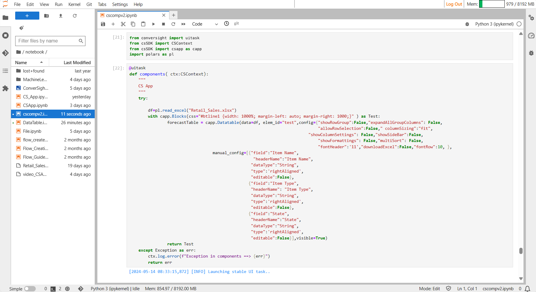
Data Table#

Data Table#
NOTE
For optimal functionality in reading Excel files, it is recommended to utilize Polars instead of Pandas, as the latter is now deprecated.
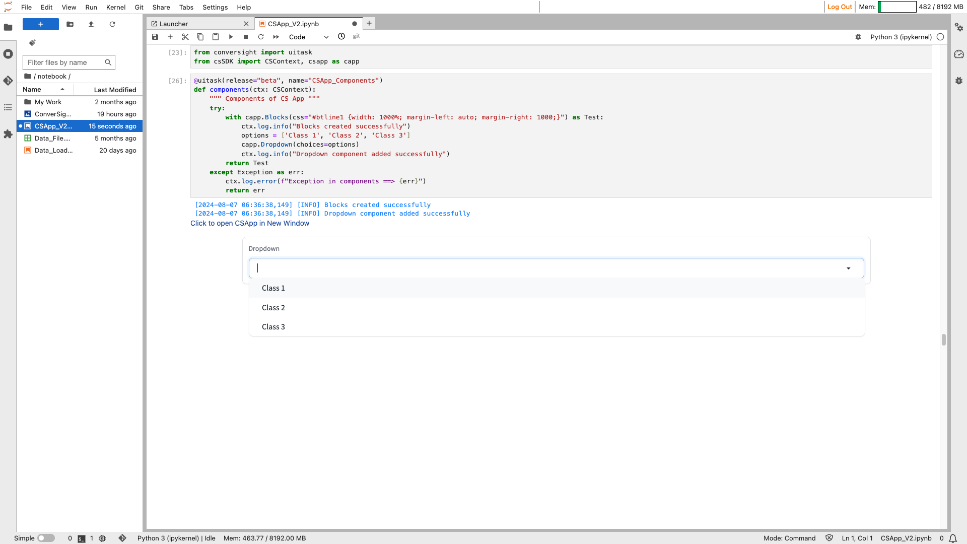
Dropdown#
Dropdown function enables you to generate a selection dropdown containing options for users to choose from.
Syntax:
Dropdown_Literal = ['literal1’, ‘literal2’, ‘literal3’, …, ‘literalN’]
Dropdown_object= csapp.Dropdown(choices= Dropdown_Literal)
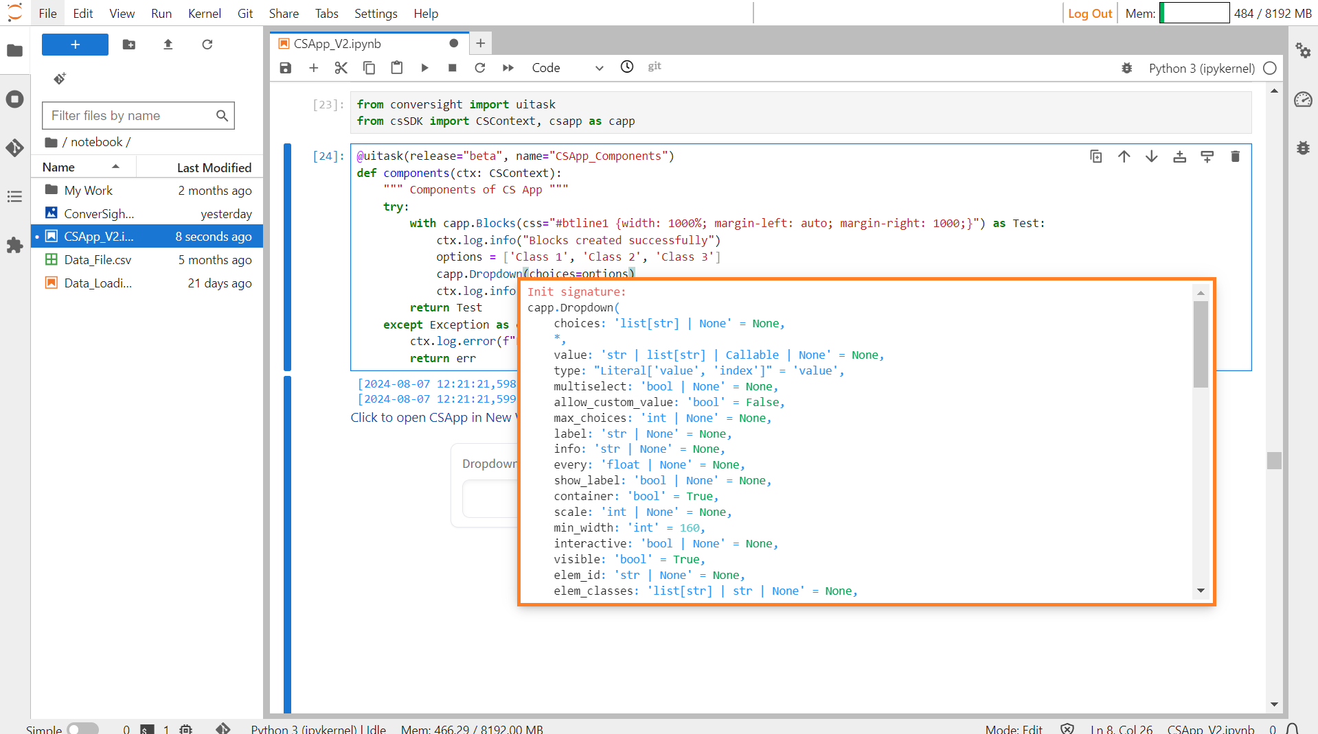
Dropdown#
Parameters of the Dropdown component:
Parameter |
Type |
Default |
Description |
|---|---|---|---|
choices |
list[ str] | None |
None |
List of options to select from. |
value |
str | list[ str] | Callable | None |
None |
Default value(s) selected in dropdown. If None, no value is selected by default. |
type |
Literal[‘value’, ‘index’] |
‘value’ |
Type of value to be returned by component. “value” returns the string of the choice selected, “index” returns the index of the choice selected. |
multiselect |
bool | None |
None |
If True, multiple choices can be selected. |
allow_custom_value |
bool |
False |
If True, allows user to enter a custom value that is not in the list of choices. Only applies if multiselect is False. |
max_choices |
int | None |
None |
Maximum number of choices that can be selected. If None, no limit is enforced. |
label |
str | None |
None |
Component name in interface. |
info |
str | None |
None |
Additional component description. |
every |
float | None |
None |
If value is a callable, run the function every number of seconds while the client connection is open. |
show_label |
bool | None |
None |
If True, will display the label. |
container |
bool |
True |
If True, will place the component in a container providing extra padding around the border. |
scale |
int | None |
None |
Relative width compared to adjacent Components in a Row. |
min_width |
int |
160 |
Minimum pixel width, will wrap if not sufficient screen space to satisfy this value. |
interactive |
bool | None |
None |
If True, choices in this dropdown will be selectable; if False, selection will be disabled. |
visible |
bool |
True |
If False, component will be hidden. |
elem_id |
str | None |
None |
An optional string that is assigned as the id of this component in the HTML DOM. |
elem_classes |
list[ str] | str | None |
None |
An optional list of strings that are assigned as the classes of this component in the HTML DOM. |
Sample :
Dropdown#
Duplicate Button#
The DuplicateButton component offers a convenient way to duplicate existing components within an interface. It provides users with a button that, when clicked, duplicates the associated component along with its configuration. This functionality is particularly useful when users want to replicate certain elements within an interface without having to manually recreate them.
Syntax:
csapp.DuplicateButton(Parameters)
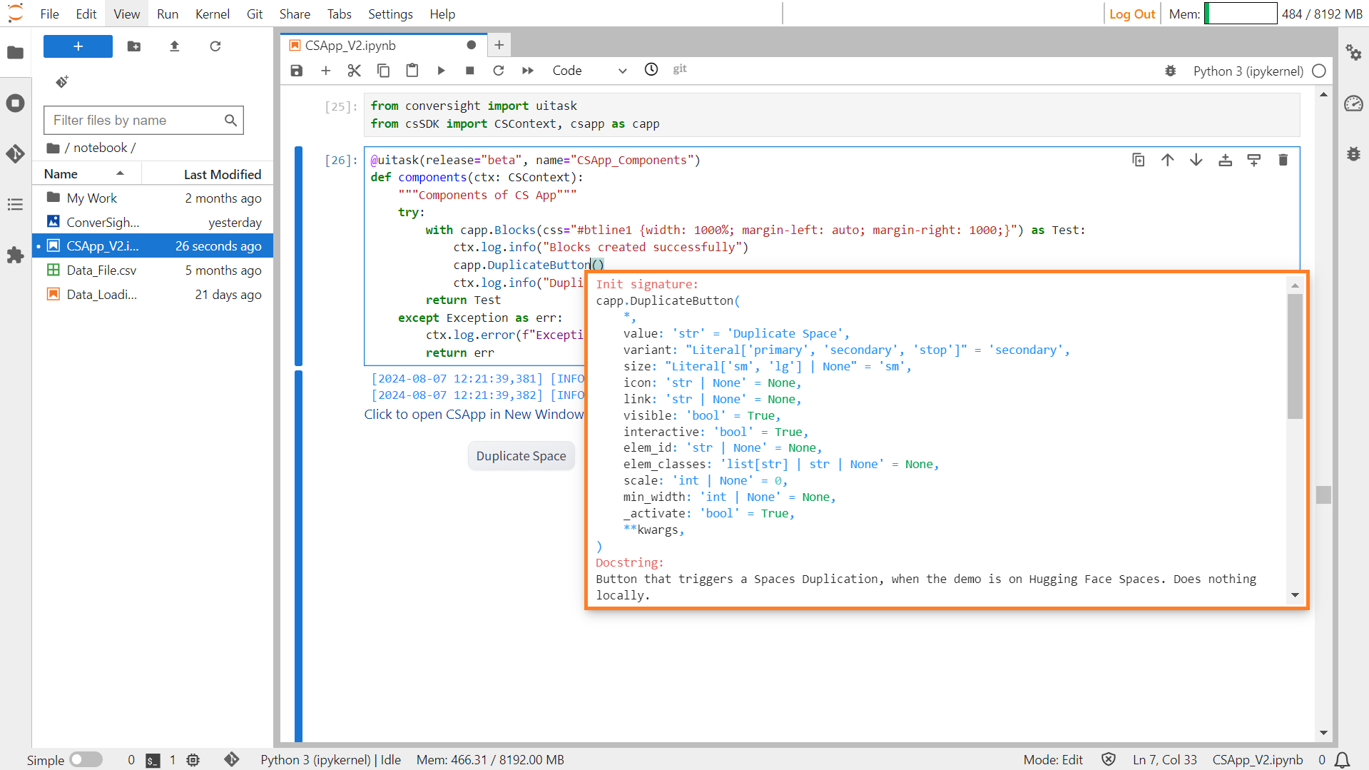
Duplicate Button#
Parameters of the DuplicateButton component:
Parameter |
Type |
Default |
Description |
|---|---|---|---|
value |
str |
‘Duplicate Space’ |
Default text for the button to display. If callable, the function sets the initial value. |
variant |
Literal[‘primary’, ‘secondary’, ‘stop’] |
‘secondary’ |
Style variant of the button. |
size |
Literal[‘sm’, ‘lg’] | None |
‘sm’ |
Size of the button: “sm” (small) or “lg” (large). |
icon |
str | None |
None |
URL or path to the icon file within the button. If None, no icon is displayed. |
link |
str | None |
None |
URL to open when the button is clicked. If None, no link is used. |
visible |
bool |
True |
If False, the component is hidden. |
interactive |
bool |
True |
If False, the Button is in a disabled state. |
elem_id |
str | None |
None |
Optional string as the id of the component in the HTML DOM for targeting CSS styles. |
elem_classes |
list[ str] | str | None |
None |
Optional list of strings as classes of the component in the HTML DOM for targeting CSS styles. |
scale |
int | None |
0 |
Relative width compared to adjacent components in a Row. Should be an integer. |
min_width |
int | None |
None |
Minimum pixel width; the button wraps if there’s insufficient screen space. |
_activate |
bool |
True |
Internal parameter. |
Sample :
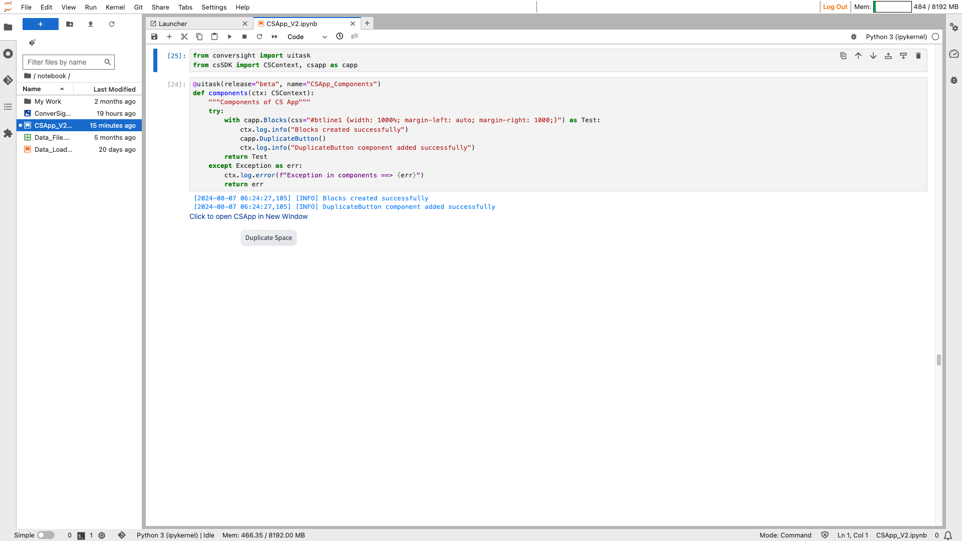
Duplicate Button#
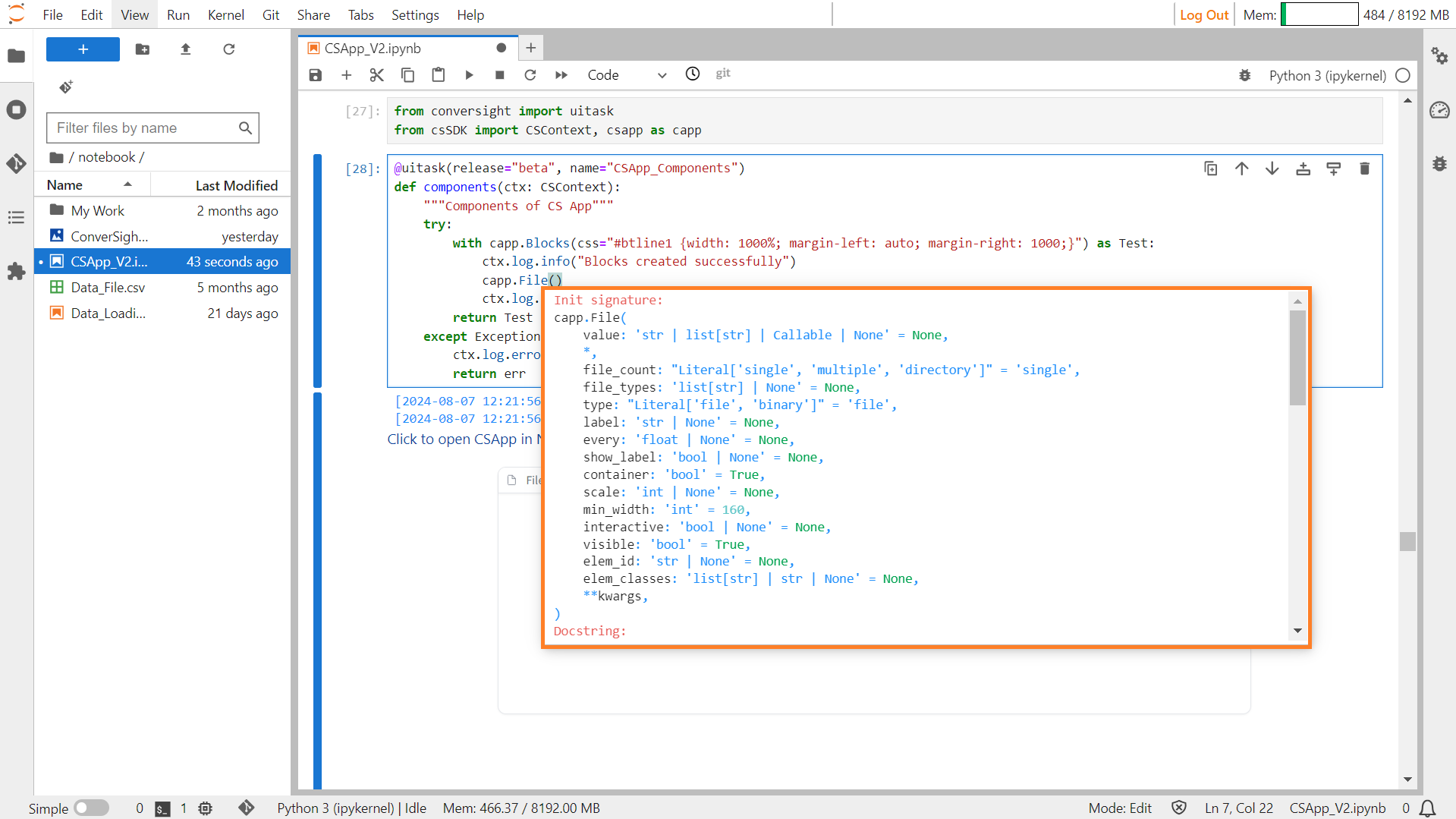
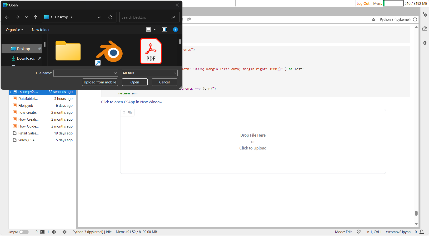
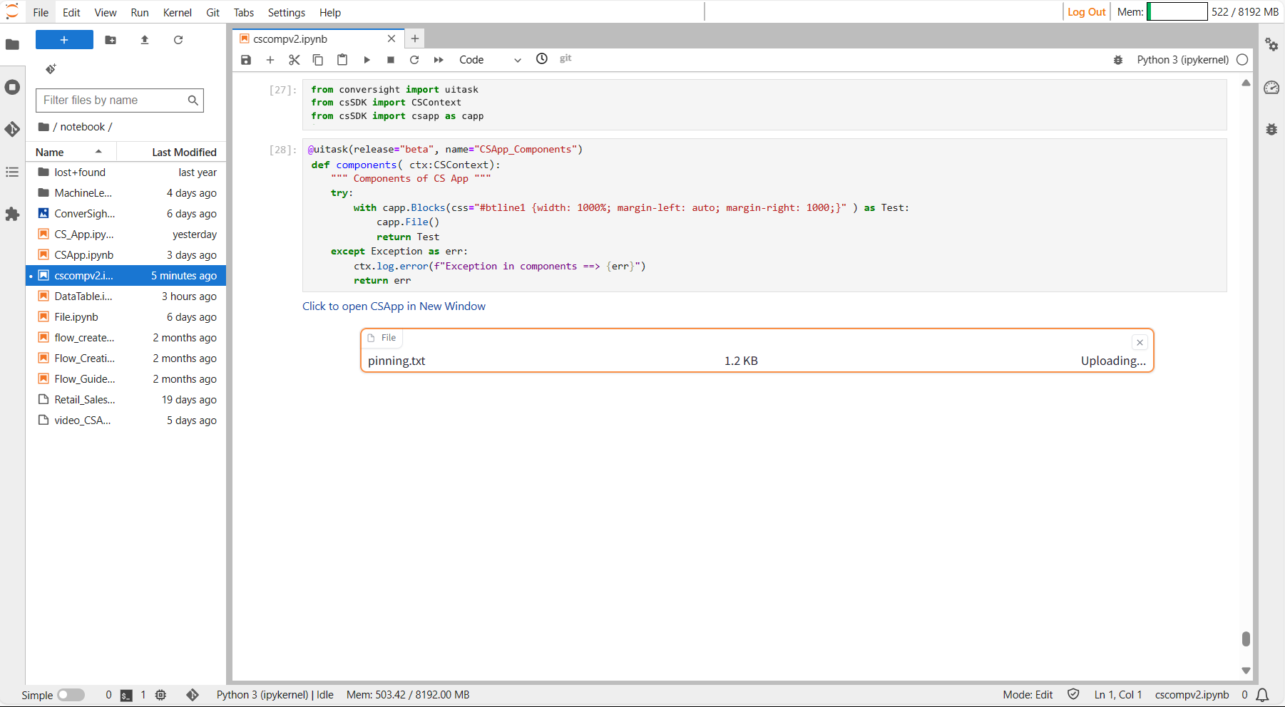
File#
The file component allows users to upload one or more generic files or display existing files within an interface, improving file management within applications.
Syntax:
csapp.File()
File#
Parameters of the File component:
Parameter |
Type |
Default |
Description |
|---|---|---|---|
value |
str | list[ str] | Callable | None |
None |
Default file to display, given as a file path. If callable, sets the initial value. |
file_count |
Literal[‘single’, ‘multiple’, ‘directory’] |
“single” |
Determines how many files the user can upload at once: one file, multiple files, or all files in a directory. |
file_types |
list[ str] | None |
None |
List of allowed file extensions or types. |
type |
Literal[‘filepath’, ‘binary’] |
“filepath” |
The type of value returned by the component. |
label |
str | None |
None |
The label for the component. Appears above it. |
every |
float | None |
None |
If value is callable, runs the function periodically while the client connection is open. |
show_label |
bool | None |
None |
If True, display the label. |
container |
bool |
True |
If True, place the component in a container, providing extra padding around the border. |
scale |
int | None |
None |
Relative size compared to adjacent Components. |
min_width |
int |
160 |
Minimum pixel width, wrapping if not enough space. |
interactive |
bool | None |
None |
If True, allows users to upload a file; if False, can only display files. |
visible |
bool |
True |
If False, the component will be hidden. |
elem_id |
str | None |
None |
Optional HTML DOM id attribute. |
elem_classes |
list[ str] | str | None |
None |
Optional HTML DOM class attributes. |
Sample :
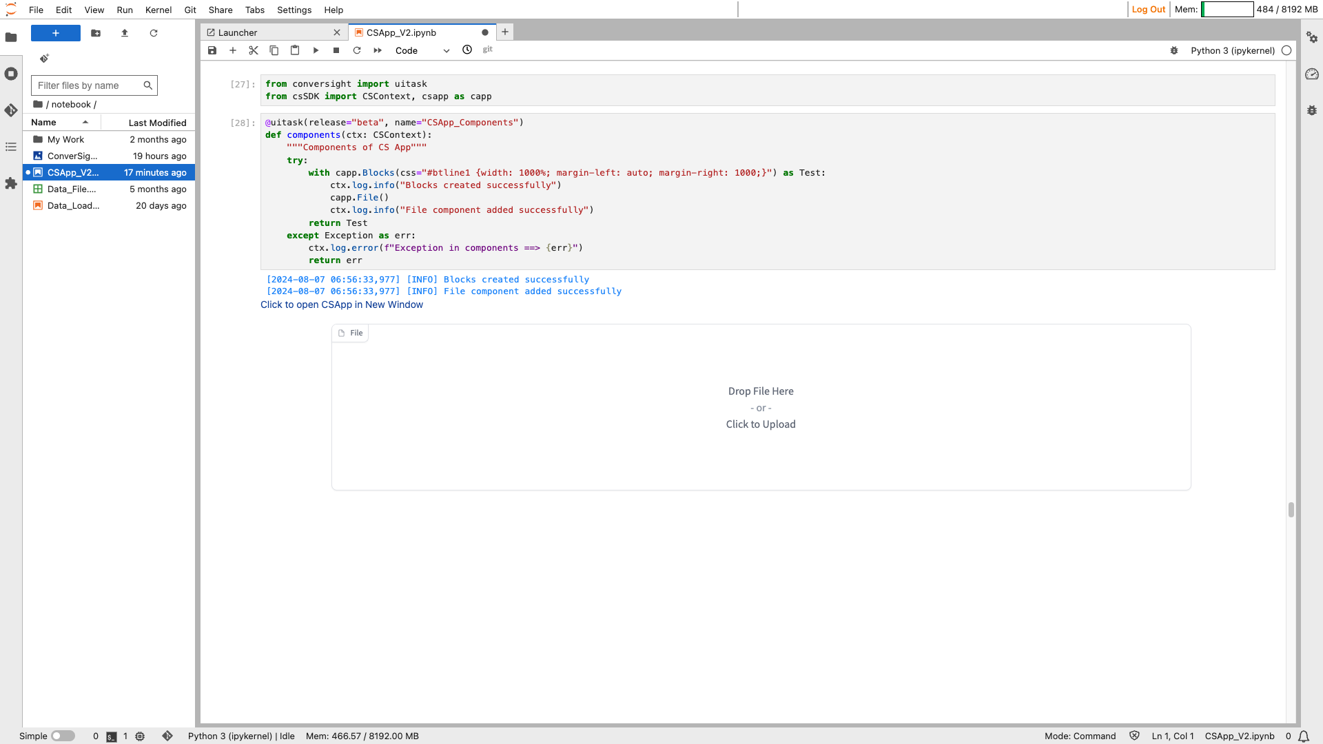
File#
File#
File#
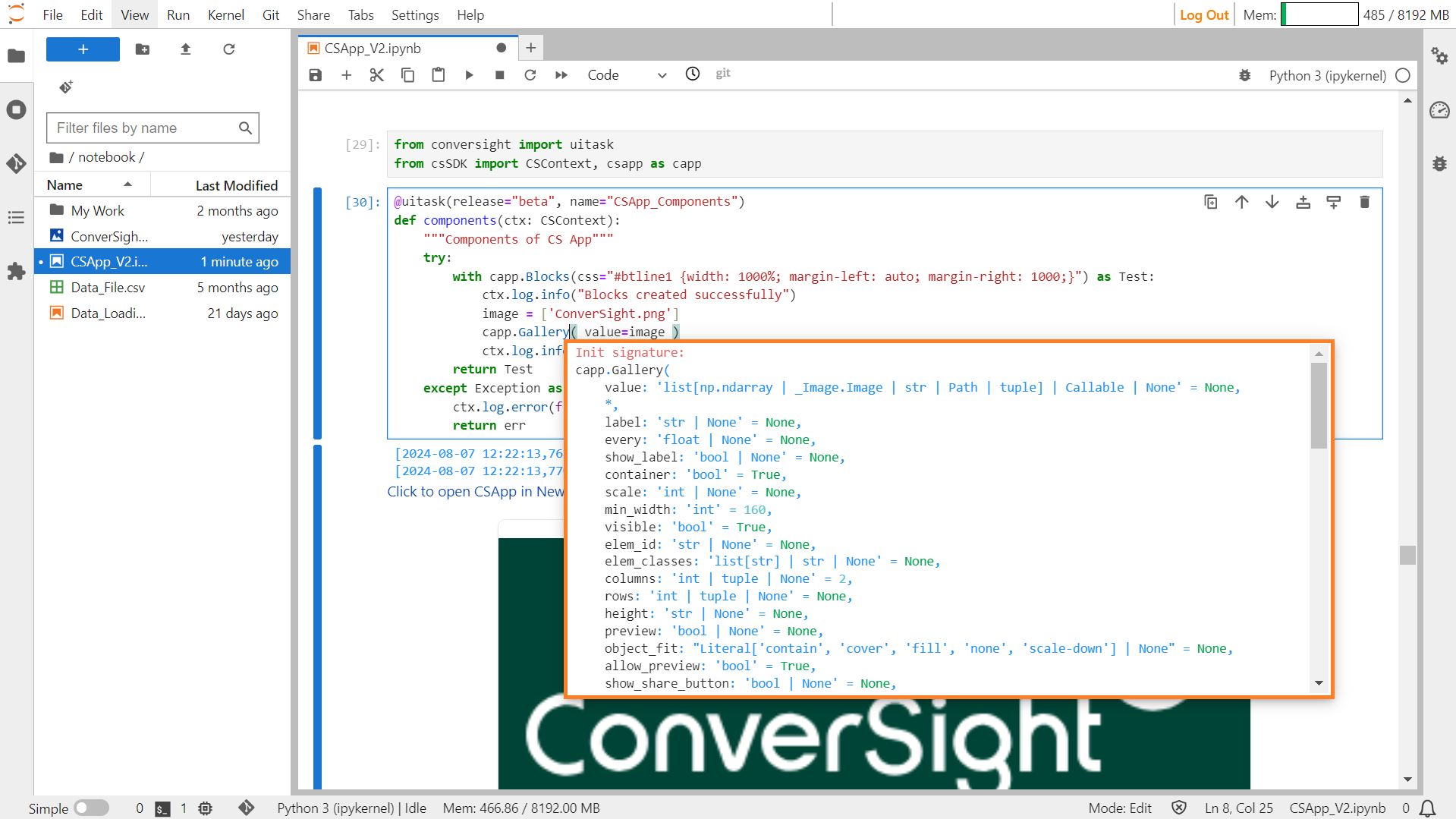
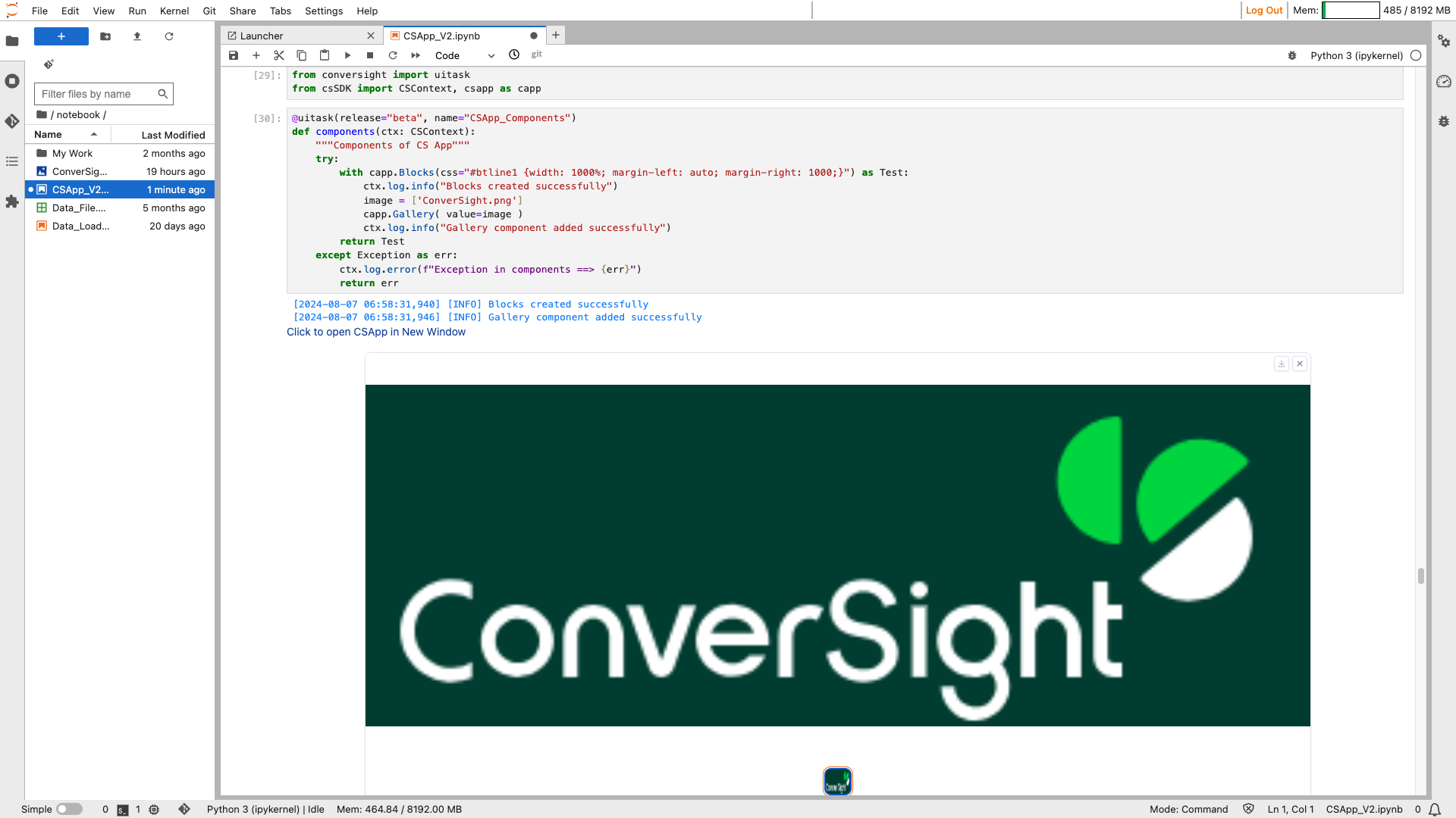
Gallery#
The Gallery component creates a gallery for displaying a grid of images, optionally with captions. Users can upload images to the gallery, and they can click on individual images to view them in higher resolution.
Syntax:
csapp.Gallery()
Gallery#
Parameters of the Gallery component:
Parameter |
Type |
Default |
Description |
|---|---|---|---|
value |
list[np.ndarray | PIL.Image.Image | str | Path | tuple] | Callable | None |
None |
Default value to show in the gallery. If callable, sets initial value. |
label |
str | None |
None |
The label for the component. Appears above it. |
every |
float | None |
None |
If value is callable, run the function periodically while the client connection is open. |
show_label |
bool | None |
None |
If True, display the label. |
container |
bool |
True |
If True, place the component in a container, providing extra padding around the border. |
scale |
int | None |
None |
Relative size compared to adjacent Components. |
min_width |
int |
160 |
Minimum pixel width, wrapping if not enough space. |
visible |
bool |
True |
If False, the component will be hidden. |
elem_id |
str | None |
None |
Optional HTML DOM id attribute. |
elem_classes |
list[ str] | str | None |
None |
Optional HTML DOM class attributes. |
columns |
int | tuple | None |
2 |
Number of images shown in one row, for each screen size. |
rows |
int | tuple | None |
None |
Number of rows in the image grid, for each screen size. |
height |
int | float | None |
None |
Height of the gallery component. |
allow_preview |
bool |
True |
If True, images will be enlarged when clicked. |
preview |
bool | None |
None |
If True, gallery will start in preview mode. |
object_fit |
Literal[‘contain’, ‘cover’, ‘fill’, ‘none’, ‘scale-down’] | None |
None |
CSS object-fit property for the thumbnail images in the gallery. |
show_share_button |
bool | None |
None |
If True, shows a share icon for sharing outputs to Hugging Face Spaces Discussions. |
show_download_button |
bool | None |
True |
If True, shows a download button for downloading the selected image. |
Sample :
Gallery#
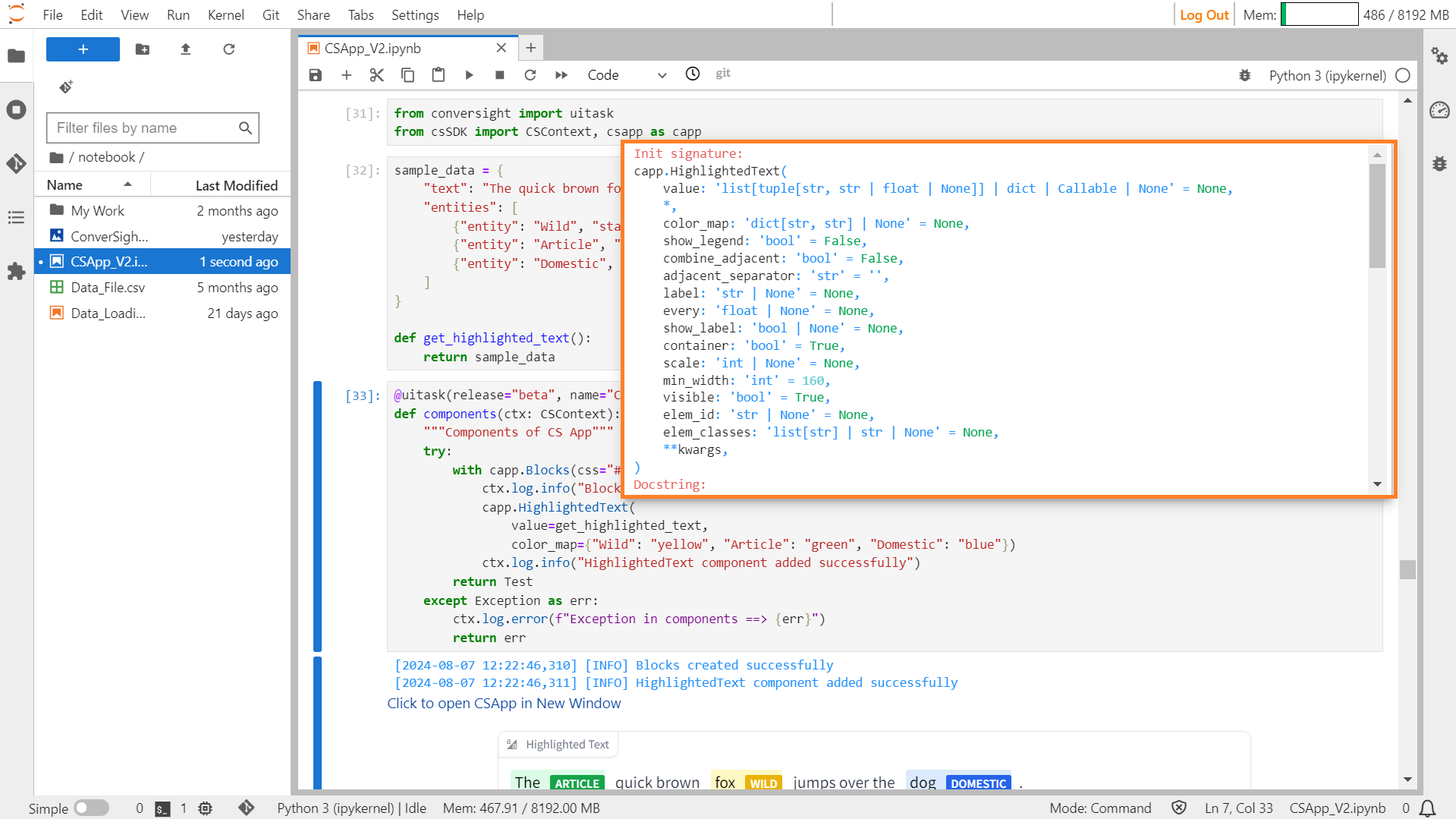
HighlightedText#
The HighlightedText feature showcases text with highlighted sections categorized based on specific criteria such as categories or numerical values. It visually emphasizes certain sections of the text to draw attention to important information or to signify specific attributes.
Syntax:
Highlighted_text_object=csapp. Highlightedtext()
HighlightedText#
Parameters of the HighlightedText Component:
Parameter |
Type |
Default |
Description |
|---|---|---|---|
value |
list[tuple[str, str | float | None]] | dict | Callable | None |
None |
Default value to show. If callable, sets initial value. |
color_map |
dict[str, str] | None |
None |
A dictionary mapping labels to colors. |
show_legend |
bool |
False |
Whether to show span categories in a separate legend or inline. |
combine_adjacent |
bool |
False |
If True, merge the labels of adjacent tokens belonging to the same category. |
adjacent_separator |
str |
“” |
Specifies the separator to be used between tokens if combine_adjacent is True. |
label |
str | None |
None |
The label for the component. Appears above it. |
every |
float | None |
None |
If value is a callable, run the function periodically while the client connection is open. |
show_label |
bool | None |
None |
If True, display the label. |
container |
bool |
True |
If True, place the component in a container, providing extra padding around the border. |
scale |
int | None |
None |
Relative size compared to adjacent components. |
min_width |
int |
160 |
Minimum pixel width, wrapping if not enough space. |
visible |
bool |
True |
If False, the component will be hidden. |
elem_id |
str | None |
None |
Optional HTML DOM id attribute. |
elem_classes |
list[ str] | str | None |
None |
Optional HTML DOM class attributes. |
Sample :
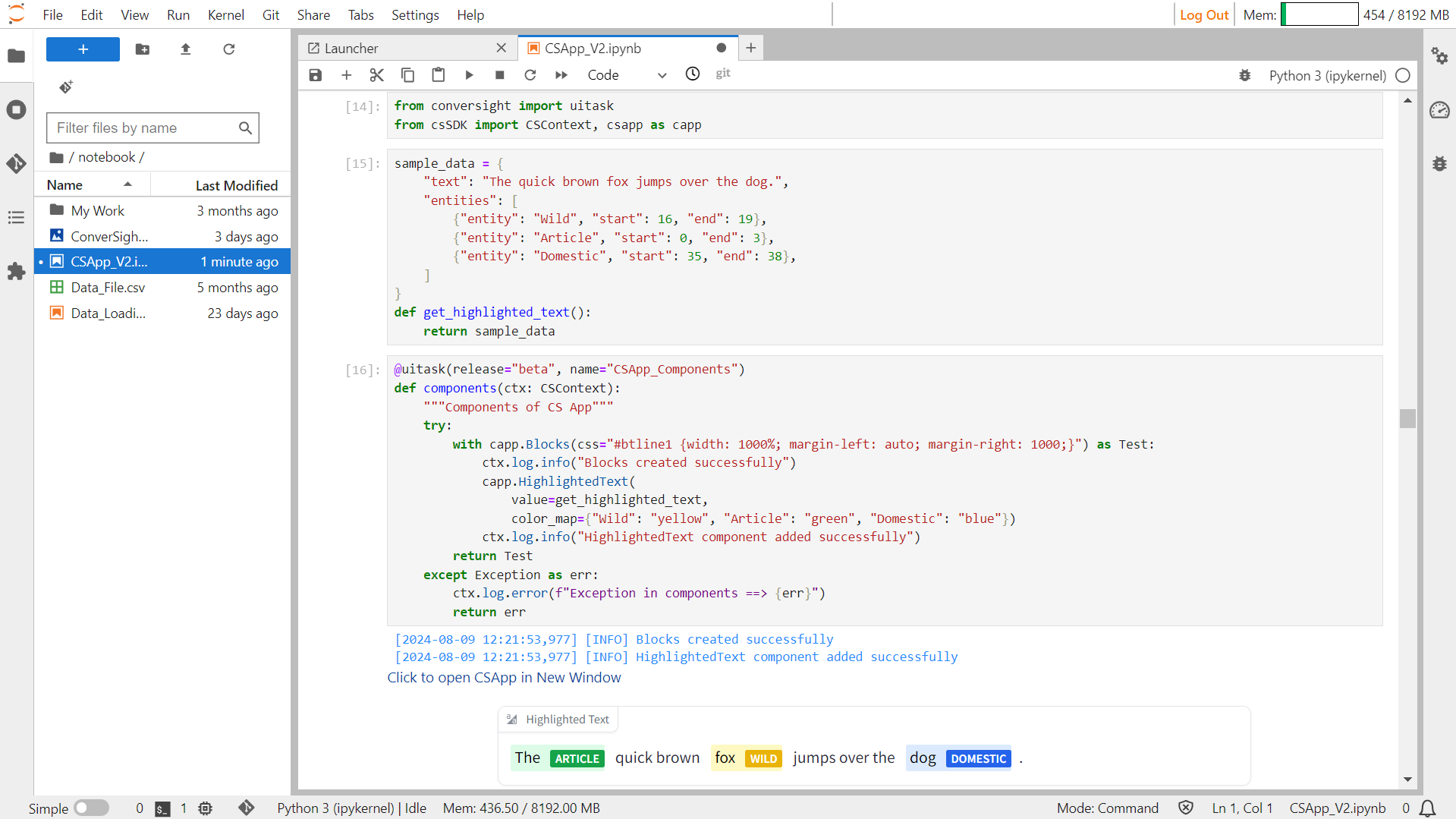
HighlightedText#
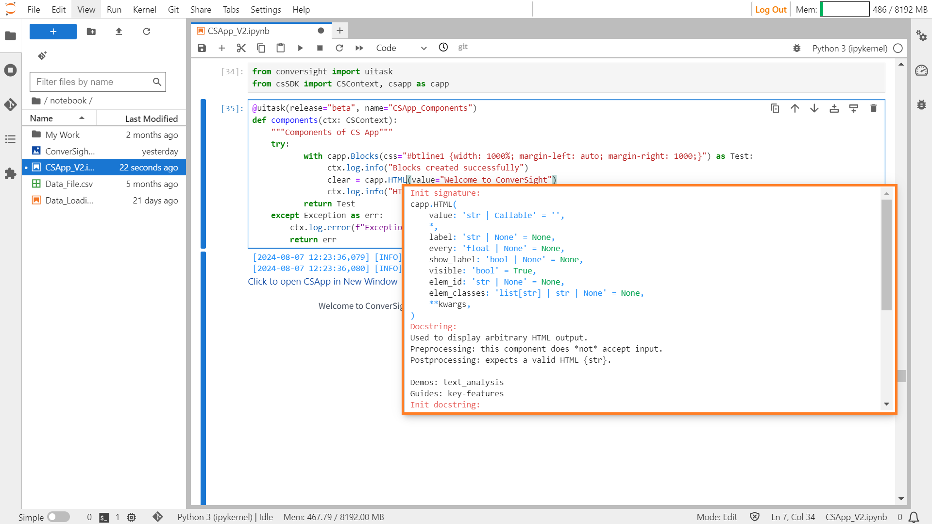
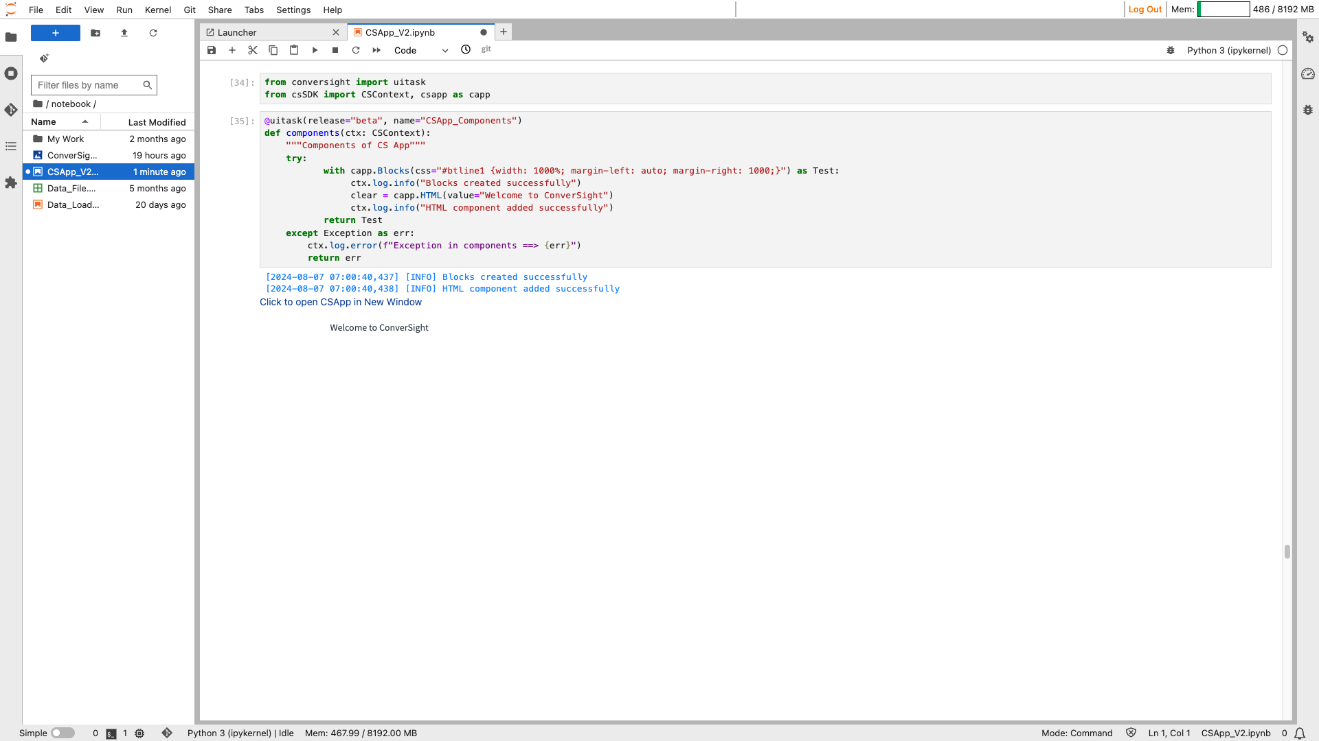
HTML#
This component is utilized for presenting arbitrary HTML output. It operates without accepting input and when functioning as output, it anticipates a valid HTML string.
Syntax:
csapp.HTML(value=’Value_string’)
HTML#
Paramters of the HTML component:
Parameter |
Type |
Default |
Description |
|---|---|---|---|
value |
str | Callable |
‘’ |
Default value. If callable, the function will be called whenever the app loads to set the initial value of the component. |
label |
str | None |
None |
Component name in interface. |
every |
float | None |
None |
If value is a callable, run the function every number of seconds while the client connection is open. |
show_label |
bool | None |
None |
If True, will display the label. |
visible |
bool |
True |
If False, the component will be hidden. |
elem_id |
str | None |
None |
An optional string that is assigned as the id of this component in the HTML DOM. |
elem_classes |
list[ str] | str | None |
None |
An optional list of strings that are assigned as the classes of this component in the HTML DOM. |
Sample :
HTML#
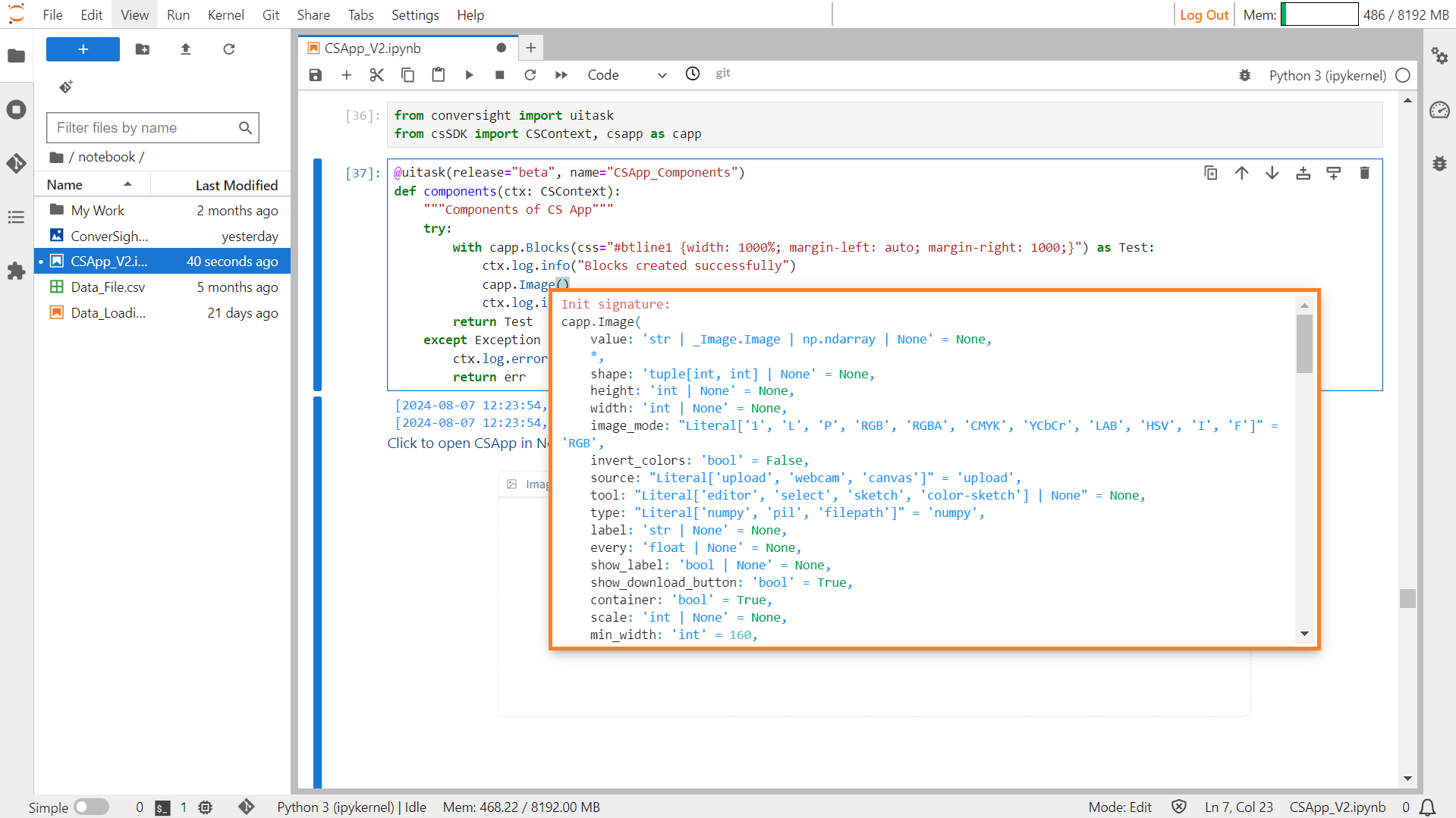
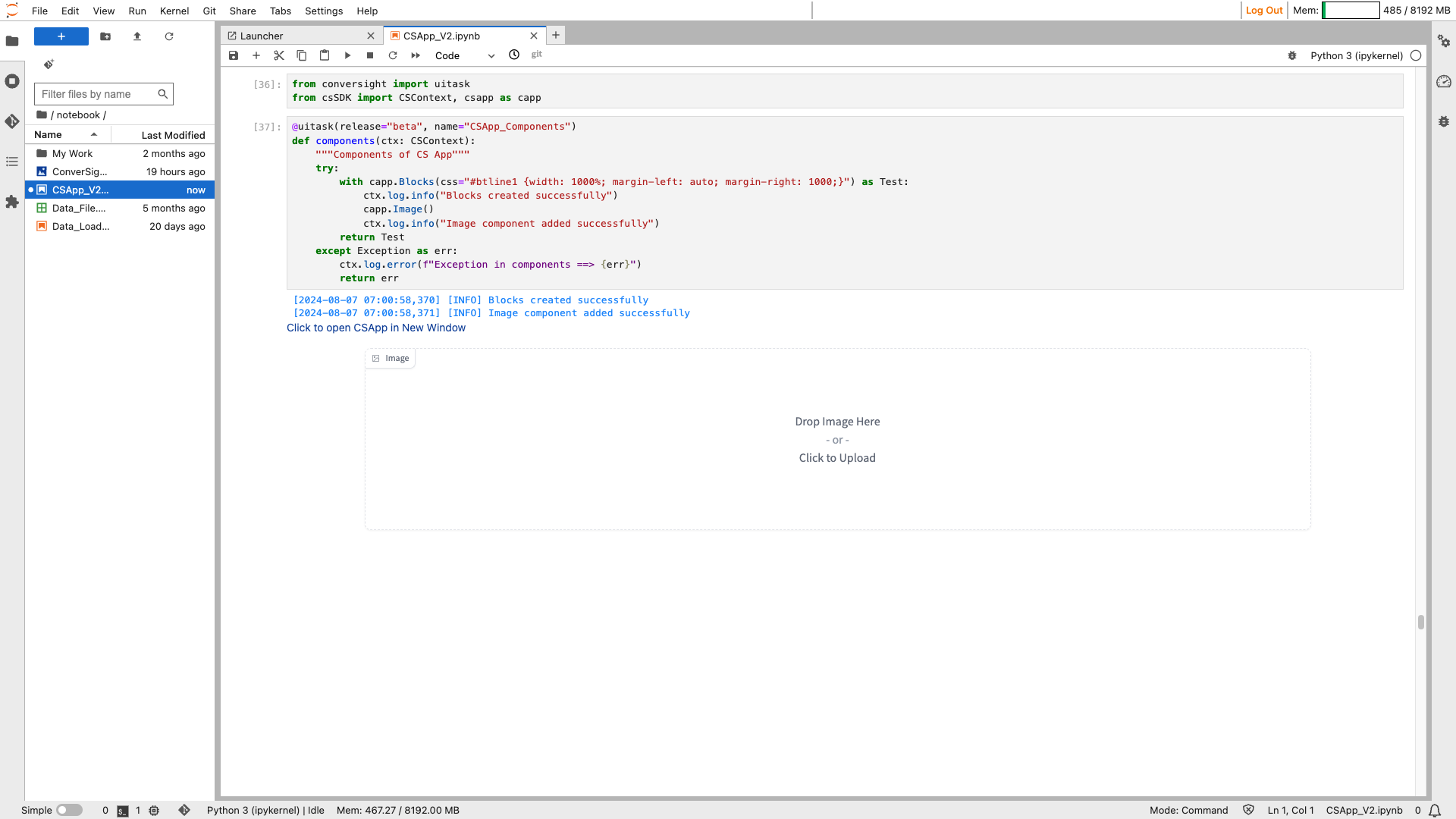
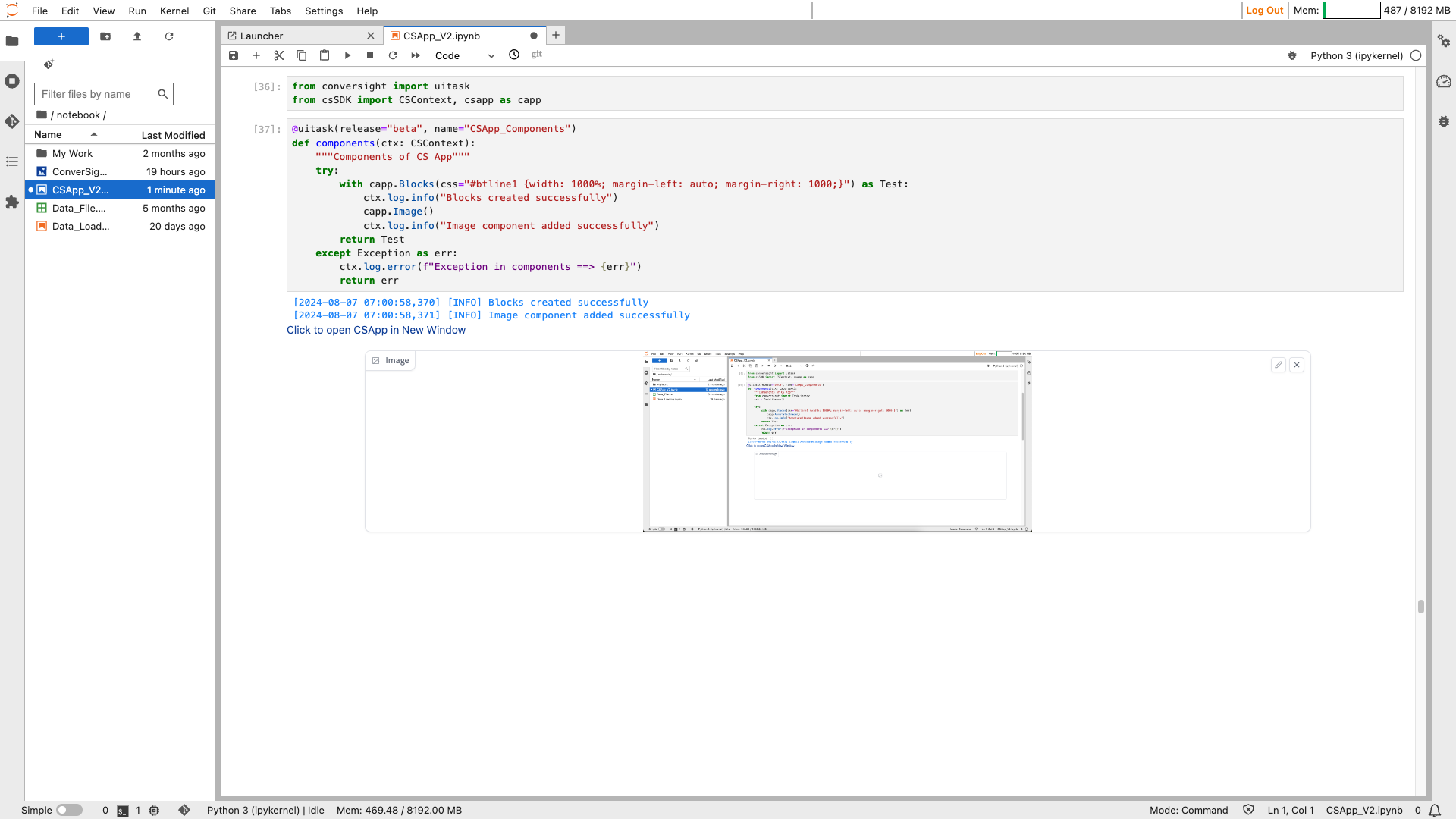
Image#
The Image component produces an image interface that enables users to either upload images or display existing ones. It supports both uploading images from the user’s device and showcasing images within the interface.
Syntax:
csapp.Image()
Image#
Parameters of Image Component:
Parameter |
Type |
Default |
Description |
|---|---|---|---|
value |
str | \ _Image.Image | np.ndarray | None |
None |
Default value for the image component. |
shape |
tuple[int, int] | None |
None |
Shape of the image. |
height |
int | None |
None |
Height of the image. |
width |
int | None |
None |
Width of the image. |
image_mode |
Literal[‘1’, ‘L’, ‘P’, ‘RGB’, ‘RGBA’, ‘CMYK’, ‘YCbCr’, ‘LAB’, ‘HSV’, ‘I’, ‘F’] |
‘RGB’ |
Image mode. |
invert_colors |
bool |
False |
If True, invert the colors of the image. |
source |
Literal[‘upload’, ‘webcam’, ‘canvas’] |
‘upload’ |
Source of the image. |
tool |
Literal[‘editor’, ‘select’, ‘sketch’, ‘color-sketch’] | None |
None |
Tool to use for interacting with the image. |
type |
Literal[‘numpy’, ‘pil’, ‘filepath’] |
‘numpy’ |
Type of the image value. |
label |
str | None |
None |
Label for the image component. |
every |
float | None |
None |
If specified, run a function periodically while the client connection is open. |
show_label |
bool | None |
None |
If True, display the label. |
show_download_button |
bool |
True |
If True, show a download button for the image. |
container |
bool |
True |
If True, place the component in a container. |
scale |
int | None |
None |
Relative size compared to adjacent components. |
min_width |
int |
160 |
Minimum pixel width, wrapping if not enough space. |
interactive |
bool | None |
None |
If True, allows user interaction with the image. |
visible |
bool |
True |
If False, the component will be hidden. |
streaming |
bool |
False |
If True, enables streaming for the webcam. |
elem_id |
str | None |
None |
Optional HTML DOM id attribute. |
elem_classes |
list[ str] | str | None |
None |
Optional HTML DOM class attributes. |
mirror_webcam |
bool |
True |
If True, mirror the webcam feed. |
brush_radius |
float | None |
None |
Radius of the brush when using sketch tools. |
brush_color |
str |
‘#000000’ |
Color of the brush when using sketch tools. |
mask_opacity |
float |
0.7 |
Opacity of the mask when using sketch tools. |
show_share_button |
bool | None |
None |
If True, show a share button for the image. |
Sample :
Image#
Image#
Image#
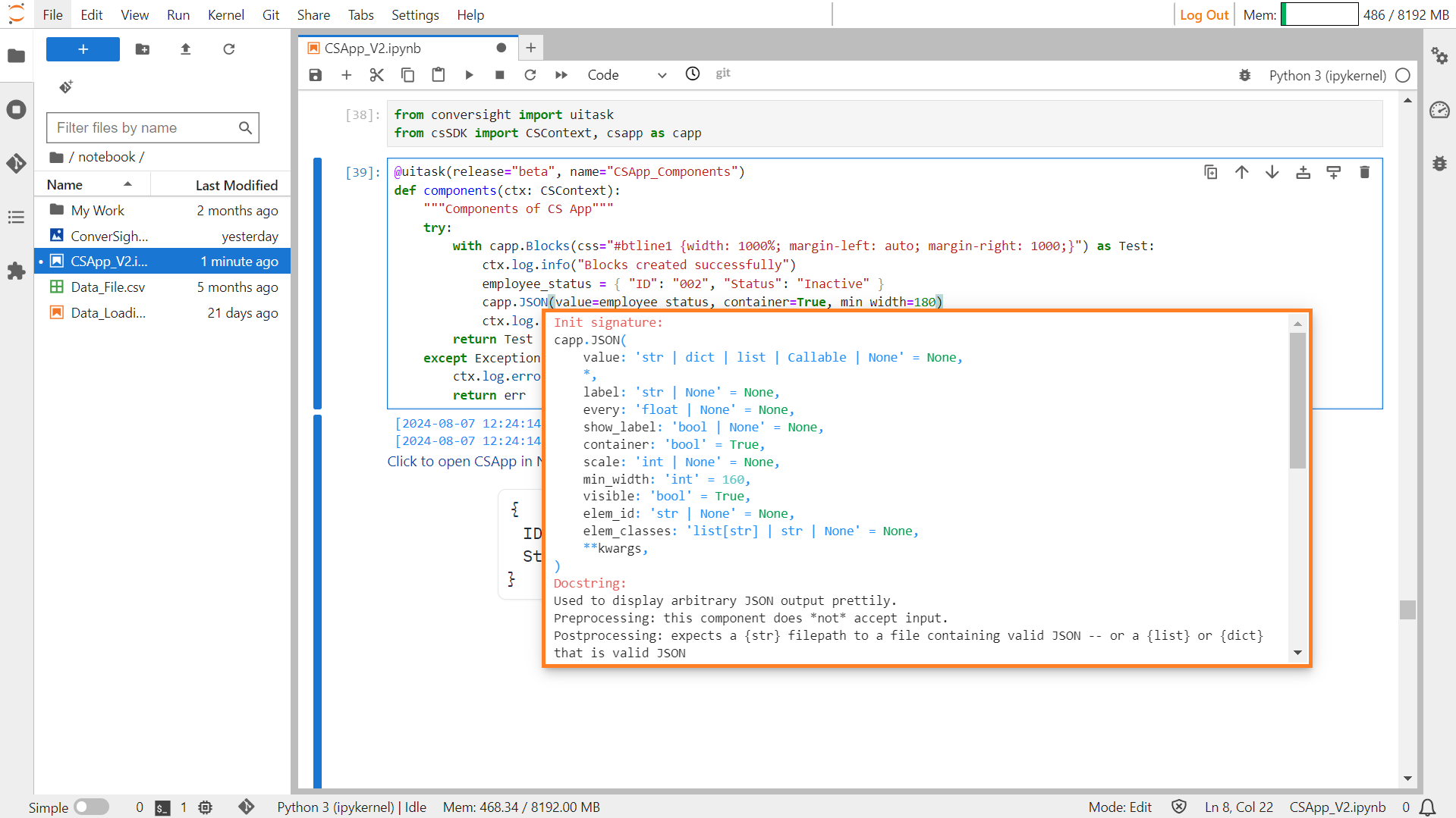
JSON#
The Json component is designed to neatly display arbitrary JSON output. Its purpose is to present JSON data in a visually organized and understandable format.
Syntax:
csapp.Json(value= example_json_file)
JSON#
Parameters of JSON Component:
Parameter |
Type |
Default |
Description |
|---|---|---|---|
value |
str | dict | list | Callable | None |
None |
Default value. If callable, sets initial value. |
label |
str | None |
None |
The label for the component. |
every |
float | None |
None |
If value is a callable, run the function periodically while the client connection is open. |
show_label |
bool | None |
None |
If True, display label. |
container |
bool |
True |
If True, place the component in a container. |
scale |
int | None |
None |
Relative size compared to adjacent Components. Should be an integer. Applies in Rows and to top-level Components in Blocks where fill_height=True. |
min_width |
int |
160 |
Minimum pixel width, wrapping if not enough space. |
visible |
bool |
True |
If False, the component will be hidden. |
elem_id |
str | None |
None |
Optional HTML DOM id attribute. |
elem_classes |
list[ str] | str | None |
None |
Optional HTML DOM class attributes. |
Sample :
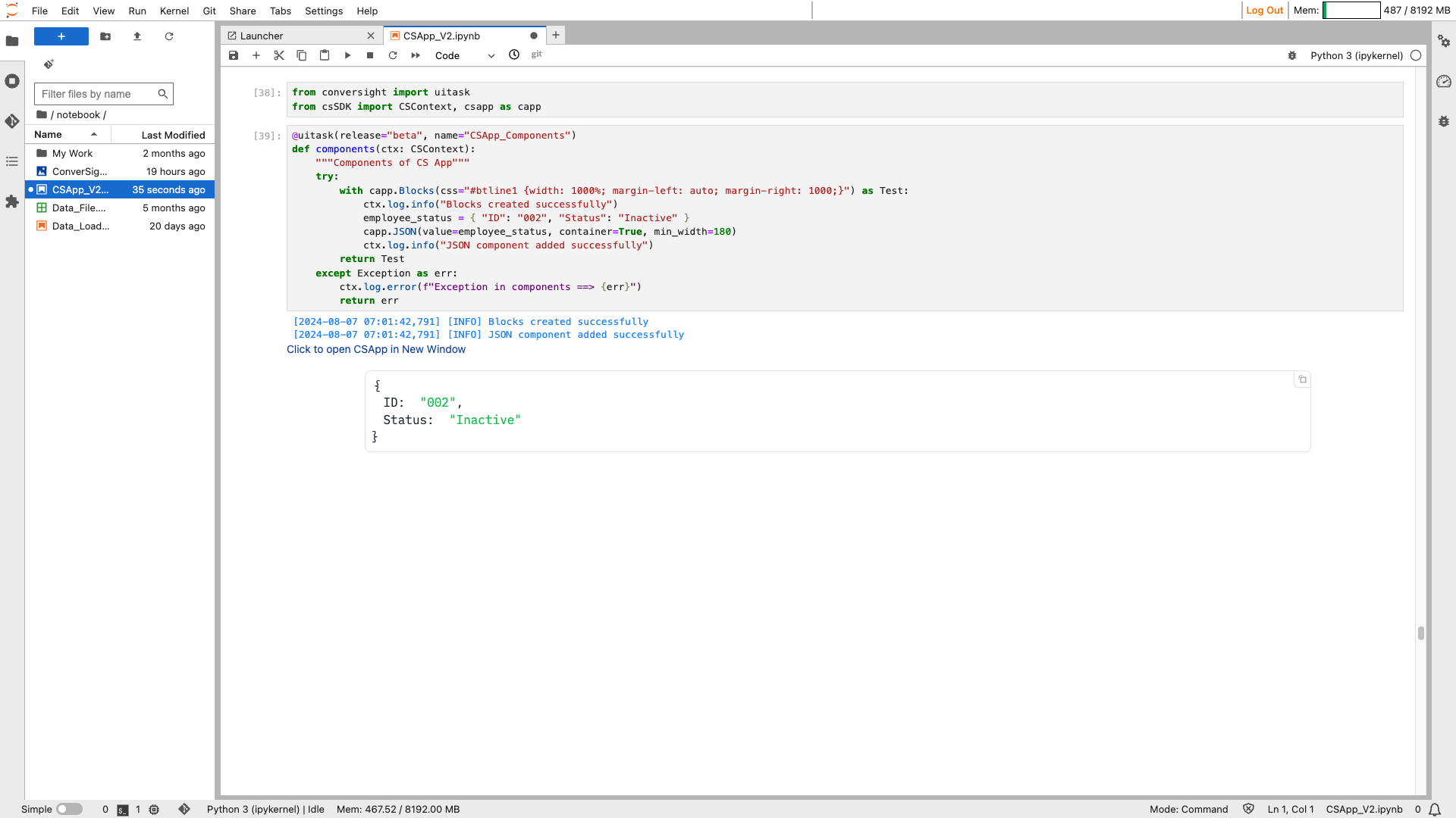
JSON#
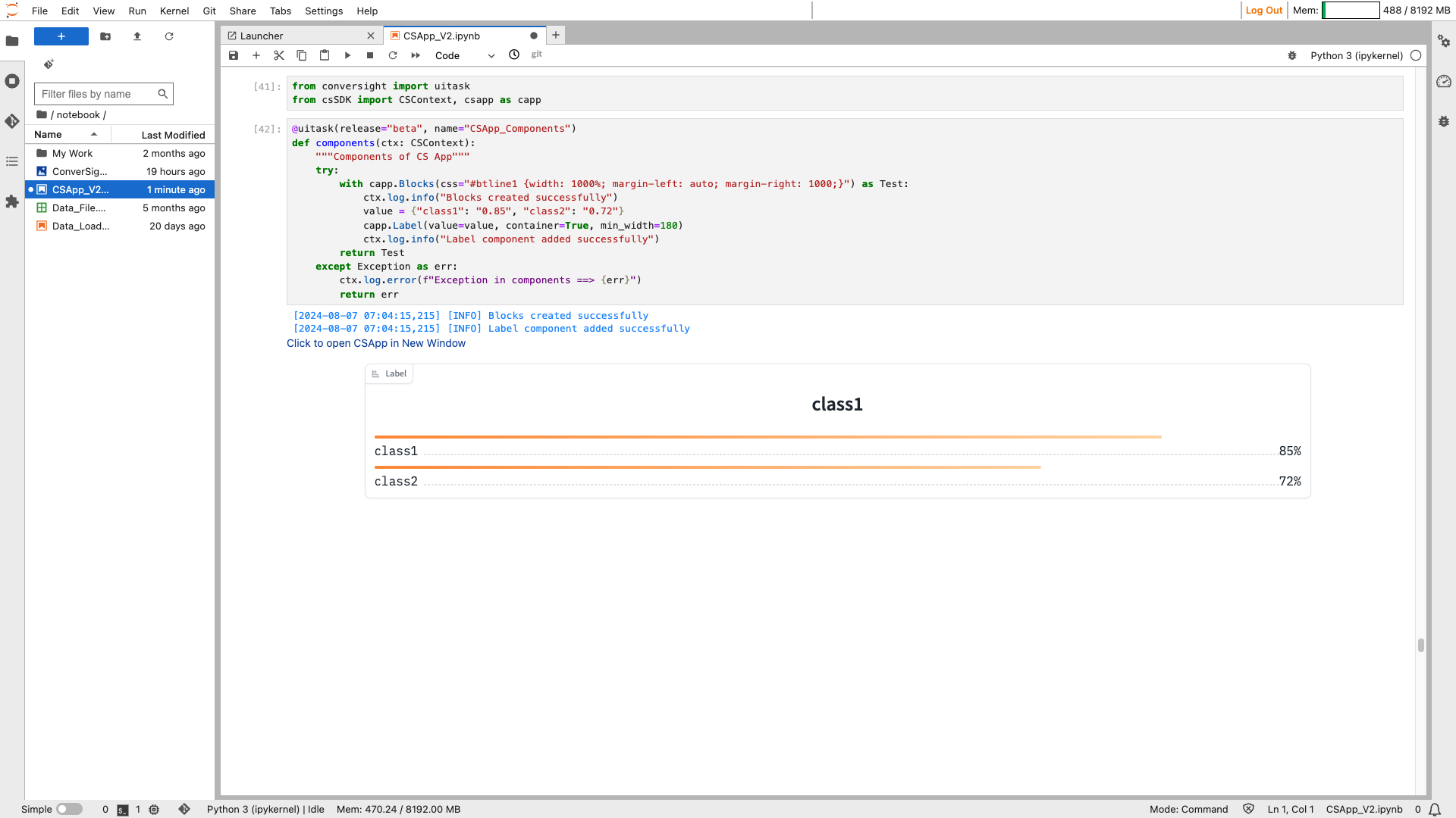
Label#
The Label component displays a classification label and confidence scores, if available, facilitating rapid identification and evaluation according to confidence levels.
Syntax:
csapp.Label()
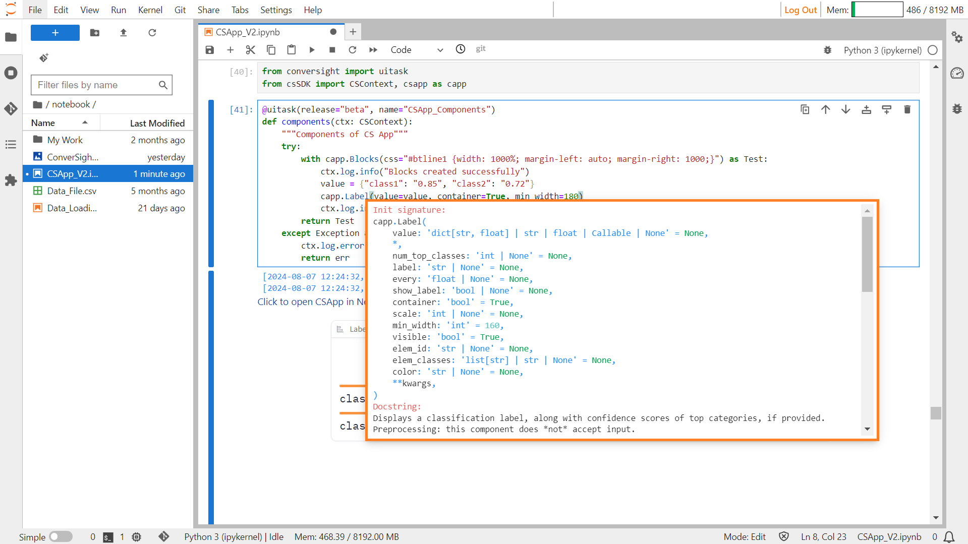
Label#
Parameters of Label component:
Parameter |
Type |
Default |
Description |
|---|---|---|---|
value |
dict[str, float] | str | float | Callable | None |
None |
Default value to show in the component. If a str or number is provided, simply displays the string or number. If a dictionary of classes and confidences is provided, displays the top class on top and the num_top_classes below, along with their confidence bars. If callable, sets initial value. |
num_top_classes |
int | None |
None |
Number of most confident classes to show. |
label |
str | None |
None |
The label for the component. |
every |
float | None |
None |
If value is a callable, run the function periodically while the client connection is open. |
show_label |
bool | None |
None |
If True, display label. |
container |
bool |
True |
If True, place the component in a container. |
scale |
int | None |
None |
Relative size compared to adjacent Components. Should be an integer. Applies in Rows and to top-level Components in Blocks where fill_height=True. |
min_width |
int |
160 |
Minimum pixel width, wrapping if not enough space. |
visible |
bool |
True |
If False, the component will be hidden. |
elem_id |
str | None |
None |
Optional HTML DOM id attribute. |
elem_classes |
list[ str] | str | None |
None |
Optional HTML DOM class attributes. |
color |
str | None |
None |
The background color of the label (either a valid CSS color name or hexadecimal string). |
Sample :
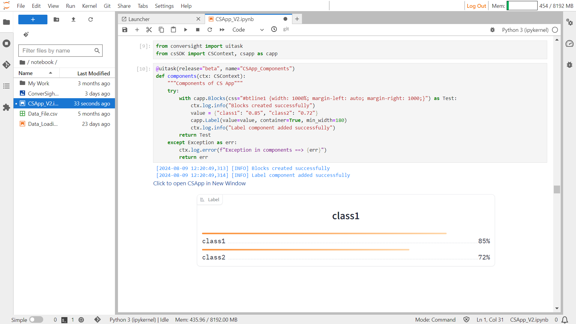
Label#
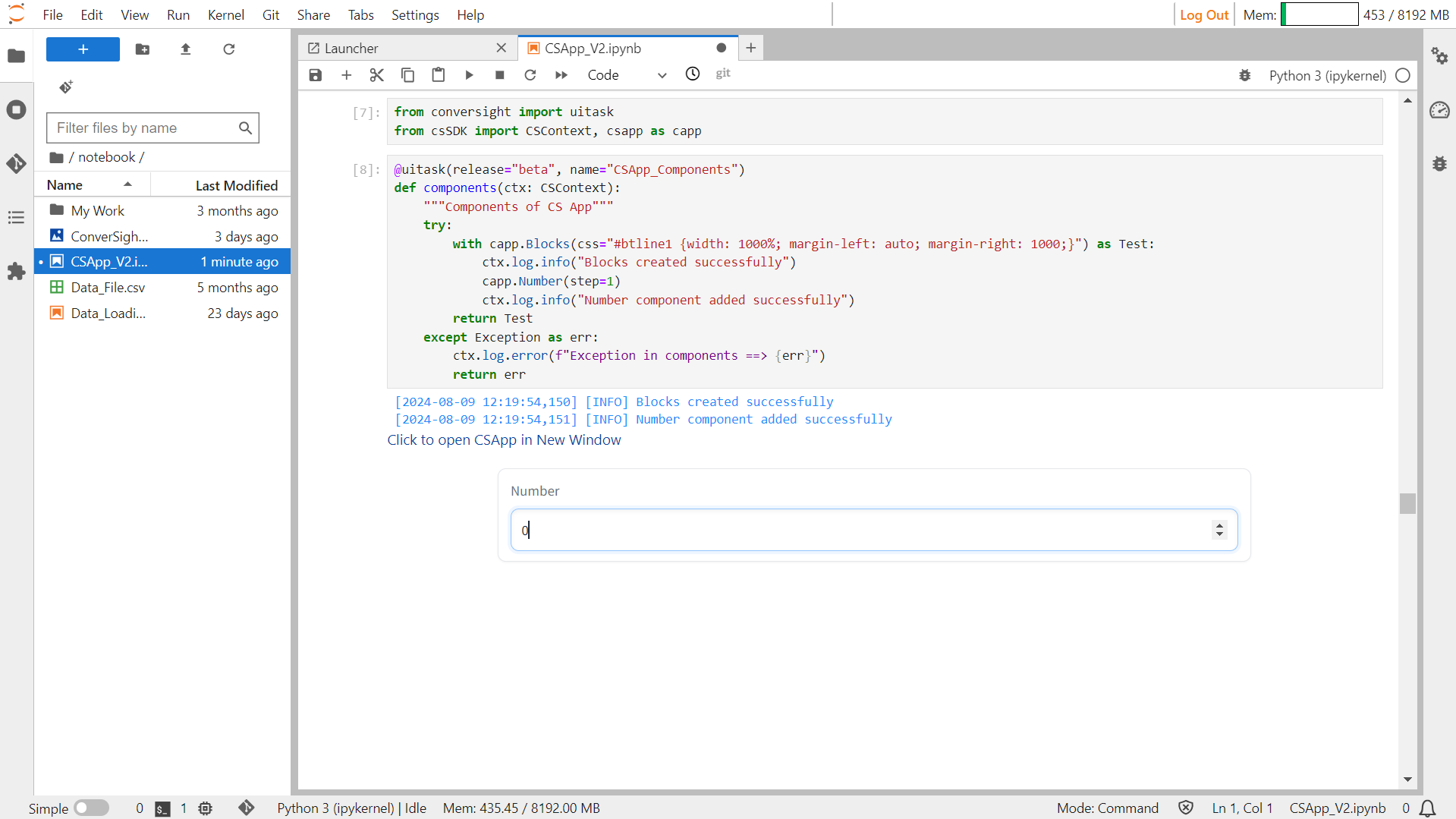
Number#
The Number component generates a numeric field that allows users to input numbers or display numeric outputs.
Syntax:
csapp.Number()
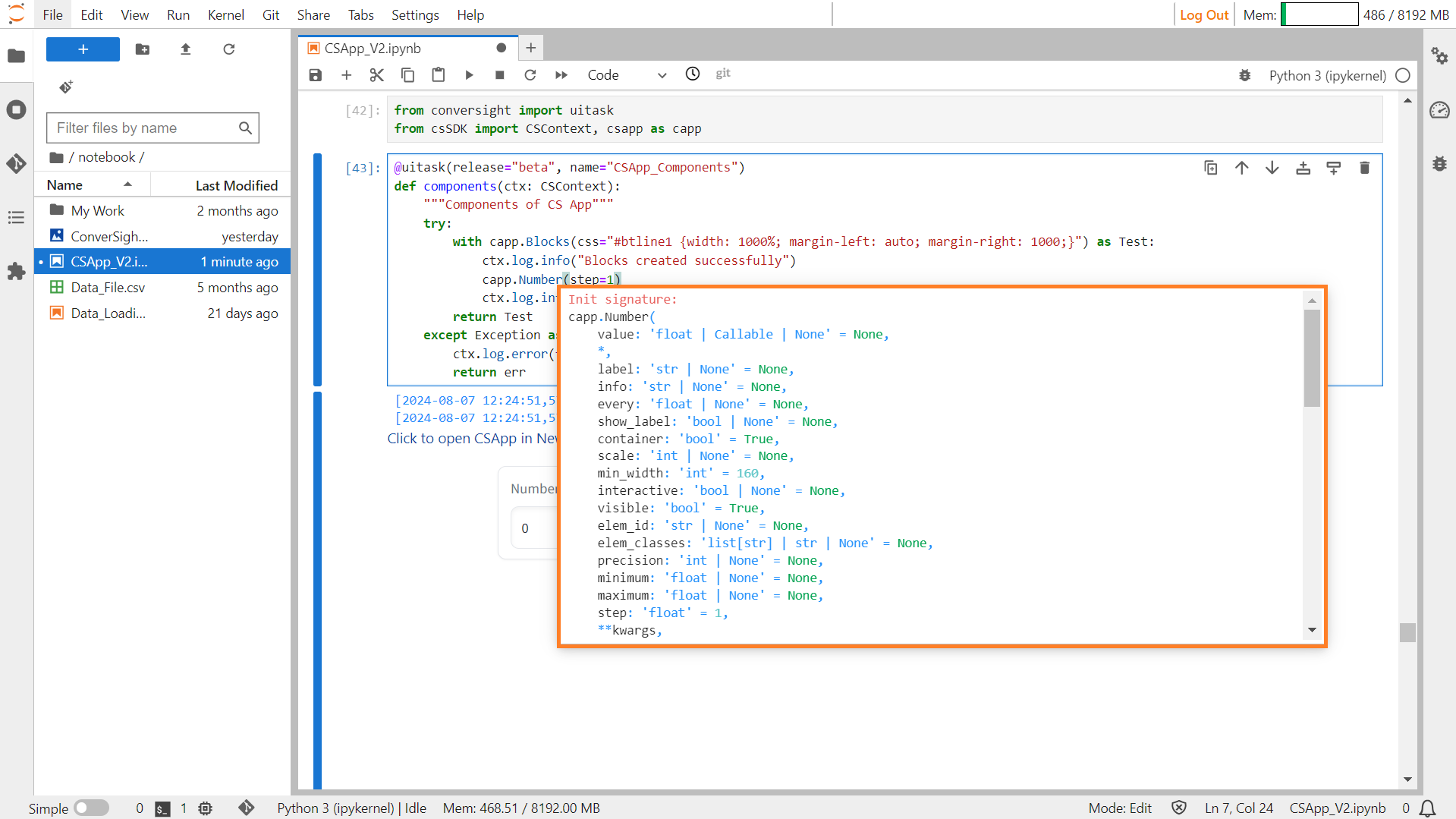
Number#
Parameters of the Number Component:
Parameter |
Type |
Default |
Description |
|---|---|---|---|
value |
float | Callable | None |
None |
Default value. If callable, it will be called whenever the app loads to set the initial value of the component. |
label |
str | None |
None |
The label for this component, which appears above the component. |
info |
str | None |
None |
Additional component description. |
every |
float | None |
None |
If the value is a callable, determines the frequency in seconds to run the function while the client connection is open. |
show_label |
bool | None |
None |
If True, the label will be displayed above the component. |
container |
bool |
True |
If True, the component will be placed in a container, providing extra padding around the border. |
scale |
int | None |
None |
Relative size compared to adjacent Components. |
min_width |
int |
160 |
The minimum pixel width of the component. It will wrap if not sufficient screen space is available to satisfy this value. |
interactive |
bool | None |
None |
If True, the component will be editable; if False, editing will be disabled. If not provided, this is inferred based on whether the component is used as an input or output. |
visible |
bool |
True |
If False, the component will be hidden. |
elem_id |
str | None |
None |
An optional string that is assigned as the id of this component in the HTML DOM. Can be used for targeting CSS styles. |
elem_classes |
list[ str] | str | None |
None |
An optional list of strings that are assigned as the classes of this component in the HTML DOM. |
precision |
int | None |
None |
Precision to round input/output to. If set to 0, will round to nearest integer and convert type to int. If None, no rounding happens. |
minimum |
float | None |
None |
Minimum value. Only applied when the component is used as an input. If a user provides a smaller value, a gr.Error exception is raised by the backend. |
maximum |
float | None |
None |
Maximum value. Only applied when the component is used as an input. If a user provides a larger value, a gr.Error exception is raised by the backend. |
step |
float |
1 |
The interval between allowed numbers in the component. Can be used along with optional parameters minimum and maximum to create a range of legal values starting from the minimum and incrementing according to this parameter. |
Sample :
Number#
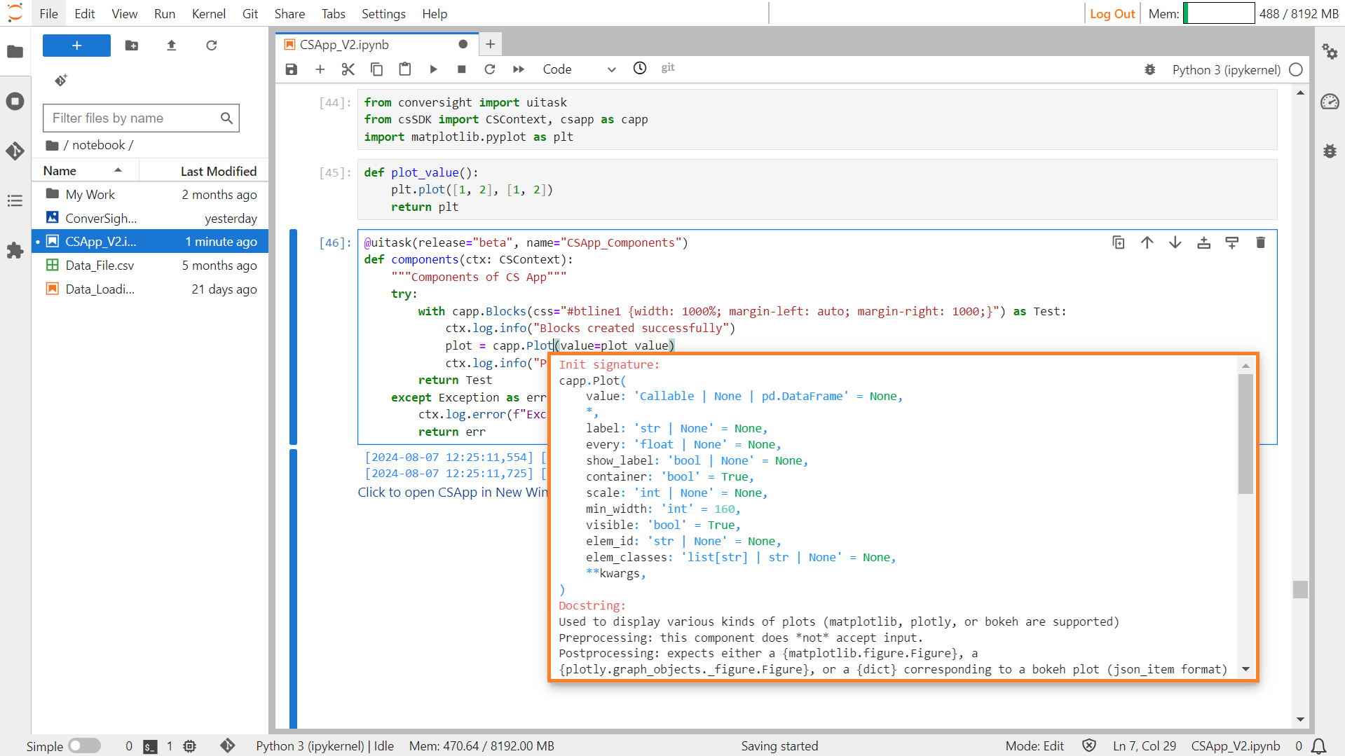
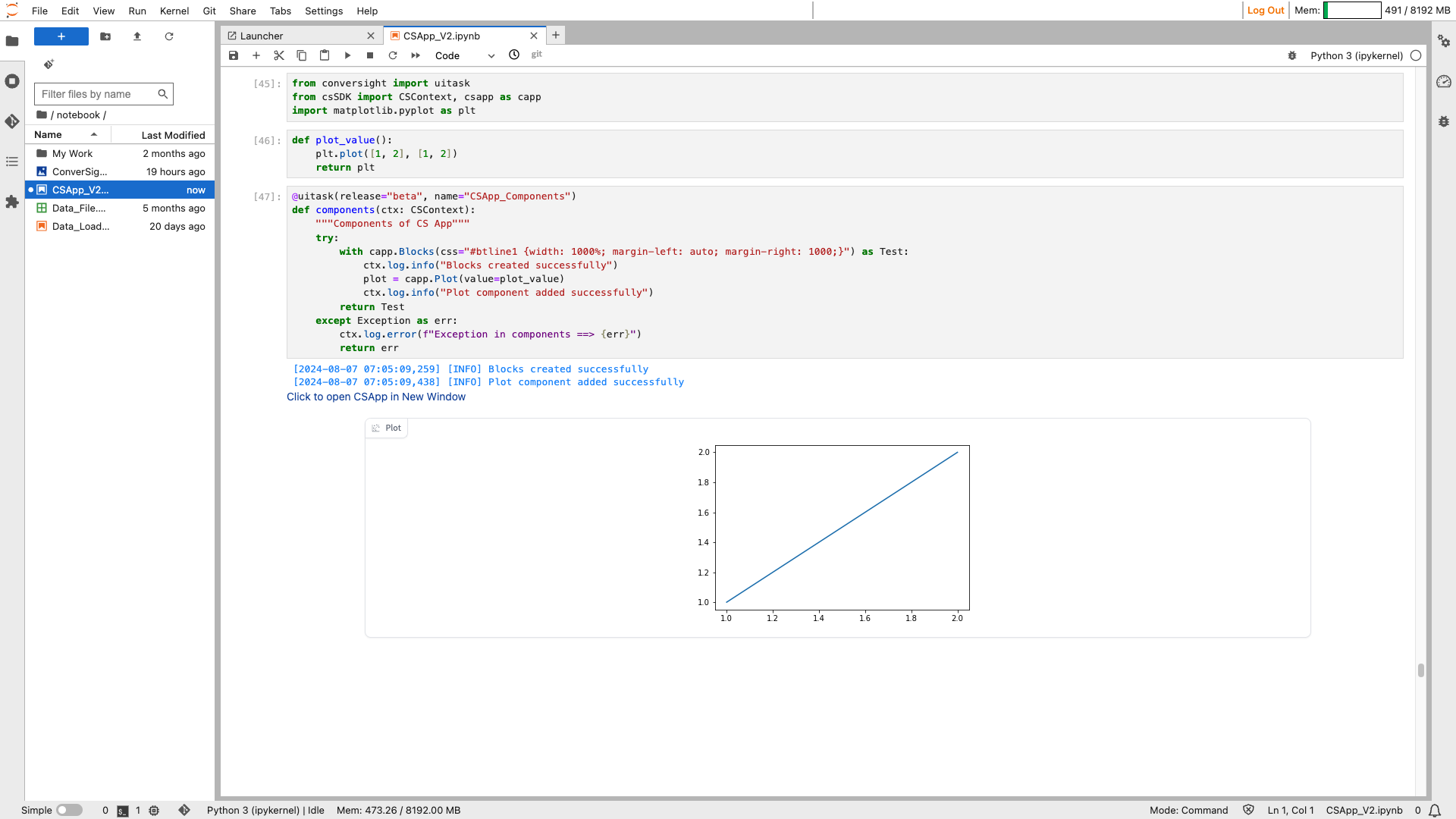
Plot#
The Plot component creates a plot that can showcase different types of plots, supporting libraries.
Syntax:
csapp.Plot(value= plot_function)
Plot#
Parameters of the Plot component:
Parameter |
Type |
Default |
Description |
|---|---|---|---|
value |
Any | None |
None |
Default plot object to display. Must be a matplotlib, plotly, altair, or bokeh figure, or a callable. If callable, sets initial value. |
label |
str | None |
None |
The label for the component. |
every |
float | None |
None |
If value is a callable, run the function periodically while the client connection is open. |
show_label |
bool | None |
None |
If True, display label. |
container |
bool |
True |
If True, place the component in a container. |
scale |
int | None |
None |
Relative size compared to adjacent Components. Should be an integer. Applies in Rows and to top-level Components in Blocks where fill_height=True. |
min_width |
int |
160 |
Minimum pixel width, wrapping if not enough space. |
visible |
bool |
True |
If False, the component will be hidden. |
elem_id |
str | None |
None |
Optional HTML DOM id attribute. |
elem_classes |
list[ str] | str | None |
None |
Optional HTML DOM class attributes. |
Sample :
Plot#
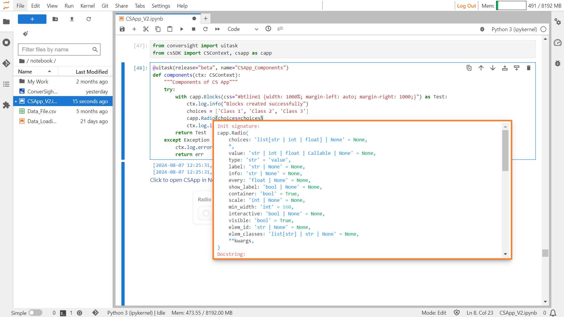
Radio#
The Radio component generates a group of radio buttons, allowing users to select only one option from a set of choices, which can be either strings or numeric values.
Syntax:
csapp.Radio(choices = List_of_options)
Radio#
Parameters of the Radio components:
Parameter |
Type |
Default |
Description |
|---|---|---|---|
choices |
list[str | int | float | tuple[str, str | int | float]] | None |
None |
List of options to select from. An option can also be a tuple of (name, value). |
value |
str | int | float | Callable | None |
None |
Default selected option. If callable, sets initial value. |
type |
str |
“value” |
Type of value returned by the component. “value” returns the selected choice, “index” returns the index of the choice selected. |
label |
str | None |
None |
The label for the component. |
info |
str | None |
None |
Additional component description. |
every |
float | None |
None |
If value is a callable, run the function periodically while the client connection is open. |
show_label |
bool | None |
None |
If True, display label. |
container |
bool |
True |
If True, place the component in a container. |
scale |
int | None |
None |
Relative width compared to adjacent Components in a Row. |
min_width |
int |
160 |
Minimum pixel width, wrapping if not enough space. |
interactive |
bool | None |
None |
If True, choices are selectable; if False, selection is disabled. |
visible |
bool |
True |
If False, the component will be hidden. |
elem_id |
str | None |
None |
Optional HTML DOM id attribute. |
elem_classes |
list[ str] | str | None |
None |
Optional HTML DOM class attributes. |
Sample :
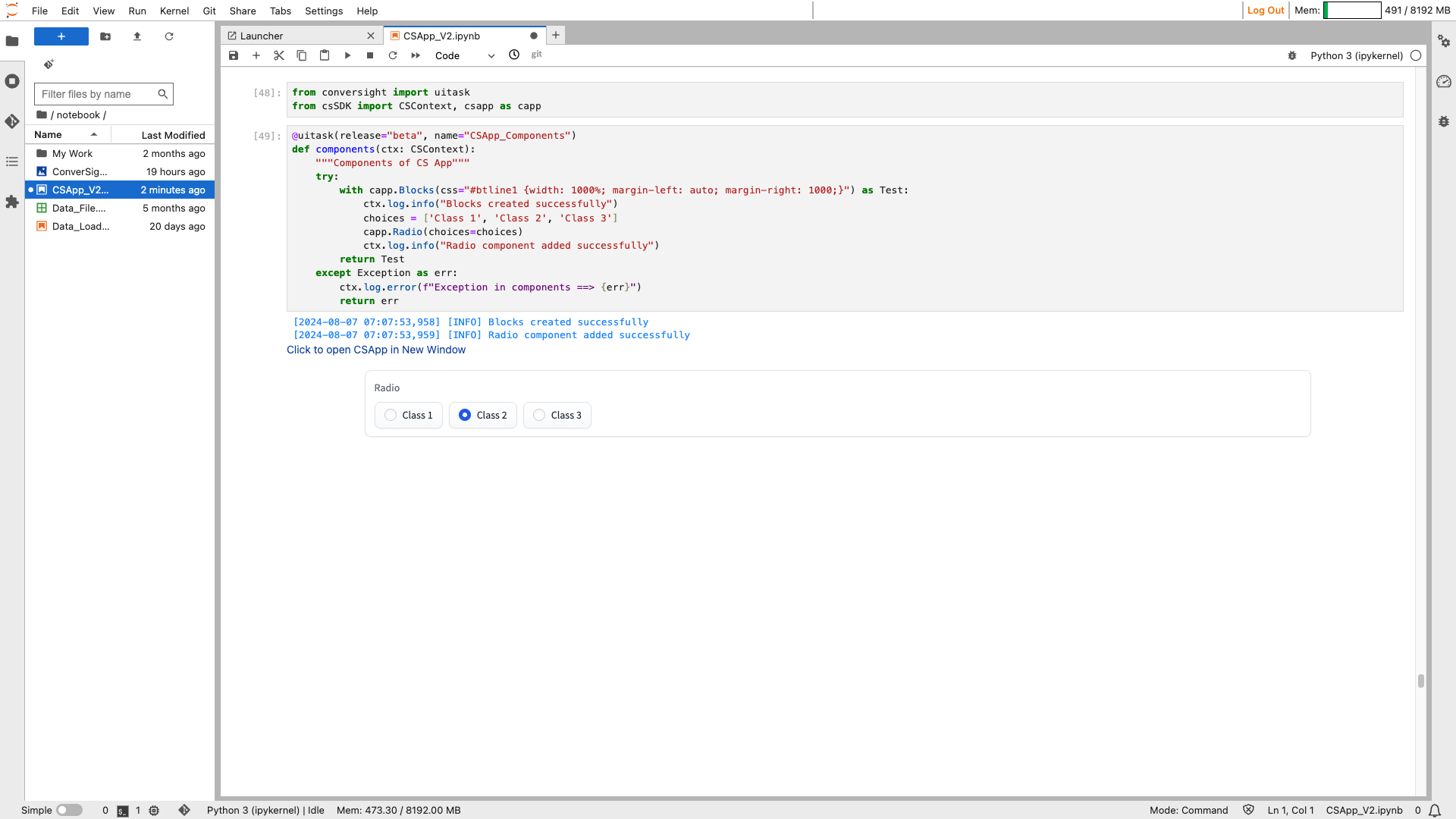
Radio#
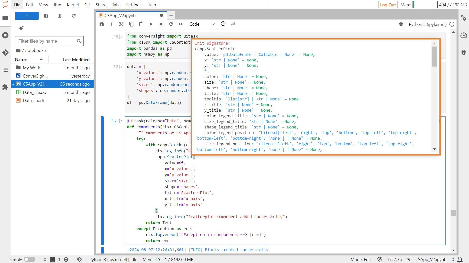
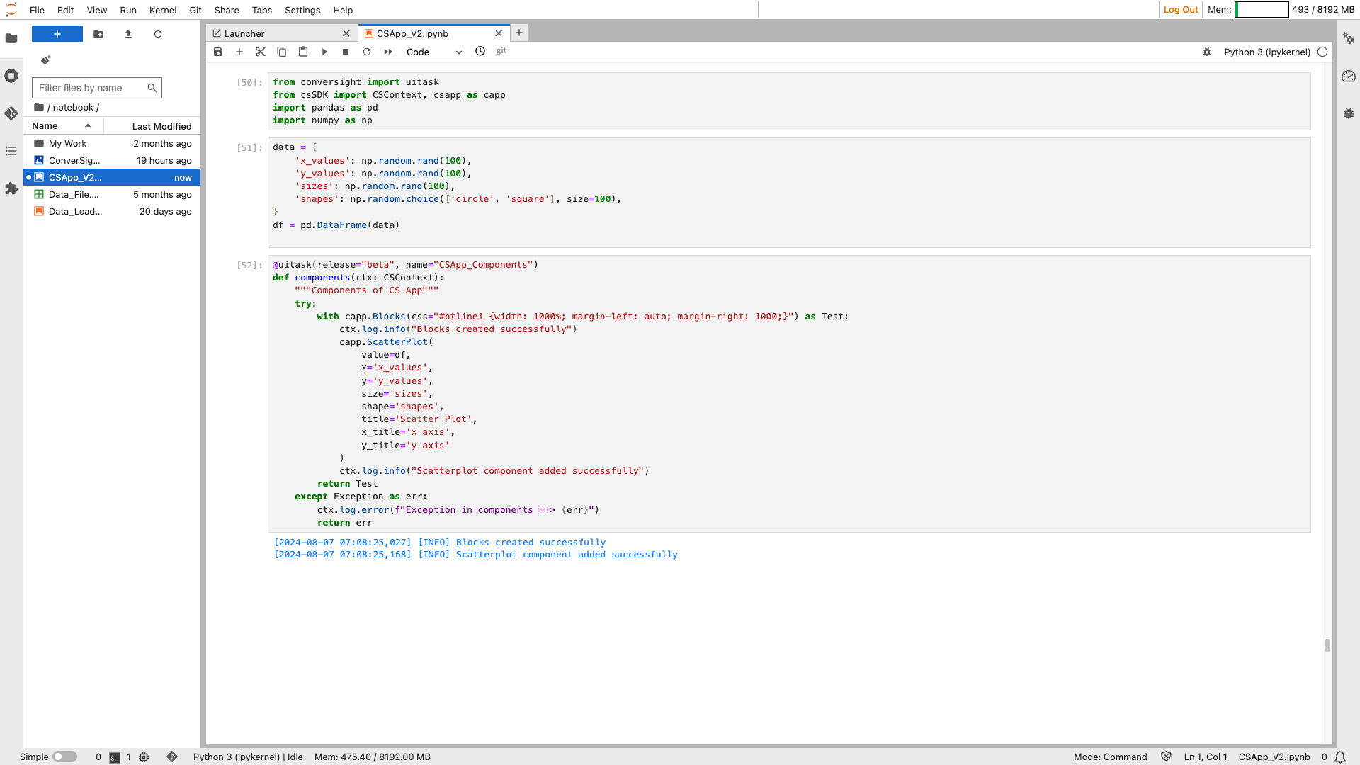
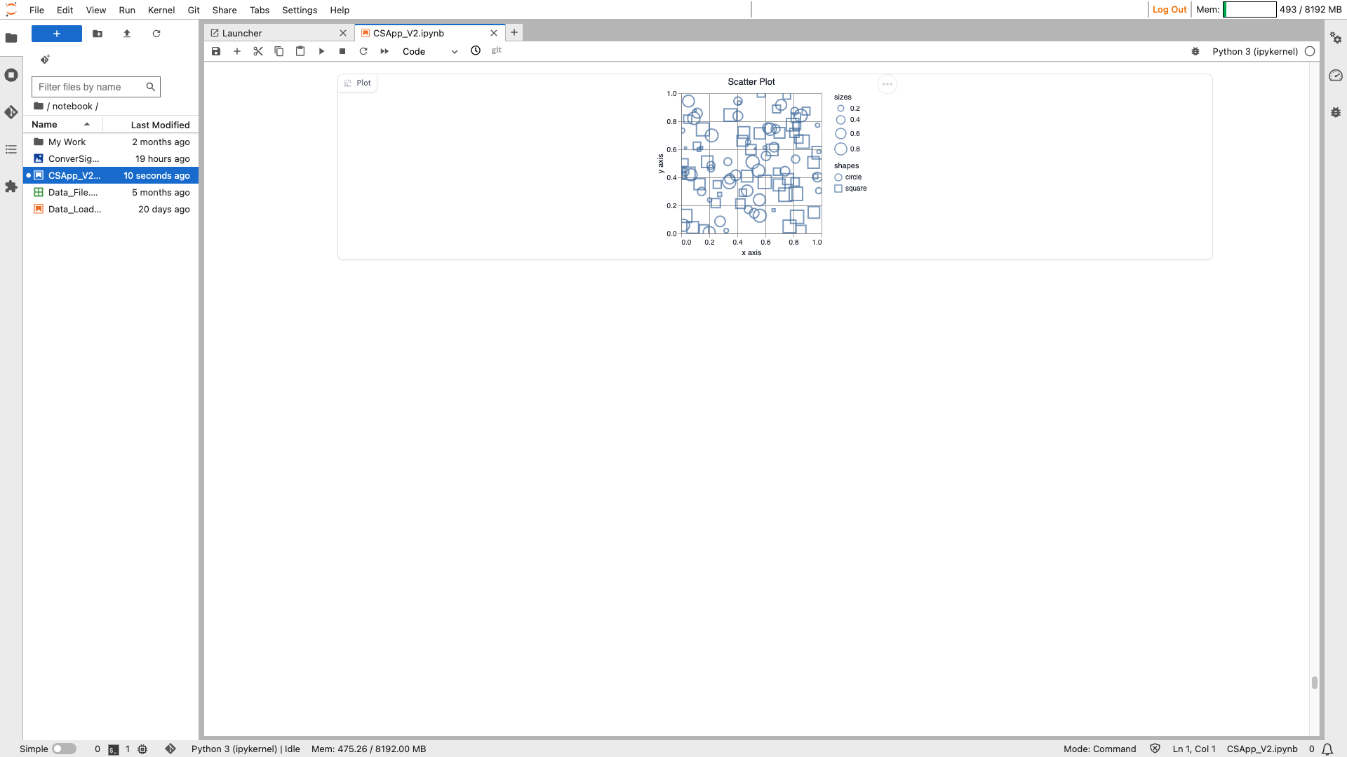
Scatter Plot#
The ScatterPlot component is used to display a scatter plot visualization of data. It allows users to visualize the relationship between two variables by plotting individual data points on a Cartesian coordinate system. Users can interact with the scatter plot by hovering over data points to see their exact values, or by zooming in and out to focus on specific regions of interest.
Syntax:
csapp.ScatterPlot(Parameters)
Scatter Plot#
Parameters of the ScatterPlot component:
Parameter |
Type |
Default |
Description |
|---|---|---|---|
value |
‘pd.DataFrame ,Callable’ |
None |
The pandas dataframe containing the data to display in a scatter plot, or a callable. If callable, the function will be called whenever the app loads to set the initial value of the component. |
x |
‘str,None’ |
None |
Column corresponding to the x-axis. |
y |
‘str,None’ |
None |
Column corresponding to the y-axis. |
color |
‘str,None’ |
None |
The column to determine the point color. If the column contains numeric data, csapp will interpolate the column data so that small values correspond to light colors and large values correspond to dark values. |
size |
‘str,None’ |
None |
The column used to determine the point size. Should contain numeric data so that csapp can map the data to the point size. |
shape |
‘str,None’ |
None |
The column used to determine the point shape. Should contain categorical data. Gradio will map each unique value to a different shape. |
title |
‘str,None’ |
None |
The title to display on top of the chart. |
tooltip |
‘list[ str],str,None’ |
None |
The column (or list of columns) to display on the tooltip when a user hovers a point on the plot. |
x_title |
‘str,None’ |
None |
The title given to the x-axis. By default, uses the value of the x parameter. |
y_title |
‘str,None’ |
None |
The title given to the y-axis. By default, uses the value of the y parameter. |
color_legend_title |
‘str,None’ |
None |
The title given to the color legend. By default, uses the value of the color parameter. |
size_legend_title |
‘str,None’ |
None |
The title given to the size legend. By default, uses the value of the size parameter. |
shape_legend_title |
‘str,None’ |
None |
The title given to the shape legend. By default, uses the value of the shape parameter. |
color_legend_position |
“Literal[‘left’, ‘right’, ‘top’, ‘bottom’, ‘top-left’, ‘top-right’, ‘bottom-left’, ‘bottom-right’, ‘none’],None” |
None |
The position of the color legend. If the string value ‘none’ is passed, this legend is omitted. For other valid position values, see: Vega Legends Orientation. |
size_legend_position |
“Literal[‘left’, ‘right’, ‘top’, ‘bottom’, ‘top-left’, ‘top-right’, ‘bottom-left’, ‘bottom-right’, ‘none’],None” |
None |
The position of the size legend. If the string value ‘none’ is passed, this legend is omitted. For other valid position values, see: Vega Legends Orientation. |
shape_legend_position |
“Literal[‘left’, ‘right’, ‘top’, ‘bottom’, ‘top-left’, ‘top-right’, ‘bottom-left’, ‘bottom-right’, ‘none’],None” |
None |
The position of the shape legend. If the string value ‘none’ is passed, this legend is omitted. For other valid position values, see: Vega Legends Orientation. |
height |
‘int,None’ |
None |
The height of the plot in pixels. |
width |
‘int,None’ |
None |
The width of the plot in pixels. |
x_lim |
‘list[int, float],None’ |
None |
A tuple or list containing the limits for the x-axis, specified as [x_min, x_max]. |
y_lim |
‘list[int ,float], None’ |
None |
A tuple or list containing the limits for the y-axis, specified as [y_min, y_max]. |
caption |
‘str, None’ |
None |
The (optional) caption to display below the plot. |
interactive |
‘bool,None’ |
True |
Whether users should be able to interact with the plot by panning or zooming with their mouse or trackpad. |
label |
‘str,None’ |
None |
The (optional) label to display on the top left corner of the plot. |
every |
‘float,None’ |
None |
If value is a callable, run the function ‘every’ number of seconds while the client connection is open. Has no effect otherwise. Queue must be enabled. The event can be accessed (e.g., to cancel it) via this component’s .load_event attribute. |
show_label |
‘bool,None’ |
None |
Whether the label should be displayed. |
container |
‘bool’ |
True |
If True, will place the component in a container, providing some extra padding around the border. |
scale |
‘int,None’ |
None |
Relative width compared to adjacent Components in a Row. |
min_width |
‘int’ |
160 |
Minimum pixel width. Will wrap if not sufficient screen space to satisfy this value. If a certain scale value results in this Component being narrower than min_width, the min_width parameter will be respected first. |
visible |
‘bool’ |
True |
If False, the component will be hidden. |
elem_id |
‘str,None’ |
None |
An optional string that is assigned as the id of this component in the HTML DOM. Can be used for targeting CSS styles. |
elem_classes |
‘list[ str],str,None’ |
None |
An optional list of strings that are assigned as the classes of this component in the HTML DOM. Can be used for targeting CSS styles. |
Sample:
Scatter Plot#
Scatter Plot#
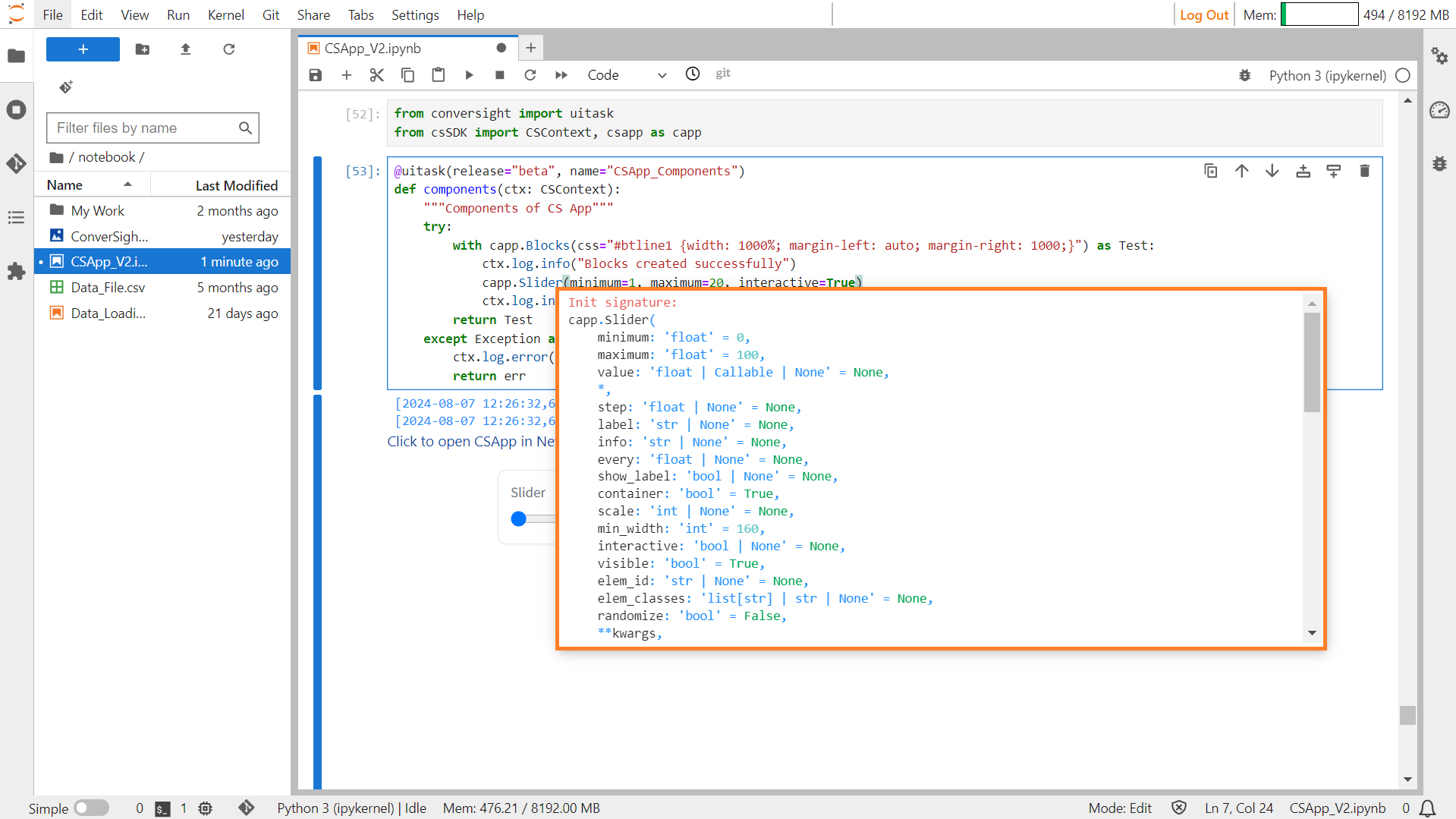
Slider#
The component produces a slider that ranges from a minimum to a maximum value, with each increment defined by a specified step size.
Syntax:
csapp.Slider(minimum = minimum_integer,maximum=maximum_integer)
Slider#
Parameters of the Slider component:
Parameter |
Type |
Default |
Description |
|---|---|---|---|
minimum |
float |
0 |
Minimum value for the slider. |
maximum |
float |
100 |
Maximum value for the slider. |
value |
float | Callable | None |
None |
Default value. If a callable, the function will be called whenever the app loads to set the initial value of the component. Ignored if randomized=True. |
step |
float | None |
None |
Increment between slider values. |
label |
str | None |
None |
The label for this component. Appears above the component and is also used as the header if there are a table of examples for this component. If None and used in a Gr.Interface, the label will be the name of the parameter this component is assigned to. |
info |
str | None |
None |
Additional component description. |
every |
float | None |
None |
If value is a callable, run the function ‘every’ number of seconds while the client connection is open. Has no effect otherwise. |
show_label |
bool | None |
None |
If True, will display label. |
container |
bool |
True |
If True, will place the component in a container - providing some extra padding around the border. |
scale |
int | None |
None |
Relative size compared to adjacent Components. Should be an integer. Applies in Rows and to top-level Components in Blocks where fill_height=True. |
min_width |
int |
160 |
Minimum pixel width, will wrap if not sufficient screen space to satisfy this value. If a certain scale value results in this Component being narrower than min_width, the min_width parameter will be respected first. |
interactive |
bool | None |
None |
If True, slider will be adjustable; if False, adjusting will be disabled. If not provided, this is inferred based on whether the component is used as an input or output. |
visible |
bool |
True |
If False, component will be hidden. |
elem_id |
str | None |
None |
An optional string that is assigned as the id of this component in the HTML DOM. Can be used for targeting CSS styles. |
elem_classes |
list[ str] | str | None |
None |
An optional list of strings that are assigned as the classes of this component in the HTML DOM. Can be used for targeting CSS styles. |
randomize |
bool |
False |
If True, the slider will have a random default value within the range defined by minimum and maximum. |
Sample :
Slider#
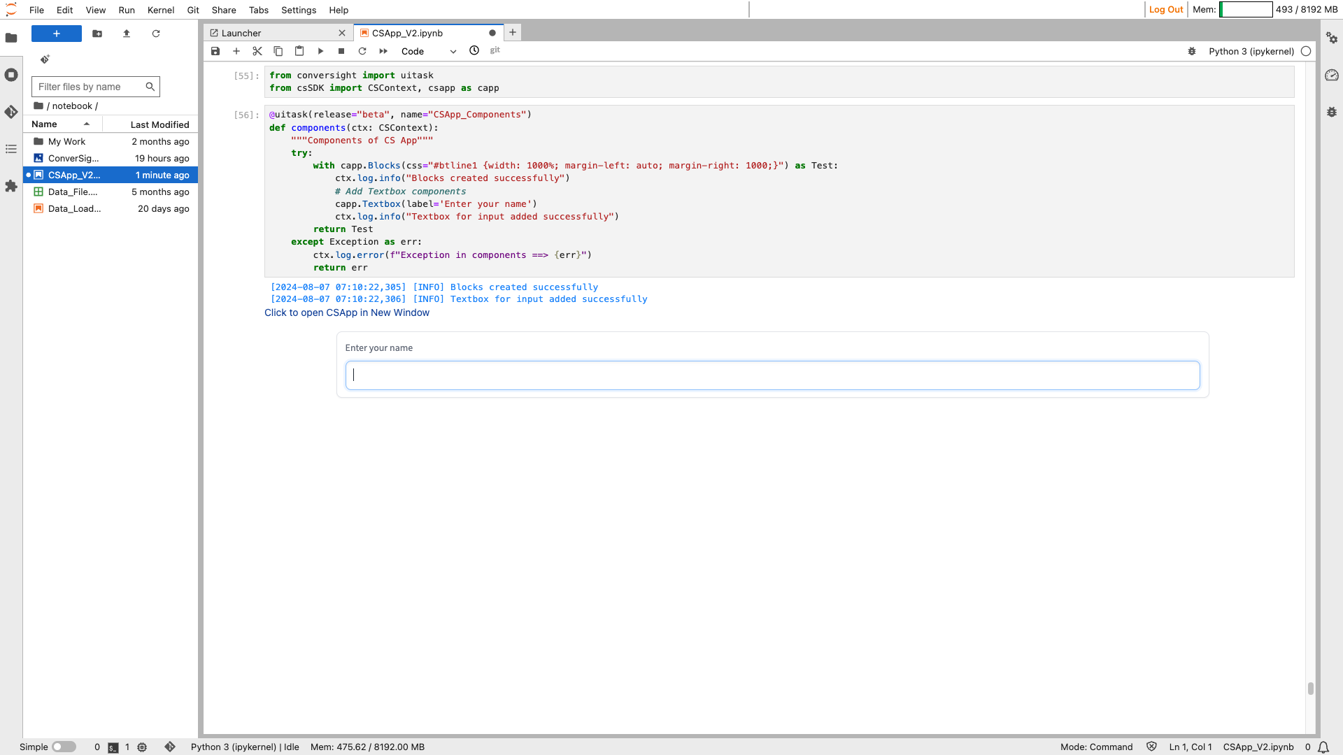
Text Box#
The Text Box function is used to establish a text area where users can input string values or showcase string outputs.
Syntax:
Textbox_object = csapp.Textbox(label=” label of the textbox”)

Textbox#
Parameters of the Textbox component:
Parameter |
Type |
Default |
Description |
|---|---|---|---|
value |
str | Callable |
“” |
Default text to provide in the text area. If callable, the function will be called to set the initial value. |
lines |
int |
1 |
Minimum number of line rows to provide in the text area. |
max_lines |
int |
20 |
Maximum number of line rows to provide in the text area. |
placeholder |
str | None |
None |
Placeholder hint to provide behind the text area. |
label |
str | None |
None |
The label for this component. Appears above the component. |
info |
str | None |
None |
Additional component description. |
every |
float | None |
None |
If value is a callable, run the function every number of seconds while the client connection is open. |
show_label |
bool | None |
None |
If True, will display the label. |
container |
bool |
True |
If True, will place the component in a container providing extra padding around the border. |
scale |
int | None |
None |
Relative size compared to adjacent components. |
min_width |
int |
160 |
Minimum pixel width, will wrap if not sufficient screen space to satisfy this value. |
interactive |
bool | None |
None |
If True, will be rendered as an editable textbox; if False, editing will be disabled. |
visible |
bool |
True |
If False, component will be hidden. |
elem_id |
str | None |
None |
Optional ID for targeting CSS styles in the HTML DOM. |
autofocus |
bool |
False |
If True, will focus on the textbox when the page loads. |
elem_classes |
list[ str] | str | None |
None |
Optional classes for targeting CSS styles in the HTML DOM. |
type |
Literal[‘text’, ‘password’, ‘email’] |
“text” |
The type of textbox: ‘text’, ‘password’, or ‘email’. |
text_align |
Literal[‘left’, ‘right’] | None |
None |
How to align the text in the textbox: “left”, “right”, or None. |
rtl |
bool |
False |
If True and type is “text”, sets the direction of the text to right-to-left. Default is False. |
show_copy_button |
bool |
False |
If True, includes a copy button to copy the text in the textbox. Only applies if show_label is True. |
Sample :
Textbox#
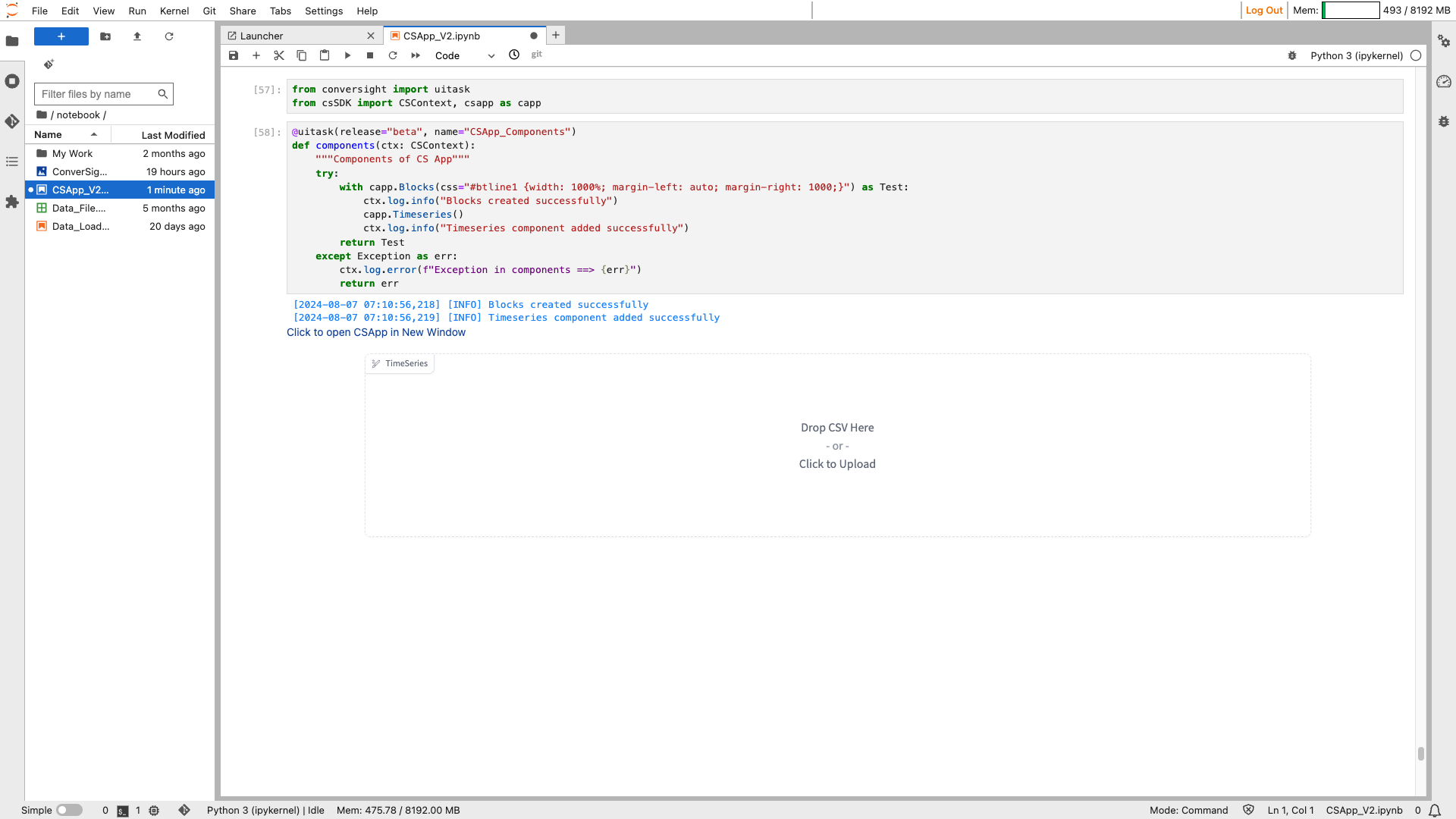
Timeseries#
The Timeseries component is used to create a visual representation of time series data. It allows users to upload or preview time series CSV files or display data frames graphically. The component preprocesses the uploaded time series data as a Pandas DataFrame and expects either a Pandas DataFrame or a string path to a CSV file as output, which is then displayed as a time series graph.
Syntax:
csapp.Timeseries(Parameters)

Timeseries#
Parameters of the Timeseries component:
Parameter |
Type |
Default |
Description |
|---|---|---|---|
value |
‘str | Callable | None’ |
None |
File path for the timeseries CSV file or a callable function. |
x |
‘str | None’ |
None |
Column name of x (time) series. |
y |
‘str,list[ str] | None’ |
None |
Column name of y series, or a list of column names if multiple series. |
colors |
‘list[ str] | None’ |
None |
Ordered list of colors to use for each line plot. |
label |
‘str | None’ |
None |
Component name in the interface. |
every |
‘float | None’ |
None |
Interval to update the component’s value, if the value is a callable. |
show_label |
‘bool | None’ |
None |
Whether to display the component’s label. |
container |
‘bool’ |
True |
Whether to place the component in a container. |
scale |
‘int | None’ |
None |
Relative width compared to adjacent components. |
min_width |
‘int’ |
160 |
Minimum pixel width, wrapping if not sufficient screen space. |
interactive |
‘bool | None’ |
None |
Whether users can upload a timeseries CSV (True) or just view it (False). |
visible |
‘bool’ |
True |
Whether the component is visible. |
elem_id |
‘str | None’ |
None |
Optional ID assigned to the component in the HTML DOM for CSS targeting. |
elem_classes |
‘list[ str] |str |None’ |
None |
Optional list of classes for CSS styling. |
Sample :
Timeseries#
Timeseries#
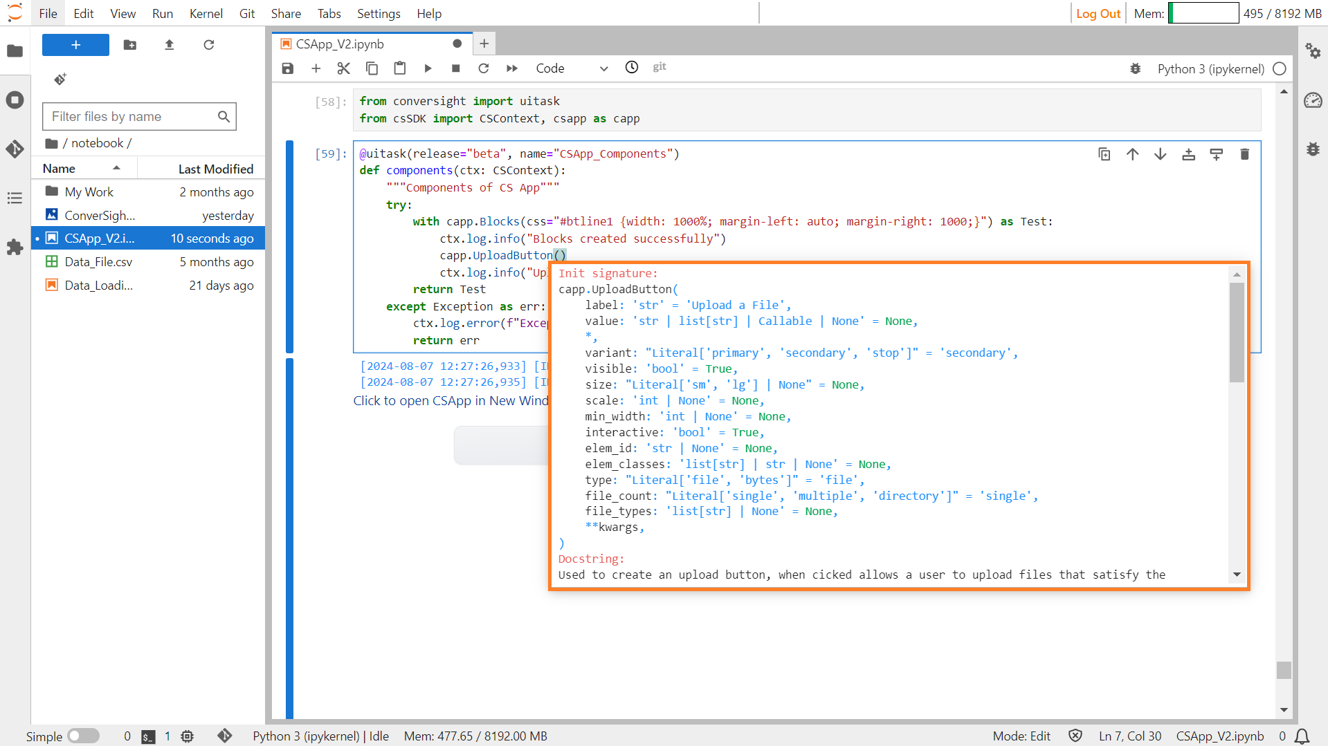
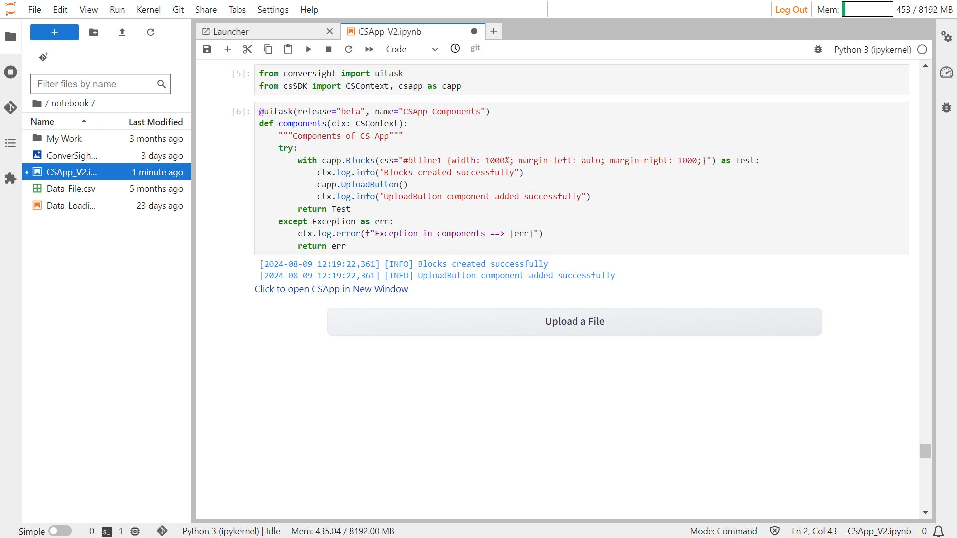
Upload Button#
The UploadButton component provides users with a button interface to upload files, enabling to select and upload files from their local system. Users can specify the text displayed on the button, the type of files to be uploaded and the number of files allowed to be uploaded. Additionally, the appearance of the button, such as its size and variant, can be customized.
Syntax:
csapp.UploadButton(Parameters)
Upload Button#
Parameters of the UploadButton component:
Parameter |
Type |
Default |
Description |
|---|---|---|---|
label |
str |
“Upload a File” |
Text on the button. |
value |
str |list[ str] |Callable |None |
None |
File(s) to upload by default. |
variant |
Literal[‘primary’, ‘secondary’, ‘stop’] |
‘secondary’ |
Button style. |
visible |
bool |
True |
Visibility. |
size |
Literal[‘sm’, ‘lg’] |None |
None |
Button size. |
scale |
int |None |
None |
Width relative to other components. |
min_width |
int |None |
None |
Minimum pixel width. |
interactive |
bool |
True |
Enables/disables the button. |
elem_id |
str |None |
None |
HTML DOM id attribute. |
elem_classes |
list[ str] |str |None |
None |
HTML DOM class attribute. |
type |
Literal[‘file’, ‘bytes’] |
‘file’ |
Type of returned value. |
file_count |
Literal[‘single’, ‘multiple’, ‘directory’] |
‘single’ |
Number of files to upload. |
file_types |
list[ str] | None |
None |
Types of files allowed. |
Sample:
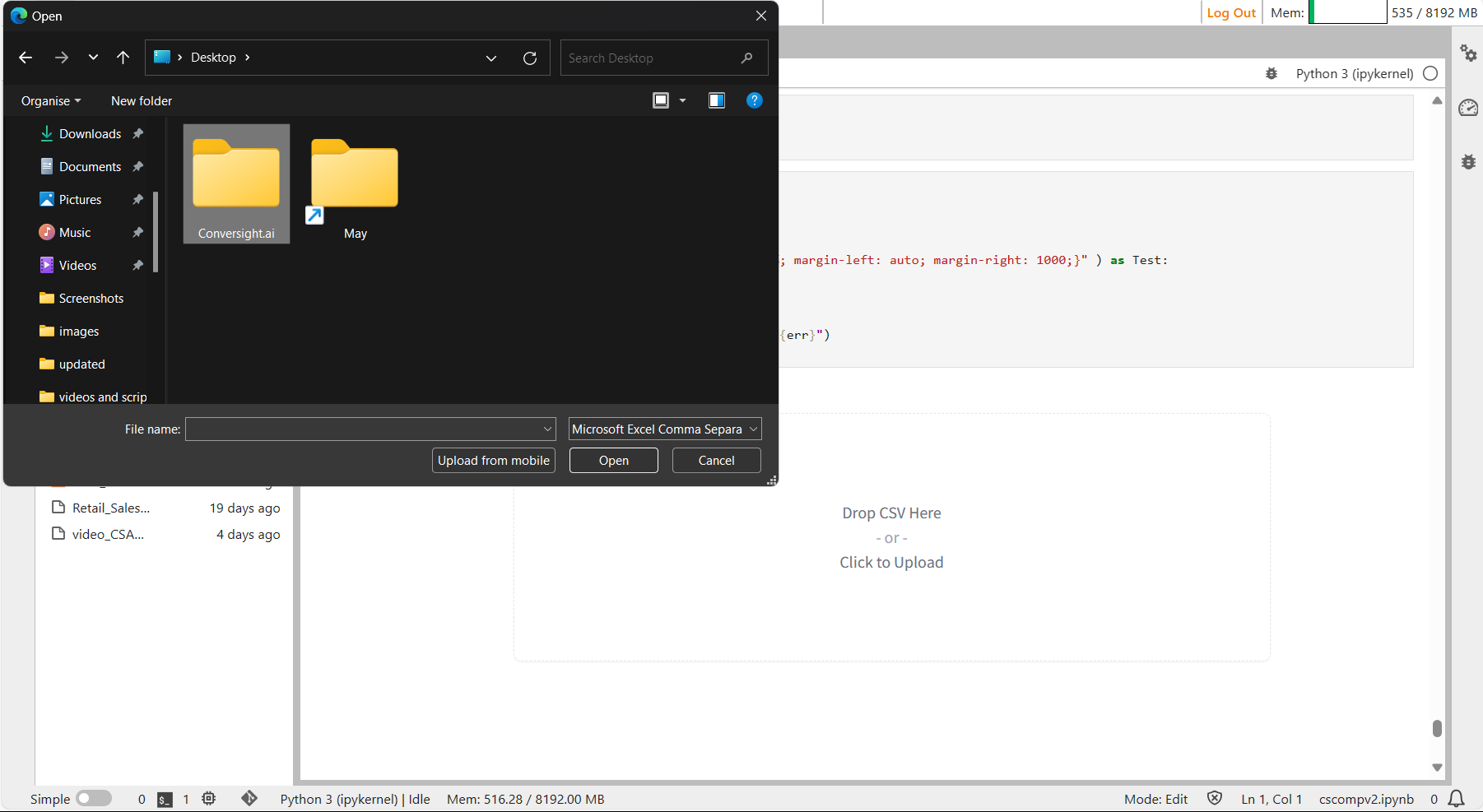
Upload Button#
Upload Button#
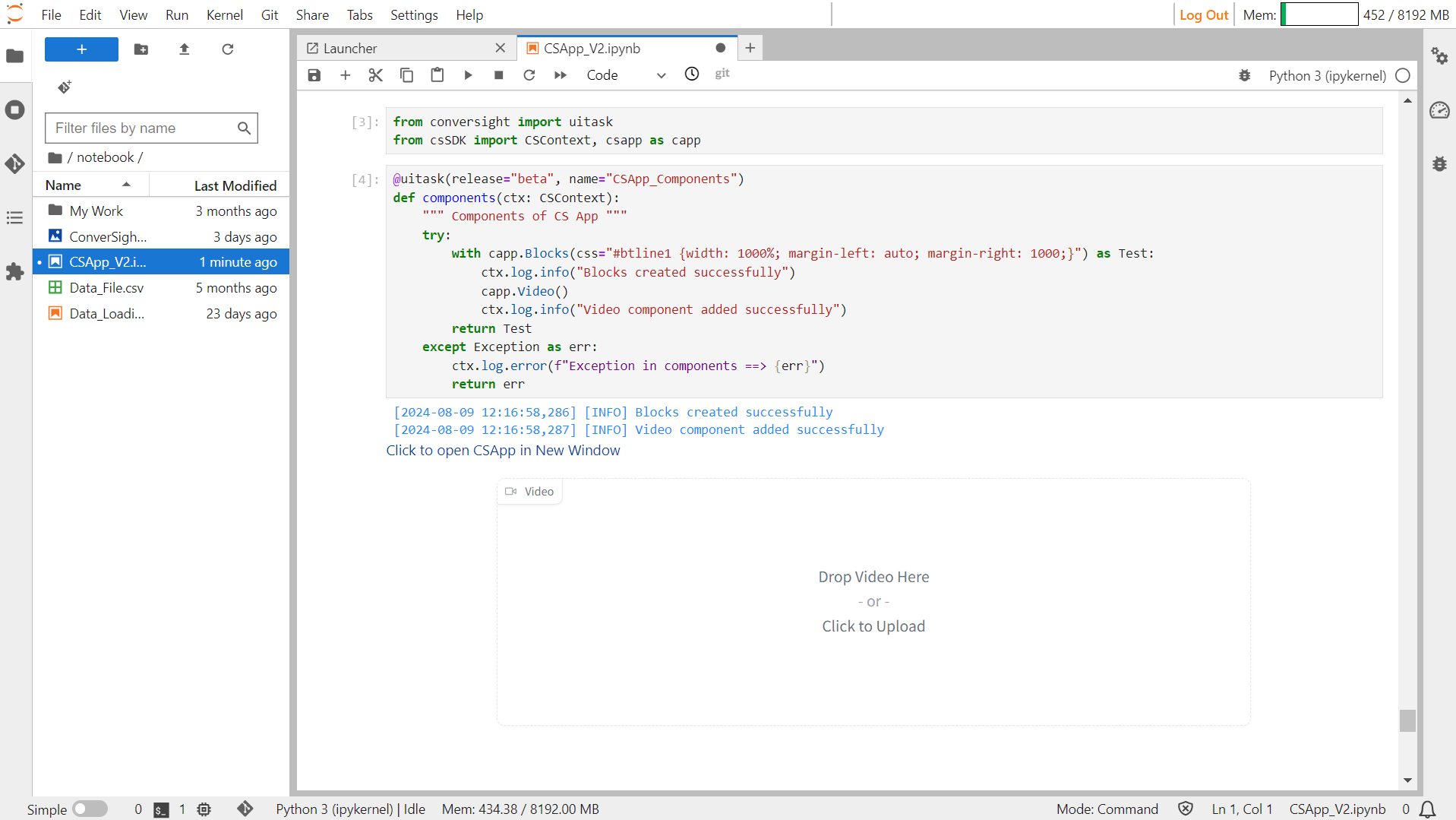
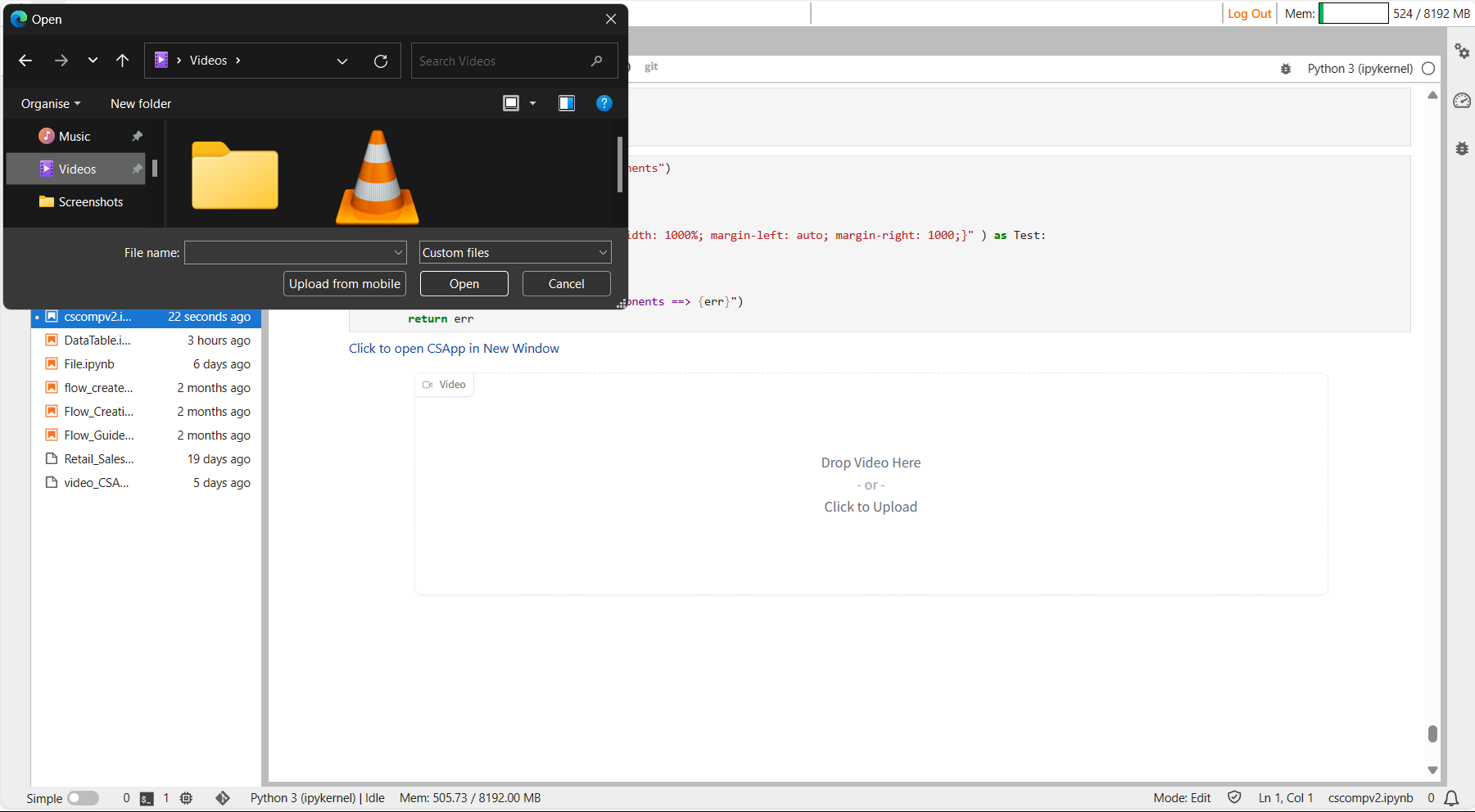
Video#
The Video functionality creates a video component that allows for uploading or recording videos as input or displaying videos as output. For compatibility with browser playback, videos must have certain container and codec combinations: .mp4 with h264 codec, .ogg with theora codec or .webm with vp9 codec. If the output video is incompatible, the component attempts to convert it to a playable mp4 format. If conversion fails, the original video is retained.
Syntax:
csapp.Video()
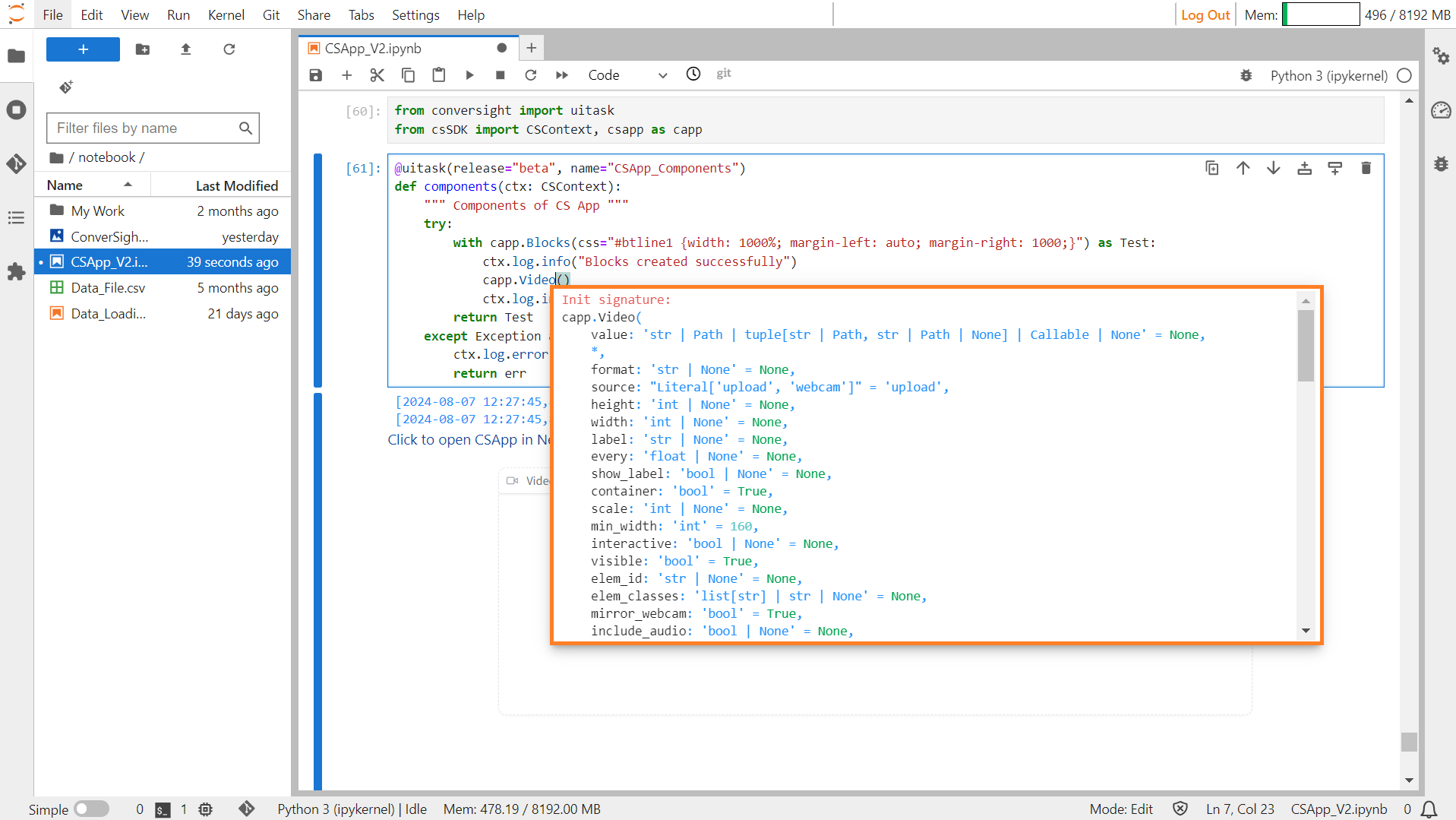
Video#
Parameters of the Video component:
Parameter |
Type |
Default |
Description |
|---|---|---|---|
value |
str | Path | tuple | Callable | None |
None |
Default video source or function to set initial value. |
format |
str | None |
None |
Format of returned video. |
sources |
list[ Literal] | None |
None |
Permitted video sources (e.g., ‘upload’, ‘webcam’). |
height |
int | str | None |
None |
Height of displayed video. |
width |
int | str | None |
None |
Width of displayed video. |
label |
str | None |
None |
Label for the component. |
every |
float | None |
None |
Frequency of function execution if callable. |
show_label |
bool | None |
None |
Option to display label. |
container |
bool |
True |
Whether to place the component in a container. |
scale |
int | None |
None |
Relative size compared to adjacent components. |
min_width |
int |
160 |
Minimum pixel width before wrapping. |
interactive |
bool | None |
None |
Whether users can upload videos. |
visible |
bool |
True |
Visibility of the component. |
elem_id |
str | None |
None |
HTML DOM id attribute. |
elem_classes |
list[ str] | str | None |
None |
HTML DOM class attributes. |
mirror_webcam |
bool |
True |
Option to mirror webcam. |
include_audio |
bool | None |
None |
Whether to include audio in videos. |
autoplay |
bool |
False |
Whether to autoplay video when used as an output. |
show_share_button |
bool | None |
None |
Option to display share icon. |
Sample:
Video#
Video#