Explorer#
The Explorer tab within ConverSight represents an advanced form of dynamic report creation, designed to simplify data exploration and analysis for users with varying levels of expertise. Reports provide a structured approach to understanding data insights, allowing users to select specific datasets and columns and they also have the option to add customized filters. This approach grants users direct access to their own data, facilitating a deeper understanding.
Creating Reports#
Sequential steps to create reports in ConverSight are as follows.
Step 1: Click on the Explorer tab in the landing page.
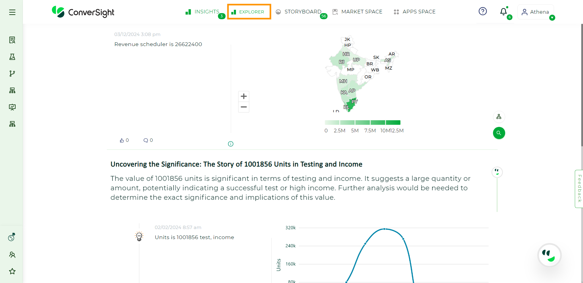
Explorer Tab#
Step 2: Users can select the Dataset from which the reports must be generated from the dropdown menu.
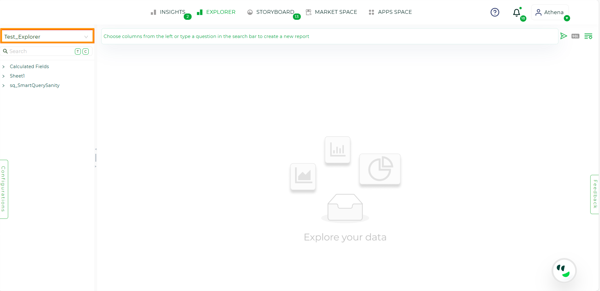
Selecting dataset#
Step 3: Once the dataset is selected, all the tables, columns, calculated fields and smart analytics in the datasheet will be displayed.

Tables Listed#
NOTE
If the dataset includes calculated fields, summary fields and smart query, they will all be displayed under calculated fields.
Step 4: Clicking on the desired table name will display all its columns. Users can then select the columns, Calculated Fields, or Smart Queries they want to query. After adding the columns to the query area, users can click on  symbol to perform aggregations based on the column data type.
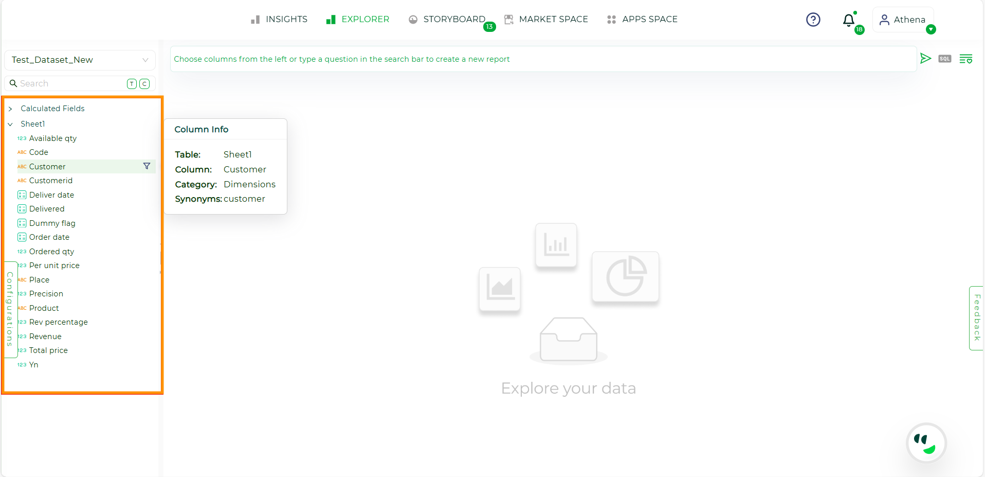
Columns Listed#
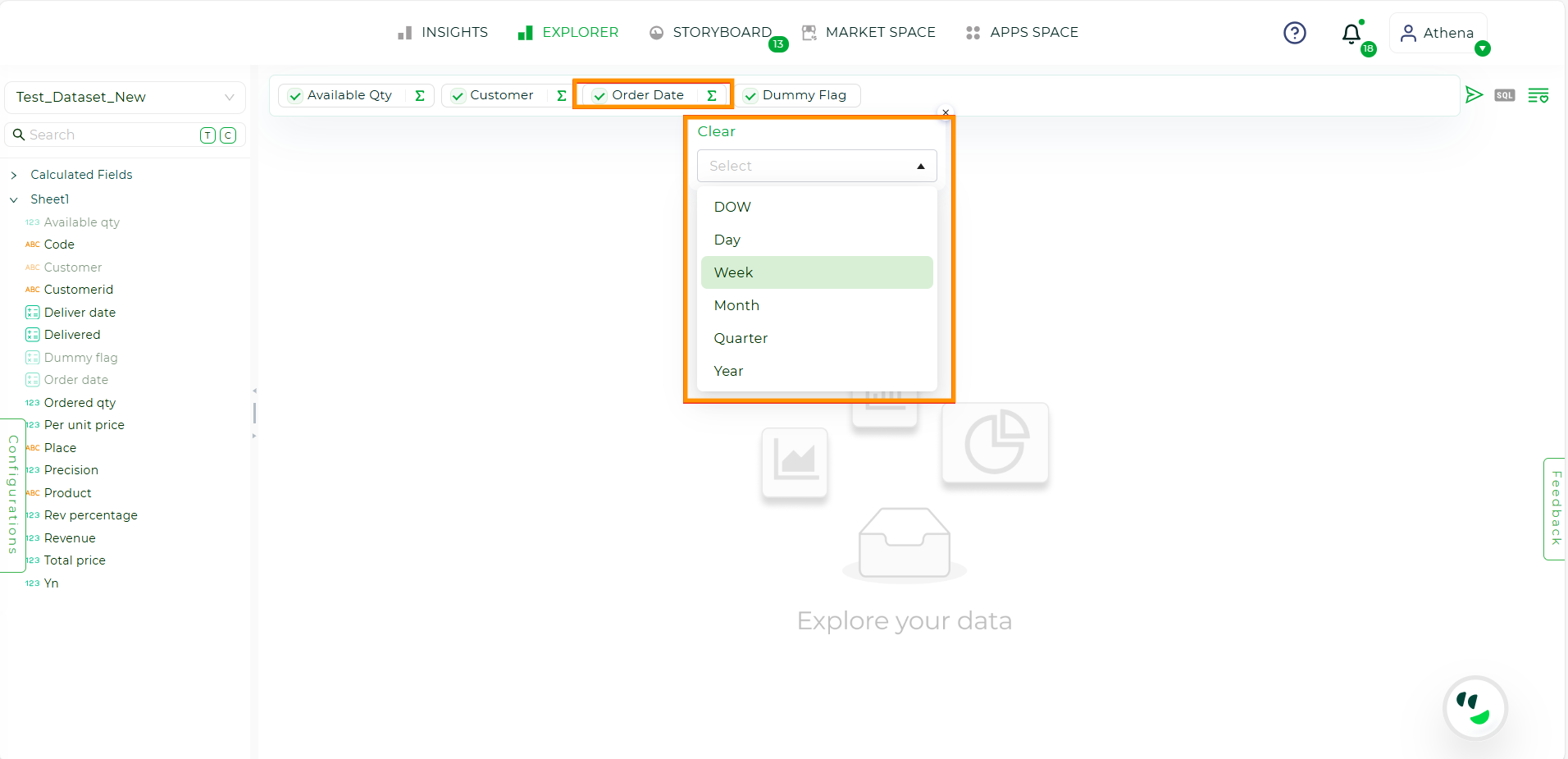
For Date Columns: Users can aggregate values based on various time intervals, including:
DOW (Day of the Week): Summarize data by individual days of the week (e.g., Monday, Tuesday, etc.).
Day: Aggregate data by days.
Week: Group data by week, allowing analysis of weekly trends.
Month: Summarize data on a monthly basis.
Quarter: Aggregate data by quarters (three-month intervals).
Year: Group data by year to observe annual trends and patterns.
Filters#
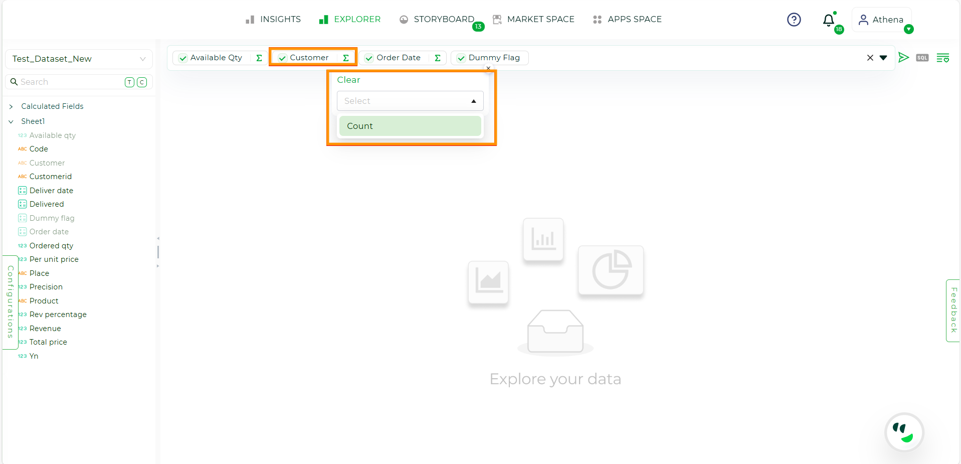
For Dimension Columns and Calculated Fields: Users are limited to using the “Count” aggregation.
Filters#
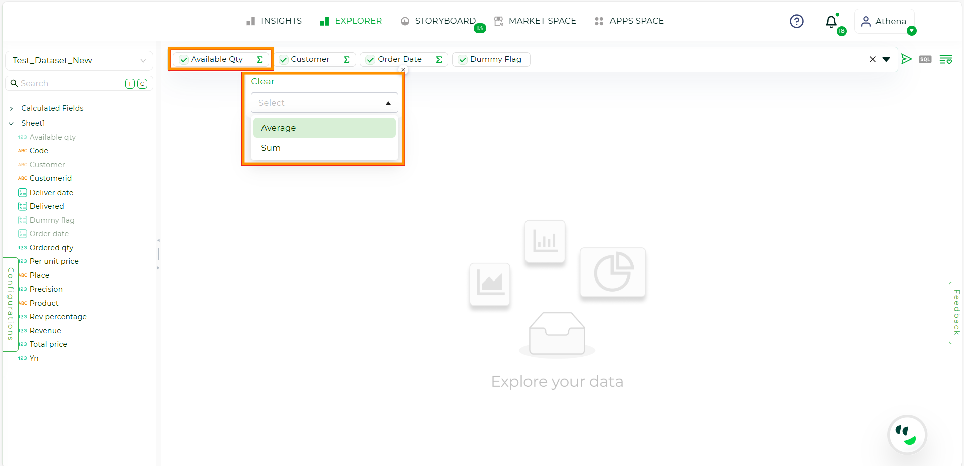
For Metric Columns: Users can apply both “Sum” and “Average” aggregations.
Filters#
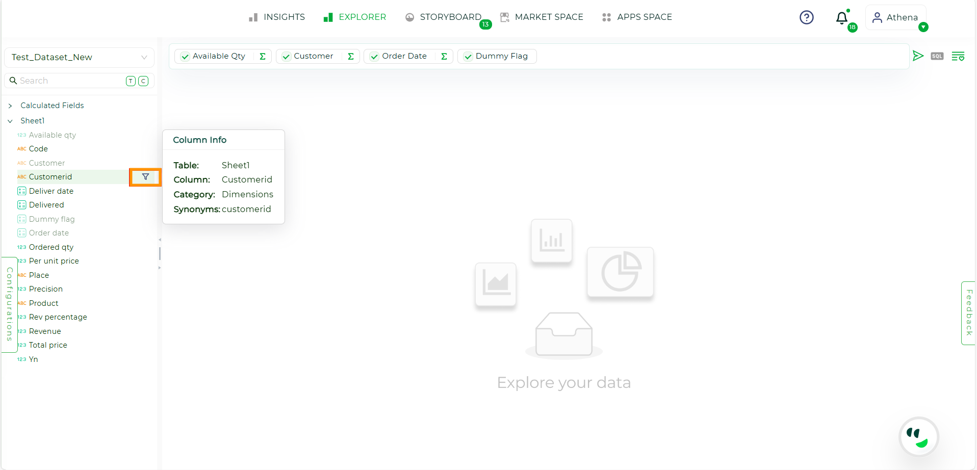
Step 5: To create and apply filters, users can click on the Funnel icon. This action allows columns to be added to the filters under the query tab. The filter conditions are predefined based on the column type.
Column Filters#
To apply filters, click on the columns added to the filters; by default, the column values will be set to “all”.

Column Filters#
Column Type |
Conditions |
Value |
|---|---|---|
Date Column |
Custom, Yesterday, Today, this week, last week, next week, this week-to-date, this month, last month, next month, this month-to-date, last quarter, this quarter, next quarter, this quarter to date, this calendar year, this financial year, last calendar year, last financial year, this year to date, this year, last year, next year, last 30 days, last 60 days, last 90 days, last 180 days, last 360 days, next 30 days, next 60 days, next 90 days, next 180 days, next 360 days, last 3 months, last 6 months, and last 9 months |
A value is required for the condition. |
Dimension Column |
Is, like, != and not like |
A value is required for the condition. |
Metric Column and Calculated Fields |
Equal to, greater than, greater than or equal to, lesser than, lesser than or equal to, not equal to, and between |
A value is required for the condition, and the ‘between’ condition requires two values to be inputted. |
Flag |
equal to and not equal to |
NOTE
Filters and columns can be removed by hovering over them, which will display an “x”. Clicking on the “x” will remove them.
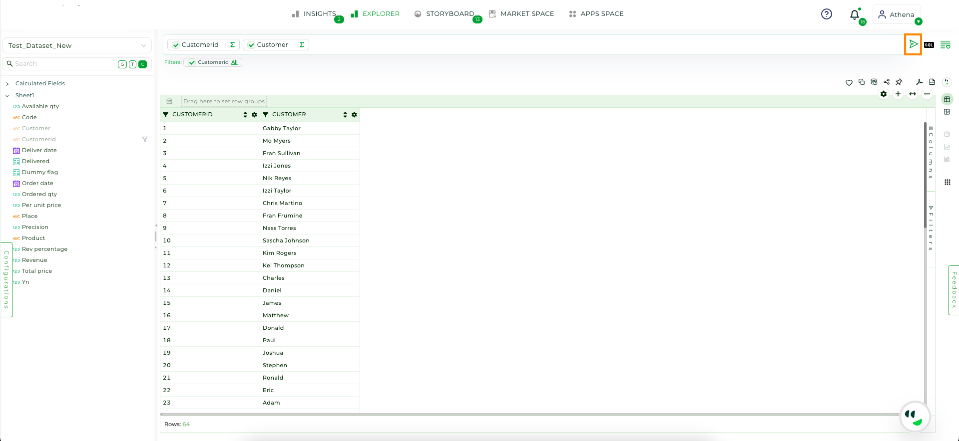
Step 6: Once the columns are selected and filters are applied, click on the Arrow Icon to generate the report.
Columns Listed#
NOTE
By default, all generated reports will be presented as Pivot Tables.
Recently Queried#
The Recently Queried dropdown in the query interface enables users to view their recently executed reports. By selecting any query from the dropdown menu, users can effortlessly revisit previous reports.
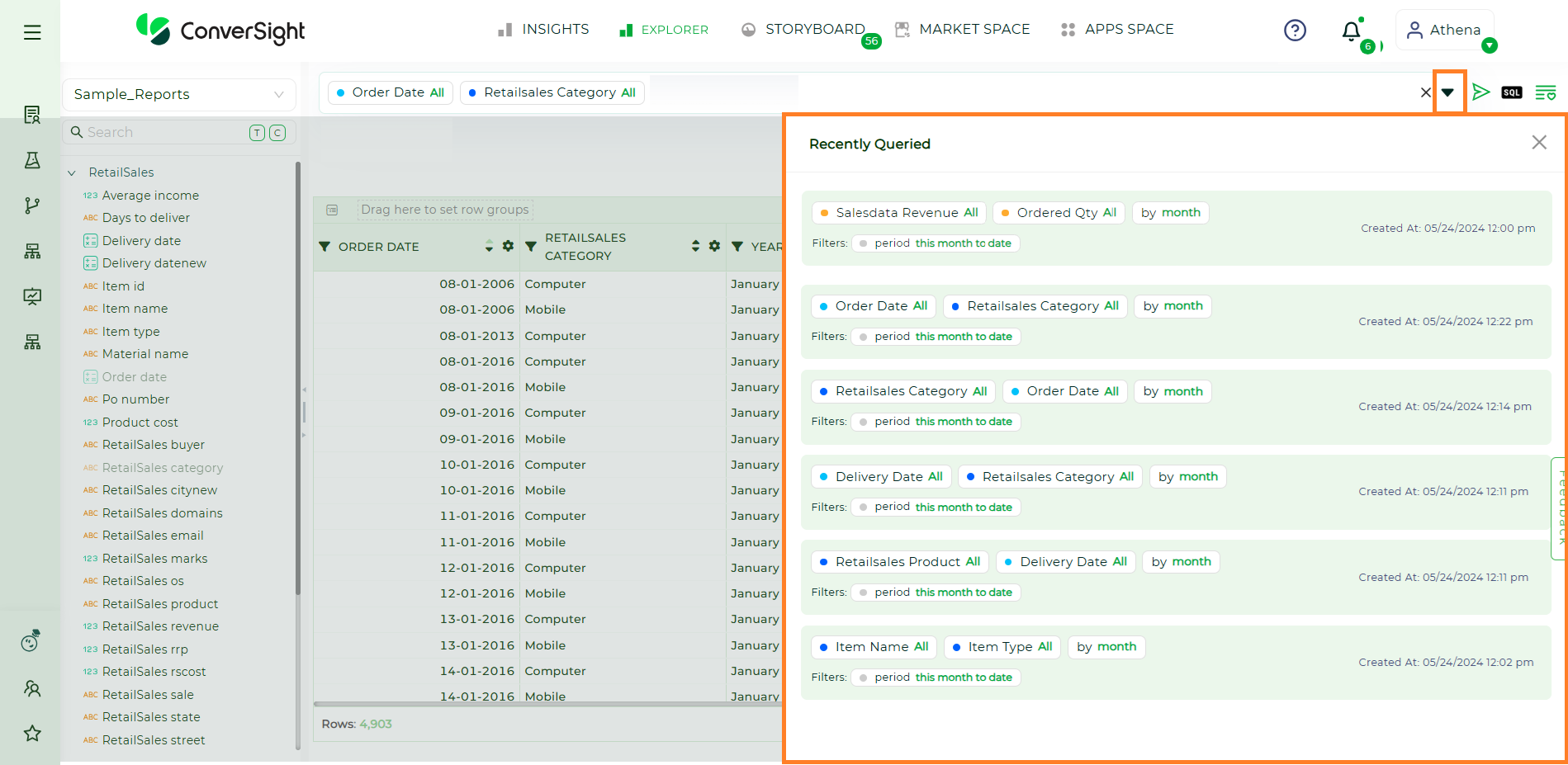
Recently Queried#
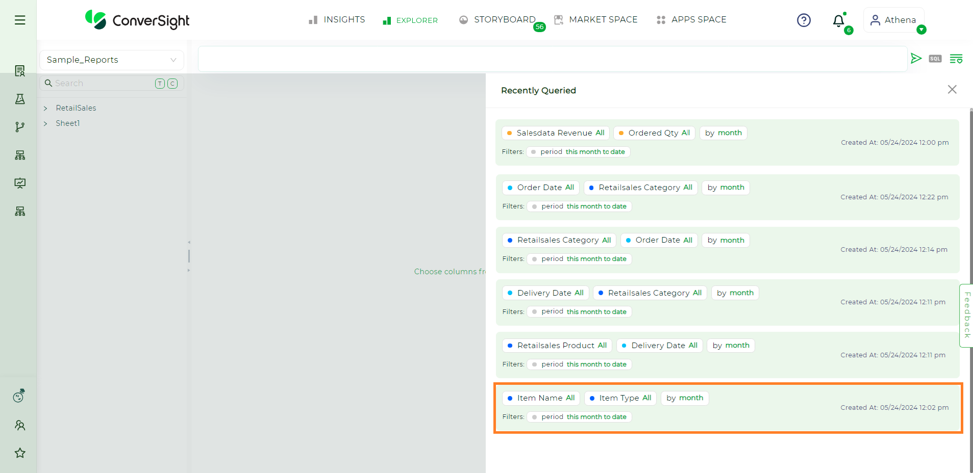
Recently Queried#
NOTE
The Recently Queried dropdown currently shows only the last 20 queries.
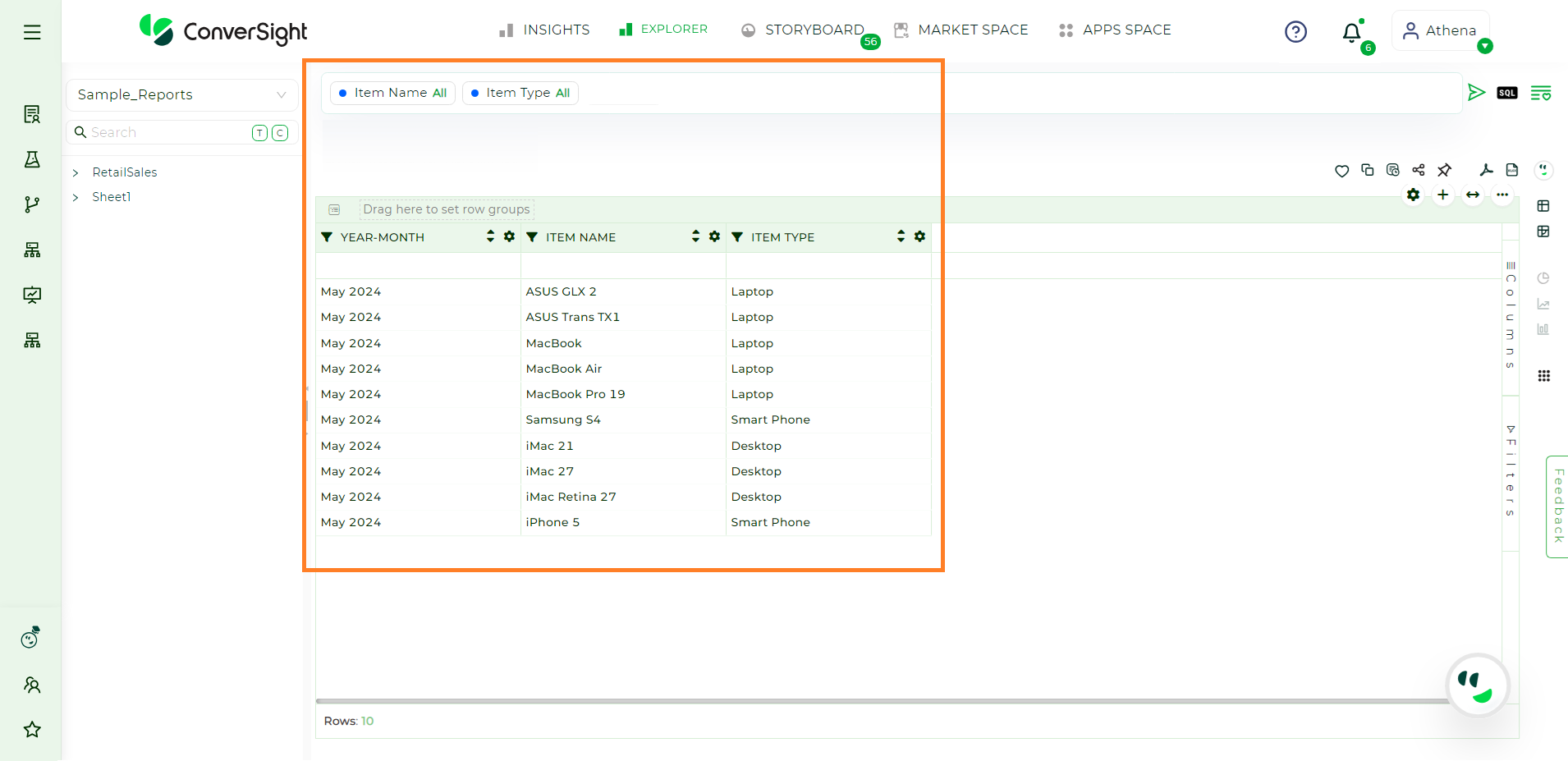
Recently Queried#
SQL#
The SQL query option immediately gives users the SQL format of the query used for the report. This feature lets you view the precise SQL code that was used.

SQL Query#
Users have the option to copy this SQL code to their clipboard, allowing them to use it for various purposes.
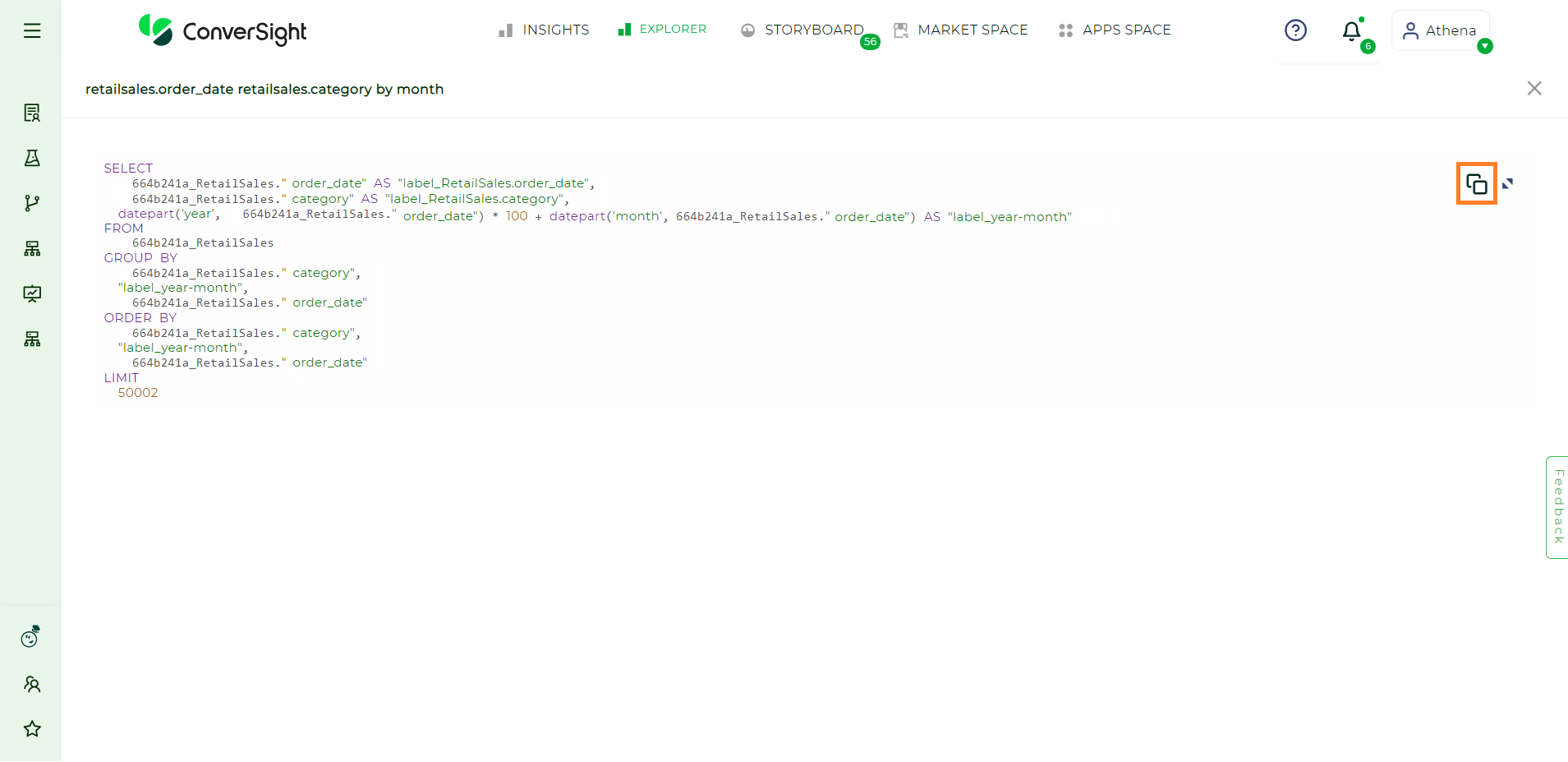
SQL Query#
Saving Reports#
Users can save created reports in two methods
Add to Favorites
Add to Favorites#
Users can bookmark their reports for fast and convenient access by utilizing the Add to Favorites icon.
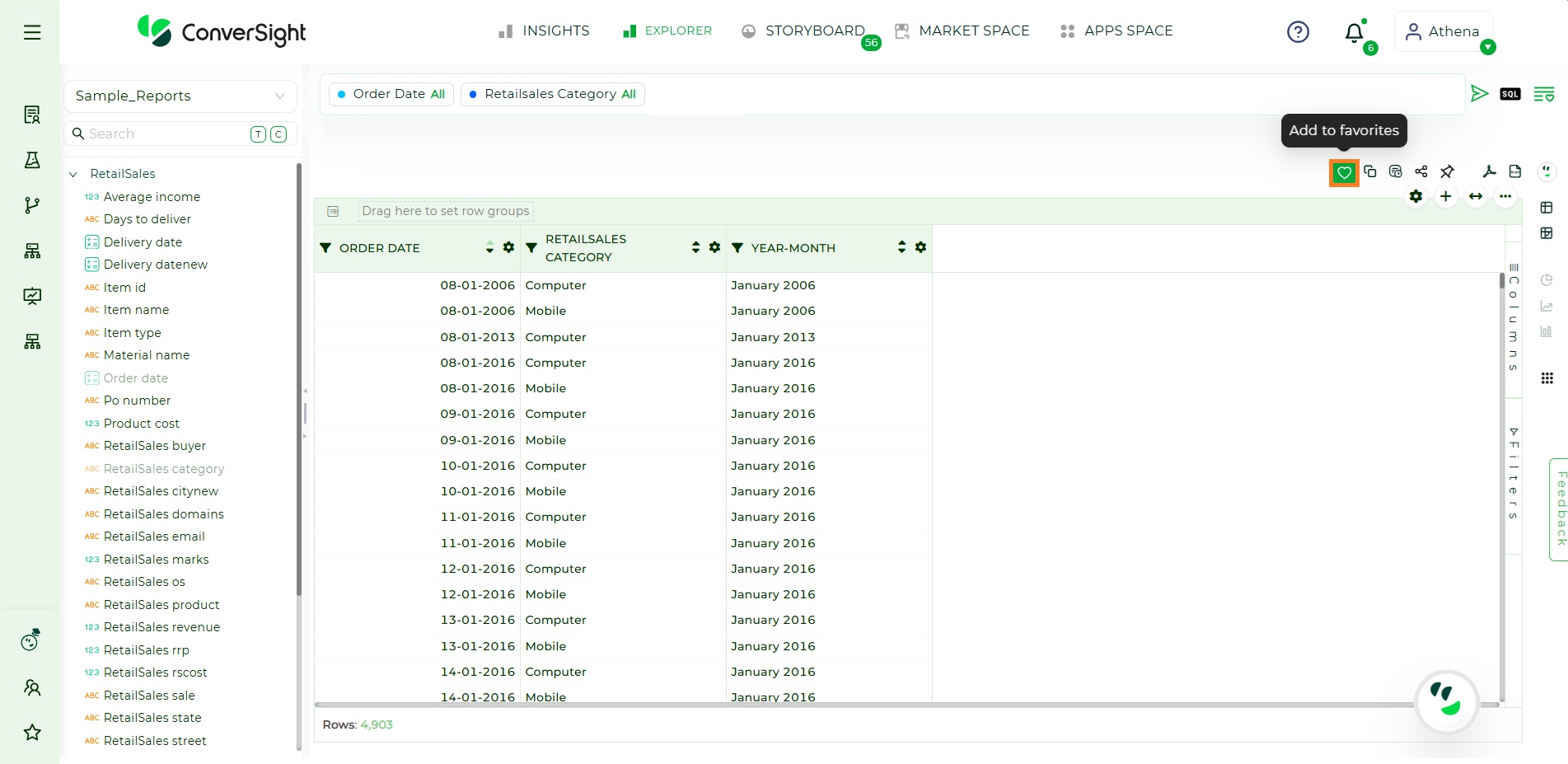
Add to Favorites#
Selecting the Add to Favorites option triggers a dialog box to appear, enabling users to input the name and choose the folder from the dropdown menu for the Report to be added to favorites.
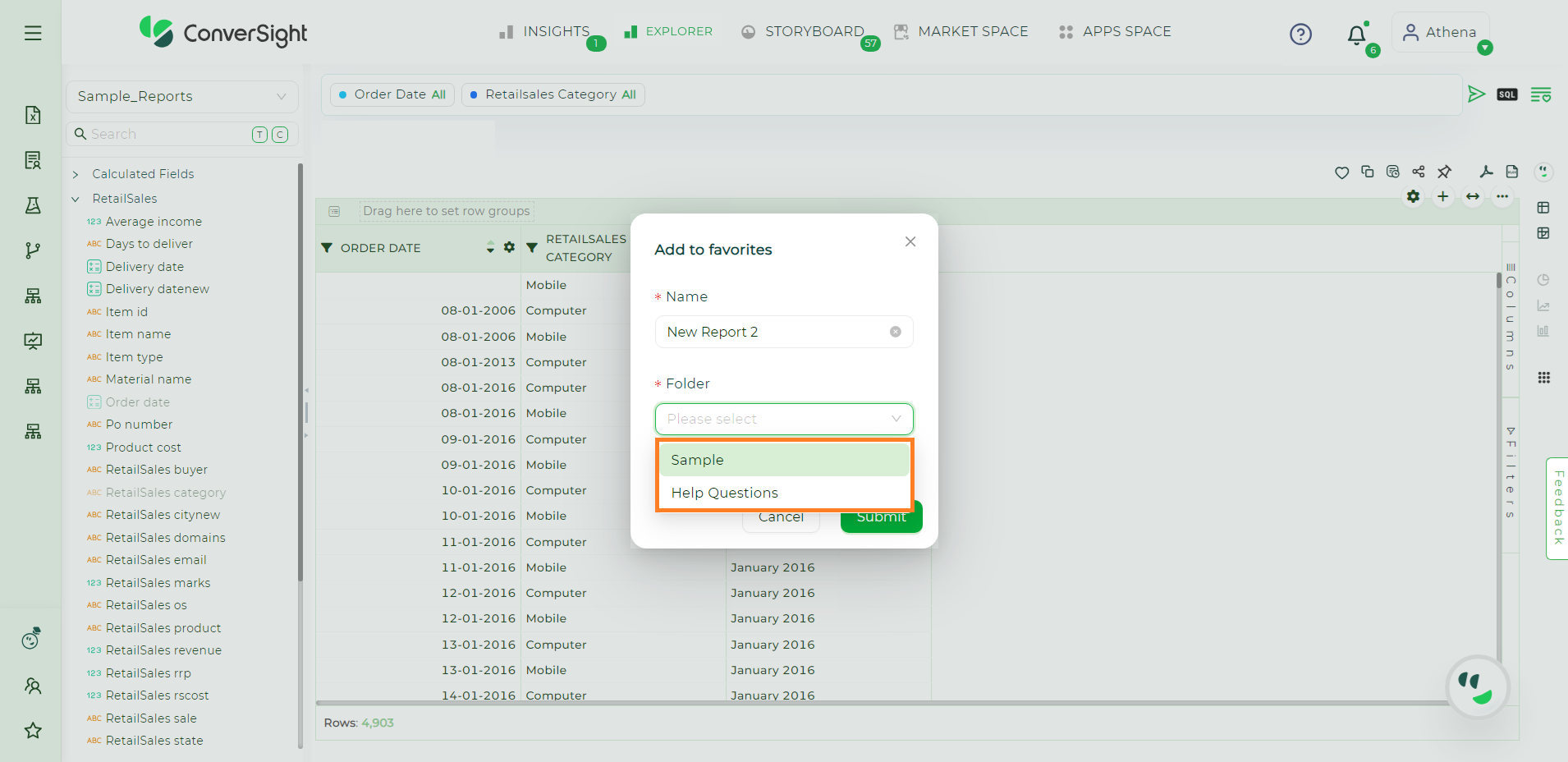
Add to Favorites#
If no folders exist or if users prefer to create one, they can do so by typing the folder name and pressing the Enter key. Once this is completed, click the Submit button.

Add to Favorites#
By adding an item to favorites, users ensure it becomes readily available in the specified favorites section. The favorites list acts as a personalized hub, enabling users to easily find their preferred reports.
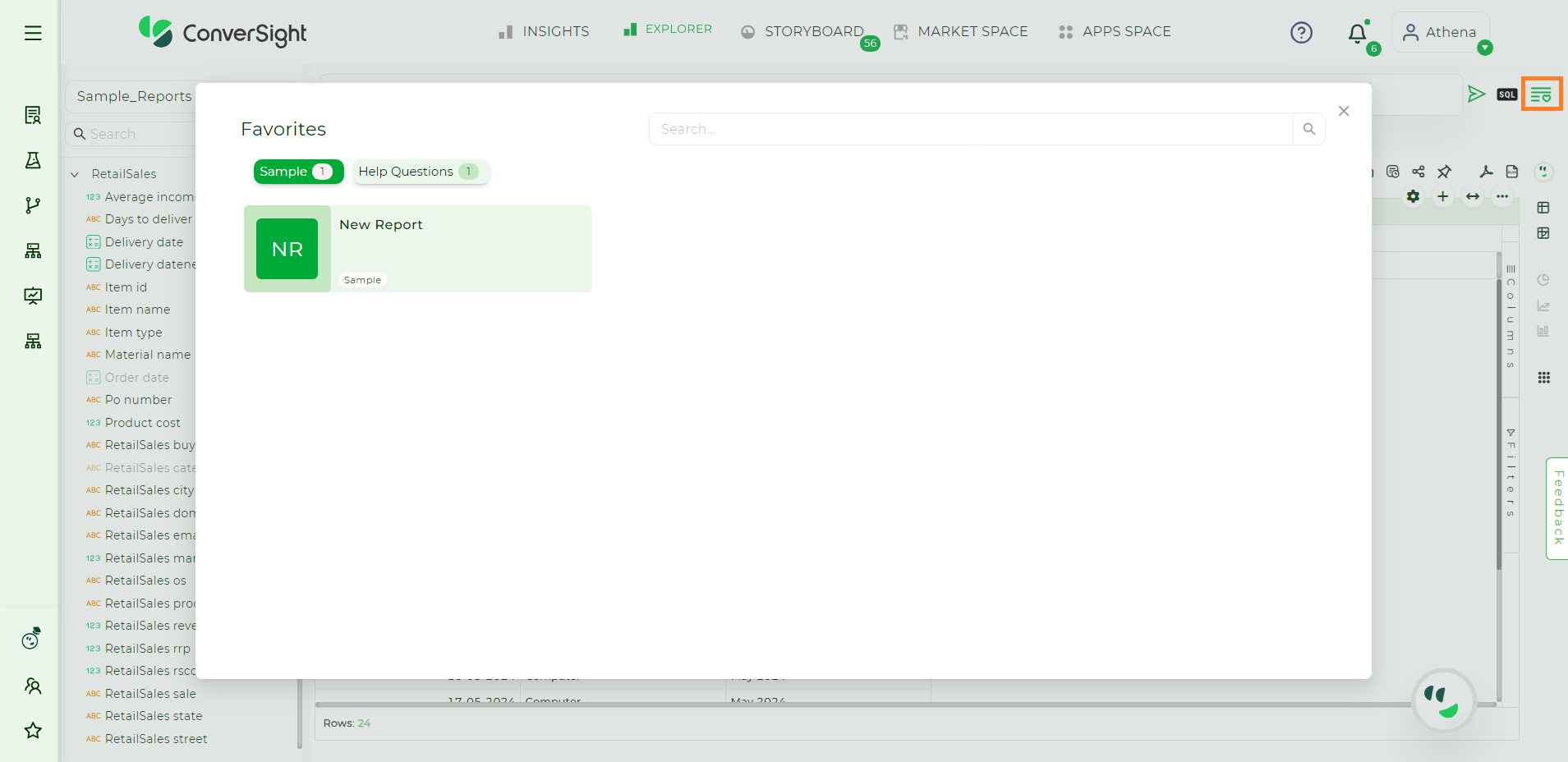
Favorites Section#
The Explorer feature in ConverSight enables users to create dynamic reports, suitable for various levels of expertise. Structured data exploration, customizable filters and diverse visual representations provide direct access to valuable insights, fostering better understanding and informed decision-making. The Pivot table offers an interactive way to explore data, with users able to customize them using different settings to improve functionality and appearance. Settings Option offer a range of choices for customization, allowing users to control how their data analysis is presented and functions.