CS - Apps#
Based on the customer’s requirements, csAppBuilder is used to create a UI-based task similar to a form. The csAppBuilder has components such as dropdown, radio button, check box, chat bot, toggle button and various other options, all of which can be utilized for designing user interfaces. Depending on the specific needs of our customers, ConverSight’s team of data scientists collaborates on customizing and refining these components.
To watch the video, click on Creation and Deployment of CS App.
UI Task#
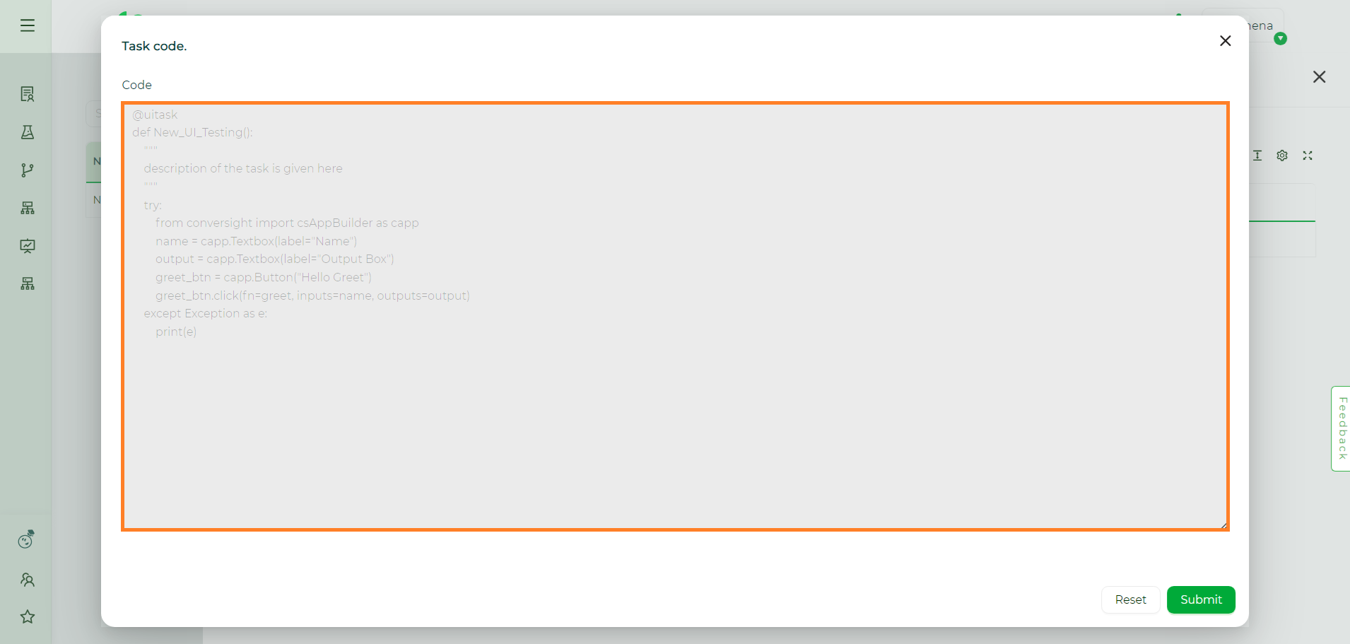
A UI Task is roughly comparable to a generic task. However, when creating a UI task, we use @uitask rather than @task. This will result in the creation of a UI task.
Based on the customer requirement to generate a user interface, this type of task makes extensive use of helper functions. In this case, the UI is constructed using csAppBuilder, which provides the capability to create n number of UI flows and web-based apps. With csAppBuilder, you can easily build demos and conveniently share them in Python. When you hit the tab key, a comprehensive list of functions available for csAppBuilder is displayed.
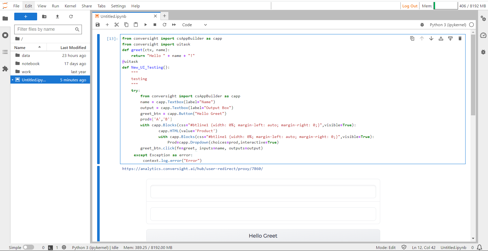
from conversight import csAppBuilder as capp
from conversight import uitask, Context
def greet(ctx, name):
return "Hello " + name + "!"
@uitask
def New_UI_Testing():
"""
description of the task is given here
"""
try:
from conversight import csAppBuilder as capp
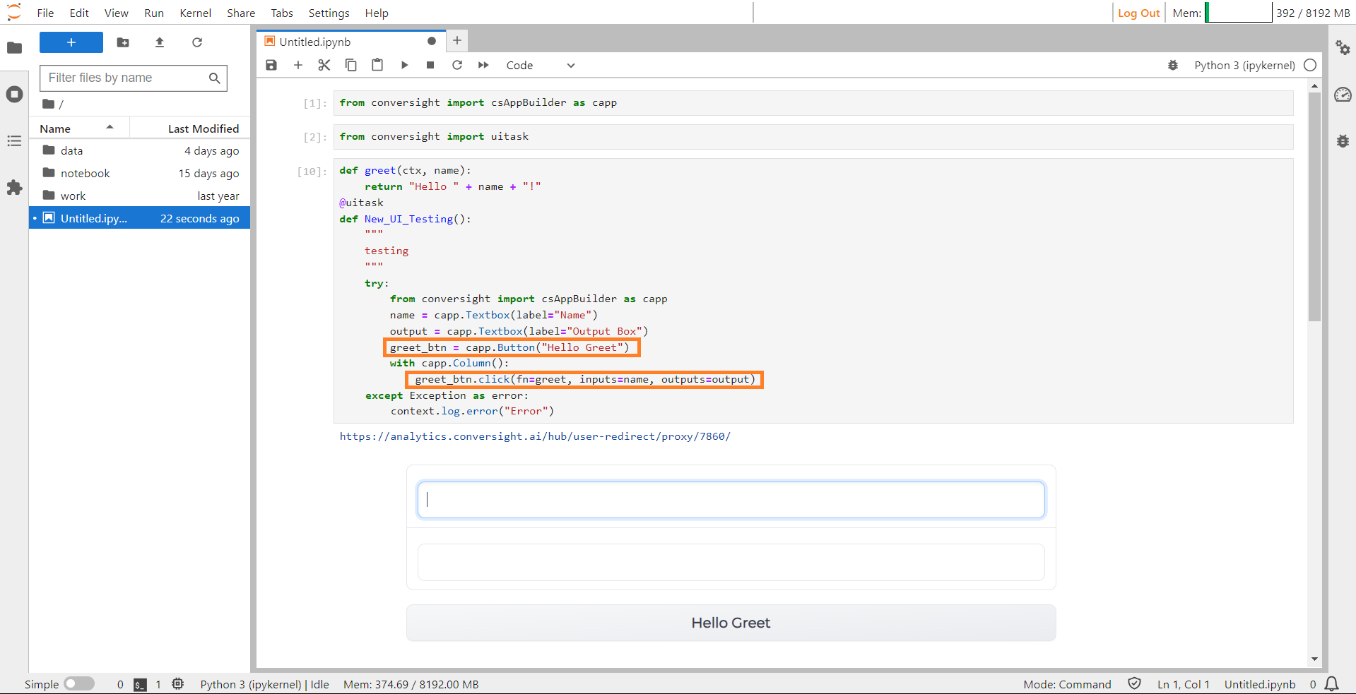
name = capp.Textbox(label="Name")
output = capp.Textbox(label="Output Box")
greet_btn = capp.Button("Hello Greet")
greet_btn.click(fn=greet, inputs=name, outputs=output)
except Exception as error:
context.log.error("error")
Components in CS App#
The csAppBuilder features components like dropdowns, radio buttons, checkboxes, chatbots, toggle buttons and various other options that can be employed for crafting user interfaces. Tailoring and enhancing these components is accessible to the users, allowing them to create interfaces based on specific requirements.
Blocks#
Blocks is a low-level API, that provides a great degree of customization for developing CS Apps. The enhanced flexibility is seen in how it controls component arrangement, triggers function execution based on events and manages data flow. This enables inputs to activate subsequent outputs, creating a cascading effect. To utilize Blocks, start by creating a Blocks object. Use the Block Objects as a context with the with statement. Define layouts, components or events within the Blocks context.
Syntax:
with capp.Block():
Block#
Layout Elements#
Layout elements in the CS App pertain to fundamental components responsible for organizing and presenting content systematically. They play a crucial role in structuring the arrangement of various elements within the application interface. Users have access to the row layout and the column layout. These layout configurations serve as foundational frameworks, enabling users to arrange and present information in a structured and visually appealing manner within the CS App interface.
Row#
In Blocks, the Row layout element is instrumental in presenting components horizontally. It serves as a structural foundation, arranging and displaying various elements in a side-by-side manner along the horizontal axis. This functionality in Blocks enables the smooth alignment of components, facilitating their presentation from left to right or right to left, ensuring an optimized visual experience and improved accessibility for users navigating the interface
Syntax:
with capp.Row():
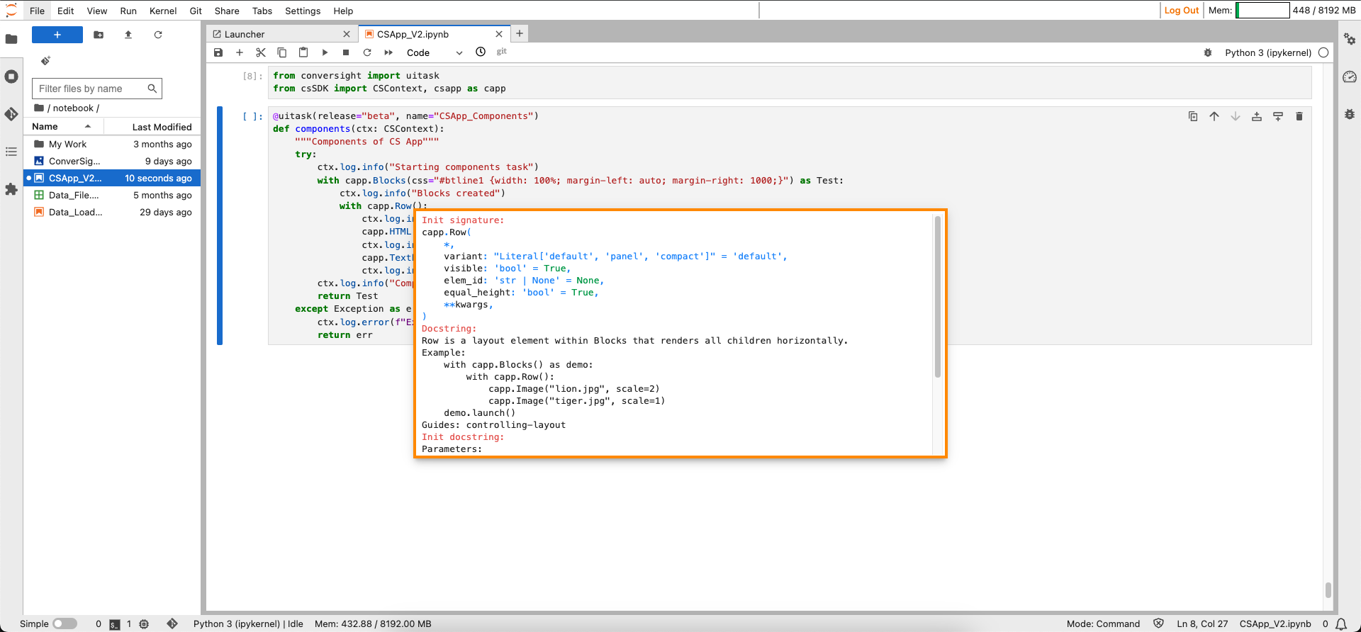
Row#
Column#
The Column layout element within Blocks is designed to present components in a vertical arrangement. It serves as a structural element, facilitating the stacking of various components in a top-to-bottom fashion. This layout feature ensures a clear and organized display, allowing users to showcase content or functional elements in a sequential and easily scannable manner within the Blocks framework. You can adjust the widths of columns using the scale and min_width parameters. If a specified scale leads to a column width narrower than the min_width, the min_width parameter takes precedence.
Syntax:
with capp.Column():
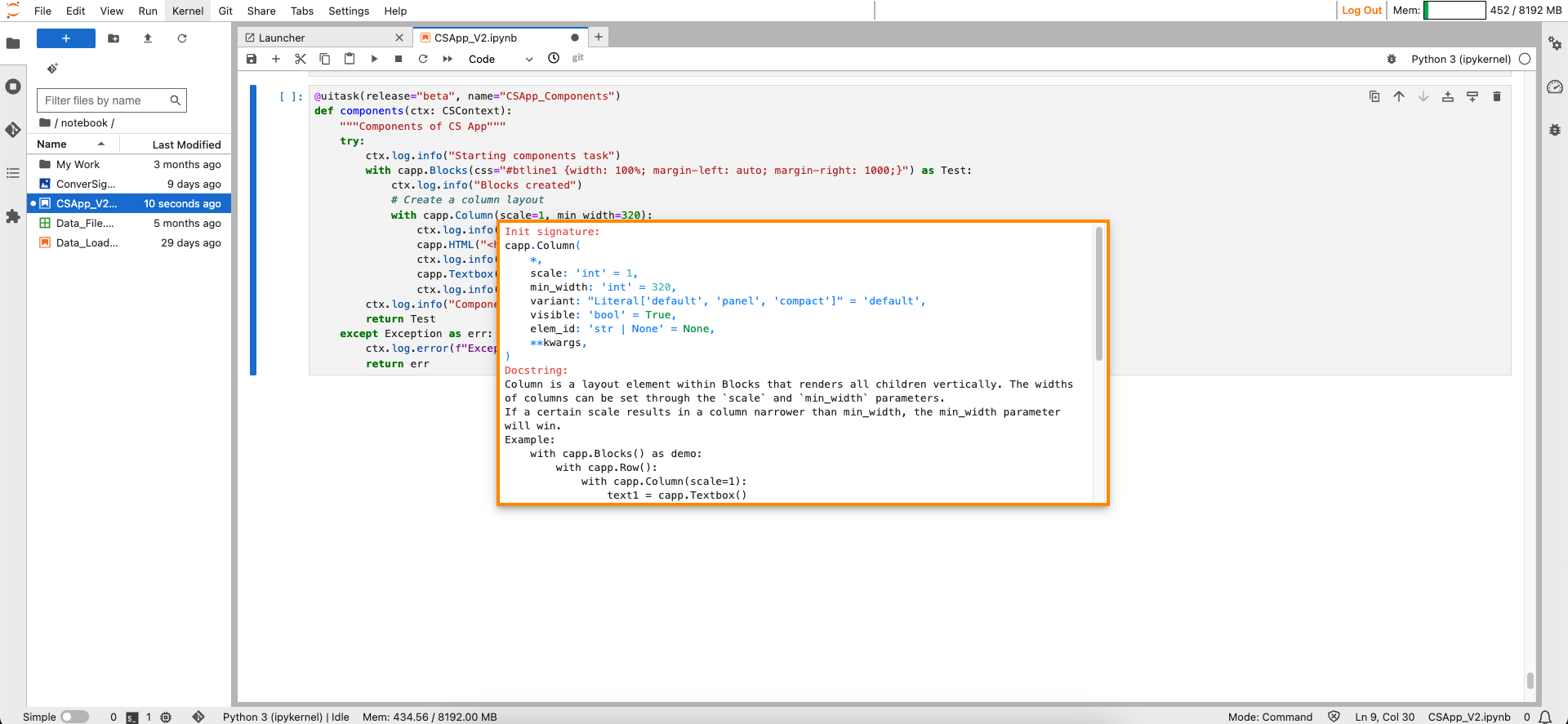
Column#
Components#
Components include selectors, properties and values that dictate how elements like text, images and layout are displayed.
Button#
The Button function is employed to generate a button capable of having customized click events assigned to it. The Button’s label can serve as an input or be configured through the output of a function.
Syntax:
button_object = capp.Button("Label of the botton")
button_object.click(fn=Associated_Function_Name, inputs = input_variable,outputs= output_variable)
Button#
Text Box#
The Text Box function is used to establish a text area where users can input string values or showcase string outputs.
Syntax:
Textbox_object = capp.Textbox(label=” label of the textbox”)

Text Box#
Dropdown#
Dropdown function enables you to generate a selection dropdown containing options for users to choose from.
Syntax:
Dropdown_Literal = ['literal1’, ‘literal2’, ‘literal3’, …, ‘literalN’]
Dropdown_object= capp.Dropdown(choices= Dropdown_Literal)
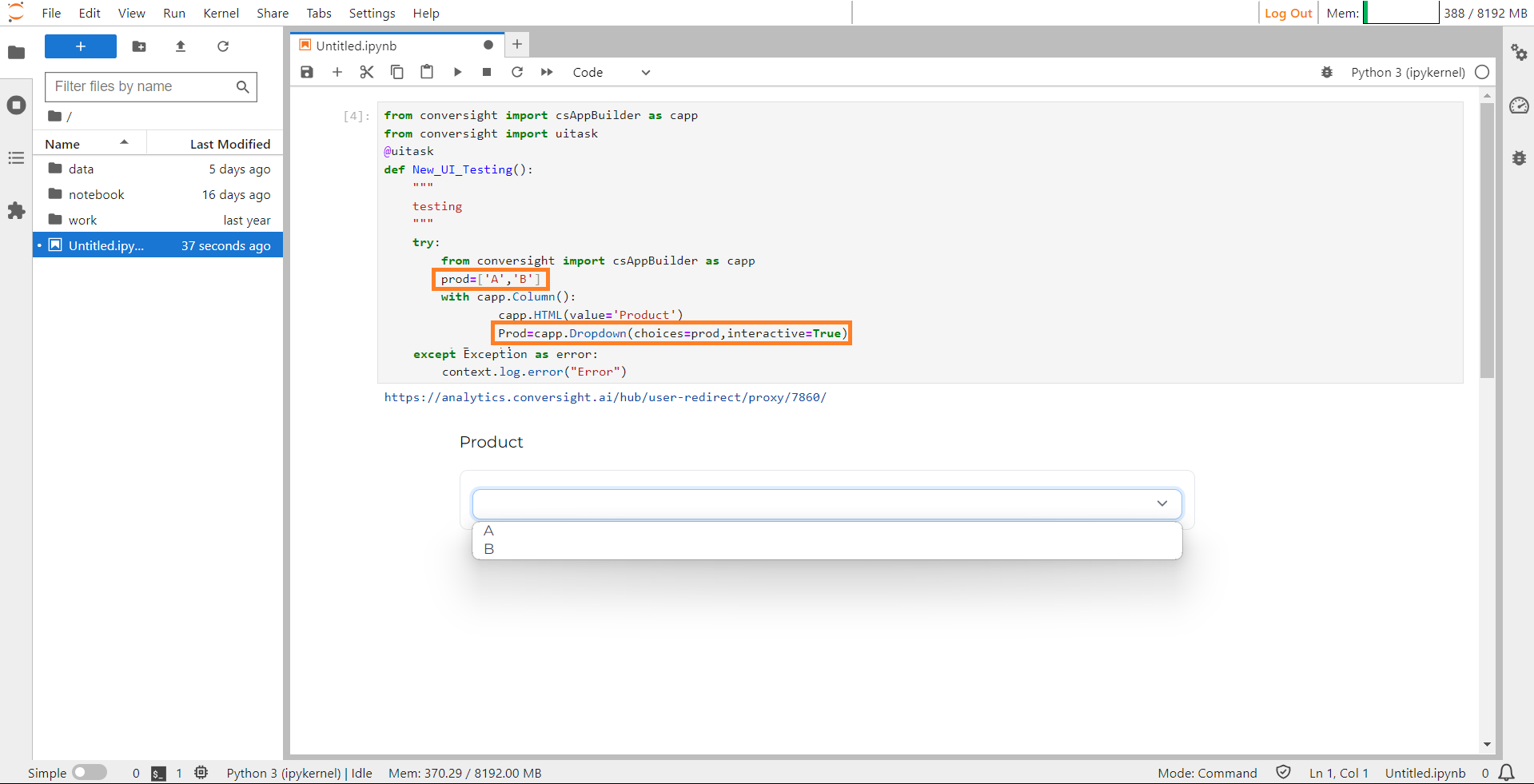
Dropdown#
HTML#
This component is utilized for presenting arbitrary HTML output. It operates without accepting input and when functioning as output, it anticipates a valid HTML string.
Syntax:
capp.HTML(value=’Value_string’)
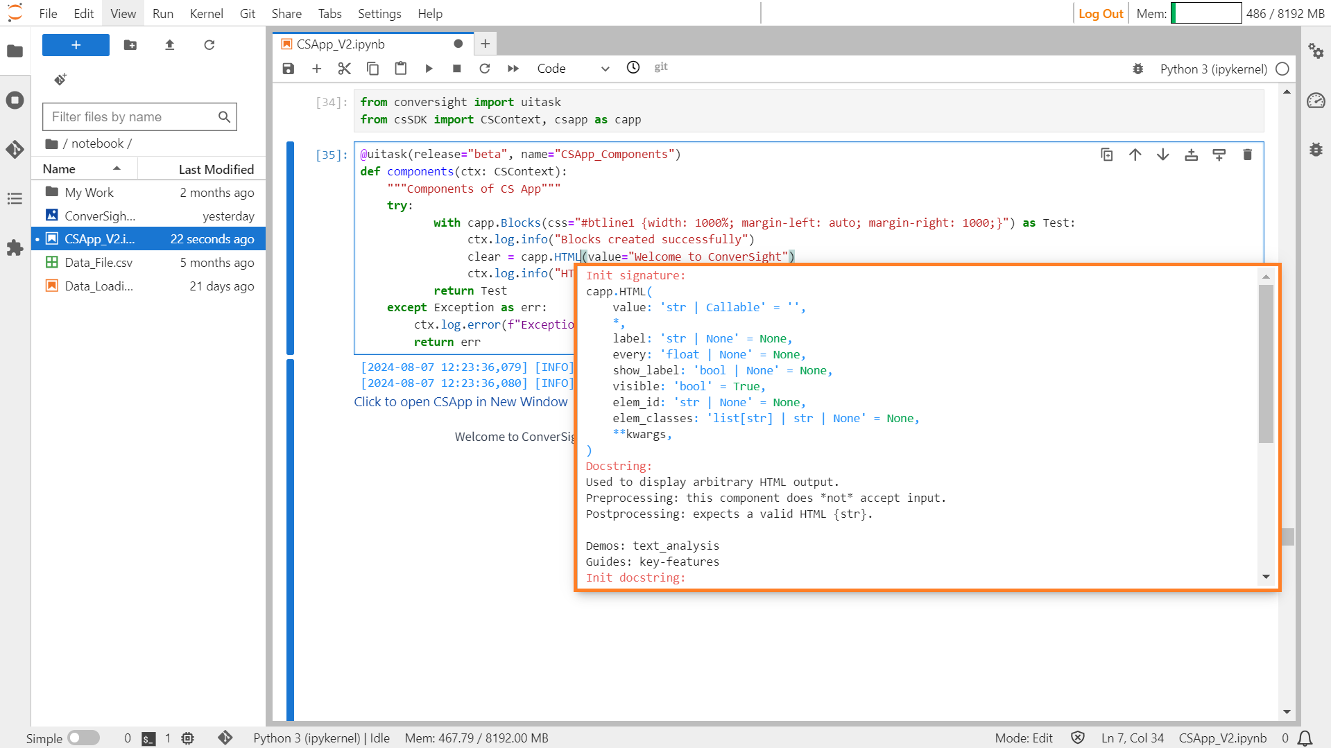
HTML#
Checkbox#
The Checkbox function allows users to make binary choices, indicating a selection or deselection of a particular option.
Syntax:
capp.Checkbox(label=” Label of the checkbox”)
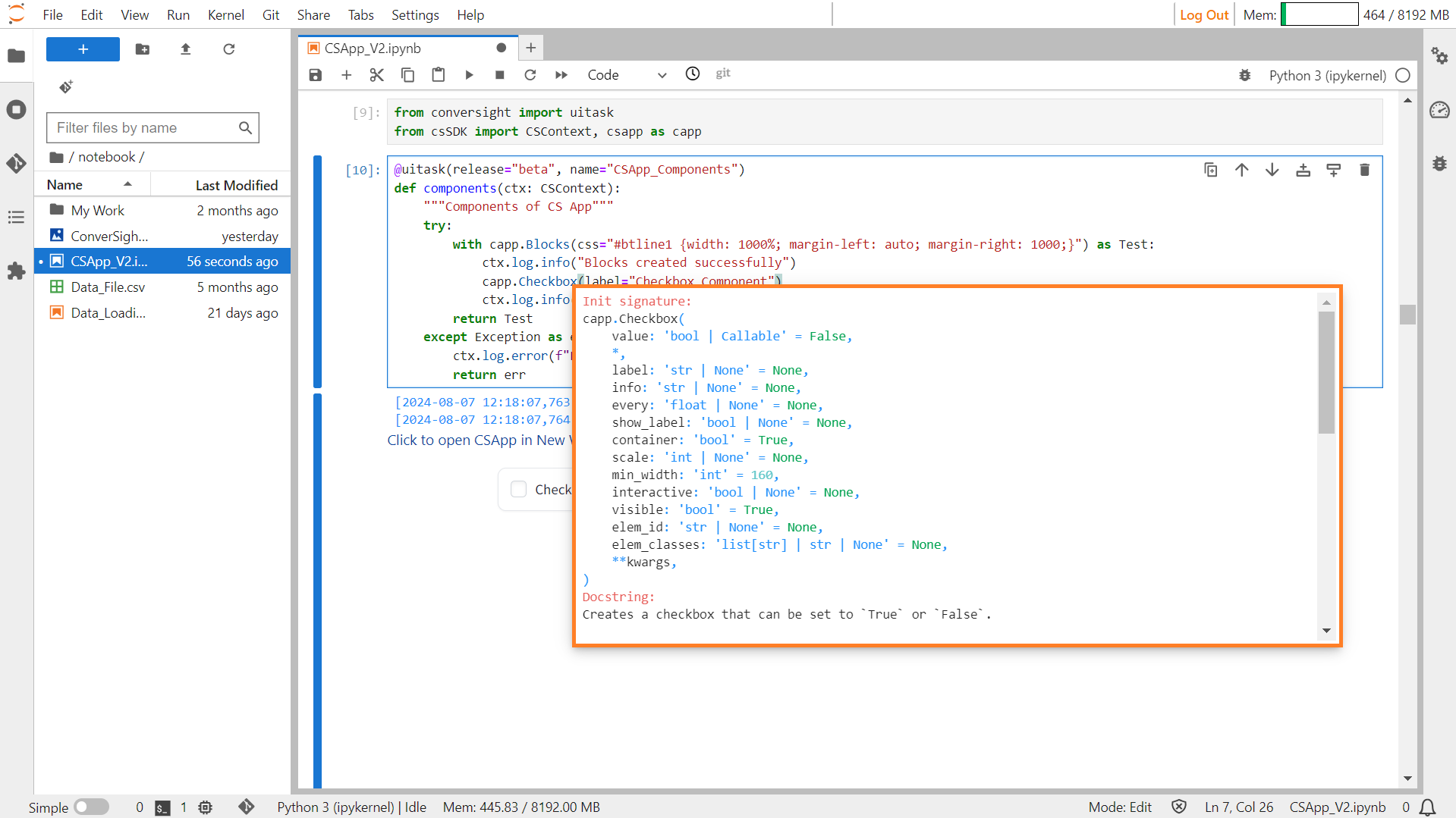
Checkbox#
CSS#
CSS is primarily utilized for styling purposes and is not inherently integrated into our CS App.
Syntax:
css_styles = '''
<style>
    selector {
        property: value;
    }

    selector2 {
        property: value;
    }

    /* Additional styles as needed */
</style>
'''
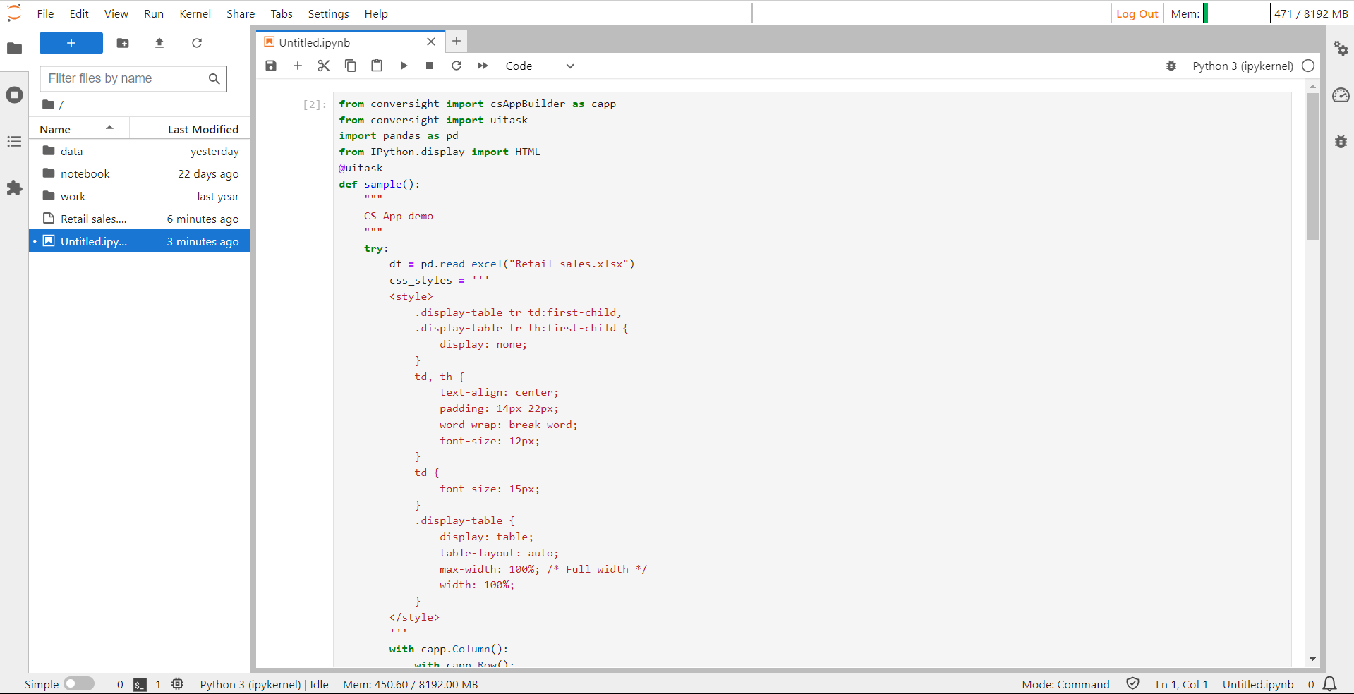
CSS#
CSS#
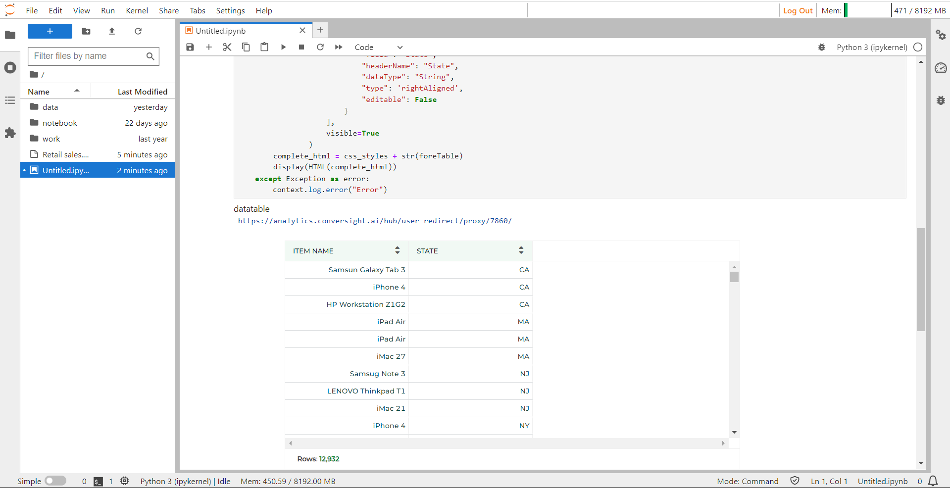
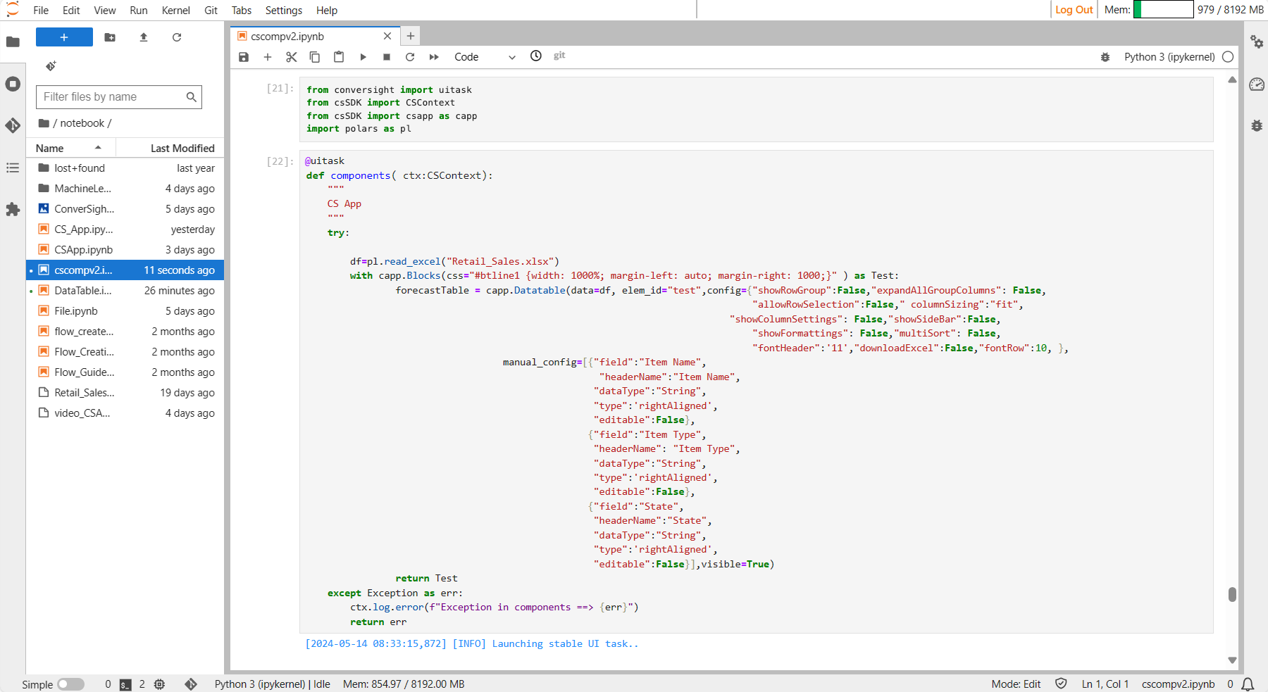
DataTable#
A Datatable serves as a structured container for presenting and viewing tabular data, providing a framework specifically designed for table visualization.
Syntax:
foreTable = capp.Datatable(data=df, elem_id="test",config={"allowRowSelection":False,
            "showFormattings":False,"showTotal":False,"showRowGroup":False},
                                   manual_config=[{"field":"Field_Name",
                                                   "headerName":"Header_Name",
                                                   "dataType":"String",
                                                   "type":'rightAligned',
                                                   "wrapText":True,
                                                   "autoHeight":True,
                                                   "editable":False},
                                              # You can include many Fields
                                                  {"field":"Field_Name",
                                                   "headerName":"Header_Name",
                                                   "dataType":"String",
                                                   "type":'rightAligned',
                                                   "editable":False}],visible=True)
Data Table#

Data Table#
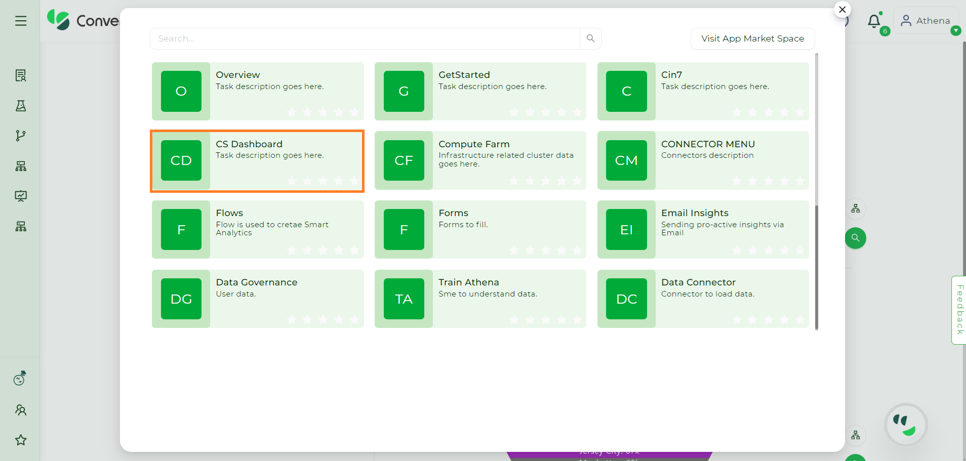
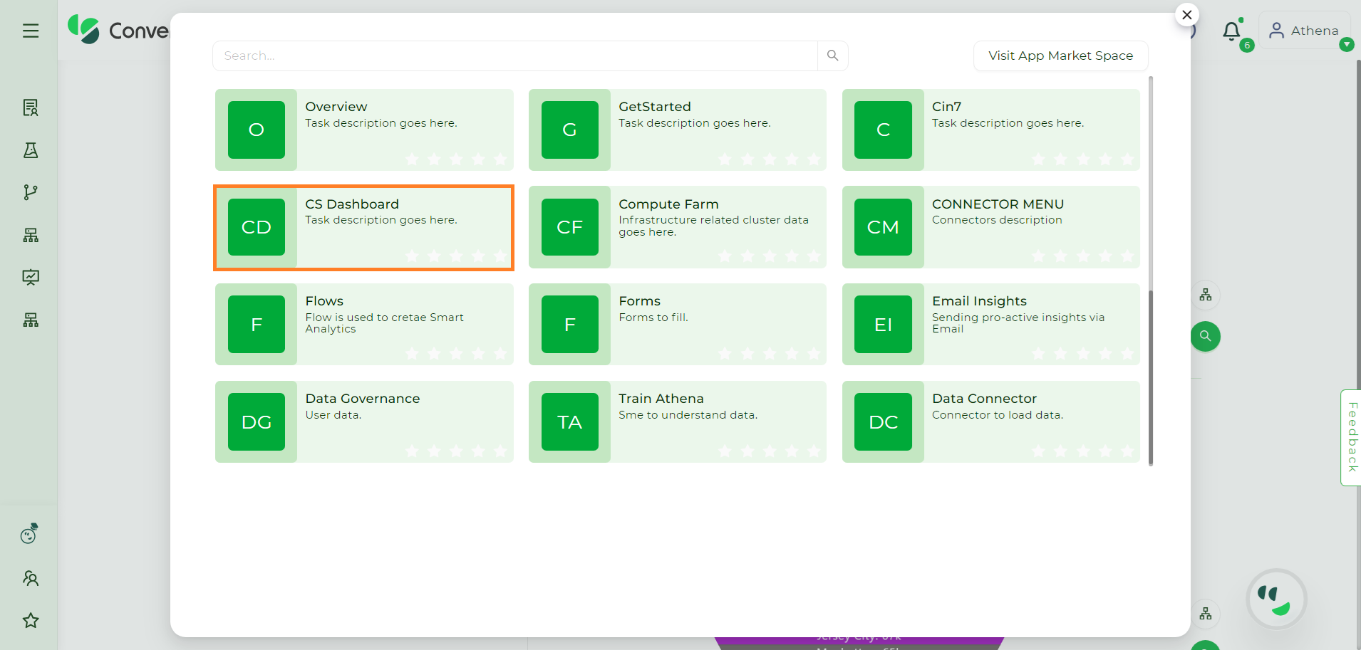
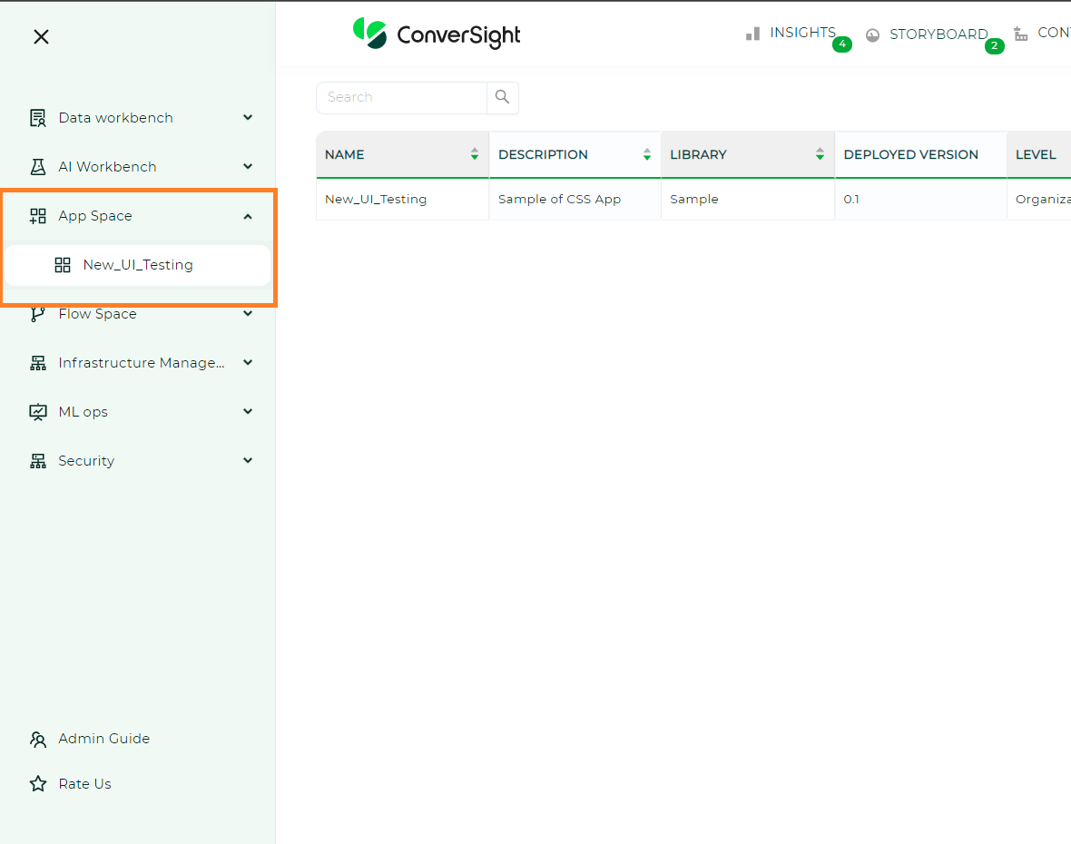
Once you create a CS App, you can run, register and promote it just like you would with generic tasks. You also have access to additional functions such as setVersion, getVersion, showCode, editCode, deleteVersion and delete to perform various operations. Created UI Task will be saved to CS Dashboard post registering it. CS Dashboard is available under Apps Space.
Apps Space#
A registered UI Task should be made deployable so that other users can access it.
CS Storyboard#
By clicking on the  icon, you can conveniently add CS Dashboard to the left side of your home screen. In the near future, you will have the ability to use Apps Space (similar to a play store) and add menus to the left side of the home screen (Configuration Tab) according to your specific requirements.
CS Dashboard#
The CS Dashboard provides a valuable platform for users to effectively manage their UI-related tasks. One of its key functionalities is the ability for users to easily deploy the specific version of their choice. This empowers users to tailor their UI experience according to their specific needs and preferences. The CS Dashboard offers users the convenience of creating new configurations using pre-existing UI tasks. This feature eliminates the need to start from scratch and enables users to leverage the existing functionalities and design elements to quickly set up their desired configurations. By streamlining the configuration creation process, the CS Dashboard enhances user productivity and efficiency in managing their UI tasks.
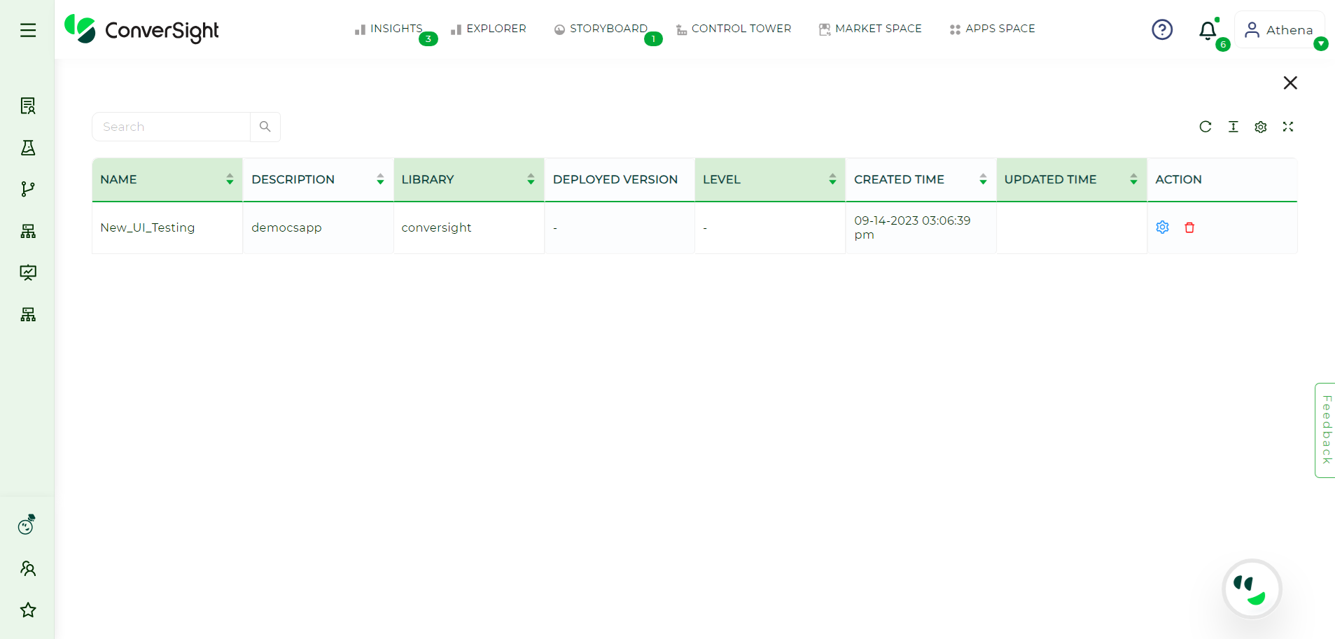
The CS Dashboard presents the created UI tasks in a user-friendly tabular format, providing convenient access to various fields of information for quick reference. These fields include the name of the UI task, a concise yet descriptive summary of its functionalities in the Description field, the library it belongs to, the deployed version and its access level, which can be categorized as User level, Platform level or Organization level.
In addition, the table also displays the time the UI task was initially created and the time it was last updated. This information can be particularly useful for tracking the progress of a task, identifying any modifications made and ensuring that the latest version is being used. Furthermore, the table includes an Action field that allows users to perform various operations on the listed UI tasks, such as editing, deleting or deploying new versions. This enables users to manage their UI tasks efficiently and effectively within the CS Dashboard.
To deploy a CS App from CS Dashboard#
Here is a step-by-step guide on deploying a CS App using the CS Dashboard:
Step 1: Access the CS Dashboard by clicking on it within the Apps Space interface.
NOTE
In the latest update, we've rebranded the "Launch Pad" as the "Apps Space."
Apps Space#
CS Storyboard#
In the CS dashboard, you will find the following information displayed for each CS app:
Name: This field shows the name of the CS app, providing a clear identification.
Description: The description field offers a concise overview of the CS app’s functionalities, giving users a quick glimpse into its capabilities.
Library: This field indicates the specific library where the CS app is stored, helping users locate and organize their apps efficiently.
Deployed Version: The deployed version field showcases the specific version of the CS app that is currently running, ensuring users have visibility into the active version.
Level: The level field denotes the accessibility of the CS app, which can be set at different levels including user level, organization level and platform level. This allows for granular control over who can access and interact with the app based on their respective roles or permissions.
Step 2: Click the  icon and choose the option Manage Versions.
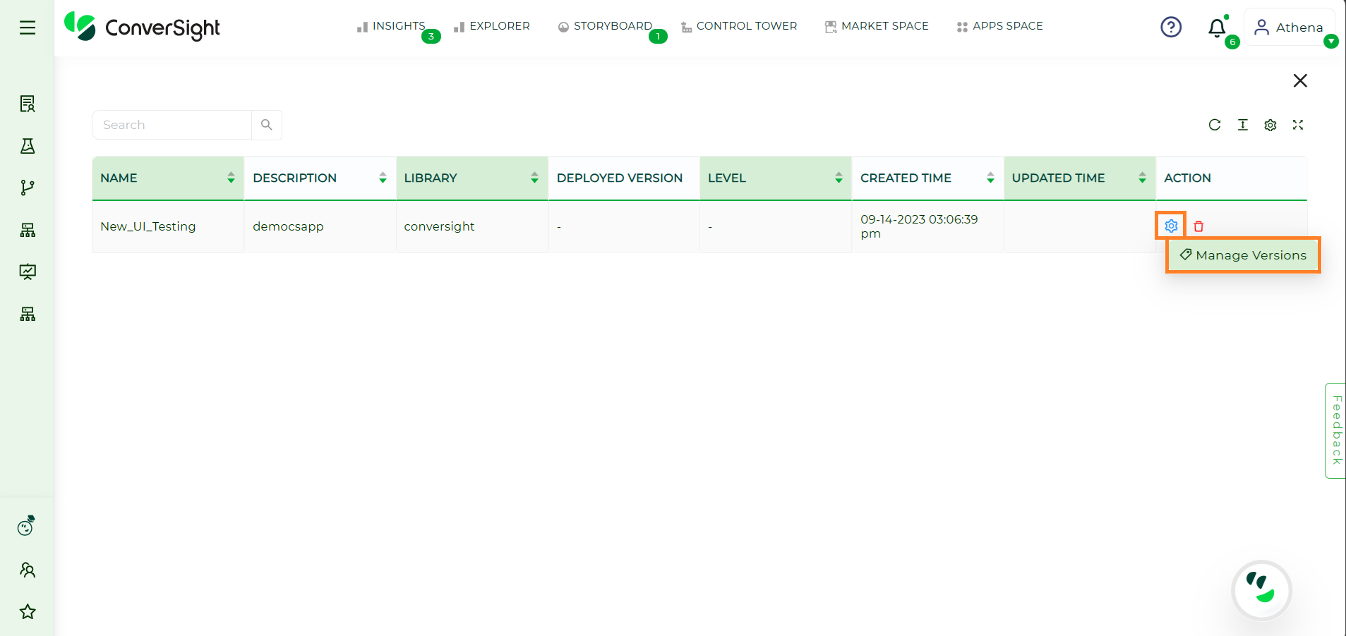
Manage Versions#
Step 3: On the Manage Versions page, click on icon and select the Configuration option.
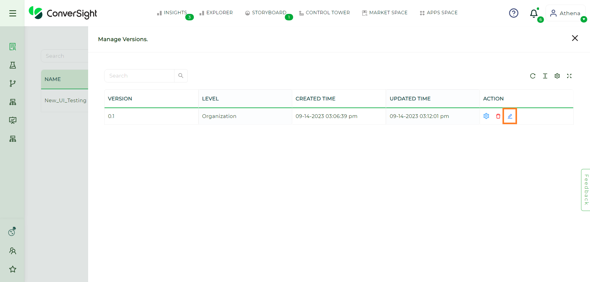
Manage Versions Page#
Step 4: On the Edit Configuration page, users are provided with the flexibility to modify the CPU core count for the deployment of their CS App. They also have the option to choose the Run on Cluster feature, enabling them to select a cluster if they have subscribed to one, thus enhancing scalability and resource allocation.
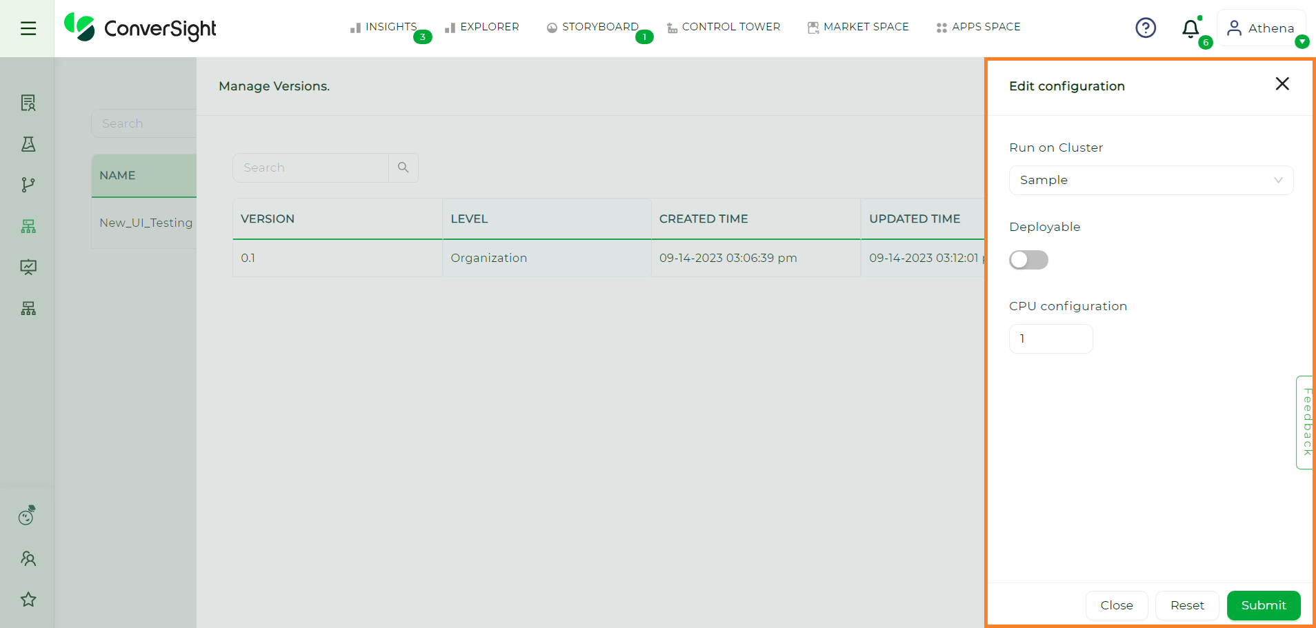
Edit Configuration Page#
Users can easily activate or deactivate the deployment of the CS App by simply toggling the Deployable option.
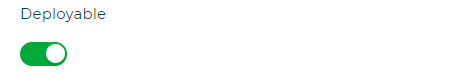
Deployable Toggle#
This action initiates the process of deploying the CS App on the platform. Once users have made the necessary configurations to suit their requirements, they can proceed by clicking  button to commence the deployment of the CS App.
Step 5: Upon successful deployment, the CS App will be automatically included in the Apps Space for easy access.
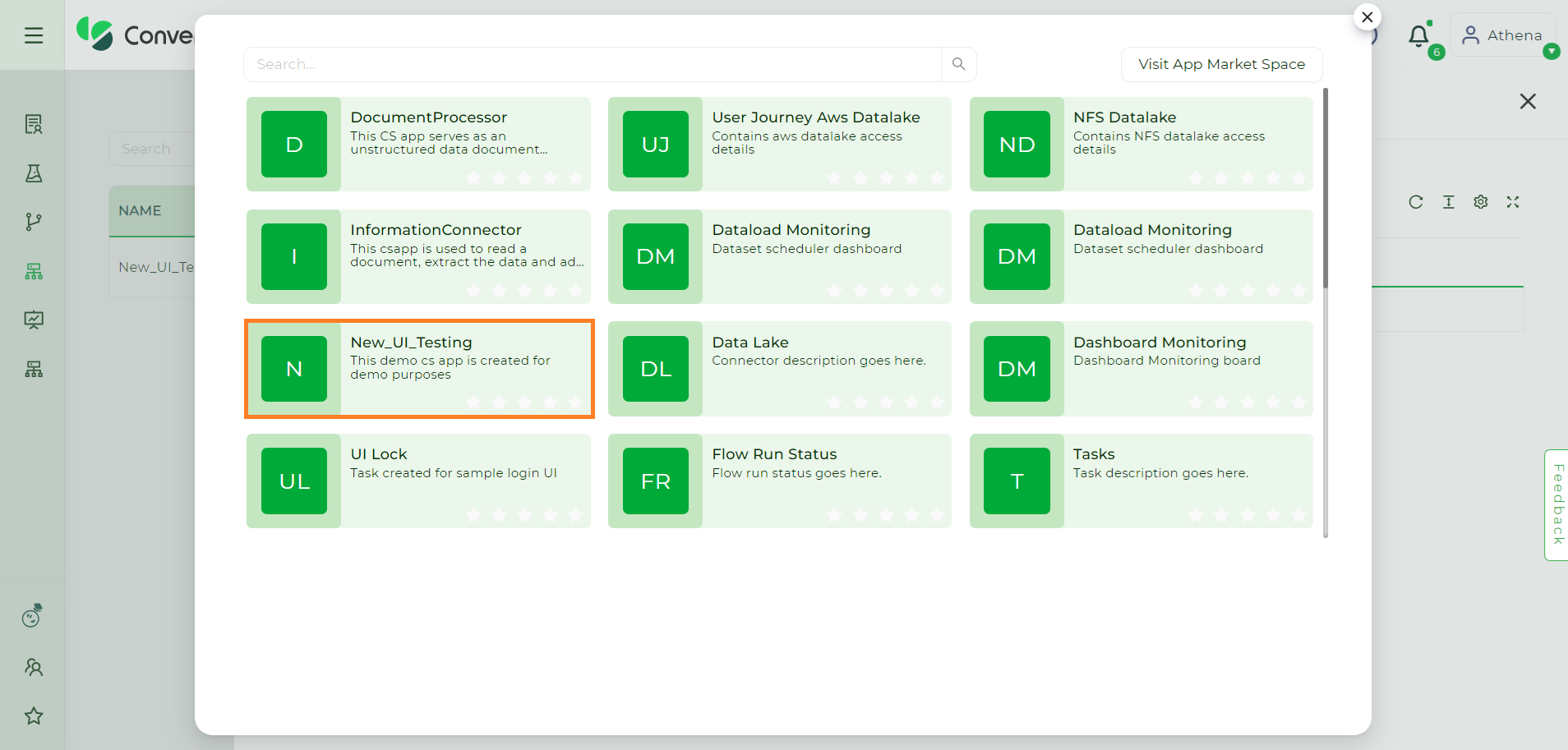
Deployed CS App#
To organize the CS App, users can utilize icon to pin the app under specific topics of their choice in the Configuration tab.
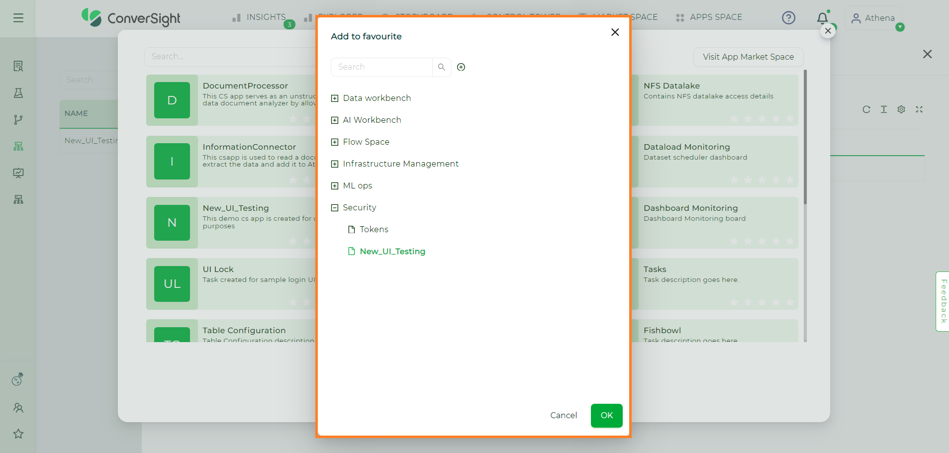
Add To Favourite#
Users have the option to conveniently drag and drop the CS App to their desired section, effectively pinning it in the designated location. For instance, above CS App is pinned under the App Space section, users can easily move it to that section using the drag and drop functionality.
Pinned CS App#
NOTE
If any changes are made to the configuration of the currently deployed version, the pinned CS App will automatically update to the new version.
Manage Versions#
In the Manage Versions page, users can efficiently manage the different versions of the CS App. The version details are presented in a tabular format, offering comprehensive information such as version number, level of access, deployment status, created and updated time.
Additionally, the table includes action fields that provide users with various options. These options include:
Task Promote
Show Code
Configuration
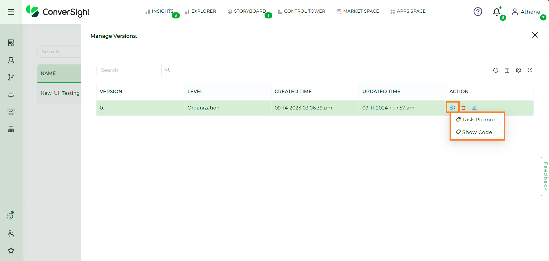
Task Promote
The Task Promote option allows users to promote the CS App version to the desired level, granting appropriate access and visibility based on their requirements.
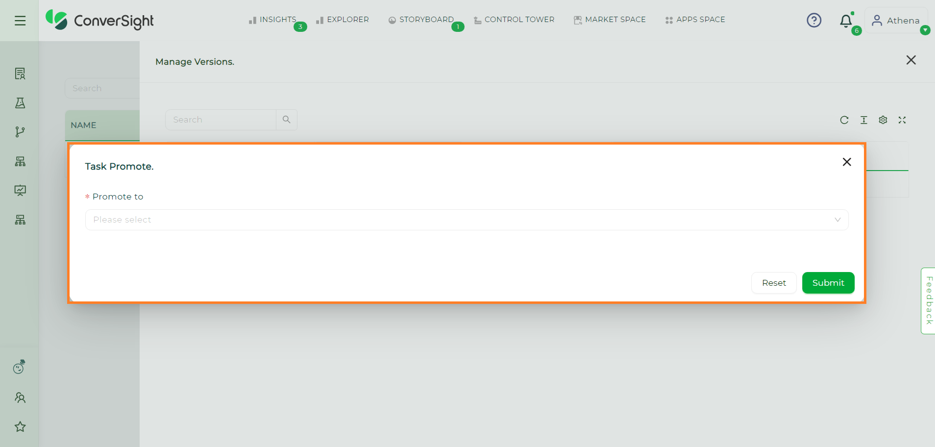
Task Promote#
This feature enables to elevate CS App versions to any of the three available levels: user, organization and platform.
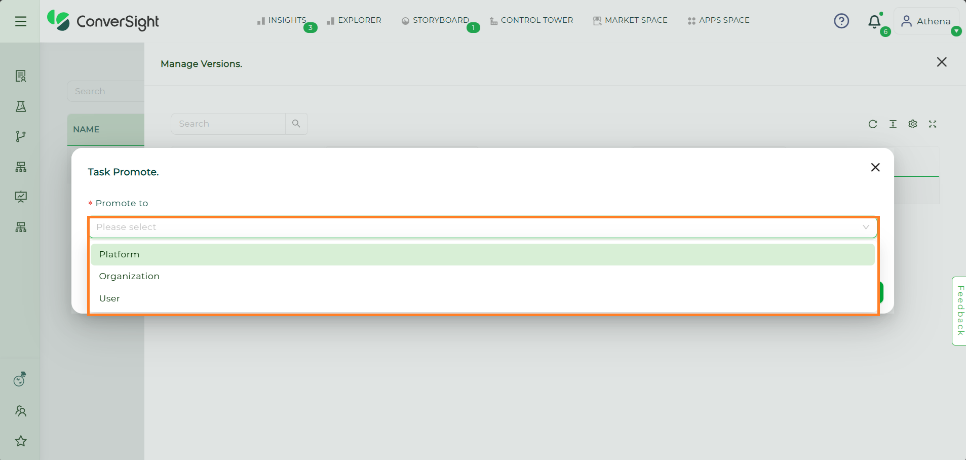
Task Promote Levels#
Show Code
Show Code displays the code of the CS App UI Task and it entirely depends on the access given during task creation.
There are three access that the user can assign to the task, which is:
View: Users have just view only option.
Edit: Users will have the privilege to edit the task and update the task.
No Access: Users will not be able to edit or access the task code which is restricted to all users and it is mainly used for confidential function
Show Code#
Configuration
Configuration provides users with the flexibility to modify the Number of CPU core to deploy count for the deployment of their CS App. They also have the option to choose the Run on Cluster feature, enabling them to select a cluster if they have subscribed to one, thus enhancing scalability and resource allocation. Users can activate or deactivate the deployment of the CS App itself by toggling the Deployable option.
Edit Configuration Page#
In addition, clicking on  icon deletes the specific versions of the CS App. This gives users the flexibility to perform specific actions based on their needs, ensuring seamless version management within the CS Dashboard.
The CS Dashboard offers a user-friendly interface, allowing users to easily navigate through different versions, configure settings and initiate deployments. Additionally, features like pinning apps to specific sections and promoting versions to different access levels contribute to better organization and access control. Overall, the CS Dashboard streamlines the management of CS apps, empowering users to efficiently handle their app-related tasks and enhance their productivity.